You See It Everywhere. You Just Don’t Realize It.
On your phone screen. At the corner of every website. On receipts, delivery boxes, Instagram ads, emails… the one thing that stays consistent is the logo.
It’s the first thing your people see, and the last thing they remember – whether it’s printed on a cap or slapped on an app, worn on a tee or flashed on TV – logo stays consistent everywhere.
But here is the problem: MOST LOGOS SUCK!
They’re overdesigned, irrelevant, hard to remember, or just straight-up lazy. And when your logo doesn’t work, your brand doesn’t stick. This guide breaks down the most common logo design mistakes we see from founders, freelancers, and even big companies who should know better.
10 Brutal Logo Design Mistakes to Avoid in 2025
Here are the 10 brutal logo design mistakes that you should avoid to build your logo right the first time. Let’s get started.
1. Trying to Do Too Much
Logos that feel like they were designed by five people in five directions. This is probably the most common logo design mistake – too many colors, multiple fonts, weird gradients, maybe even a swoosh. The intention to stand out and go a little extra often results in a mess.
- The eye doesn’t know where to look.
- It doesn’t scale well (think: favicon, app icon, etc.)
- It’s hard to reproduce on merchandise, packaging, or signage.
- It doesn’t leave a mental imprint.
Let’s see a few examples.
Starbucks

The original Starbucks logo in the 1970s featured a topless mermaid with two tails surrounded by detailed text and fine lines. It was more mythology than coffee brand.
Over the years, they stripped everything down. And by 2011, the text was gone, and only the simplified green siren remained. It works on a cup, an app, and a billboard — and no one forgets it.
Animal Planet

Animal Planet 2008 logo was clunky, with an elephant jumping over the wordmark with Earth in the background. It was difficult to scale and looked chaotic on digital screens.
Their rebrand in 2018 replaced it with a simple, bold wordmark. Now it looks modern, works on all formats, and feels intentional.
What to do instead
- Stick to one icon (if needed), one typeface, and no more than 2 colors.
- Think of where the logo will live: favicon, signage, packaging, invoice headers, app icons.
- If it’s not immediately readable at 50×50 pixels, it’s too much.
2. It Falls Apart When Resized
What works on a billboard might not work on your browser tab.
A logo needs to hold its integrity across devices, formats, and screen sizes — whether it’s printed on packaging, scaled up on a billboard, or reduced to a favicon or app icon.
The Mistake
Designers often create logos in complex detail, forgetting that logos need to scale. Intricate illustrations, text-heavy compositions, or thin lines may vanish or blur when reduced. If your logo only looks good ‘large’, it’s a problem.
Let’s take a few examples.
Spotify

Spotify’s original 2008 logo had a cartoonish look with playful sound waves and bubbly font. While it worked on banners and large screens, it became hard to read on mobile and didn’t reflect the maturity of the brand as it grew.
In 2013, they ditched the shadows and went with a bold, minimal icon that worked with everything from app icon to advertising.
How to Fix It
- Design with scalability in mind from day one.
Use vector graphics, avoid fine details, and test how it renders at multiple sizes. - Use responsive logo systems.
Brands like Coca-Cola, Nike, and Disney have multiple logo variants: full wordmark, simplified symbol, monogram. - Stick to strong shapes and clean lines.
Think of Apple’s logo — instantly recognizable and legible at 8 pixels or 800 feet.
3. You Can’t Use It Everywhere
A great logo works in color, black & white, print, and digital. No excuses.
This logo design mistake shows up when brands rely too much on gradients, shadows, or color tricks that don’t translate well to all mediums, especially print or embroidery.
The Problem
Let’s say your logo only works on a white background, or worse, only in full color. What happens when you need to print it on a black t-shirt, a monochrome flyer, or embroider it on fabric? You’re stuck, and likely spending more money fixing this logo mistake or adapting it every time.
Let’s take a few examples.
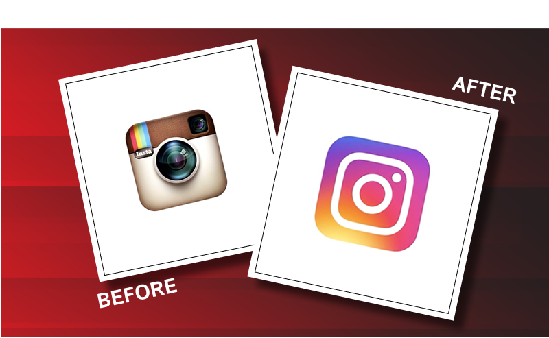
Instagram’s 2010 logo was detailed and literal — a camera with a lens, rainbow stripes, and multiple gradients. When it evolved into the app icon we see today, they shifted to a flat, modern glyph — more adaptable across screens, print, and all visual formats.
How to Avoid it
- Design in black and white first.
If your logo works in monochrome, it will work in color. This is a basic design rule that still gets ignored. - Create logo variations.
You should have:
- Full color version
- Single-color version
- Inverse (white) version
- Horizontal + vertical orientation versions
- Full color version
- Test it across materials.
Simulate your logo on real-world mockups: signage, business cards, t-shirts, digital headers.
4. It Doesn’t Reflect Your Brand
Your logo isn’t art. It’s communication. And if it doesn’t echo your brand’s tone, values, and industry, it’s confusing people instead of connecting with them.
Think of your logo as your brand’s face. If your business is a law firm and your logo looks like it belongs to a surf shop, that disconnect is costly. Misalignment creates distrust, especially for first-time customers who decide in seconds whether you’re worth their time.
Let’s see a few examples to understand it better.
Logo Fail – GAP
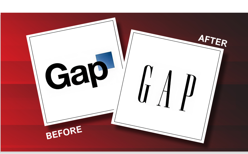
In 2010, Gap replaced its iconic blue box logo with a generic-looking wordmark that screamed “template.” Customers hated it. It didn’t reflect the brand’s legacy, its youthful energy, or its mass-market identity. After major backlash, Gap scrapped the rebrand within a week.
What to do instead:
- Define Your Brand First: Before designing anything, list your brand traits. Are you premium, playful, serious, bold?
- Match the Mood: Align typography, icons, and colors with your brand’s tone. A luxury brand may go serif and monochrome. A youth fashion brand may go bold and colorful.
- Test for Fit: Ask real people (not just your team) what your logo makes them feel. If it doesn’t match what you’re trying to say, start over.
Spotify’s minimalist, vibrant green logo feels modern, playful, and tech-savvy — a perfect match for a digital-first, music streaming platform. The brand tone and the logo speak the same visual language: accessible, current, and energetic.
5. You’re Using the Wrong Colors
Color is more than just decoration. It’s psychology. It influences emotion, shapes perception, and even affects purchasing behavior. If your logo’s colors aren’t strategically selected, they might be silently sabotaging your brand.
Using color just because “it looks nice” or because it’s your favorite shade? That’s guesswork — not branding.
Let’s take a look at a few examples to understand the importance of color in logos.
Pepsi
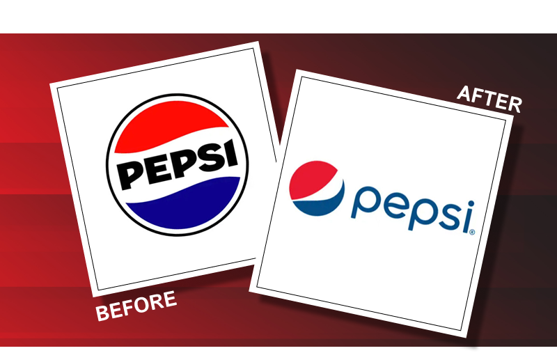
Pepsi has gone through multiple rebrands, but one of the most criticized was its 2008 logo and color refresh. The new gradient and strange white swirl confused many. It lacked the emotional punch of Coca-Cola’s consistent red, which evokes energy and excitement.
How to do better:
Remember National Geographic’s iconic yellow rectangle? It’s no accident. Yellow evokes curiosity and optimism — a perfect match for a brand exploring science, culture, and nature. Even without text, the shape and color scream “Nat Geo.”

- Study Color Psychology: Use trusted palettes for your industry. Blue = trust (fintech, healthcare). Red = energy (retail, food). Green = growth/sustainability.
- Use No More Than 2–3 Colors: Keeps things clean and reduces visual noise.
- Test Across Mediums: Your colors should work on both digital and print, on screens and physical merch.
6. The Font Is Killing It (In a Bad Way)
A bad font choice can quietly wreck an otherwise decent logo. Fonts carry personality. They can feel formal, playful, retro, modern, loud, or soft — and if the tone doesn’t match your brand, the message gets lost.
Too decorative? It’s hard to read. Too generic? You’ll fade into the crowd. And don’t even start with Comic Sans…
Tropicana

Tropicana’s 2009 rebrand ditched its classic font for a generic sans-serif typeface. It removed all personality from the packaging. Sales dropped by 20% in just two months — a $30 million mistake. The company quickly reverted to its old design.
What to do instead?
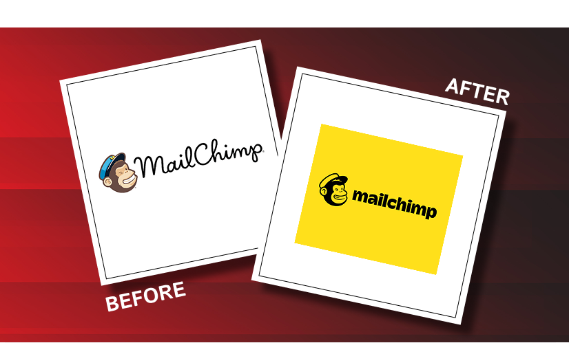
Mailchimp’s logo revamp is a great example of how to choose the perfect logo fonts. Mailchimp’s playful script logotype feels approachable and creative, which aligns perfectly with its tone as a quirky, user-friendly email platform. It stands out in the SaaS space where most logos feel overly serious or sterile.
- Choose Fonts With Character: Serif fonts often communicate tradition or luxury. Sans-serif fonts can feel modern and clean. Handwritten styles are friendly. Choose what matches your voice.
- Prioritize Readability: Fancy fonts that aren’t legible at small sizes or in quick glances are just eye candy with no use.
- Test for Versatility: Try your font on a dark background, on merch, and in small formats like app icons. If it breaks down, it’s not the one.
7. It’s Chasing Trends
Logos that follow design fads don’t age well. What feels modern today often becomes cringey tomorrow. Great logos outlast trends.
Trendy isn’t inherently bad. But when your logo’s foundation is based on what’s hot right now (like 3D gradients or ultra-minimalism), you risk looking outdated fast. Here are a few examples of what happens when you chase trends and when you don’t:
Uber Rebrand
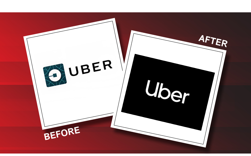
In 2016, Uber moved from a recognizable wordmark to a strange symbol that was supposed to represent “bits and atoms.” It was too abstract, and most users had no idea what it meant. Uber walked it back in 2018, returning to a clean wordmark with strong, timeless typography.
Apple
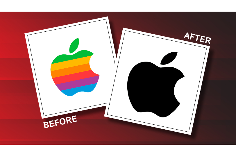
Apple’s logo has subtly evolved with design eras — from rainbow to chrome to flat monochrome — without ever changing its core shape. That consistency made it timeless, while allowing for subtle trend-aware tweaks.
How to Fix It
- Build on Purpose: Design based on your brand mission, not the latest Behance trend.
- Aim for Timelessness: Stick with clean lines, balanced proportions, and simple forms. Think Nike, Apple, FedEx.
- Don’t Be Afraid to Evolve: You can modernize over time without losing your core identity.
8. There’s No Meaning Behind the Logo
The best logos carry a layer of thought that reflects a brand’s identity, purpose, or values. This doesn’t mean it needs to be complicated. In fact, simplicity works best when it’s tied to meaning.
A meaningless logo may look clean, but it often ends up being forgettable. In contrast, a logo with hidden depth or relevance becomes memorable — and even iconic. Let’s see a few examples.
FedEx

At first glance, it’s just bold letters. But look closely between the “E” and the “x” — there’s an arrow hidden in the negative space. It subtly communicates speed, precision, and forward movement — everything the brand stands for.
Beats by Dre
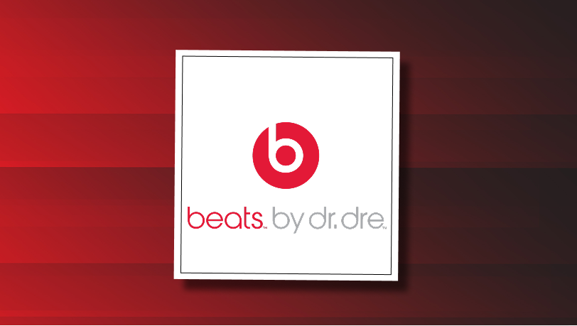
The logo looks like a lowercase “b,” but placed inside a circle, it also resembles a person wearing headphones from the side. It’s clever, minimal, and instantly connects with its core product and audience.
Here’s how you can add meaning to your logo:
- Start with “Why”: Before design begins, ask what your brand stands for. What do you do differently? What emotion should people feel when they see your logo?
- Think in Symbols: Can you visually represent your brand’s values or purpose through shapes, letters, or metaphors?
- Keep It Subtle: You don’t need to spell it out — the best meanings are the ones people discover over time and remember forever.
9. The Logo Feels Visually Unbalanced
If something looks off but you can’t quite tell what it is — it’s probably a balance issue. Alignment, spacing, proportions, and weight all impact how a logo feels. When a logo is unbalanced, it creates discomfort, even if the viewer can’t explain why.
Balance doesn’t mean symmetry. It’s about visual flow and harmony. A well-balanced logo feels “right” — like it fits naturally anywhere, on a screen or on a storefront.

The original Twitter bird had a slightly awkward posture and uneven weight. The 2012 refinement introduced perfect curves, adjusted wing shapes, and improved symmetry, giving it a more confident and balanced presence without changing the core idea.
Pepsi
Pepsi’s redesign brought in an asymmetrical “smile” shape within the circle. While some found it modern, many critiques pointed to its lack of optical balance — especially compared to the symmetrical, iconic Pepsi logos of the past. The design feels unstable in some applications, especially when scaled small.
To make sure your logo doesn’t feel visually imbalanced, you have to:
- Use Grids and Geometry: Build on proven design structures like circles, squares, and the golden ratio to guide placement.
- Mind the Weight: Make sure lines, shapes, and letterforms feel evenly distributed. No side should visually “tip.”
- Check Across Formats: A logo that looks balanced in a PDF might feel lopsided on an app icon. Test everywhere.
10. You Designed It Without Feedback
Designing in a vacuum is one of the fastest ways to create a logo that doesn’t connect. When you skip feedback — from users, stakeholders, or even peers — you miss critical blind spots. You might think your design is clear, clever, or balanced, but others may see confusion, misalignment, or even unintended meanings.
A strong logo doesn’t just look good in isolation — it works across perspectives. Getting real feedback reveals how your audience actually perceives it.
Let’s take a few examples.
London 2012 Olympics Logo
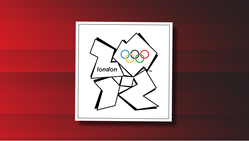
The jagged, abstract 2012 Olympics logo was unveiled to massive public confusion and criticism. While the designers defended it as bold and modern, many viewers called it unappealing, hard to read, and even offensive. A broader stakeholder test could have caught that disconnect early on — especially for an identity meant to represent a global event.
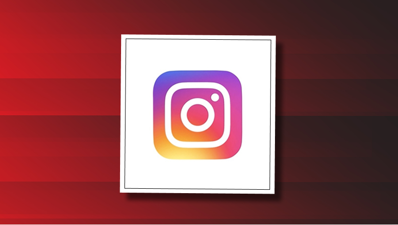
When Instagram introduced its colorful gradient icon, the initial feedback was mixed. But unlike Gap, Instagram had actually tested the redesign internally and externally. Over time, users adapted, and the logo became widely accepted — even praised — because the rollout considered how people felt and allowed time for transition. That kind of measured feedback loop made a big difference.
Not having a second opinion can often backfire. Here’s what you need to know when designing a logo for your brand:
- Don’t Design Alone: Involve people — customers, teammates, even strangers. Fresh eyes spot what you overlook.
- Test at Multiple Stages: From sketch to final, get feedback at key points. It helps refine the direction without overhauling everything later.
- Ask the Right Questions: Instead of “Do you like it?” try “What does this remind you of?” or “How would you describe the brand based on this?”
Fix or Redesign? When to Redesign Your Logo vs. When to Refine It
Not every logo disaster needs a full-blown overhaul.
Sometimes, a few smart design tweaks can completely change how your brand is perceived. But other times—when your logo is fundamentally misaligned with your business or feels like it’s from a past decade—it’s better to start fresh.
The table below helps you break down exactly when a minor fix will do, and when it’s worth investing in a complete logo redesign. Use it as a diagnostic tool before you waste more time or budget patching the wrong problem.
| Criteria | Fix | Redesign |
| Logo clarity at all sizes | Minor improvements needed for small-scale use | Logo falls apart when scaled down or up |
| Alignment with brand vision | Generally on-brand, just needs polish | No longer fits business direction or mission |
| Typography and color relevance | Replace outdated fonts or off-tone colors | Typography or colors send the wrong message |
| Modern design standards | Slightly outdated, still functional | Design looks old-fashioned or amateur |
| Technical versatility (formats) | Logo works in most formats with minor issues | Fails in multiple contexts (merch, app, signage) |
| Audience feedback | Mostly positive, with constructive suggestions | Negative or confused response from target audience |
If you checked more boxes in the “Fix” column — your logo might just need a refresh. But if you’re leaning heavily into the “Redesign” column, it’s time to start fresh.
How to Get It Right the First Time
Designing a strong logo doesn’t require a degree in branding—but it does demand a methodical process. Here’s a step-by-step breakdown.
1. Define Your Brand Vision
Start by answering these:
- What’s your mission?
- Who’s your ideal audience?
- What emotions should your logo evoke?
Example
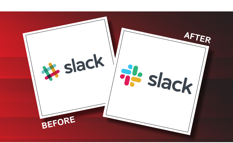
Slack’s visual rebrand focused on aligning its identity with collaboration and digital-first work. The old hashtag logo was visually noisy. The new, simplified symbol tells a cleaner, unified story.
2. Build a Smart Logo Brief
Include:
- Primary use cases (website, merch, signage, favicon)
- Industry context and tone (e.g., fintech vs. skincare)
- Color restrictions (avoid too many)
- Any non-negotiables (e.g., must use a symbol)
Pro Tip: Use a simple form with radio buttons for stakeholders to give input. It reduces friction and misalignment.
3. Work With a Pro
Freelancer or agency, make sure they:
- Show past work aligned with your brand’s vibe
- Understand format requirements (vector, print, B/W)
- Offer a logo system (not just one file)
Work with a professional logo design company to avoid hassle and focus on scaling and growth of your business.
4. Ask for the Right Deliverables
At a minimum, get:
- Full-color logo
- Black and white version
- Reversed logo (light on dark)
- Favicon-ready version
- Vector file (.AI, .EPS)
- Logo usage guidelines
5. Test in the Real World
- Create mockups: app icon, social avatar, signage, hoodie
- Use tools like UsabilityHub for A/B feedback
- Show it to 5 people in your audience — ask what they remember 5 mins later
6. Finalize With Brand Guidelines
Lock in:
- Primary & secondary fonts
- Logo variations & correct usage
- Brand colors with hex, CMYK, RGB
- Clear do’s and don’ts
Work with the Top-Rated Logo Design Company
At Logo Design Valley, we’ve worked with 3,500+ startups, small businesses, and growing brands across industries — and the one thing they all needed was clarity.
Not just a good-looking logo.
A logo that works — in the real world, on real screens, in front of real customers.
That’s why our approach is rooted in what actually matters.
Before we even design a single stroke, here’s what we ask:
- What do you stand for?
- Where will your logo appear?
- Who are you competing with?
You get brand-aligned concepts — not generic shapes picked from a template.
With our custom logo design services, you don’t get one flattened PNG file and a “good luck.”
You get a complete logo system:
| Deliverables | Description |
| Primary Logo | Full version used on websites, signage, etc. |
| Icon/Mark | For mobile, social profiles, or watermarks |
| Monochrome Versions | Works in black-and-white and greyscale |
| Print-Ready Files | CMYK, scalable vector formats |
| Web-Optimized Files | PNGs, SVGs, and favicon |
| Brand Sheet | Fonts, colors, usage guide |
We also include usage instructions — where, when, and how to use each file — so your visual identity stays consistent.
Ready to Build a Logo You’ll Be Proud of?
Whether you’re starting a new venture, launching a product, or cleaning up your existing brand, Logo Design Valley is ready to help you get it right the first time.
1. What makes a logo design fail?
Logos often fail because they weren’t built for scale or versatility. A design might look sharp on a laptop screen but become unreadable on a social media profile, mobile app icon, or printed merchandise. Brands like Yahoo! and BT faced backlash when they introduced over-designed logos that didn’t translate well across formats. A logo must be functional before it’s flashy.
Test your logo across multiple formats — favicon, signage, packaging, and print — before finalizing.
2. How do I know it’s time to redesign my logo?
If your current logo feels outdated, doesn’t reflect your brand tone, or lacks consistency across platforms, it’s time for a redesign.
For example, Dropbox refreshed its logo to better align with its broader suite of creative tools. If your logo can’t grow with your brand or looks amateur, rebranding is a smart business move — not a cosmetic one.
3. Should I hire a professional logo design company or go with a freelancer
It depends on your goals. Freelancers work well for quick, budget-friendly designs. But for serious branding, a professional logo design company offers end-to-end logo design services — strategy, scalability, testing, and documentation. Think of it like this: freelancers give you a logo. A branding team gives you a system.
You get the following key deliverables if you work with a professional logo design company:
- Logo variations (horizontal, stacked, favicon)
- Color versions (CMYK, RGB, black & white)
- Font specifications
- Brand usage guidelines
4. What’s the most common mistake in logo design?
The most common mistake in logo design is overcomplication. Many businesses cram too many elements into a logo — icons, gradients, multiple fonts — making it hard to read or remember. Brands like Mastercard and Warner Bros. simplified their logos in recent years to improve memorability. The strongest logos are the simplest ones. Clarity always wins.
5. How do I choose the right font and color for my logo?
Start with your brand tone. Is your business serious, playful, luxury, modern, or minimal? Fonts and colors should reflect that. For instance, law firms use serif fonts for trust and authority, while wellness brands often go with clean sans-serif fonts and calming hues. Read our logo color combination ideas for more details.
6. What should I expect from a professional logo design company?
If you work with a professional logo design company, you should expect the following:
- A discovery session to understand your brand goals
- Concept development (not just 1 logo, but multiple directions)
- Revisions and feedback loops
- Final deliverables in multiple formats
- A basic brand style guide
Top logo design companies like Logo Design Valley often include brand strategy workshops, competitive analysis, and usage documentation to support long-term brand growth.
7. How long does it take to get a professional logo designed?
Timelines vary depending on the scope. A custom logo design project from a professional agency usually takes 5–15 business days. It involves research, sketching, digital concepts, revisions, and final delivery. Urgent timelines can be discussed, but rushing often sacrifices quality.
8. Can a bad logo hurt my business
Absolutely. A weak logo erodes trust, especially for online-first businesses where your logo is often the first point of contact. A study by Siegel+Gale found that consumers are more likely to trust brands with simple, clean logos. Poor logos can confuse customers, reduce brand recall, and signal unprofessionalism — all of which affect conversions.
9. How much should I expect to pay for a high-quality logo
Prices vary widely. Marketplaces and freelance logo designers might charge as little as $50 to $200. But top-tier logo design companies typically offer packages ranging from $299 to $5,000+ depending on brand strategy, number of concepts, and deliverables. Think of it as a long-term investment in your business image.
10. Can I fix my logo without a full redesign?
Yes — if the issues are small. Tweaks like font refinement, color balancing, or simplifying shapes can modernize your logo without losing its core identity. For example, Google has subtly refined its logo multiple times without breaking familiarity. However, if the design is fundamentally misaligned with your brand — start fresh.