It takes only 0.05 seconds for a user to form opinions about your brands on the basis of visuals alone. That’s quicker than a camera shutter and in the photography business, your logo can often form that first impression.
Want Your Photography Brand to Look as Good as Your Shots?
Your logo is often your first impression—make sure it reflects your talent and niche.
Whether you’re a solo photographer, a part-timer who shoots weddings on the weekends or a professional running a creative studio – a logo works as your identity across the audience. In a crowded market where every portfolio site and Instagram grid competes for attention, a strong logo can help communicate your niche, style and professionalism in an instant.
If you’re not sure what to add in and how to create the best logo for your brand, this blog post explores 20+ photography logo inspirations that can capture what’s trending and working in 2025. From luxury signature logos and minimalist monograms to the camera icons and clever use of negative space, you’ll find a ton of ideas that can match your aesthetic and improve your brand in this guide.
We’ll also explore in detail about what makes a logo great, include real-world examples, and offer practical tips to help you create a masterpiece that can stand out across platforms, no matter if you’re leveraging a logo maker, hiring a designer or simply sketching your own.
Let’s dive in!
What Makes a Great Photography Logo In 2025?
In a world where clients often discover you via Google search or Instagram account, your photography logo isn’t just a graphic, it’s the very first impression of your brand. And in 2025, standing ahead of competitors means a lot more than just putting a camera icon next to your name.
Choosing between the two is often dependent on you
A good photography logo needs to do three core things:
- communicate what you do in an instant
- reflect your studio or personal style immediately
- be versatile and adaptive to look great on social media, websites, business cards and even watermarks
Let’s break down how that can be achieved:
Your Logo Should Communicate Your Story
Whether you’ve an established commercial studio or you simply do wedding photography as a part-timer, your logo should reflect your vibe in front of the audience. Be it edgy, romantic, and minimal or luxury, the best photography logos are those speaking how you like to capture your clients the best.
That’s where logo inspiration photography styles come into play. Are you more drawn towards clean, modern photography logo inspiration or something more expressive and conventional like a handwritten photographer logo? You can always pick the style that describes you best.
Think of your photography logo as a visual handshake. You’ve got one second to say, ‘This is me, and I shoot like this.’ to your clients. How’d you want to do that?
Icon or No Icon
Some of the premium photography logos don’t use icons at all – instead, they leverage bold fonts or stylish photography signatures to stand out. Others go creative with clever camera logo designs or subtle aperture shapes. However, the key is to use something meaningful and not generic. Even if you’re using a camera logo, make sure it’s not the same, overused shutter icon everyone else in the industry has.
Simplicity Is the Foundation for Success
Overdesigned logos often appear complicated and don’t age well. In 2025, minimal and clean designs are winning over everything else. A clean photography logo design can scale well, can be leveraged in making effective photography watermarks and looks sharp on mobile.
Remember, if your logo doesn’t look great in black and white or 100px, it’s not ready for the launch.
Typography Does the Heavy Lifting
Your choice of font can entirely change the feel of your photography business logo. While serif fonts represent a timeless and high-end brand, sans-serif reflect modernism and friendliness and script fonts offer aesthetic and personal feels which is ideal for a wedding photography logo inspiration.
Your Logo Should Work Everywhere
Think social media profiles, websites, mobile apps and client galleries – your logo should appear perfect in all formats. The ideal way is to test your photography logo ideas in all formats such as, horizontal banners, circular icons, and square crops, etc. before the launch.
Pro Tip: shrink your logo to 100 pixels, flip it in black and white, and drop it on a sample photo – if it appears well in all forms, it’s certainly a keeper.
20+ Photography Logo Inspirations That Stand Out
Minimalist Photography Logo Inspiration
Timeless, clean, and versatile. Minimalist logo ideas continue to dominate branding in 2025, and for all the good reasons.
A minimalist photography logo focuses on balance and clarity. No clichés, no clutter – just some strategically put together fonts, a hint of iconography and subtle spacing. Whether you’re using it to watermark your images, on a website header, or business cards, simplicity can help you achieve all of that hassle-free.
Why Minimalist Logos Work So Well
- They can be instantly recognized, even in small sizes
- Are perfect for watermarking images without distracting their viewers from actual photo
- Simpler to adapt across print and digital platforms
- They age a lot better than design-heavy or complicated designs.
Minimalist photography logos are popular among fine arts, portrait, and editorial photographers who want their work to shine, not the logo.
Let’s take a look at some of the most successful photography logo inspirations that falls in the minimalistic category and explore how what helped them work:
Annie Leibovitz
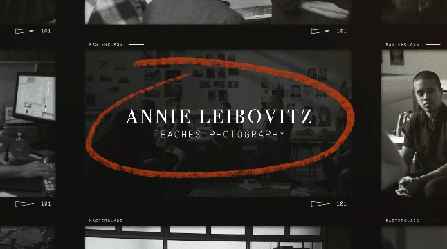
Her name is the logo. A very simple, clean serif font without any icons and anything else. It’s the confident appearance and instant reorganization that makes it a successful photography logo.
Jose Villa
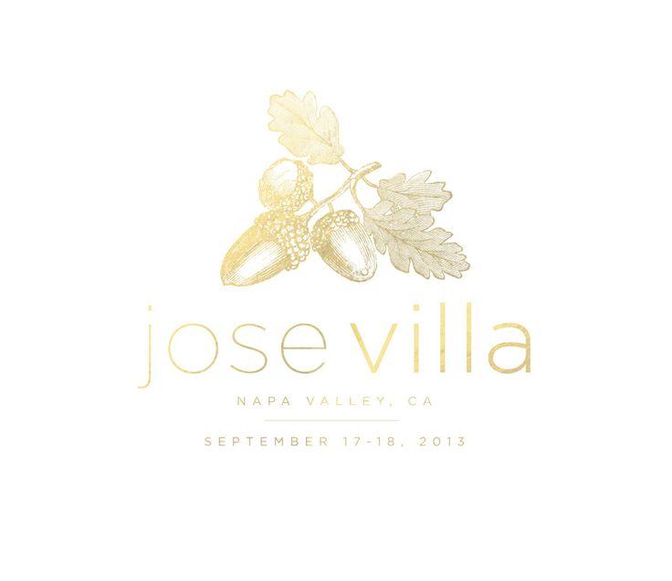
Uses a soft cursive typography to offer the utmost personal and elegant feel. It really shows itself as a wedding or lifestyle photography brand.
Elizabeth Messina

A basic, type-only logo that doubles as a soft watermark on her film-inspired, romantic imagery.
Tips for Your Minimalist Logo
- Use 1-2 fonts at maximum.
- Make an intentional use of white space.
- Choose colors that go well with your editing style (such as: warm neutrals, muted grays, and soft black)
- Test your logo as a photography watermark on some of your photos, if it feels intrusive, it’s too much.
Prefer Clean, Timeless Aesthetics?
Minimal logos never go out of style—and we can help you design one that speaks volumes with simplicity.
Modern Photography Logo Inspiration
If your brand is more into bold, tech-savvy or editorial kinds of shoots, a modern photography logo can be your ideal choice.
Modern logos leverage bold typography, geometric shapes and clever alignment to offer professional yet current vibes. They are mainly popular among content creators, commercial photographers, and those targeting lifestyle or fashion clients.
What Makes a Logo Modern In 2025?
- Structure layout and clean lines
- Custom icons and initials arranged in geometric forms
- Smart use of negative spacing
- Sans-serif fonts that offer an intentional yet sleek touch
Modern logos are designed with the concept of adaptability in mind. And so, they look great across mobile screens, video intros, and brand kits – making them the perfect choice for creators that manage multi-platform portfolios or do videography, etc.
Let’s look at some of the modern logo designs that works successfully for photography businesses and explore what helps them win:
Peter McKinnon
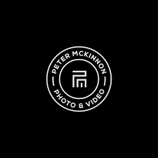
His personal brand logo uses a bold PM monogram inside a circle. It’s strong, edge, and easily recognizable, best for commercial shooters and content creators.
Studio A

Their logo uses a perfect blend of precise symmetry with contemporary type. It’s sharp, clean, and confident just like the kind of photography they do.
FStoppers

A photography and videography platform with a clean wordmark logo that reflects authority and simplicity.
How to Create the Modern Look
- Make use of sans-serif fonts in uppercase such as, Proxima Nova, Monstreat or Gotham
- Keep the spacing tight but readable at the same time
- Experiment with symmetry or layering initials into a symbol
- Avoid using unnecessary gradients or shadows, flat design works the best
Pro Tip: If you want to create something bold without using icons, the best way-out is turning your initials into a geometric monogram for a custom yet modern touch.
Retro and Vintage Photography Logo Inspiration
What was once considered as old is now becoming stylish and the talk of the town. In 2025, retro photography logos are making a comeback, especially for brands that aim to evoke emotion, timelessness, and nostalgia.
This style mostly leans towards film-era motifs, classic fonts, textured icons and earthy color palettes. It’s one of the top favorites among photographers who offer print services, shoot on film or brand themselves as storytellers with a timeless aesthetic.
Why Go Retro?
- Evokes a sense of trust and nostalgia
- Creates an emotional connection with audiences that values the past
- Stands out in a sea of minimalistic yet modern logos
- Works the best for vintage weddings, photo studios, and print-focused brands
Real-Time Examples
Kodak

A photography legend, Kodak’s bold red and yellow logo with its retro font has influenced tons of modern throwback designs.
Feather & Twine Photography
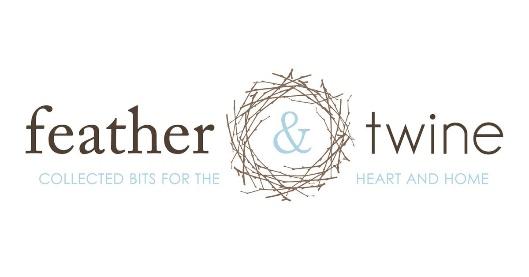
Their aesthetic blends vintage charm with storytelling. Their logo features a simple script combined with an organic illustration, often used in muted tones and film-style overlays.
Tiffany Photography Co.
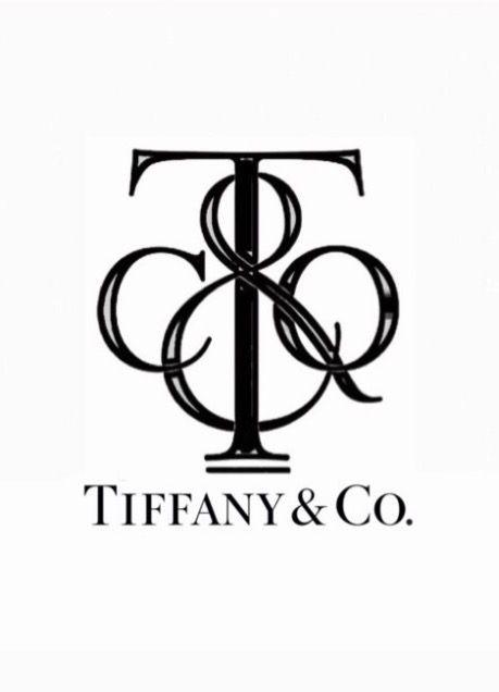
Their logo uses a blend of warm colors with classic typography, echoing the 70s aesthetics, perfect for lifestyle sessions and print lovers.
Tips to Create a Retro-Inspired Logo
- Make use of serif fonts such as: Abril Fatface, Playfair Display, or custom typewriter-style fonts
- Integrate vintage icons such as film strips, old cameras, grainy textures or even sunbursts
- Use colors such as, olive green, burnt orange, faded gold, or muted navy
- Add depth with badge-style framing, subtle shadows, or layered shapes
Pro Tip: A vintage-inspired logo that works better with a hand-drawn camera element or grainy watermarks.
Wedding Photography Logo Inspiration
When it comes to wedding photography, your logo isn’t just a design, it’s your signature on someone’s most intimate and timeless memories. The best wedding photography logos are those that blend emotion, elegance and brand personality together. Let’s take a look at some of the real-world, finest examples and explore what helps them succeed:
KT Merry Photography

They use a minimalist serif logotype in combination with a delicate monogram. The use of white space alongside a soft, romantic color palette perfectly aligns with the photographer’s luxurious clientele. It’s a prime example of minimalist wedding photography logo inspiration that communicates through restraint.
Jasmine Star
Their logo has evolved over the time, from a basic, playful handwritten script to the bold modern sans-serif look – it has stood tall throughout. It reflects the growth mindset of the wedding photography business. It’s a smart plan of branding consistency and personal evolution.
Indie Earl
She uses a rustic, raw, and earthy logo style, perfect for elopement-style wedding shoots and adventurous couples. Her logo blends nature-inspired elements with script font, showcasing how nature-based logos resonate perfectly with the niche wedding segments.
Tips For Designing a Wedding Photography Logo
- Make use of serif or script fonts that convey timelessness and romance. Think about elegance, not excess.
- Adding your actual signature or a custom signature-style font can help build trust and humanize your brand.
- Elements like floral vines, rings or feathers can also add meaning while keeping your logos subtle to avoid the cliché.
- Pick soft, romantic color palettes such as, pastels, earthy tones or muted golds to keep the emotional touch alive and add a premium vibe. Avoid using loud or saturated hues.
Nature-Inspired and Organic Logo Concepts
If your lens is usually focused on mountains, forests, or golden-hour beach shoots, a nature-inspired photography logo may be your best visual identity move. These logos visually echo the organic, earthy feel of your subject matter—and attract like-minded clients.
Real-World Examples
Benj Haisch
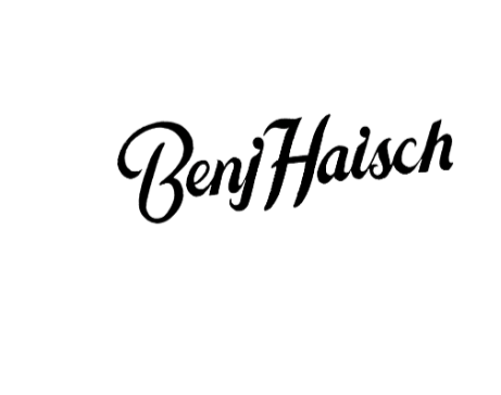
Known for his adventurous elopement shoots, Benj integrates subtle mountain silhouettes into his icon. It’s clean, minimal, and perfectly aligned with his nature-focused brand.
Sophie Kaye Photography
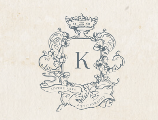
Her logo leans into soft florals within a crest layout. It reflects her timeless film photography style with a touch of romanticism—ideal for outdoor wedding photography.
Tips to Create a Nature-Inspired Photography Logo
- Use earth-toned palettes (greens, browns, muted blues) for an organic feel.
- Incorporate shapes from nature—think leaves, waves, sunrises, or even wildflowers.
- Opt for soft, flowing fonts that mirror the movement of natural elements.
- Balance icons and typography to avoid clutter and keep the design serene.
Whether you’re designing a luxury wedding brand or crafting a timeless serif logo, your visual identity should extend beyond just a watermark. Even your packaging, prints, and albums should follow the same aesthetic direction. For creative consistency, you might also explore album cover design ideas that complement your logo style.
Turn Your Visual Style into a Visual Identity
Whether you’re an elopement photographer or a luxury wedding artist, your logo should reflect your environment and audience.
Luxury & High-End Photography Logos
A luxury photography logo doesn’t need to shout—it whispers elegance through spacing, type, and minimalism. This style is popular among editorial, fashion, and destination photographers who cater to upscale clientele.
Real-World Examples
Greg Finck
His logo features a refined serif typeface with spacious kerning and clean alignment. Often displayed in gold foil or black and white, it instantly communicates prestige.
Le Secret d’Audrey
This Paris-based photographer blends an elegant script with uppercase serif fonts, creating a logo that looks like it belongs to a French couture label.
Tips for Designing a High-End Photography Logo
- Go serif or custom-lettered—avoid trendy or playful fonts.
- Leave breathing room—luxury is about space and simplicity.
- Limit the color palette—stick to black, white, gold, or soft neutrals.
- Avoid icons unless minimal and abstract (e.g., a faint monogram or watermark).
Takeaway: A luxury photography logo thrives on restraint. Every element should feel intentional, polished, and premium.
Signature & Logotype-Based Logos
Sometimes, your name is your brand—and the logo should reflect that. Signature-style or logotype-only designs are especially effective for solo photographers and personal brands.
Real-World Examples
Brandon Woelfel
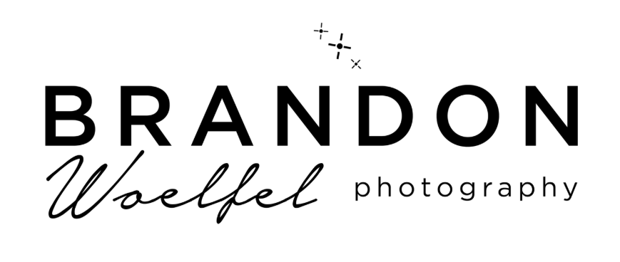
His handwritten name is instantly recognizable and doubles as a watermark on his neon-lit portraits. It feels personal and creative, just like his work.
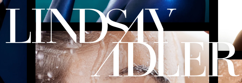
Lindsay Adler
No icons, no frills. Just a bold, confident logotype with expert font choice and clean spacing. It matches her reputation in the fashion photography world.
Tips for Crafting Signature/Logotype Logos
- Use a custom or hand-lettered script for signature logos.
- Pair with minimal sans or serif fonts for subtext (like “Photography”).
- Ensure readability at small sizes—especially if you watermark your work.
- Avoid unnecessary symbols unless they add real meaning.
Takeaway: A signature logo puts your name front and center—perfect for photographers building a personal or influencer-style brand.
Abstract & Clever Logo Concepts
Smart, abstract logos are ideal if you want to stay away from cliché camera icons—but still want something creative. These designs use negative space, dual meanings, or hidden shapes to stand out.
Real-World Examples
The Snap Bar

Their logo creatively combines a camera flash icon with a cocktail bar theme—perfect for a company offering photobooth rentals with personality.
Pye Jirsa

This well-known wedding photographer uses a modern, abstract icon that resembles both an aperture and an eye. Clean, clever, and highly memorable.
Tips for Crafting Abstract Logos
- Start with your brand’s core concept, not just photography as a theme.
- Explore double-meaning icons (e.g., shutter + leaf, lens + sun).
- Keep lines and shapes minimal—abstract doesn’t mean complicated.
- Use versatile colors that work across light/dark backgrounds.
Takeaway: If you want to avoid looking like every other “camera-logo photographer,” abstract branding offers a smart, standout solution.
Photography Logo Design Tips for 2025
Building a strong visual identity starts with the right logo. Here are practical, high-impact tips to design a photography logo that resonates with your audience in 2025.
a. Choose the Right Style for Your Brand
- Your logo should reflect your niche—whether it’s a wedding photography logo inspiration, a nature-themed logo, or a fashion studio’s branding.
- Personal brands can lean into signature-style logos or handwritten fonts.
- Studios may benefit from modern photography logos or minimalist icons with bold typefaces.
b. Use Tools Like Photography Logo Makers
Not a designer? Use tools like Canva, Looka, Adobe Express, or Zno for quick creation.
- Pros: Fast, budget-friendly, and great for testing concepts.
- Cons: Limited customization and may lack originality.
c. Fonts & Colors Matter More Than Ever
- Typography and color choices speak volumes.
- Serif fonts = timeless and elegant (great for luxury and editorial).
- Sans-serif = modern and clean (perfect for tech or lifestyle photographers).
- Pastels offer warmth; bold tones project energy or drama.
You can also check-out the best color combination ideas that work in 2025 for a thorough understanding.
d. Think Mobile-First and Watermark-Ready
Your logo must be legible on smartphones and ideal for use as a photography watermark.
- Test logo clarity at small sizes
- Ensure contrast works over photo
Where to Design Your Photography Logo
In 2025, creating a photography logo that feels intentional, platform-ready, and niche-specific is easier than ever—if you know where to look.
1. DIY with Online Photography Logo Makers
If you’re a solo photographer or just testing brand waters, online tools can be a great way to experiment.
Platforms like Canva and Looka offer intuitive interfaces and pre-made templates that are especially popular among lifestyle and portrait photographers. You can customize your photo logo with camera icons, pastel tones, or signature fonts—all with just a few clicks. Want something watermark-friendly? Adobe Express gives you minimalist templates ideal for placing over your photos, while Zno caters directly to photographers with templates optimized for albums and galleries.
2. Work with a Professional Logo Designer
If you shoot high-end weddings or editorial campaigns, a custom-designed logo helps elevate your visual identity. Many luxury photography brands like Greg Finck or Le Secret d’Audrey have logos crafted by professional designers—with refined serif fonts, elegant spacing, and multiple variations (horizontal, vertical, watermark-ready).
The investment pays off when you need consistency across your website, packaging, and Instagram profile grid. It also allows you to create a logo that truly reflects your niche—whether it’s destination weddings, studio portraits, or black-and-white film photography.
3. Explore Design Marketplaces
Not ready for an agency, but want something beyond a template? Try marketplaces like 99designs or Fiverr. Many emerging photographers have found unique branding here, especially those leaning into abstract or modern minimalist logo concepts.
For example, adventure-focused photographers like Benj Haisch use nature-inspired crests with mountain outlines—details easily communicated to freelance designers if you provide clear brand cues.
Pro Tip: Whether you’re working with a designer or using a tool, keep scalability in mind. Your logo should look crisp as a favicon, watermark, or blown up on signage.
Ready to Elevate Your Photography Brand?
Don’t settle for generic icons. We’ll help you create a timeless logo that works across watermarks, websites, and social platforms.
Let’s Build Your Photography Logo →
Final Thoughts
A strong photography logo isn’t just decoration—its how clients remember you, trust you, and differentiate you from the crowd. Whether you’re capturing weddings in the woods, shooting high-end editorials in Paris, or offering lifestyle portraits in your hometown, your logo should speak your visual language.
From minimalist marks to signature watermarks, the best logos in 2025 reflect personality, purpose, and professionalism. Make sure yours does the same.
Whether you’re starting fresh or rebranding, our expert at Logo Design Valley can help you craft a photography logo that captures your unique style—no templates, just intentional design.
Let’s Build Your Signature Brand Today
Still choosing the right logo design company?
Get a quick, expert review. No pitch, just clarity on what fits your stage, budget, and growth.