
You’re walking down a grocery aisle. Dozens of sodas compete for your attention. But your hand moves instinctively—toward a bright red can with bold white script. Coca-Cola.
You didn’t stop to read. You didn’t need to.
That’s the power of color. It cuts through the noise, makes you feel something, and tells a story before a single word is spoken.
Companies invest hundreds of thousands of dollars to figure out the best logo color combinations, and it reflects pretty well in their logos. Brands like Netflix, McDonald’s, and Spotify don’t just have great logos—they have unforgettable color systems designed to trigger emotion and recognition in a flash.
So the real question is: What does your logo color say about you? And what are the best logo color combination ideas in your industry that you can take inspiration from?
Let’s figure it out!
What Your Logo Color Combination Really Mean in Branding
Having the right logo color combination is the emotional entry point to your brand. It builds trust, signals meaning, and shapes experience.
| Color | Emotion Triggered | Trusted By | Best For |
| Red | Passion, urgency, energy | Coca-Cola, YouTube | Food, retail, entertainment |
| Blue | Trust, calm, intelligence | Facebook, IBM, PayPal | Tech, healthcare, finance |
| Green | Growth, peace, health | Spotify, Whole Foods | Wellness, sustainability |
| Yellow | Optimism, energy, clarity | McDonald’s, Bumble | Fast food, kids, travel |
| Purple | Luxury, creativity | Cadbury, Twitch, Glossier | Beauty, education, innovation |
| Orange | Friendliness, confidence | Amazon, Fanta, SoundCloud | E-commerce, media, startups |
| Black | Sophistication, authority | Chanel, Nike, Uber | Luxury, fashion, automotive |
| Pink | Playfulness, care | Barbie, T-Mobile, Canva | Lifestyle, beauty, Gen Z brands |
According to a study from the University of Loyola, Maryland, color increases brand recognition by up to 80%. And if you’re not using the best logo color combinations for your brand, you’re missing out on a lot of untapped potential.
What Logo Color Combinations Reveal About Billion-Dollar Brands
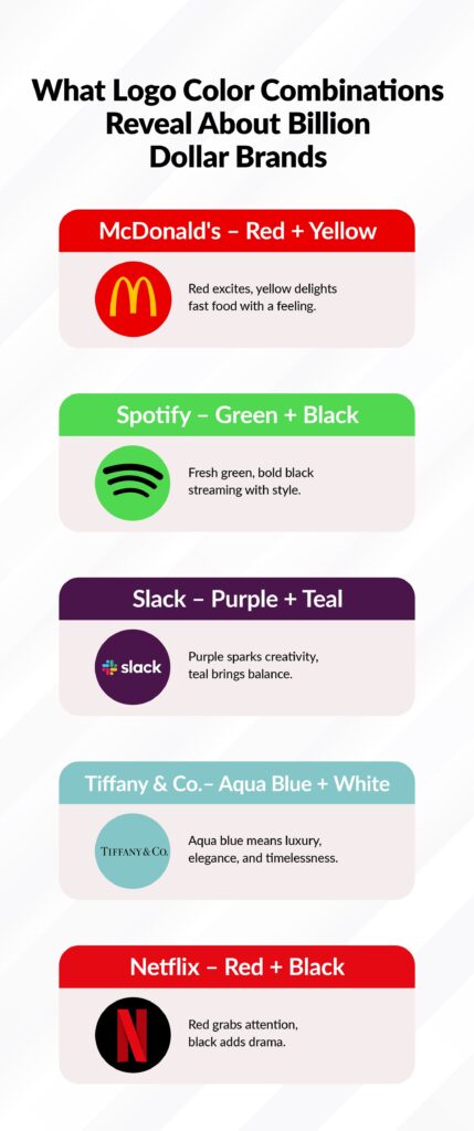
Color can turn a good brand into a global one. Brands that are cherished both online and offline don’t just pick pretty shades. They engineer colors that would be recognized, remembered, and replicated based on data.
McDonald’s – Red + Yellow
McDonald’s chose red because it sparks appetite and urgency. Yellow adds cheer and optimism. It’s not just fast food—it’s emotionally programmed food.
Everything from their signage to their Happy Meals sticks to this emotional formula. And it works. Even a toddler can identify the golden arches without reading a word.
Pro Tip: McDonald’s localizes its red tone for heat zones—brighter in colder regions, deeper in warmer ones.
Spotify – Green + Black
Spotify didn’t use blue or red—because they wanted to stand out in the tech world. Their choice of neon green made them instantly recognizable on app stores. Green signals freshness. Black adds edge and contrast. And it’s one of the most iconic logo color combinations picked by recent digital startups.
Their logo is engineered for modern screens—and even their playlists play with green overlays to stay on brand.
UX Strategy: Spotify’s green is tuned for both dark mode and app store discoverability.
Slack – Purple + Teal
Slack wanted to be different from the cold blue tones of business tools. Their logo color combination gives inclusive and creative vibes. Purple suggests innovation. Teal adds balance and emotional warmth. The result? A logo that feels both fun and professional.
Tiffany & Co. – Aqua Blue + White
Tiffany is just way ahead of its competition in terms of brand recognition, thanks to their iconic logo color combination. “Tiffany Blue” is now globally synonymous with elegance, luxury, and timelessness. Their branding proves that sometimes one unique color, consistently used, can say more than an entire marketing campaign.
Brand Recall: 93% of Tiffany’s shoppers recognize the color before they see the name.
Netflix – Red + Black
Netflix’s logo mirrors the cinematic experience. Red grabs attention, while black represents drama and sophistication. Their brand doesn’t just look good—it feels like watching a movie. Whether you’re on mobile, smart TV, or scrolling social, that red and black combo feels unmistakably “Netflix.”
Best Logo Color Combinations Ideas by Industry
Your logo should be high-effort, well-thought out, and strategically correct for your industry.
Let’s explore winning logo color combos for different business types.
Restaurant & Food Brands
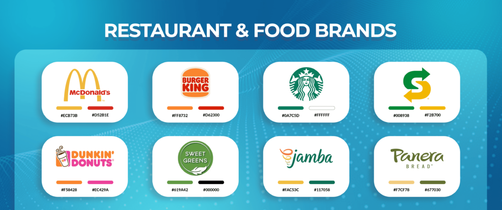
Food is emotional. Whether it’s fast and bold or slow and fresh, your logo color needs to evoke appetite and mood. Below are the best logo color combination ideas for restaurant and food brands.
| Business Type | Combo | Why It Works |
| Fast Food Chain | Red + Yellow | Urgency and hunger, fun and speed |
| Vegan Café | Green + Brown | Natural, grounded, healthy |
| Dessert Bar | Pink + Mint | Sweet, playful, fresh |
| Steakhouse | Plum + Cream | Premium, intimate, refined |
| Juice Bar | Lime + White | Zesty, clean, and energizing |
Build a Flavor-First Logo
We’ll design a logo that makes people crave your brand before they even see your menu.
Let’s Talk!
Tech Startups
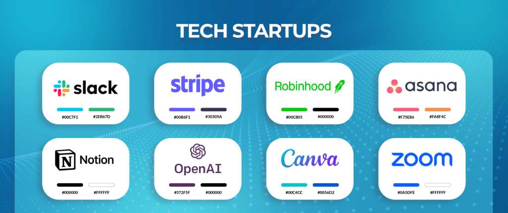
In tech, first impressions are everything. Your logo should feel modern, intelligent, and clean. Here are the most iconic logo color combination ideas for tech startups.
| Startup Type | Combo | Why It Works |
| SaaS App | Teal + Charcoal | Minimal, calm, trustworthy |
| AI Product | Purple + Black | Sophisticated, futuristic |
| Fintech Platform | Navy + Lime | Traditional trust, modern energy |
| Productivity Tool | Blue + White | Clear, simple, smart |
Pro Tip: Avoid being “yet another blue tech startup.” Use color contrast to build distinction without losing credibility, like Spotify.
Make Your Startup Look as Smart as It Is
We’ll help you build a logo that fits your pitch and your product.
Fashion & Apparel
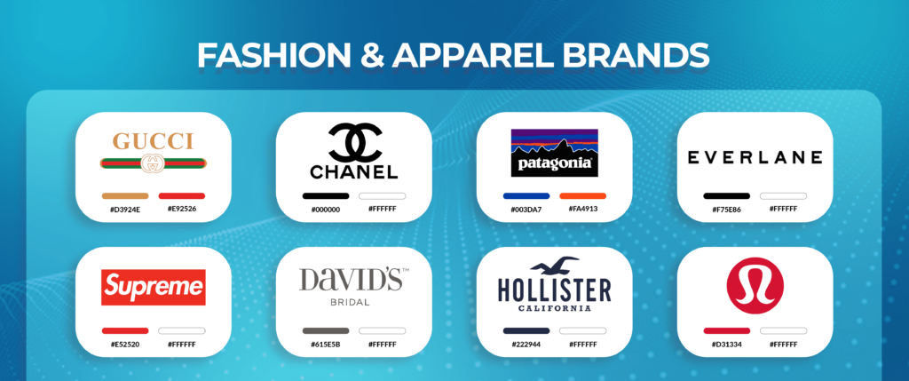
Fashion is personal. The right color can express your brand’s entire aesthetic before the user ever clicks. Let’s take a look at the best logo color combination ideas for fashion and apparel brands.
| Brand Type | Combo | What It Says |
| Luxury Couture | Black + Gold | Bold, elegant, expensive |
| Sustainable Wear | Olive + Cream | Minimal, natural, eco-conscious |
| Streetwear | Black + Red | Urban, edgy, unapologetic |
| Bridal Boutique | Rose + Ivory | Romantic, soft, elevated |
| Youth Apparel | Yellow + Sky Blue | Joyful, energetic, trendy |
Pro Tip: Color isn’t just about emotion here—it’s about culture. Know your tribe.
Healthcare Brands
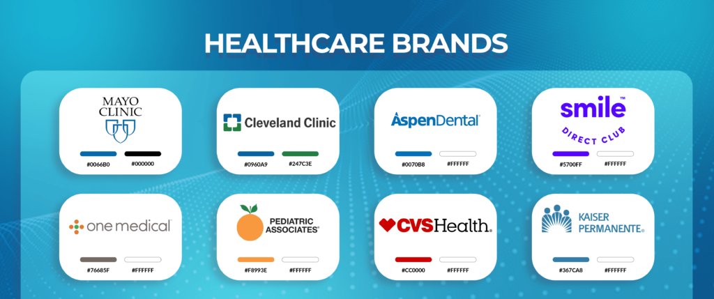
In healthcare, color must first establish trust—then comfort. The right palette can reduce anxiety, especially in spaces like dentistry. Let’s take a look at the most iconic logo color combination ideas for healthcare and wellness brands.
| Practice Type | Combo | Why It Works |
| General Dentistry | Sky Blue + White | Clean, professional, calming |
| Pediatric Clinic | Aqua + Yellow | Friendly, fun, approachable |
| Dental Spa | Mint + Silver | Modern, premium, soothing |
| Orthodontics | Teal + Gray | Structured, serious, neutral |
Pro Tip: Avoid dark or aggressive colors. Healthcare logos thrive on serenity and clarity.
Lawyers & Law Firms
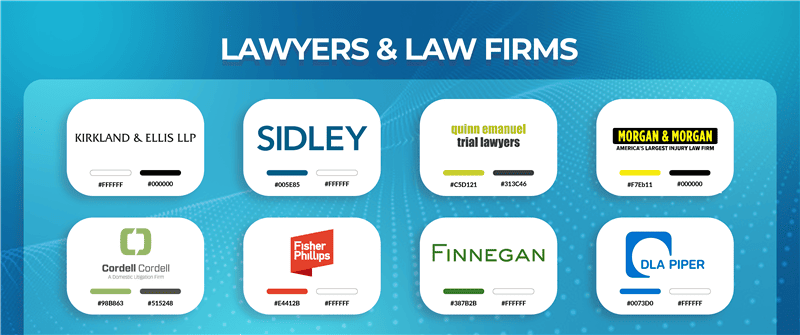
Law firms built on trust. Your colors should suggest authority, intelligence, and professionalism. Here are the best logo color combination ideas for law firms.
| Practice Area | Combo | What It Signals |
| Corporate Law | Navy + Silver | High-end, intellectual, stable |
| Boutique Firm | Burgundy + Ivory | Heritage, uniqueness, class |
| Criminal Defense | Black + Gold | Strength, power, confidence |
| Family Law | Slate + White | Neutrality, warmth, balance |
Pro Tip: Serif fonts and muted, masculine colors tend to perform best for legal clients.
E-commerce & DTC Brands
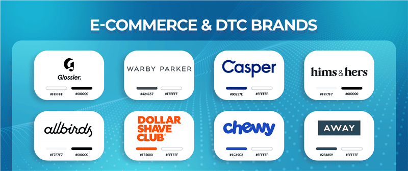
If you’re in the ecommerce and retail industry, your logo will appear everywhere—from thumbnails to TikToks. Color must pop, load fast, and drive trust. Let’s take a look at the best logo color combination ideas for ecommerce and DTC brands.
| E-commerce Type | Combo | Why It Converts |
| Skincare DTC | Nude + White | Elegant, clean, feminine |
| Gadget Retailer | Blue + Gray | Dependable, technical |
| Lifestyle Market | Lilac + Black | Trendy, bold, Instagrammable |
| Kids Store | Yellow + Aqua | Bright, high-energy, inviting |
Pro Tip: Consider how your color will work on packaging, shipping labels, and social ads.
Fitness & Wellness Brands
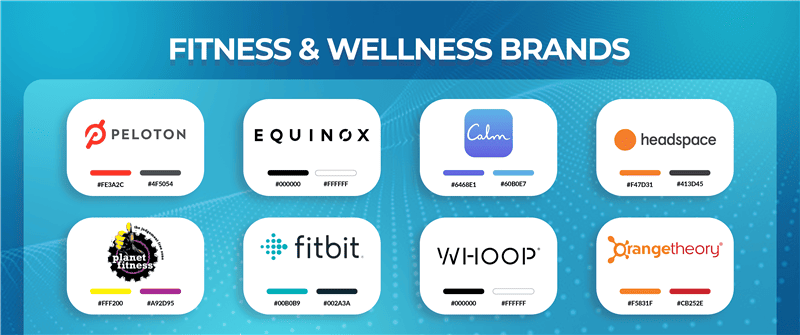
Wellness branding balances energy with calm. The palette depends on your vibe—gym or meditation, strength or peace. Let’s have a look at the most iconic logo color combination ideas for fitness and wellness brands.
| Brand Type | Combo | What It Feels Like |
| Strength Training | Red + Black | Gritty, intense, focused |
| Yoga Studio | Coral + Sand | Warm, inviting, balanced |
| Health App | Lavender + Teal | Calm, tech-enabled, centered |
| Recovery Therapy | Blue + Mint | Clean, clinical, fresh |
Pro Tip: Use natural tones for mindfulness brands, and bold, high-contrast palettes for athletic energy.
Monochrome vs Duotone vs Full Color: What Logo Color Combination Works Best?
| Style | Pros | Brands That Use It |
| Monochrome | Minimalist, iconic, adaptable | Apple, Nike, Chanel |
| Duotone | Balanced, unique, easy to brand | Airbnb, Slack, Stripe |
| Full Color | High energy, youthful, attention-grabbing | Google, eBay, Microsoft |
Quick Guide:
- Monochrome: Best for luxury and timeless appeal.
- Duotone: Perfect for creating balance with a modern twist.
- Full Color: Ideal for brands that thrive on energy and diversity.
The logo color combination you choose will define your brand’s overall vibe and personality. Invest the right amount of time and effort, as redesigns are not just costly but also time-consuming and often devastating.
Logo Color Trends for 2025
The world’s changing—and your palette should too. Here’s what’s trending:
1. AI-Curated Color Systems
Designers are now using tools like Khroma, ColorMind, and Adobe Color powered by machine learning to generate data-informed palettes and logo color combination ideas based on target personas and platforms.
2. Dark Mode Optimization
With most users browsing in dark mode, your colors must contrast well against black and gray—not just white. Pick a logo color combination accordingly.
3. Muted Neons
Think neon peach, limewashed green, or electric lavender—bright but never harsh. These logo color combinations are dominating Gen Z brands all over the world.
4. Retro Revivals
From burnt orange (1970s) to soft pastels (1990s), nostalgic logo color combinations are helping brands stand out while staying familiar.
5. Accessibility-First Color Palettes
More brands are designing for WCAG compliance for readability for the colorblind and low-vision users across all devices.
Common Mistakes in Logo Color Selection & How to Avoid Them
Below are the five most common mistakes in logo color selection and tips to avoid them proactively.
Choosing Colors Based on “What Looks Cool”
What works for you might not work for your audience. Emotion trumps aesthetics—make sure your logo color combination speaks to your target market’s feelings and expectations.
Overlooking Contrast & Responsiveness
Your logo should stand out across all platforms, from mobile screens to dark mode. Make sure your logo color combination works seamlessly across devices and viewing environments.
Using Too Many Colors
More than three core colors can overwhelm your audience. Keep your logo color palette clean and simple for clarity and impact.
Copying Popular Brands
Just because a big brand uses a certain color doesn’t mean it’s right for you. Your logo color combination should reflect your unique brand identity, not copy others.
Skipping Accessibility Tests
1 in 12 men are colorblind, and ignoring this can lead to lost conversions. Choose a logo color combination that’s accessible to everyone, ensuring readability and inclusivity.
The Ultimate Logo Color Combination Checklist
Before you launch your brand, run your logo color or logo color combination through this final filter:
- Does it reflect your core brand personality?
- Does it align with your industry expectations—but stand out within them?
- Is it legible in black & white?
- Does it look good in light and dark modes?
- Will it scale across web, mobile, print, and social?
- Is it emotionally resonant to your specific audience?
If you answered “no” to any of the above—you’re not done yet.
Final Thoughts
Logos aren’t meant to be admired. They’re meant to be remembered.
When someone sees your brand for the first time—on an ad, app, or store shelf—they won’t analyze it. They’ll feel it.
Color is the fastest, most emotional part of that feeling. And in most cases, it’s the only part they’ll remember.
So, when choosing your logo color combination, choose wisely. Choose emotionally. And choose strategically.
Talk to an Art Director from Logo Design Valley
We create psychology-backed, industry-optimized, color-perfect logos that don’t just look good—they sell, scale, and stick.