
The best gym logo ideas begin with intention. They reflect the energy of your space, the mindset of your clients, and the promise behind your brand. Every element matters, but color does the heavy lifting.
Red powers intensity. Black builds dominance. Green introduces balance. When chosen with purpose, these combinations shape how your brand is seen and remembered.
In this guide, we’ll break down the role of color in fitness branding, study real logos that get it right, and map out palettes that align with your niche, so your logo looks as strong as the business behind it.
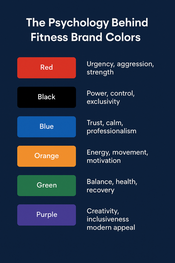
The Psychology Behind Fitness Brand Colors
People form an opinion within 90 seconds of interacting with a product, and up to 90% of that judgment is based entirely on color. That kind of influence isn’t accidental. It’s strategic.
Before anyone interacts with your gym, they interact with your brand. And before they read a tagline or step inside your space, they see a color.
In the fitness world, color carries weight. It tells people what to expect from your brand, how to feel about it, and who it’s made for.
A high-energy gym uses color to spark adrenaline. A wellness studio uses it to create calm. A premium club uses it to express exclusivity. Each one is communicating something precise, and color is the fastest way to say it.
Here’s how some of the most effective fitness brands use color to shape perception:
Red
Associated with power, intensity, and forward motion. Brands like F45 and Barry’s use red to spark energy and urgency—perfect for performance-driven training spaces.
Black
Symbolizes control, authority, and premium quality. Often found in high-end gyms and boutique clubs aiming to create a serious, elevated experience. Equinox and Peloton rely on it for exactly that reason.
Blue
Communicates trust, focus, and calm. Blue appears frequently in digital platforms, medical-aligned training environments, and wellness spaces that prioritize safety and stability.
Orange
Signals movement, motivation, and optimism. It’s active and engaging, which makes it a natural fit for group training studios and high-intensity bootcamps like Orangetheory.
Green
Evokes health, balance, and restoration. Green is often used by yoga studios, rehab centers, and functional wellness brands aiming to highlight physical and mental wellbeing.
Purple
Speaks to identity, creativity, and inclusion. Frequently chosen by women-centered brands and alternative fitness concepts that lean into self-expression and individuality.
White and Grey
Create clarity, simplicity, and modern contrast. These shades are rarely used alone but play a key role in sharpening bold palettes and keeping branding clean and readable.
Color builds recognition. It carries emotion. And when used intentionally, it creates alignment between what your brand offers and how people experience it.
Your gym’s colors already send a message
Let’s make sure they say the right thing
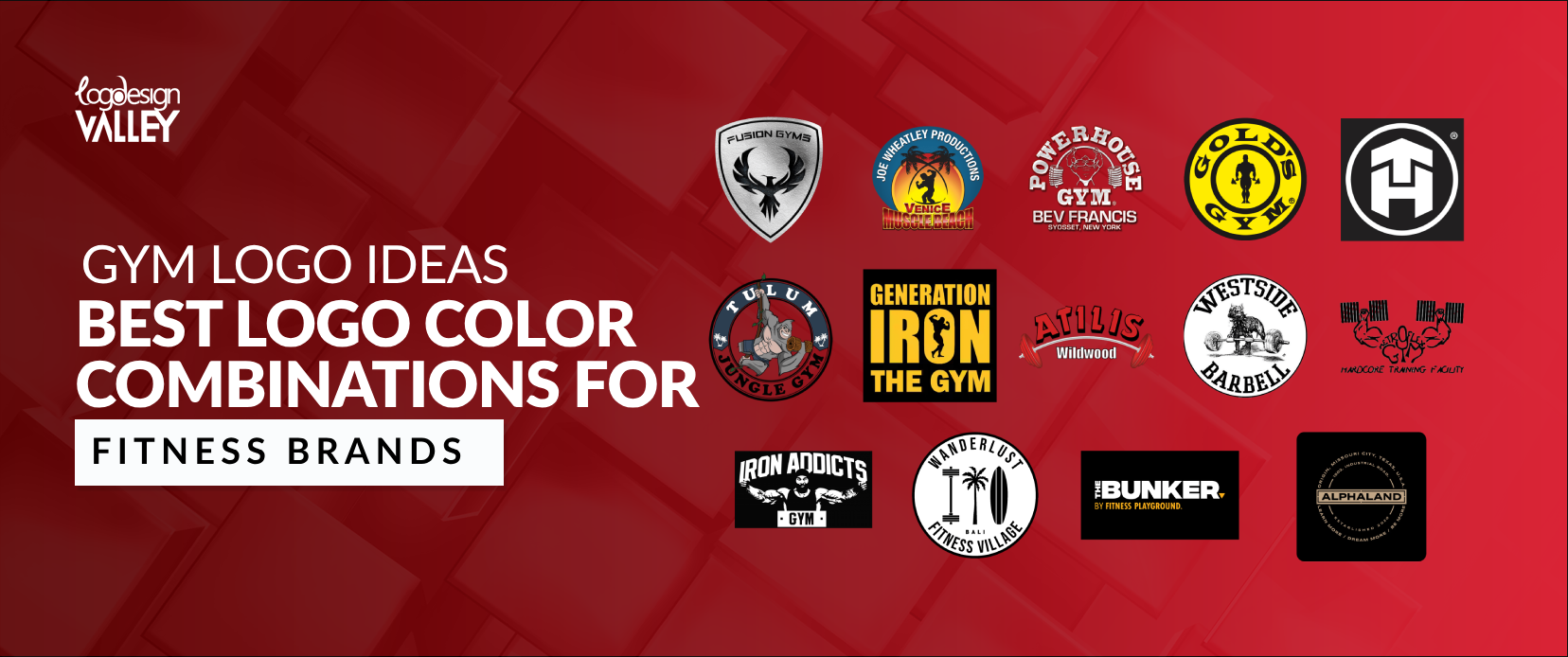
Top 10 Gym Logos & Why They Work
When a fitness brand gets its logo right, you feel it. The color, the shape, the spacing—it all clicks. Great logos in this space aren’t trying to look clever. They’re built to be remembered, respected, and repeated.
Let’s break down ten logos from fitness brands that have nailed the fundamentals.
| Brand | Color Combination | Why It Works |
| Gold’s Gym | Yellow and Black | Yellow adds visibility and energy; black brings strength and tradition. Classic, bold, and built for recognition. |
| F45 Training | Navy and Red | Navy signals structure, red adds energy. Together they reflect high-performance group training. |
| Equinox | Black and White | Clean and elevated. The contrast feels premium, timeless, and confident. |
| Orangetheory | Orange and White | Orange mirrors the brand’s heart-rate focus and energy-driven model. White keeps it bright and modern. |
| Barry’s | Red and Black | Red drives intensity, black sharpens the brand. Together they signal power, style, and grit. |
| Planet Fitness | Purple and Yellow | Bold and approachable. Purple sets it apart, yellow adds a friendly, inclusive tone. |
| SoulCycle | Yellow and Grey | Yellow sparks positivity, grey creates balance. Feels dynamic, urban, and social. |
| CrossFit | Black and Red | Focused and aggressive. Black simplifies, red injects drive. Built for performance. |
| Anytime Fitness | Purple and Grey | Soft yet reliable. Purple adds personality, grey keeps it grounded. Great for accessibility. |
| Peloton | Black and Red | Polished and charged. Black leans luxury, red keeps it active. Feels like both product and lifestyle. |
Takeaway: These logos don’t just “look cool.” Each color combination reinforces the brand’s personality, pricing, and target audience. That’s what makes them memorable—and that’s what makes them work.
Your logo deserves to be in that lineup
Let’s design one that earns its place
Best Logo Color Combinations by Fitness Niche
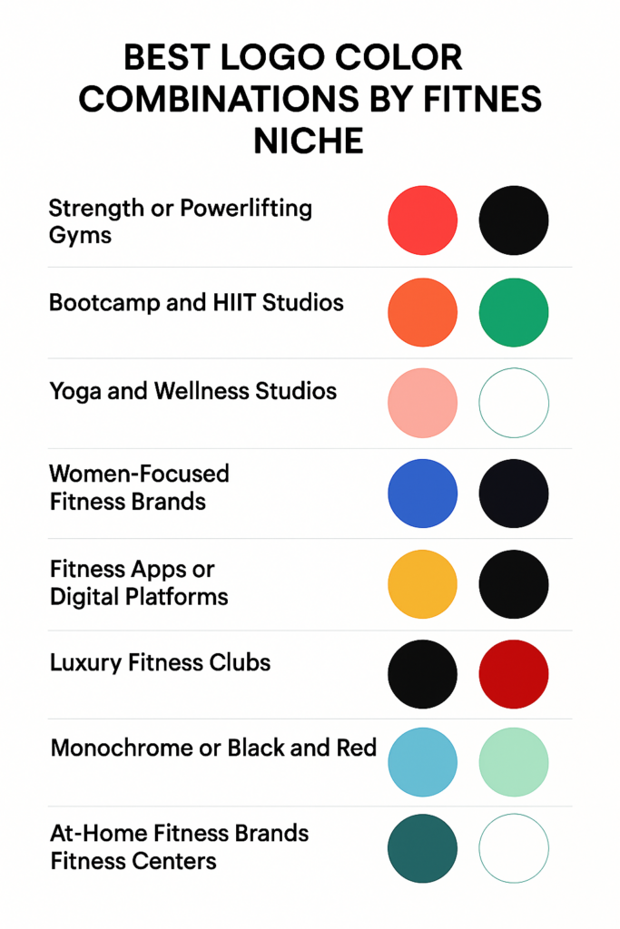
Color carries different weight depending on your fitness model. A strength gym speaks a different visual language than a yoga studio. A luxury club doesn’t share the same energy as a bootcamp. Here are the best logo color combination ideas that you can take inspiration from.
Strength or Powerlifting Gyms
Red and black create a palette built for impact. Red amplifies intensity and action. Black adds weight, control, and focus. Together, they signal seriousness, discipline, and physical dominance—perfect for a results-driven environment.
Bootcamp and HIIT Studios
Orange paired with black feels fast, alert, and active. Orange adds movement and momentum. Black provides sharpness and clarity. This combination encourages energy and accountability, which are core to bootcamp-style formats.
Yoga and Wellness Studios
Green and white bring a sense of balance, calm, and renewal. Green connects to nature and health. White keeps the space open and clean. The pairing promotes physical and mental clarity, making it ideal for breathwork, flexibility, and recovery-focused spaces.
Women-Focused Fitness Brands
Coral with grey creates a visual tone that feels strong yet approachable. Coral introduces warmth without softness. Grey adds modernity and structure. Together, they attract with confidence and offer a sense of belonging.
Fitness Apps or Digital Platforms
Blue and purple gradients make the brand feel forward-thinking and intuitive. Blue promotes trust and stability. Purple introduces creativity and momentum. Gradient usage adds dimension and motion, aligning with digital-first products and user experience.
Luxury Fitness Clubs
Gold and black speak directly to aspiration and control. Gold creates an aura of success. Black keeps the tone elegant and authoritative. This combination positions the brand as high-end, exclusive, and performance-focused.
MMA, CrossFit, or Combat Gyms
Monochrome or a black-and-red palette creates a raw and unfiltered identity. Black centers the brand with discipline. Red injects energy and confrontation. These colors align with intense training styles and performance under pressure.
At-Home Fitness Brands
Sky blue and mint offer a sense of calm, freshness, and approachability. Blue adds trust and reliability. Mint introduces clarity and lightness. The result feels clean, user-friendly, and built for comfort.
Medical or Rehab-Based Studios
Teal and white bring clinical precision with emotional warmth. Teal blends the professionalism of blue with the wellness tone of green. White supports clarity and trust. This palette works well for audiences focused on recovery and guided care.
Group Training Studios
Yellow combined with navy builds positivity with control. Yellow brings motivation and energy. Navy introduces direction and strength. Together, they promote group movement, leadership, and a shared sense of progress.
How to Choose the Right Color for Your Gym Logo
Color carries meaning. It influences perception, builds emotion, and defines how people connect with your brand. A strong palette brings clarity to your identity and direction to your message. Use this checklist to shape choices with intent, not instinct.
1. Who is your brand speaking to?
Clarify your audience. Demographics, fitness level, motivation—each one points to a different emotional tone.
2. What feeling should the logo deliver at first glance?
Focus on a core emotion. That might be intensity, calm, ambition, or control. Your palette should express that without explanation.
3. Where will the logo live most often?
Think across every touchpoint—signage, mobile, merch, ads. Color should stay consistent, legible, and distinctive everywhere it appears.
4. How many colors support a clear identity?
Two colors often create the strongest foundation. A third can add range if it brings contrast or depth.
5. What does your service model communicate visually?
Performance gyms rely on bold, high-contrast palettes. Wellness brands reflect calm and clarity. Fitness apps benefit from fresh, tech-forward tones.
6. How well do the colors perform in contrast?
Strong contrast improves visibility and sharpens recognition across all sizes and surfaces.
7. Can the palette extend across every brand asset?
From digital screens to gym interiors, your color system should hold steady and deliver a consistent message.
8. How does the logo respond to light and dark backgrounds?
Test adaptability across variations. The palette should remain confident and legible regardless of the surface.
9. Is there cohesion across all selected tones?
Each color should serve a purpose. Together, they should feel unified—supporting one identity, not competing for attention.
10. Does the full visual reflect the ambition of your brand?
Your palette should speak the same language as your positioning. When you look at it, the direction should feel clear.
You’ve done the checklist. You know the gaps
Let’s build the brand that fits your ambition
The Problem With DIY Gym Logos
Templates create logos. Strategy builds brands.
A DIY logo often looks fine in isolation. But fine isn’t enough on a gym wall, a trainer’s uniform, or a mobile app. Without clarity, the identity feels generic. Without intent, it gets ignored.
Most shortcuts miss the core of what fitness branding needs—focus, edge, and visual strength. A strong logo captures all three through color, balance, and bold restraint.
In fitness, perception drives decision. People feel your brand before they try it. The logo becomes the handshake. It should feel sharp, confident, and aligned with the experience they’re about to have.
Good branding removes doubt. It gives your gym presence—online, in print, and across every surface it touches.
Why Fitness Brands Trust Logo Design Valley
Fitness branding speaks before the product. Before the workout, the app, the facility—people see the logo. It sets the tone, signals quality, and creates expectation.
We’ve worked with gyms pushing performance, studios designing for recovery, and startups building fitness platforms from scratch. Each one needed a logo that felt aligned with the space, the people, and the experience.
Here’s how we work:
Built with purpose, not decoration
We design for motion, energy, focus, and calm—whatever your brand leads with. Every element in your logo supports that tone.
Designed to work everywhere
Wall signage, mobile apps, uniforms, equipment, packaging. Every file is made to hold up in real-world use, not just mockups.
Colors grounded in psychology
Every palette we recommend ties back to your audience and brand personality. We use color to guide emotion, not just style.
A process built around collaboration
We bring clarity from day one. You see early concepts, shape the direction, and walk away with work that feels owned.
Zero templates. Zero recycled assets
We don’t reuse. Every logo is designed from the ground up—custom, focused, and aligned with your business goals.
The result is more than a logo. It’s an identity that stands up to real pressure, just like your brand.
Build a Logo That Holds Its Ground
Early-stage brands don’t get second chances. People make up their minds quickly—before they try the product, before they read your pitch. The logo does the talking first.
For fitness startups, that first signal matters. It speaks to the kind of experience you’re creating. It shows how serious you are about your audience, your product, and the market you’re trying to own.
We design visual identities that make that first signal count. Sharp marks. Intentional color systems. Logos that look right on screens, pitch decks, merch, and inside real spaces.
If you’re building something real, make the brand feel that way from day one.