In a world where attention spans have been shrunk to seconds, the most memorable are brands that manage to say more with less. Nike’s swoosh, apple’s bitten apple, and McDonald’s golden arches are a prove that simplicity isn’t plain, it can be powerful at the same time.
With branding moving from print to pixels, complexity has almost stopped scaling. A logo that looked great on a storefront now needs to perform equally on an app icon or favicon. That’s where minimalist logo designs comes in –they’re clean adaptable and instantly recognizable.
At Logo Design Valley, we’ve witnessed how cutting-down visual noise can sharpen brand identity. The truth is simple: when people don’t have to put in extra efforts in decoding your logo; they get the chance to memorize it.
Bring Clarity to Your Brand Identity
Don’t let visual clutter hold your brand back. Our expert designers at Logo Design Valley craft minimalist logos that stand out across every platform — from print to pixels.
Key Takeaways
- Minimalist logos work because they reduce visual noise, strengthen recognition, and make your brand instantly memorable.
- The human brain prefers visuals it can decode easily, which is why minimal logos perform better in recall and engagement.
- Great brands evolve their logos by simplifying, not starting over, preserving recognition while modernizing their identity.
- Clean, geometric, and vector-based designs ensure clarity across every medium, from print to pixels.
- Minimal doesn’t mean cold or empty; it’s about distilling your brand story to its most powerful visual form.
- When you focus on proportion, balance, and intent, you build a logo that outlasts trends and technology shifts.
The Psychology behind Visual Simplicity
Ever wondered why some logos just instantly capture your eyes? Well, that’s not plain luck but psychology behind their design and ideation working just right.
Cognitive Fluency: The Brain Loves Easy
The human brain is designed that way – wired to prioritize things it can quickly process. Cognitive fluency is a concept in psychology that explains why simpler visuals feel more familiar and trustworthy. When a logo is easy to interpret, the brain automatically rewards it with a positive emotion – a shortcut that strengthens brand recall.
Gestalt Principles and Visual Perception
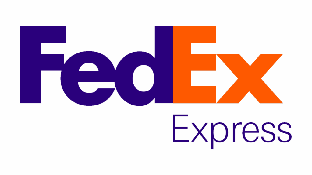
Designers often utilize Gestalt principles to determine how people might perceive different patterns and shapes. Our brain is naturally wired to connect incomplete forms and find meanings in empty spaces. That’s exactly why negative space logos like FedEx feel clever and memorable. The arrow between E and X has been purposefully put to reflect speed and precision, not just to add decoration to the logo.
Simplicity = Clarity + Emotion
A visually simple logo distills emotion while enhancing recall, especially in creative industries where imagery defines identity. See our collection of photography logo inspirations to understand how visual minimalism can evoke emotion and recognition at once.
Visual simplicity in branding isn’t just an aesthetic trend, it sure is a psychological advantage. The easier your audience can understand your log, the quicker they can trust your story.
The Evolution of Minimalist Logos: How Global Brands Simplified Over Time
Minimalism in logo isn’t just a trend that will fade over time, it’s the result of years of adaption and refinement. The biggest brands from across the globe have progressed into simplicity, reducing complex shapes and designs to attain universal clarity. Let’s take a look how they managed to do that and get inspired:
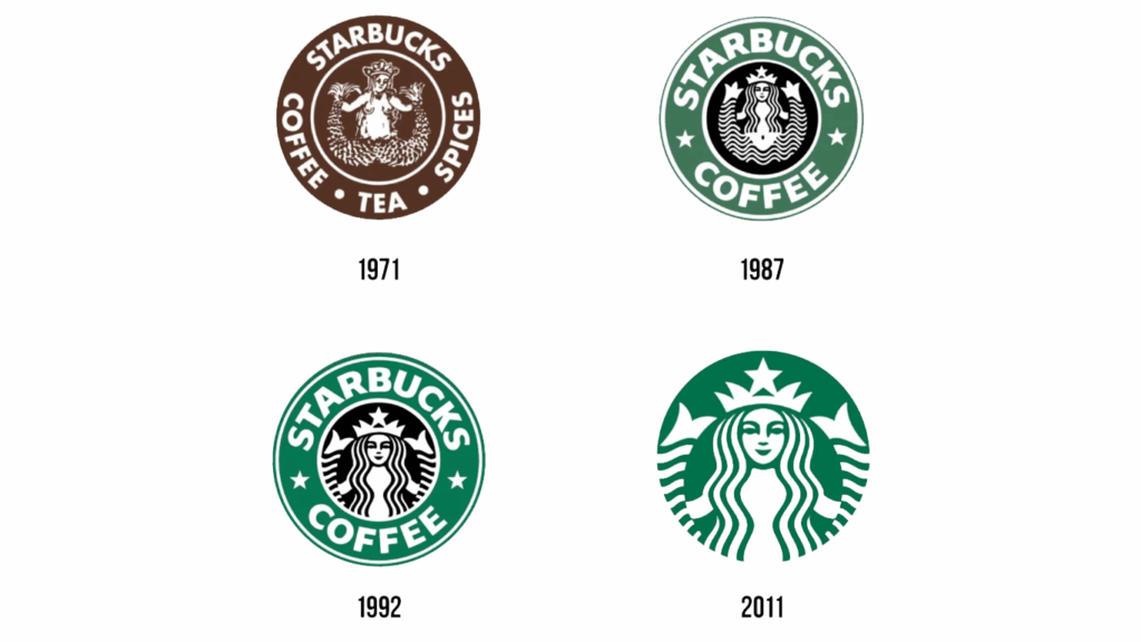
Starbucks: From Complex Symbolism to Simple Storytelling
The original logo of Starbucks which dates back to 1971, featured a detailed siren with borders and text. It is undoubtedly beautiful but cluttered with so many elements. Over the years, the brand adapted innovation in the design industry and trimmed away noise – removing outer rings and typography until only the siren remained. The outcome? A simple, iconic mark that can be recognized instantly no matter what color, size and format it appeals in. Starbucks’ logo is certainly the evolution done right.
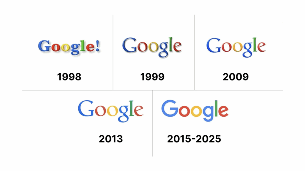
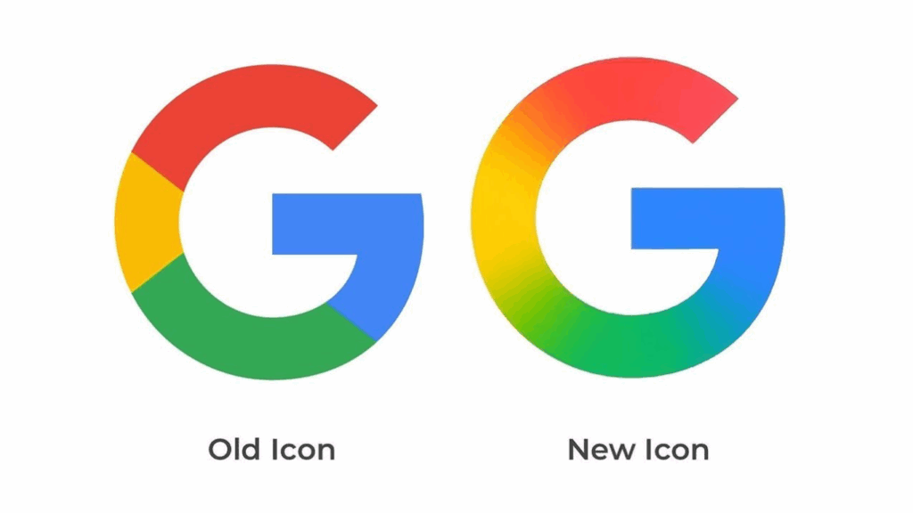
Google: Redefining Simplicity for the Digital Era
The visual identity of Google rightfully captures logo abstraction in action. From a 3D-style serif logo in the early 2000s to a modern, flat-style, geometric sans-serif form, every iteration serves a single purpose i.e. better legibility across screens. Reducing excessive complexity over a period, Google has strengthened their visual voice from the core and ensured scalability from desktop to mobile icons.
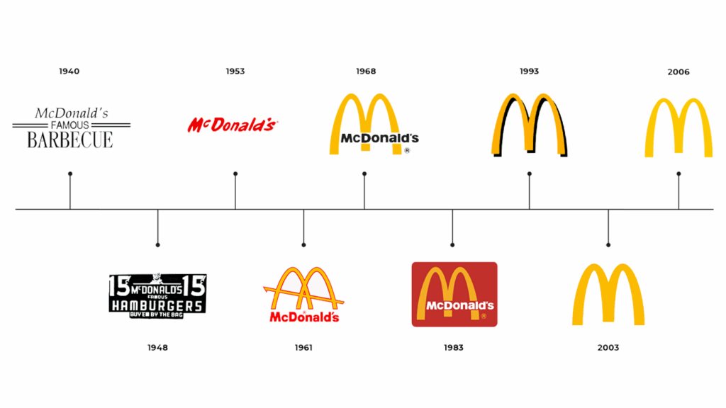
McDonald’s: The Golden Arches of Recognition
McDonald’s logo variations reflect an entire journey of how logo simplification techniques can craft a timeless brand asset. The overlapping golden arches that were only a part of the detailed illustration in the earlier logos, evolved into one minimalist logo design. It’s bold, simple, and instantly triggers brand association across the globe.
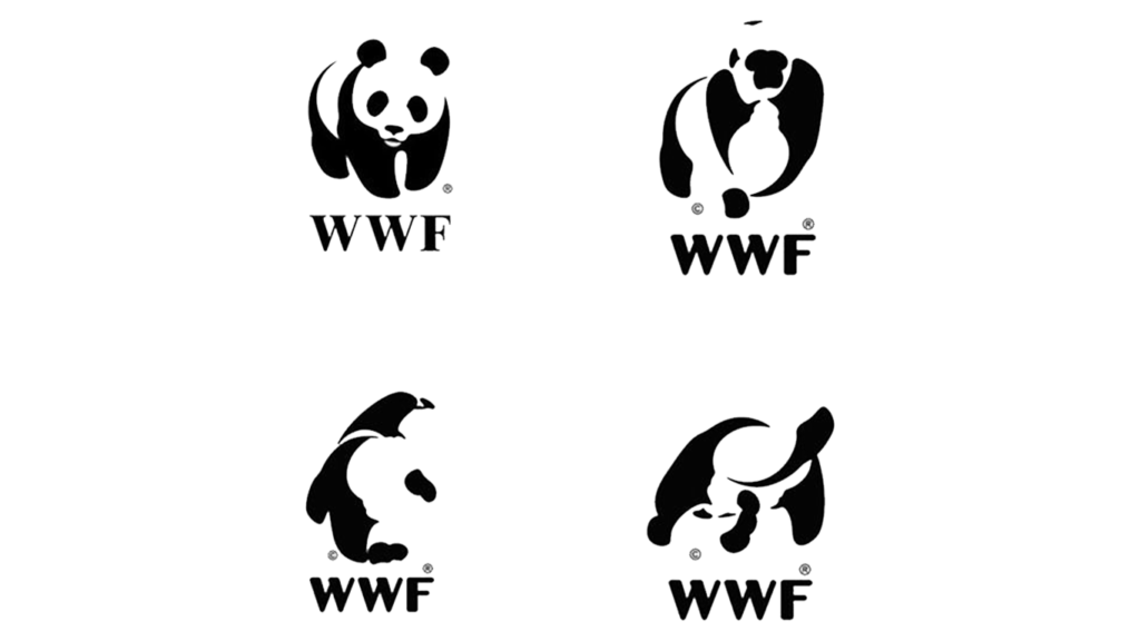
WWF: The Power of Symbolic Minimalism
The WWF panda logo speaks of emotional minimalism at its best. Using only black and white shapes, it manages to convey identity, conversation, and empathy – all through simplicity. No embellishments, no gradients, just design driven by purpose.
The Pattern: Simplify to Amplify
From logo redesigns to crafting minimalist brand identities, the pattern is similar: every major brand adapted simplification not just to follow trends, but to make their recognition timeless. For small businesses and startups; that’s a critical lesson – when you logo is simple, your message gets louder.
Transform Complexity Into Timeless Design
Inspired by how Google and Starbucks simplified their logos? Let’s refine yours with the same precision and strategy.
The Design Logic: How to Simplify a Logo Step-by-Step
A great logo cannot just happen, its design and ideation made simple trough refinement over time. Logo simplification is both an art and a process, grounded in design logic, clarity, and geometry. Here’s how the best brands and clever startups get it right.
Identify the Core Shape or Story
Every logo sure comes from a foundation – a concept, shape or story that defines its existence. Get started by isolating that very concept. Ask yourself this question: what if I delete everything from this logo, what’s that one element capable of still representing my brand? That’s your core for the simple, minimalist logo.
Remove the Decorative Noise
Simplification refers to subtraction with intention. Eliminate gradients, outlines and shadows that are not important and bring any meanings to your logo. This is how reducing visual complexity can enhance both memorability and clarity.
Test for Scalability and Adaptability
It is crucial that your logo looks equally strong on a billboard as well as a mobile icon. It is the core of a responsive logo design – building variations that carries consistent recognition in every context and size.
Apply Geometric Refinement
While refining your logo’s geometry, don’t forget that typography carries equal visual weight. The right typeface can make or break your brand perception. Explore our guide on best fonts for modern logos to choose the type that complements your minimalist design perfectly.
Validate with Context
Testing your finalized version of the logo in real-world scenarios is very important. Apply it across your packaging, social media avatars, app icons, and even dark/light modes. A good logo will always adapt without effort because it’s built with clarity on the core.
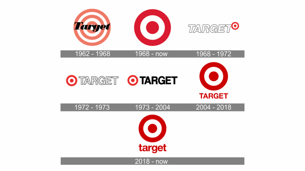
Case Insight: Target’s Bullseye
The evolution of Target’s logo is truly a masterclass for entrepreneurs and business owners that aim for a minimalist logo design. From a literal, multi-ring target to just a bold red mark which can be recognized across the globe, it’s a proof that cutting-down excessive details doesn’t compromise a logo’s meaning, it magnifies it.
The Modern Minimalist Design Movement in Branding
Minimalism branding hasn’t appeared out of nowhere. Instead, it has roots in timeless design philosophy. The modern shift towards vector precision and geometric simplicity can be traced back to one major influence i.e. the Bauhaus movement.
From Bauhaus To Brand Clarity
The Bauhaus school emphasizes upon functionality over embellishments and ornaments – the idea that form follows function. This mindset has completely redefined design thinking, inspiring the minimalist aesthetics of today. Similar principles guide modern logo mark design where every curve, line and color has a purpose.
Vector Graphics: The New Canvas
With design moving digital, vector-based logos (SVGs) have become the gold standard. They’re infinitely scalable, appears crisp on every screen and are perfect for responsive branding. A vector logo minimal in detail guarantees flexibility across print, web, and mobile – critical for startups that are competing in a multi-platform world.
Flattening the Design for Modern Media
Flat designs aren’t just a design trend; they are a functional shift. When Google, Apple, and Microsoft adopted flat icons, they set a new standard for accessibility and clarity. Gradients and shadows provided a way to the bolder shapes and cleaner geometry, making logos quicker to load, easier to read, and more versatile.
Semiotics and the Meaning behind Shapes
The relationship between shape and meaning extends beyond logos, it also drives creativity in music and media branding. Our album cover design ideas explore how minimal geometry and symbolism shape visual storytelling in modern design.
Minimalism doesn’t mean reduction, instead – it’s about refining visuals until nothing irrelevant remains. And that’s exactly what makes minimalist logos incredible yet timeless.
Redesigning vs. Redefining: When to Simplify Your Existing Logo
Not all logos need complete redesigning, sometimes – all you need is clarity to strengthen your brand identity. The challenge majority brands face is refinement and not reinvention. Knowing exactly when and how to simplify your logo is the core – it decides whether your logo will successfully evolve or lose its recognition altogether.
When Does Your Logo Need Simplification
If your current logo feels cluttered, outdated, and inconsistent across digital and print media, it’s high time you simply the visuals. The common signs you logo needs simplification includes:
- Typography that loses legibility at smaller sizes
- Heavy gradients or drop shadows that doesn’t scale well
- Inconsistent across mobile, web, and packaging
- Complex symbols or overlapping shapes
A simplified logo always works best across all platforms. Be it the favicon of your website or a billboard on the highway – it will appear just right.
Let’s take a look at some of the finest logo refinements over time and get inspiration:
Google’s Gradual Refinement
If you talk about strategic simplification, the evolution of Google’s logo is certainly a master class. The logo has transformed from a serif wordmark with embossed effects to a flat, geometric sans-serif form. The change hasn’t been about the aesthetics or trends only – it reflects a major consideration of digital legibility. The redesigned Google logo can be easily read and recognized on any device or screen size.
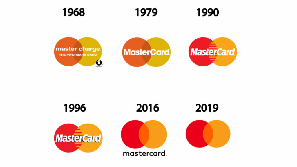
MasterCard’s Minimalist Leap
MasterCard moved from their text-heavy logo design to just two intersecting circles – simple, plain yet capable of speaking the brand’s story really well. The minimalist, refined logo keeps the brand equity intact while optimizing it well-enough for mobile visibility. The simplicity has helped enhance the brand’s readability, recall and global consistency.
Refinement Protects Brand Equity
Simplifying logos doesn’t always mean starting over from scratch. It’s mainly about trimming the excessive details for clarity while ensuring the emotional core remains intact. Whether through stronger typography, cleaner geometry, or color restraint – refinement helps ensure your identity remains familiar – just a little sharper.
The smartest redesign is often one that removes everything you don’t need.
The Business Impact of Simplicity: Why Minimal Logos Convert Better
A simple logo doesn’t only look better, it also performs great for businesses. In branding, clarity directly influences recall, trust and conversion.
Simplicity Drives Recognition
Simple logos are 13% more memorable and 7% more trustworthy than the complex ones. When your audience can instantly recognize your logo, they’re more likely to engage, remember and recommend your brand.
Scalability Strengthens Visibility
Minimalist logos don’t just scale well on packaging or billboards, they also adapt beautifully across digital spaces like social media and video channels. If you’re building a cohesive brand presence, check out our youtube banner design ideas for inspiration on maintaining visual consistency online.
Clarity Boosts Brand Perception
Customers are more likely to associate with balanced, clean logos for they reflect reliability and professionalism. A visually simple logo showcases confidence and signals that your brand truly understands what it is.
Data Meets Design
Digital-first brands now test their logos’ clarity by running A/B campaigns and mobile-eye tracking. The outcomes are usually consistent: simpler logos earning higher click-through and recall rates, especially on small-screen experiences.
In business, recognition is currency and simplicity compounds it. A well-designed, minimal logo doesn’t just create awareness; it can build trust at first glance.
Design That Converts — Not Just Impresses
A minimalist logo can boost recognition, trust, and conversion. Partner with Logo Design Valley to create a visual identity that truly performs.
How Logo Design Valley Helps You Simplify With Purpose
At Logo Design Valley, we believe in the fact that simplicity isn’t about doing less, it’s about saying more with intent and clarity. Every successful logo originates from a strong idea and becomes timeless through refinement. That’s exactly where can help brands transform.
With professional logo designers in a team, our core design process is based upon strategy and not guesswork. Each logo we create is grounded in:
- Clarity: focused forms, clean lines, and purposeful space.
- Scalability: designs that stay recognizable and sharp across all important platforms: from packaging to app icons and everything in between.
- Timelessness: visual identities that remain relevant for years and outlast trends.
Whether you’re launching a new startup or modernizing your existing brand, we follow a thorough logo refinement process to make sure your identity evolves while keeping the essence intact. We go through the following steps:
- Concept Discovery: understanding your audience, positioning and story.
- Sketch and Simplify: refine ideas into distinctive yet minimal logos.
- Vector Precision: building grid-aligned, scalable logos that can perform well across devices.
- Responsive Adaption: crafting adaptable logo versions for print, mobile, and digital use.
We’ve helped startups and established brands alike find clarity in their visual identity — through design systems that look modern, feel authentic, and communicate purpose at every touchpoint.
Because when your logo is simple, your brand message becomes powerful.
Looking to explore creative directions before refining your own brand identity? Don’t miss our in-depth guide on minimalist logo ideas – a perfect visual resource to inspire simplicity that speaks volumes.
Conclusion
Simplicity isn’t just a design choice anymore; it’s become a competitive advantage for brands. With markets growing crowded every day, attention spans are shrinking to nano-seconds. The brands that win in today’s competitive landscape are the ones that people can instantly recognize and trust.
A minimalist logo design stands the test of time because it’s crafted with purpose and not for mere decoration. It can scale effortlessly, adapt across different media, and speak of your story with unbreakable confidence.
For startups and growing businesses, now is the time to rethink complexity. The future of branding belongs to clarity and your logo is exactly where it begins.
At Logo Design Valley, we turn complex ideas into simple, clean and bold brand identities that last. Let’s refine your logo design into a mark that your audience will always recognize and memorize.
Ready to Simplify With Purpose?
Whether you’re a startup or a growing brand, our minimalist logo design experts will help you turn your story into a timeless visual mark.
Frequently Asked Questions (FAQs)
1. What is a minimalist design logo?
A minimalist logo design is a visual mark built around simplicity, balance, and clarity. It uses essential elements — like clean lines, geometric shapes, and limited colors — to communicate a brand’s essence without distractions. Think of Apple, Nike, or Target: simple forms that tell complete stories.
2. How to make a logo minimalist?
To make a logo minimalist, focus on refinement and subtraction with purpose:
- Start by isolating your logo’s core concept or story.
- Remove decorative details, gradients, or shadows that don’t serve meaning.
- Use balanced typography and clean geometry.
- Test for scalability — it should look perfect on both a billboard and an app icon.
- Ensure consistency across light, dark, and mobile variations.
- Minimalism is about clarity, not compromise.
3. Can ChatGPT design a logo?
While ChatGPT can’t create vector graphics directly, it can help you ideate, conceptualize, and refine logo ideas. You can use it to brainstorm minimal logo concepts, define brand direction, and even generate creative briefs for your designer. For execution, you’ll still need a professional logo designer or design software like Adobe Illustrator or Figma.
4. Which brand is minimalist?
Several global brands embody minimalism at its finest:
- Apple – simple form and negative space mastery.
- Nike – the swoosh that captures motion in one curve.
- Google – clean typography optimized for digital clarity.
- MasterCard – two intersecting circles symbolizing connection.
Each of these brands proves that clarity and purpose outshine complexity.
5. How many colors should a simple logo have?
A minimalist logo typically uses one to three colors at most. The goal is to enhance recognition through consistency and contrast. Many timeless logos rely on monochrome palettes or high-contrast pairs that maintain readability and versatility across digital and print media.
6. Can a logo be too simple?
Yes, if simplicity strips away meaning. A logo becomes too simple when it loses distinctiveness or fails to connect emotionally. The key is balanced minimalism, keeping only what’s essential while ensuring the logo still communicates your brand story.
7. What fonts work best for minimalist logos?
Fonts that define minimalist logo design are typically sans-serif or geometric, as they reflect modernity, precision, and legibility. Some of the best choices include:
- Helvetica Neue
- Futura
- Poppins
- Avenir
- Montserrat
