Most people say “logo” when they mean a lot of things. But in design, precision matters. A logomark isn’t a logotype, and a logotype isn’t just another kind of logo. Each one communicates differently. Knowing the difference between a logo, logomark, and logotype helps designers make better choices and helps clients ask for the right thing.
This guide explains the key differences between them, with real logotype and logomark examples, so you can design or commission a brand identity that works.
What Is a Logo?
A logo is a visual shortcut for a brand. It’s not just a symbol or a word; it can be both. Think of it as the umbrella term that covers several identity types.
Here are the three most common forms:
- Logomark: a symbol or icon with no text.
- Logotype: a brand name styled as type.
- Combination Mark: a mix of both logomark and logotype.
The confusion usually starts with logo vs logomark. A logomark is a type of logo, but not all logos are logomarks. That small detail changes how the identity functions across mediums.
Also read: How to create a logo?
What Is a Logomark?
A logomark is a symbol. No letters. No words. Just a mark that represents the brand. It works when recognition matters more than readability. You don’t need to read the name. You just know the shape.
Some well-known logomark examples:
- Apple’s apple.
- Twitter’s bird.
- Nike’s swoosh.
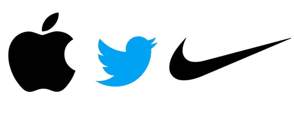
These marks stand alone because the brands behind them are strong. For new brands, logomarks work best when used with a logotype until the symbol earns its meaning.
- Choose a logomark when your goal is memorability at a glance.
What Is a Logotype?
A logotype is a logo made entirely of text. No symbols. Just the brand name, designed with a purpose. Typography does the heavy lifting here. Every curve, weight, and space carries meaning.
Some well-known logotype examples:
- Google.
- Coca-Cola.
- FedEx.
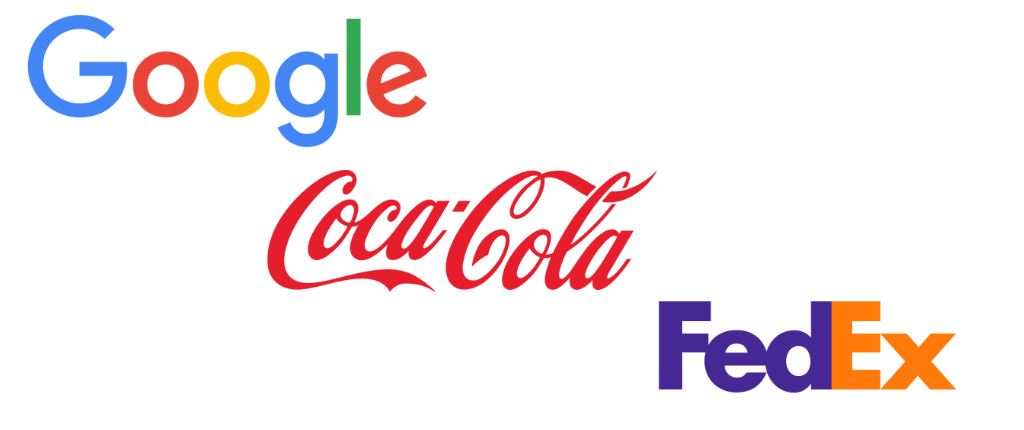
Logotypes work best when the name itself is the brand. They build recognition through repetition, including on screens, signs, packaging, and everywhere in between. For new or name-driven brands, a logotype offers instant clarity and long-term visibility.
- Logotypes are especially effective for creators who rely on name visibility—think YouTubers, authors, or those exploring podcast cover art ideas where brand text needs to stand out.
Logomark vs Logotype: Key Differences
Logotype vs logomark is not a debate. It’s a design choice. Both are logos, but they serve different functions.
| Feature | Logomark | Logotype |
| Form | Symbol only | Text only |
| Function | Recognition through shape | Recognition through name |
| Examples | Apple, Nike, Twitter | Google, Coca-Cola, FedEx |
| Best For | Simplicity, mobile apps, icons | Clarity, new brands, name recall |
| Scalability | Works small, no text needed | Needs readable font sizes |
Use a logomark when your brand is already known. Use a logotype when your name is the message.
Need a Logomark or Logotype That Actually Works?
We don’t do generic. Our logo designs are backed by strategy, tested for scale, and built to last.
Logo vs Logotype: Know What You’re Choosing
Choosing between a logo vs logotype isn’t a style decision. It’s a strategy. The right choice depends on your industry, audience, and growth stage.
✅ Startups
Why: Your name is unknown. You need people to remember it.
When: In the early stages, like pre-launch to 3 years in.
How: Use a logotype to put your name front and center. Clean typography builds recall.
Example: Dropbox started with a strong logotype. The word came first. The box icon followed later.
✅ Tech Products & Apps
Why: You need a mark that works at 16px and scales.
When: When you’re launching mobile apps, SaaS tools, or browser-based products.
How: Use a combination mark. Drop the text only when the icon is recognizable.
Example: Instagram evolved from a camera + wordmark into just the icon after global recognition.
✅ Fashion & Lifestyle Brands
Why: The brand name is the brand. Style is in the type.
When: For image-driven products where luxury and recognition are key.
How: Go with a logotype that’s bold, minimal, and timeless.
Example: Chanel uses a simple, all-uppercase logotype. No icon needed, just type.
✅ B2B & Enterprise
Why: In business, names build credibility more than icons.
When: Selling to companies, not consumers.
How: A logotype with professional type signals trust and scale.
Example: Salesforce leads with a clear logotype. The cloud icon is secondary.
✅ Creative or Iconic Brands
Why: Some brands become symbols.
When: Once your name is no longer needed for recognition.
How: Use a logomark but only after you’ve built enough brand equity.
Example: Apple used its full name in early logos. Today, the apple stands alone.
✅ The Takeaway!
- Start with a logotype.
- It builds recognition and trust.
- Add a logomark once people know your brand without needing to read it.
Final Comparison: Logomark vs Logotype vs Logo
Design terms often blur. So here’s a clean side-by-side to help you decide: Logomark vs Logotype vs Logo—what’s what, and what to choose.
| Feature | Logomark | Logotype | Logo (umbrella term) |
| Form | Symbol only | Stylized text only | Can be either, or both combined |
| Focus | Recognition through shape | Recognition through name | Identity in any form |
| Use Case | Icons, apps, global brands | Startups, B2B, name-driven brands | Flexible depending on brand strategy |
| Examples | Apple, Nike, Twitter | Google, FedEx, Coca-Cola | Adidas (combo), Amazon (combo), etc. |
| Best When… | Brand is already known | Brand needs name visibility | You want both clarity and creativity |
A logomark vs logo choice comes down to recognition. A logotype vs logo choice comes down to visibility. And the full logo gives you room to evolve.
- Start with clarity. Grow into symbolism.
How to Create a Logomark
A logomark is a visual symbol. It represents a brand without using words. But strong logomarks aren’t born from decoration. They’re designed through decisions.
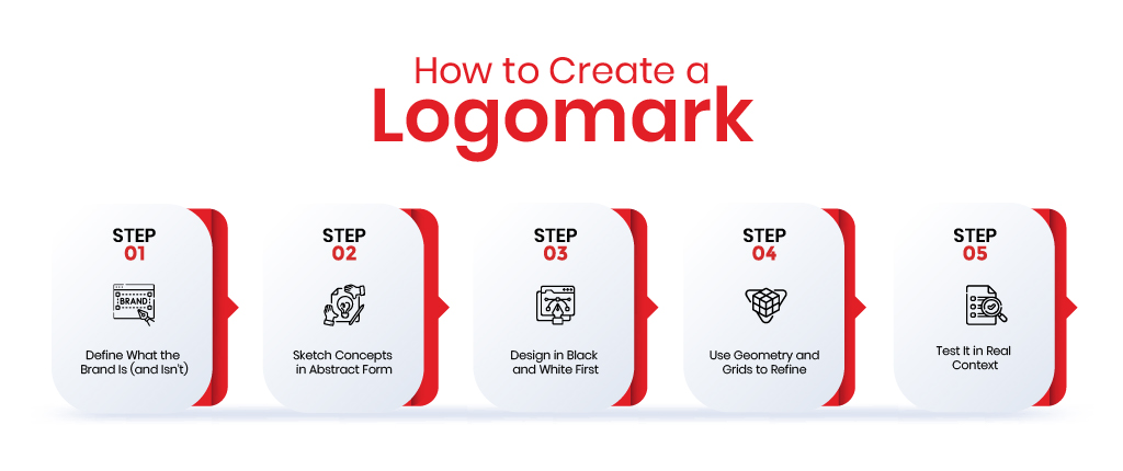
✅ Step 1: Define What the Brand Is (and Isn’t)
Before drawing anything, define the brand in one short sentence. Ask:
- What problem does the brand solve?
- What makes it different from competitors?
- What should people feel when they see the mark?
If the mark doesn’t reflect the brand’s core idea, it’s just a shape.
Example: Twitter’s logomark is a bird in motion. It reflects speed, connection, and brevity. That’s the product.
✅ Step 2: Sketch Concepts in Abstract Form
Start with form, not detail. Explore basic shapes:
- Circles convey unity, safety, and friendliness.
- Squares imply trust, logic, and stability.
- Triangles suggest direction, change, or risk.
The idea is to visually express meaning using minimal geometry. Avoid text, gradients, or complex scenes. Think in silhouettes.
- Real Rule: If your mark can’t be drawn in 3 seconds from memory, simplify.
✅ Step 3: Design in Black and White First
Color can mislead. Strong logomarks rely on form, not flair.
Test your design:
- At very small sizes (24px or smaller).
- On light and dark backgrounds.
- As a favicon or mobile app icon.
If the mark loses meaning or clarity in any of these settings, it’s not ready. Think Apple’s bitten apple, Nike’s swoosh instantly clear in black, white, or gray.
✅ Step 4: Use Geometry and Grids to Refine
Once your idea works at the concept level, refine it with structure:
- Use grids to align and balance the design
- Clean up curves and spacing
- Use symmetry where appropriate, but break it deliberately when needed
Grids don’t kill creativity. They force discipline. That’s what makes logomarks feel timeless.
✅ Step 5: Test It in Real Context
Don’t stop at mockups. Place the logomark:
- On an app icon
- In a profile avatar
- On a T-shirt, packaging, or billboard
Make sure it scales, feels unique, and can stand alone. If people can recognize the brand without reading a word, the mark works.
- If you’re brainstorming restaurant logo ideas, a strong logomark can communicate flavor, culture, or ambience without a single word.
How to Create a Logotype
A logotype is a logo built with words. No icons. No symbols. Just typography, used with purpose. When it works, the name is the brand.
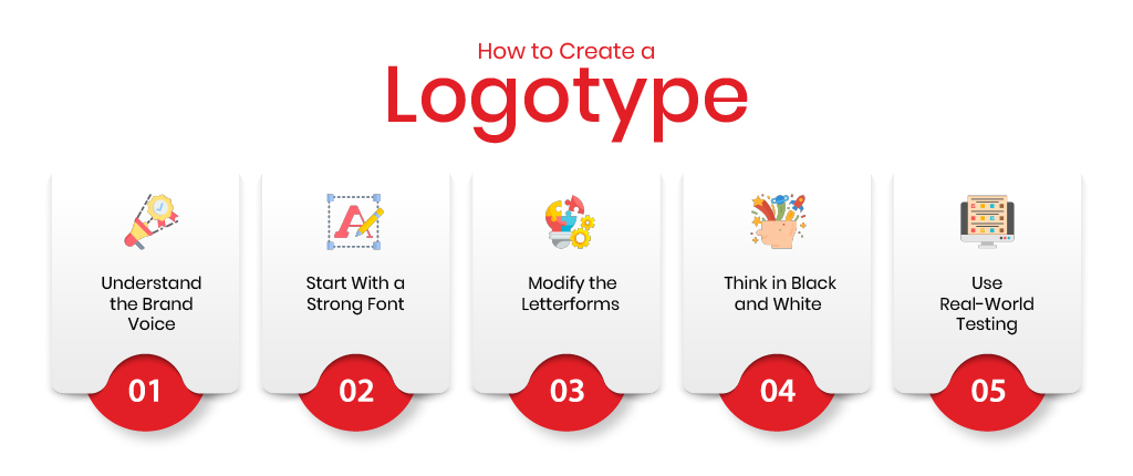
✅ Step 1: Understand the Brand Voice
Before choosing fonts, understand what the brand sounds like:
- Is it serious or playful?
- Luxurious or functional?
- Established or disruptive?
Your type must match the tone. Google’s logotype says “friendly and open.” Coca-Cola’s logotype says “classic and emotional.” Design follows personality.
✅ Step 2: Start With a Strong Font
Choose a base font with clean geometry and strong character.
Look at:
- Serif fonts for tradition and trust.
- Sans-serif fonts for modern and clean.
- Display or custom fonts for uniqueness.
Avoid trendy fonts. Choose something that reflects longevity.
✅ Step 3: Modify the Letterforms
Don’t settle for off-the-shelf. Great logotypes have subtle customizations:
- Adjust spacing (kerning) for optical balance.
- Extend or reduce certain stems or tails.
- Modify terminals or curves to stand out.
These changes are small, but they make your logotype ownable. FedEx hides an arrow in negative space. That’s clever geometry, not just type.
✅ Step 4: Think in Black and White
Color shouldn’t carry the design. If the logotype doesn’t communicate without color, it’s not finished.
Test it:
- On light and dark backgrounds.
- At large and small sizes.
- In horizontal and stacked formats.
If it reads clearly at 12px, it’s solid.
✅ Step 5: Use Real-World Testing
Drop the logotype into real use cases:
- Website headers.
- Email signatures.
- Mobile menus.
- Business cards.
Does it hold its presence when surrounded by noise? Does the name stay recognizable at a glance?
That’s how you test signal vs noise.
- Not every brand needs a complex font treatment, but clarity and legibility are non-negotiable. If typography isn’t your strong suit, it’s worth it to hire a designer who understands how to align type with tone.
Logomark and Logotype Cost Estimation
| Logo Type | Ideal For | Design Complexity | Avg. Cost Range | Key Deliverables | Example Brands |
| Logomark | Tech startups, mobile apps, minimal brands | High | $1,000 – $3,000+ | – Custom symbol / icon – Scalable vector files – Black & white & color versions – App/social media icons – Usage rights | Apple, Nike, Twitter |
| Logotype | B2B, editorial brands, early startups | Medium | $800 – $2,000 | – Custom wordmark – Font licensing advice – Kerning, spacing, geometry – Color & grayscale versions – Final files (SVG, PNG, AI) | Google, FedEx, Coca-Cola |
| Combination Logo | SaaS companies, fashion brands, full rebrands | Very High | $2,000 – $5,000+ (or more) | – Logomark + logotype – Horizontal & vertical layouts – Responsive design formats – Brand usage guidelines – Full logo system export | Adidas, Dropbox, Mastercard |
See What You’ll Actually Pay—No Guesswork.
Answer a few quick questions and get a realistic quote for your logo project within 24 hours.
Why Logo Design Valley Is the Top Choice
Logo Design Valley is trusted by startups, agencies, and enterprises for one reason: precision. Every logomark, logotype, and combination logo we craft is rooted in research, tested for clarity, and designed to scale across platforms.
✅ 1,200+ brands served across 100+ industries.
✅ Expert-led design process—not crowdsourced.
✅ Dedicated support from concept to delivery.
✅ Transparent pricing, no hidden revisions.
✅ Quick turnarounds with zero compromises on quality.
Your brand’s first impression deserves better than a template. We’ll build it right—right from the start.
Wrapping Up!
A logo isn’t just a graphic. It’s a decision.
- Choose a logotype when you need clarity.
- Choose a logo mark when your symbol can stand alone.
- Choose both when flexibility matters.
Understanding logo vs logomark vs logotype isn’t just about terms. It’s about using the right tool for the right job. Good design starts with knowing what you’re building. And ends with people remembering it.
Ready to Build a Logo That Stands for Something?
Start with a free consultation. No sales pitch. Just smart design advice.
FAQs: Logotype vs. Logomark vs. Logo
1. What is a logo?
A logo is a visual identifier that represents a brand. It can include text, symbols, or both. It’s an umbrella term that covers logomarks, logotypes, and combination logos.
2. What is a logo mark?
A logo mark (or logomark) is a symbol or icon without text. Think Apple’s apple or Nike’s swoosh. It’s purely visual, used when brand recognition is already strong.
3. What is a logotype?
A logotype is a text-based logo built entirely from custom or modified typography. Brands like Google and FedEx use logotypes to emphasize name recognition.
4. What’s the difference between a logotype and logomark?
A logotype uses type only. A logomark uses a graphic symbol. Logotypes focus on brand name visibility; logomarks rely on visual memory and symbolic impact.
5. When should I use a logomark and logo?
Use a logomark when your brand is already known and you need a strong symbol (e.g., app icon). Use a full logo when you want flexibility, including text and mark together.
6. Can I use both logomark and logotype?
Yes. This is called a combination logo. It’s the most versatile option, letting you separate the symbol and text as needed.
7. What are some famous logomark examples?
- Apple’s apple.
- Twitter’s bird.
- Nike’s swoosh.
These brands are recognizable even without their names.
8. What are well-known logotype examples?
- Google.
- Coca-Cola.
- FedEx.
Each of these relies on distinct typography to stay memorable.
9. How much does a logo design cost?
- Logotype: $800–$2,000
- Logomark: $1,000–$3,000
- Combination Logo: $2,000–$5,000+
Prices vary based on customization, strategy, and the designer’s experience.