Fonts are not just design choices, they’re the visual voice of your brand. In today’s competitive business landscape, where audiences can form first impressions within just 50 milliseconds. The right font can define whether your logo looks professional and timeless or it can be forgotten in no time.
When it comes to building a minimalist, modern brand identity – typography sites as the foundation. The best fonts for modern logos do a lot more than helping them look great, they communicate style, personality and trust in one go. Whether you’re revamping the identity of your existing brand, launching a new startup or creating a bold rebrand for 2025, making the right logo font choice is one of the most strategic decisions you’ll make in the process.
In this guide, we’ll explore what makes a great logo font, highlight the best modern fonts for logos in 2025, and break-down the framework for choosing typography that fits your brand. By the end, you’ll know which fonts can help brands stand ahead of all competitors and how you can make the right choice.
Why Font Choice is Crucial for Brand Identity
A logo is not only a graphic, it’s the face of your business. And at the heart of every logo lies typography. Fonts can shape how your audience may perceive your brand such as, playful, trustworthy, luxury or innovative. In fact, studies report that consistent branding across all platforms can maximize the revenue by 23%. Choosing the best fonts for modern logos is a core step in that consistency.
When businesses rely on good fonts for logos, they integrate subtle signals that can help building trust. Think of Coca-Cola’s iconic ‘flowing script’ – it communicates timelessness and authority. The clean serif sans font used by Google showcases modernism and simplicity. These are not some random choices, instead, they’ve been strategically selected professional fonts for logos that truly aligns with brand values and audiences.
Contrarily, using the wrong fonts can often impact your credibility. Using a playful script on the logo of a financial firm can feel misplaced and a rigid serif font wouldn’t go right with a youth-oriented lifestyle brand. That’s why brands focusing on growth need to think beyond aesthetics.
The best fonts for branding help bridging creativity with strategy. They’re not only readable but also scalable and versatile – built to represent your company across print, digital, and physical touchpoints. Put simply, font choice is a brand choice.
Get a Logo That Works in Every Medium
From digital screens to print, your logo should be versatile and timeless. Our designers craft logos that adapt without losing impact.
Characteristics of the Best Fonts for Modern Logos
Not all fonts are crafted to carry the burden of entire brands. While some are great on the outlook and often tempts you when making a choice, the best fonts for modern logos are those sharing specific qualities that can help you stand-out in a crowded market ensuring clarity across all platforms.
Simplicity and Readability
From billboards to mobile screens, logos appear everywhere and play a critical role when it comes to building brand identity and recognition. Good fonts for logos are easier to read no matter the size – making sure your brands remain easily recognizable even in small digital formats.
Scalability and Versatility
A font can look very appealing on a website but lose impact in print. That’s a very common dilemma for brands. Using top logo fonts that are both versatile and scalable is the only solution and can also help maintain your brand’s character across different platforms, from social media icons to packaging and everything else.
Timelessness over Trendiness
Though trendy cool fonts for logos can be great and tempting, they’re not always timeless and age quite poorly. Brands that come with the intention of lasting for decades choose great logo fonts that maintain a balance between timeless design and modern appeal.
Alignment with Brand Personality
The choice between sans serif, serif, and script is never random. Modern sans serif fonts for logos are intentionally picked up by brands that aim to reflect minimalism and innovation. Serif fonts, on the contrary, are used to communicate trust and tradition. Script display fonts are great for creative and expressive brands.
To cut it short, the best font for logos are ones that feel authentic to your brand’s voice. It’s not just a font type for logos but the design choice must reflect what your brand reinforces every time the audience looks at it.
Best Modern Fonts for Logos In 2025
Typography trends continue to evolve every day, but there are some styles that manage to dominate the design world consistently. Let’s take a look at some of the best modern fonts for logos in 2025, broken down by categories to help you match them with the personality of your brand and industry without hassle.
Let’s dive in:
Sans Serif Fonts (Minimalist and Clean)
Sans serif fonts are often categorized as the modern best fonts for logos because of their timeless appeal and clarity. Giants like LinkedIn, Google, and Spotify use these fonts in their logos for a reason – they’re easy to read, professional and easily adaptable across platforms. The most commonly used sans serif fonts in logos include, Monstreat, Helvetica, Futura and Avenir. If you’re looking for minimalist logo ideas, check out our detailed guide on clean, convertible branding.
Examples:
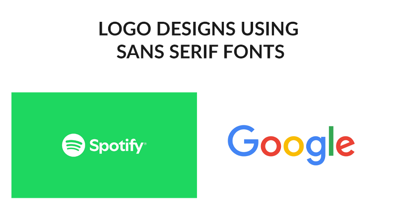
- The clean and colorful use of sans serif fonts by Google reflects true innovation.
- Spotify uses the clean, minimal sans serif typeface which can be quickly recognized and remembered.
It is an ideal font for SaaS-based companies, technology startups and modern lifestyle brands for the simplicity and innovation it’s capable of reflecting.
Serif Fonts (Classic and Trustworthy)
Serif fonts represent authority and tradition. They’re popular for being the most professional fonts for logos and have been used by law firms, banks and luxury brands over the decades. Brands that value credibility can leverage the greatness of serif fonts and appear timeless and trustable in front of their audience. The commonly used serif fonts with logos include, Baskerville, Garamond, and Playfair Display.
Examples:
- The New York Times, given their timelessness and authority, rightfully uses a serif logo with a typeface that speaks of credibility and class.
- Tiffany and Co. has very strategically used an elegant serif font to communicate timelessness and elegance to their audience.
Serif typefaces serve as great fonts for logos when the core values of your brand relies on trust and sophistication. The font manages to balance both elegance and timelessness at once – making itself the best font for business logos.
Script and Handwritten Fonts (Creative and Expressive)
Script and handwritten fonts bring a personal touch and authenticity in your logo. They are often considered as cool fonts for logos for the individuality and creativity they carry along. Fonts like Lobster, Pacifico, Dancing Script, and custom brush lettering are often great to use with logos.
Example:
- Coca-Cola uses an iconic flowing script communicating timeliness and creativity at its best.
- Instagram’s old logo uses handwritten-style script showcasing the personal and playful side of the brand.
These are considered as good fonts for a logo when it comes to fashion or artisanal brands as well as boutiques and creative agencies, etc.
Display Fonts (Bold and Distinctive)
Display fonts are designed to appear bold, unique and captivating. They’re strong fonts for logos for whom standing out is critical. The most commonly used display fonts for logos include: Raleway Heavy, Bebas Neue and custom display typefaces.
Examples:
- Disney uses a custom display font that’s both playful and easily recognizable, the very requirement for what the brand does.
- Lego uses a customized bold and geometric display font which rightfully showcases the brand as fun and has helped them build a strong identity over time.
The best fonts for logo design aren’t just aesthetically pleasing choices, they’re critical business decisions. Whether you’re drawn towards a luxury serif, minimalist sans serif appear to be your best shot or a bold display typeface grabs your attention, remember the goal: always choose a logo font that can speak your brand’s personality and stand through the test of time.
Don’t Risk a Forgettable Brand
Choosing the wrong font can make your brand blend in. Let our experts create a modern, minimalist logo that sets you apart from competitors.
How to Choose the Right Font for Your Logo
With tons of font types for logos available, choosing the right one often feels overwhelming. The good news is – there’s a foolproof framework you can follow to get through the process easily. Here’s how you can pick the best fonts for logo design that truly matches your brand.
Understand Your Brand Personality
Think of the values first and design second. Aesthetics might attract you but if you’re a law firm, choosing professional fonts for logos such as serif would certainly be the ideal move. It will help you reflect authority. However, a tech startup can benefit from modern sans serif fonts for logos that speaks innovation from every inch.
Know Your Audience
It is equally important to know your audience as it is to understand the brand. Think of what you want your audience to feel when they look at your log. A modern font for logo reflects strength and minimalism while a handwritten script communicates creativity and easy approach. Dig deep around how your audience would want to feel looking at your logo and choose a font accordingly.
Prioritize Readability and Scalability
Your brand fonts should be adaptable across platforms, from billboards to the small-sized app icons. A good font for logos is always legible at any size, color and even in black and white.
Test Before You Finalize
Testing is crucial. You must always try all your shortlisted fonts on mockups: packaging, websites, and social media. It can help you determine if they appear consistent across all platforms and are capable of conveying the message you aim to deliver.
Avoid Overcomplicating
Mixing up too many fonts for log design negatively impacts your brand identity. It can overcomplicate things and leave your logo as hard to be remembered or recognized. The ideal way is to stick to one strong logo font in combination with a supporting typeface and boom – that’d be enough to make your logo great.
While these tips are helpful, professional designers thoroughly understand typography and know which fonts suit best with your strategy. At Logo Design Valley, we help brands move beyond ‘what looks good’ to ‘what works best’ – creating custom logo typefaces that communicate your business identity and resonate with your audience.
Best Fonts for Business Logos In 2025
When it comes to building a corporate identity, the best fonts for business logos are ones that create a balance between memorability and professionalism. In 2025, businesses prefer typography that can communicate authority, trust, and modern appeal.
Strong fonts for logos help brands stand on top of the competition. For example:
- IBM uses a bold slab serif which rightfully reflects their reliability and strength.
- FedEx leverages the clean outlook of sans serif font that communicates precision and efficiency. The integration of a subtle arrow between the ‘E’ and ‘X’ symbolizes movement which is the core of their brand.
The best fonts for brands just don’t look stylish, they’re also capable of solving business challenges. A serif typeface can work best for financial firms that aim to reflect stability while a digital-first startup should opt for a modern font for logo that’s scalable and minimalist at the same time.
The hard fact is – fonts for business logos should work across all platforms. Be it on websites, signage, business cards or even the very small app icons – your logo font should be easily adaptable in all sizes and formats. This is the reason why top business company logos are always timeless and not driven by trend. They are made with the vision of building trust and recognition over a period as the business grows without the need for redesigns or rebranding.
If you’re into building a new brand or planning to refresh an existing one, choosing the best font for a business logo shouldn’t be a rushed decision. You should always adopt a strategic approach making sure the font you choose becomes an asset, one that can strengthen your brand visibility across every touchpoint.
In case you’re confused, we have the best professionals in the team who can help you choose the best font or even design a custom logo font that fully resonates with your brand.
Mistakes Businesses Make When Choosing Logo Fonts
While a strategically chosen logo font can help uplift your brand, a wrong choice can undermine trust and recognition at the same time. A lot of businesses make common logo design mistakes that can weaken the identity unintentionally. Let’s take a look at some of those mistakes to ensure you don’t make them when choosing your business logo font:
Prioritizing Trends over Timeliness
Though trendy fonts look appealing. Chasing after them often backfires. It is because what may look trending and fresh today would feel outdated a few months or years later. Since most businesses are built with the vision of long-term growth, using trendy logo fonts can end up making your logo look outdated within no time. A common example is startups using geometric, thin sans serif typefaces which can lose uniqueness over time.
Ignoring Readability
A logo should be legible across all mediums – from app icons to billboards and everything else. Choosing fonts that may look stylish with overly decorative scripts often create confusion. Think of Comic Sans MS – it is usually cited as a bad example for logo fonts mainly because of the playful yet non-professional appearance.
Using Too Many Fonts
Using two or more fonts in a single logo often creates complexity and dilutes brand consistency. Top-tier brands like Google and Coca-Cola prove how single fonts can carry decades of recognition when chosen with strategy.
Overlooking Brand Personality
Many brands end up making this mistake. They would choose playful, trendy logo fonts ignoring what industry they’re coming from just so they look aesthetic and appealing. The outcome is – the logo clearly misses brand personality and confuses the audience. The ideal way is to make sure your logo fonts align with the brand values and industry expectations.
The cost of choosing the wrong font for logo is quite high, rebranding later can cost you money, time, and even requires rebuilding the recognition. That’s where expert guidance comes in. At Logo Design Valley, we help businesses avoid such mistakes by finding or custom-designing fonts that aligns with their brand identity and can strengthen that in the longer run.
Make Your First Impression Count
You never get a second chance at a first impression. Get a professionally designed logo that communicates trust, style, and authority from day one.
Final Thoughts
Choosing the best fonts for modern logos is a lot more than pleasing aesthetics, it’s a business strategy that influences how customers will perceive and remember your brand. A typeface isn’t just letters on the screen, it carries personality, meaning, and trust. The right choice can make your logo timeless and great while a slightest slip can push you towards costly rebrands again and again.
There are many free tools you can experiment with and rely on trending typefaces as well, but your brand identity is way too expensive to take a chance. Testing fonts is undoubtedly valuable, but attaining the perfect balance between uniqueness, readability, and emotional impact requires professional expertise.
That’s where professionals step in. At Logo Design Valley, we don’t just pick fonts out of available options, instead – we create logo identities meant for growth, ensuring the typefaces resonate with your audience, vision, and industry standards.
Ready for a Modern, Minimalist Logo?
Stop experimenting with fonts and templates. Partner with our experts to design a custom logo that reflects your brand identity and fuels business growth.


