Before anyone hears your voice, they see your cover. In a crowded scroll of tiny squares, the right podcast cover art invites trust. A strong design isn’t louder. It’s clearer. It understands the listener before the listener understands the show.
This guide shares podcast cover art ideas that draw attention and stay memorable and shows you how to create a podcast cover that reflects your identity, builds trust, and gets listeners to press play.
Let’s discuss it in detail!
What Makes a Podcast Cover Work Today?
Scroll through any podcast app, and you’ll see hundreds of covers but few that hold your eye.
A good podcast cover isn’t busy. It’s balanced. It doesn’t just look nice. It makes a split-second promise: This is worth your time.
✦ Clarity Beats Complexity
Your podcast artwork will often appear as a thumbnail, small, compressed, and surrounded by distractions. Overly detailed designs collapse under these constraints. Clean typography, bold colors, and deliberate spacing help the design hold up at every size.
- What works at 3000×3000 pixels must still work at 150×150.
✦ Color Signals Tone
Warm tones convey energy. Cool tones suggest calm. Neutrals speak with restraint. Your podcast cover should reflect not just your theme but the emotional rhythm of your show. Color isn’t just visual; it’s psychological.
✦ Typography Is Voice
The font you use is the voice your listeners see. Sans-serif fonts feel modern. Serif fonts suggest depth. Handwritten fonts are personal but hard to read in small sizes. Choose the type that’s readable, distinctive, and aligned with the personality of your content.
✦ Consistency Builds Trust
If your podcast thumbnail doesn’t match your website, social content, or episode graphics, you lose cohesion and credibility with it. A good podcast cover fits into a system. It reinforces the story, not just decorates it.
- Every time your artwork appears, it should feel like a reminder, not a surprise.
Podcast Cover Art Ideas That Actually Attract!
You have seconds—maybe less.
In a wall of podcast covers, attention is earned by simplicity, not noise. The best podcast cover art ideas don’t try to say everything. They say one thing, well.
Here are a few design directions that work not because they’re trendy but because they’re clear:
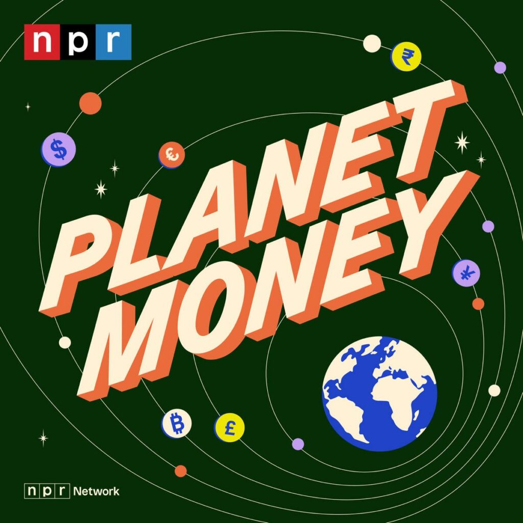
1. Use a Single, Bold Focal Point
A central image or shape—large and uncluttered—draws the eye faster than text-heavy layouts. Think of it like a visual elevator pitch. Your podcast thumbnail should be understood at a glance, not a guess.
- Idea: A high-contrast object or symbol tied to your topic (e.g., a cracked cassette for a music nostalgia podcast).
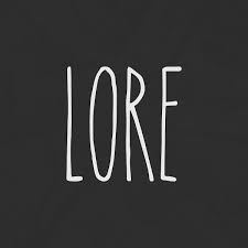
Example: A simple, worn-look circular illustration (no skull, no photo), just the title word “Lore” in a distressed font on a textured background.
2. Embrace Visual Metaphor
Instead of showing a literal mic or face, use metaphor to hint at meaning. A cloud for curiosity. A maze for complexity. This adds intrigue without over-explaining.
- Idea: A tangled string slowly straightening out, for a podcast about problem-solving.
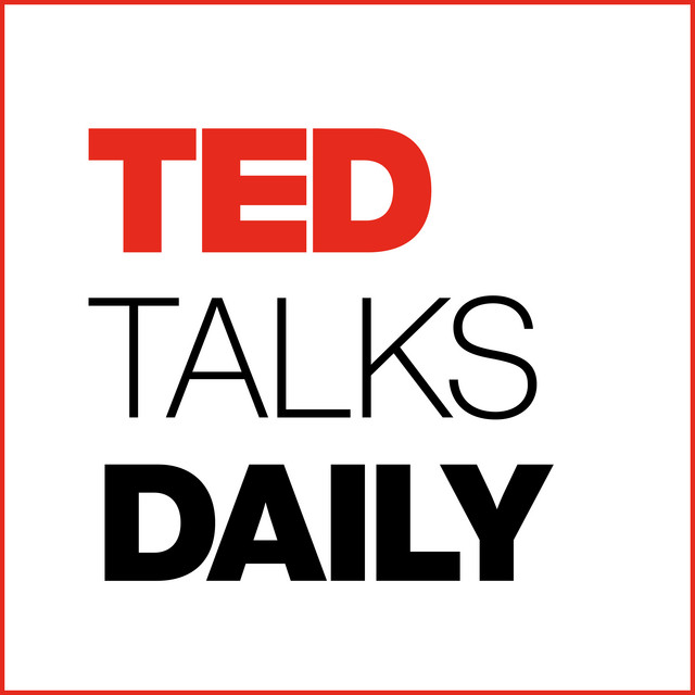
Example: The “TED” wordmark commands attention, nothing else competes for visual priority.
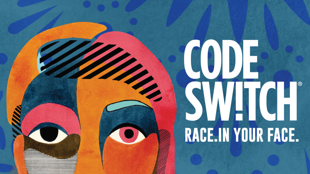
3. Go Monochrome with One Accent Color
A full-color palette can overwhelm. But one accent color on a monochrome base creates hierarchy and focus. It also adds visual calm, something your audience may crave.
- Idea: Soft gray background with a sharp coral circle to draw focus.
Example: Code Switch podcast cover design balances visual calm with attention-grabbing contrast
4. Let the Text Breathe
The title of your podcast shouldn’t compete with the design. Use clean fonts and give them space. Avoid cramming in episode numbers or taglines on your cover.
- Idea: Just the podcast name, spaced generously and aligned with one icon
Example: The podcast cover features just the “ATP” acronym in bold, clean type, horizontally centered with generous spacing around the letters.

5. Break the Grid, Thoughtfully
Most designs follow a center alignment. Breaking that, placing the type left or the image down low can grab attention if done with purpose. But do it for rhythm, not rebellion.
- Idea: Vertical text stack at the left margin with empty space to the right
Example: The title “Exponential View” is aligned to the upper-left, creating intentional alignment away from the center.

These podcast cover art ideas aren’t tricks. They’re tools for designing moments that interrupt the scroll and earn a second look. Visual clarity is the new clickbait, but with integrity.
The Right Podcast Cover Art isn’t loud. It’s Memorable.
Want one that draws clicks and earns loyalty?
How to Create a Podcast Cover That Aligns With Your Brand
A podcast cover is not where design begins. It’s where your brand speaks—visually—for the first time.
So before you open a design tool or hire a podcast logo designer, ask this: What should someone feel the moment they see my show?
That’s where alignment begins.
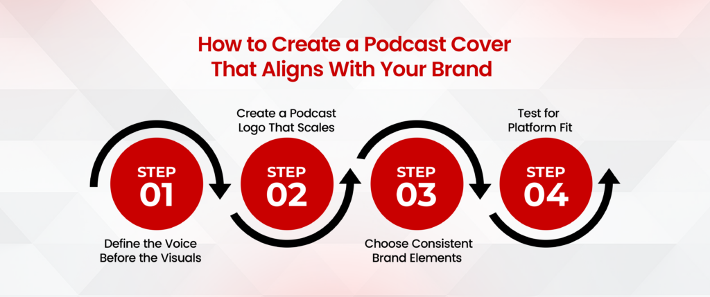
Step 1: Define the Voice Before the Visuals
Are you casual or clinical? Funny or formal? Solo or community-driven?
The goal of podcast branding isn’t to be liked by everyone; it’s to be recognized by the right ones.
A cover that reflects your voice builds instant credibility.
Step 2: Create a Podcast Logo That Scales
Many creators try to fit a full logo, tagline, image, and background onto one tiny square. Don’t. Your podcast logo should work in multiple sizes, especially as a podcast thumbnail.
Focus on:
- Strong icon or type-based mark.
- High contrast for visibility.
- No fine lines or small details.
A good logo whispers your identity. A cluttered one just mumbles.
Step 3: Choose Consistent Brand Elements
Design consistency makes your show feel professional even if you record from a closet.
Make clear decisions about:
- Color palette (ideally 2–3 core colors)
- Font style (1–2 typefaces max)
- Iconography style (flat, outlined, abstract?)
When your podcast cover, website design, and social banners all feel unified, you don’t just build a brand; you build trust.
Step 4: Test for Platform Fit
Your cover will appear on Spotify, Apple Podcasts, YouTube, and social media. Upload mockups to preview how it looks across them. What reads on a desktop might vanish on mobile.
- Your art isn’t done until it’s device-proof.
Knowing how to create a podcast cover that aligns with your voice isn’t about tools; it’s about clarity. If your message is clear, your cover can be simple.
And simple often wins.
Podcast Logo Design Principles That Still Matter
Trends fade. Legibility stays.
In a space where first impressions happen at 60×60 pixels, podcast logo design is less about flair and more about functional beauty. A good podcast logo is not decorative. It’s directional.
It leads the eye. It signals tone. It creates memory.
1. Think in Squares and Circles
Your podcast logo will be cropped in various ways across platforms. Apple Podcasts uses a square. Spotify compresses it. YouTube may round it.
- Design within a square, but preview in circles.
Use margins generously. Let the core symbol or type live comfortably inside the shape, never edge to edge.
2. Prioritize Simplicity Over Detail
Details disappear. Lines blur. Color gradients compress poorly.
The best podcast logos are simple: a single icon, a clean font, and a defined structure. Anything more is noise. Anything less is silence.
Logos aren’t art. They’re signs with soul.
3. Font Choice Is Your Voice, Visualized
Your typography says more than your words.
Slab serifs suggest strength. Round sans-serifs feel friendly. Script fonts whisper intimacy but rarely scale well.
Choose typefaces that hold their form even when scaled to thumbnail size. Test before finalizing.
4. Hire a Podcast Logo Designer (If You Can)
DIY can work, but it often lacks cohesion. A professional podcast logo designer brings structure, hierarchy, and brand thinking to the process.
- Good designers remove the unnecessary. Great ones reveal the essentials.
If hiring isn’t an option, study strong examples. Reverse-engineer what makes them work. Simplicity, symmetry, contrast, and whitespace almost always show up.
In short, your logo should be felt before it’s read.
And remembered long after the app is closed.
Creative Podcast Logo Ideas to Spark Your Process
Creativity isn’t about complexity. It’s about choices that feel inevitable.
When it comes to podcast logo ideas, forget to be clever for its own sake. Instead, aim for concepts that communicate who you are in the fewest possible elements.
Below are logo directions that real creators use and listeners remember.
1. The Monogram Logo
Use your podcast’s initials in a custom arrangement. It feels personal, scalable, and highly recognizable.
Example: “TL” for The Loop, with bold overlapping typography and subtle shadow play.
Why it works: It scales well. It’s easy to stamp onto thumbnails, merch, or even audio waveforms.
2. The Symbol + Type Hybrid
Pair one strong symbol with minimalist typography. The symbol carries the emotion. The type delivers the name.
Example: A minimal compass icon next to clean sans-serif lettering for a travel podcast.
Why it works: Versatility. The symbol alone can become your brand shorthand.
3. The Shape-Driven Concept
Build your design around a distinct geometric shape, such as a circle, triangle, or square, to create balance and visual rhythm.
Example: A triangle play button incorporated into the title type.
Why it works: Shapes anchor memory. Your brain likes order in chaos.
4. The Negative Space Trick

Use empty space inside letters or icons to hide a visual message, a mic in the letter “O,” or a wave hidden in a curve.
Example: A dialogue bubble inside the “D” of a design podcast.
Why it works: Subtle cleverness rewards attention. But keep it readable.
5. The Illustrated Identity
Hand-drawn icons or line art give your brand a human feel. Ideal for creators who want to connect deeply or feel artisanal.
Example: A sketched notebook with earbuds for a storytelling podcast.
Why it works: Imperfect visuals feel real, and real gets remembered.
- When exploring creative podcast logo ideas, don’t ask: Is this cool? Instead ask: Will someone recognize this in 3 weeks and know it’s me? That’s the benchmark.
Ready to turn your podcast cover art idea into visual impact?
Work with expert designers who get your voice and your audience.
Podcast Cover Art Examples Worth Studying
Not all good covers look the same. But all good covers do the same job:
They stop the scroll. They say something clearly. And they stick.
Below are real podcast covers that use timeless design ideas and show how those ideas work.
1. 99% Invisible
Core Idea: Use structure to suggest meaning.
The design is based on strong shapes and simple typography. No photos. No gimmicks. It feels architectural, just like the podcast’s theme.
- 🧠 What to learn: You don’t need images to make a powerful cover. Use clean lines, limited colors, and centered type to signal professionalism and focus.
2. The Daily by The New York Times
Core Idea: Color = brand recognition.
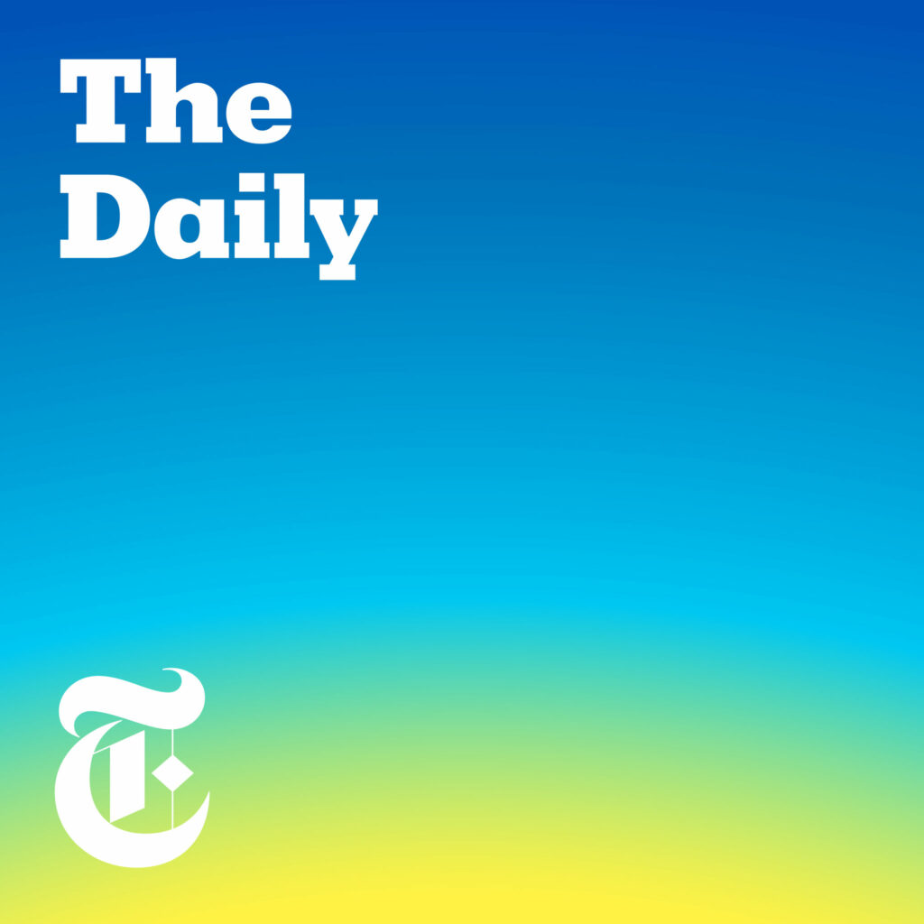
It’s just a gradient from deep blue to bright yellow with small text in the corner. But that yellow-and-blue combo is instantly recognizable now. That’s brand power.
- 🧠 What to learn: Pick 1–2 strong brand colors and stick with them. You don’t always need fancy logos. Color alone can carry identity.
3. Crime Junkie
Core Idea: Texture adds tone.
This one uses rough textures and stark fonts. It doesn’t show a crime scene or a victim. But it feels serious, raw, and dark, the exact tone of the podcast.
- 🧠 What to learn: Your background doesn’t have to be plain. Subtle textures (grain, scratches, paper) can set the emotional tone without showing anything graphic.
Don’t copy these designs. Copy the thinking behind them. Each one answers a simple question:
What do I want someone to feel the instant they see this?
That’s the start of every strong podcast cover.
Technical Details You Shouldn’t Ignore
Design doesn’t fail because it’s ugly. It fails because it’s unreadable, off-size, or broken on the platform where people see it first.
Great podcast covers aren’t just visually smart. They’re technically sound.
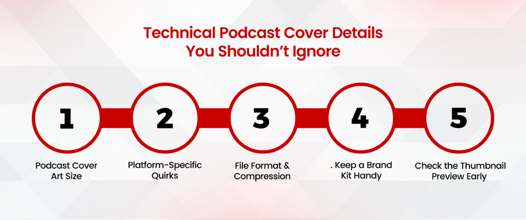
Here are the essential details most people overlook and why you shouldn’t.
1. Podcast Cover Art Size
Your podcast logo size should follow platform standards. The most accepted size is:
3000 x 3000 pixels at 72 DPI in JPG or PNG format.
Why this matters:
- It keeps your podcast graphic sharp on high-resolution screens.
- It’s required by Apple Podcasts and most major directories.
- Small or blurry files may be rejected or look low-quality.
Always design in large size first. Then scale down.
2. Check the Thumbnail Preview Early
Your artwork needs to look good at 3000×3000, but it must also work at 60×60.
This is where most podcast thumbnails fail. Text disappears. Logos shrink. Details blur.
Zoom out. Squint. Does it still work?
Make sure your:
- Title is readable at a glance.
- Main icon or element doesn’t crowd the edges.
- Background doesn’t overpower the foreground.
3. Platform-Specific Quirks
Different players treat artwork slightly differently:
- Spotify auto-crops to center.
- Apple Podcasts prefers cleaner designs with readable titles.
- YouTube needs widescreen thumbnails (1280×720). If you publish full episodes there.
Don’t design once and walk away. Test across formats.
4. File Format & Compression
Use PNG for logos with transparency. Use JPG for faster loading times.
Always export at high quality, but under 1MB if possible.
Heavy files have slow load times. Small, compressed ones lose clarity. Find the balance.
5. Keep a Brand Kit Handy
Save your color codes, font pairings, logo variations, and iconography in one folder.
That way, every future episode graphic, Instagram post, or email header stays consistent.
Consistency is not boring. It’s how brands become trusted.
Great design isn’t just what you see, it’s what doesn’t break when you hit publish.
Tools and Services to Create a Podcast Cover
Not every great idea comes with design skills.
If you’re wondering how to make a podcast logo that looks professional without hiring a full agency, there are two paths: DIY tools and professional services. Both work depending on what you need.
Let’s break them down.
1. DIY Tools for Creating Podcast Logos and Covers
You don’t have to be a designer to make a podcast logo that works. Some tools do the heavy lifting so you can focus on the idea, not the pixels.
Top options:
- Canva – Drag-and-drop templates with audio branding presets.
- Figma – Precision design control with collaboration features.
- Adobe Express – Quick branding assets using AI-powered templates.
Start with simplicity. Focus on clarity over creativity. Add personality later.
2. When to Hire a Podcast Logo Designer
If your podcast is central to your brand or business, working with a real designer brings strategic thinking into the process.
A skilled podcast logo designer decodes your brand voice into visuals that stick.
It’s a smart step when:
- You’re launching with sponsors or marketing plans.
- You’re struggling to connect design with a message.
- Your early DIY logos feel off-brand or inconsistent.
3. What a Podcast Cover Art Service Actually Does
A professional podcast cover art service helps translate your identity into something scroll-stopping, not just good-looking.
Among the options, Logo Design Valley has become a go-to choice for creators and startups alike. Why?
Because they combine:
- Solid research into your audience and niche.
- Multiple design concepts (not just templates).
- Scalable formats for all platforms (Spotify, Apple, YouTube).
- Real human collaboration, not just software automation.
They treat podcast cover design like brand design with consistency, clarity, and usability across every touchpoint.
“They got it right the first time.” Feedback from many who now trust them with long-term design work.
In summary:
- DIY if you’re starting out or testing ideas.
- Hire a designer when visuals need to match your voice.
- Use trusted services when branding needs to last.
Final Checklist Before You Publish Your Podcast Cover
Here’s a final checklist to make sure your podcast cover art is ready for the public eyes:
1. Is it the right size?
- 3000 x 3000 pixels.
- 72 DPI, JPG, or PNG format.
- File size under 1MB.
🧠 Platforms like Apple or Spotify might reject oversized files. Undersized ones look blurry.
2. Is it readable in small sizes?
- View it at 60×60 (thumbnail scale).
- Is the text still legible?
- Can you spot the main icon or logo instantly?
🧠 Users scroll fast. Your cover has seconds to work.
3. Are your fonts and colors accessible?
- Use high contrast between background and text.
- Avoid ultra-thin fonts or heavy script styles.
- Check how it looks in dark mode and on grayscale screens.
🧠 Clear beats clever. Always.
4. Does it look consistent across platforms?
- Test on Apple Podcasts, Spotify, and YouTube.
- Make a horizontal version for video episodes or audiograms.
- Recheck formatting for Facebook, Instagram, and TikTok.
🧠 A strong brand looks familiar everywhere.
5. Is your logo included but not overpowering?
- The podcast logo should support, not dominate.
- Use whitespace well. Let your title and vibe breathe.
🧠 Balance makes a design memorable.
6. Is it aligned with your show’s tone?
- Does the style match the genre and audience?
- Will a new listener get the right impression in 3 seconds?
🧠 You don’t get to explain your cover. It speaks on its own.
Wrapping it Up!
Great podcast artwork doesn’t win awards. It wins trust.
You don’t need the flashiest graphics. You need something people remember, even when they forget the name of your show. Something that works whether it’s on a billboard or the corner of a phone screen.
Most creators chase the idea of viral. But smart creators build for recognition. Take the time to get it right. Or work with someone who will. And when you’re ready to make that leap, we are built to do more than just make things pretty.
Because in design, what’s seen is remembered, but what’s felt is shared.
First Impressions Are Silent, But They Speak Volumes
Make your podcast cover art thoughtful, not templated.
FAQs – Podcast Cover Art Ideas
Q1: How do I make cover art for my podcast?
Start with a square canvas (usually 3000×3000 px). Use one strong visual, clean typography, and a color that fits your tone. Tools like Canva or Adobe Express work. Or hire a designer if it’s mission-critical.
Q2: How much does podcast cover art cost?
Good design isn’t cheap. And the cheap design isn’t noticed. Expect to invest $150–$500 for thoughtful, custom work. One clear podcast cover can do more than a dozen ads.
Q3: What is the cover of a podcast called?
It’s called podcast cover art or podcast thumbnail. It’s your first impression. Sometimes, your only one.
Q4: What size should podcast cover art be?
The standard is 3000×3000 pixels, JPG or PNG, under 500KB. Always test how it looks at thumbnail size.
Q5: What makes a good podcast cover art?
Simplicity. Contrast. Focus. A clear message in 1 second. It should work even when shrunk to an inch wide.
Q6: What font is best for podcast cover art?
Sans-serifs like Helvetica, Futura, or Montserrat. Bold, readable, no frills. Think street signs, not wedding invites.