
Did you know 75% of consumers can recognize a brand by its logo alone? In Fintech, where trust and security are crucial, your logo is often the first thing customers see, and it can make or break their trust in 50 milliseconds.
Your logo should convey clarity, confidence, and consistency. It’s the visual face of your company, instantly signaling stability and professionalism to potential clients. As Gold Mine Media puts it, “Design elements create immediate trust signals that convey stability and security.”
Logo Design Valley believes that this trust-building process begins with a strategic, well-designed logo that speaks to the core values of your brand.
Key Takeaway
- 75% of consumers recognize a brand by its logo alone—your FinTech logo builds credibility in under 50 milliseconds.
- Clean, minimal designs improve recognition and loyalty; overly complex logos can confuse customers.
- Blue conveys trust (used in ~35% of FinTech logos), green signals growth, and black reflects authority.
- Legible, modern fonts make financial brands feel professional and approachable; poor typography can drive users away.
- Scalable, adaptable logos that work across apps, websites, and devices are the 2026 standard.
- FinTech logos range from $500 DIY versions to $10,000+ professional designs—quality impacts trust, recognition, and long-term brand value.
What is a FinTech Logo?
A FinTech logo is the cornerstone of your brand’s identity, it’s not just a design, but the visual representation of your company’s core values: trust, security, and innovation. In an industry where consumers entrust you with their financial information, your logo must establish credibility from the first interaction.
The logo is typically the face of your financial institution, conveying stability, security, and credibility at first glance. It’s your first opportunity to signal to customers that your business is reliable, professional, and trustworthy.
What Are the Key Elements of a Successful FinTech Logo
Let’s dig into each element that helps create a successful fintech logo design:
Simplicity & Clarity
Simple logos are proven to perform better in terms of brand recognition and customer loyalty. Simple and descriptive logos that clearly convey what the brand represents are the most effective for long-term brand recognition, reported a thorough analysis of 597 company logos by Harvard Business Review.
Logos like Nike’s swoosh or Target’s bullseye are instantly recognizable because they focus on simplicity. In the FinTech space, your logo needs to be clear, clean, and versatile enough to work across various platforms, whether it’s a website, a mobile app, or social media.
The US Chamber of Commerce also highlights that “the best logos are clean and easy to recognize,” and this principle is especially important for FinTech, where trust needs to be built quickly. A cluttered or overly complicated logo can confuse potential customers, while a straightforward design fosters familiarity and reliability.
Trustworthiness
In the financial sector, trust is everything. A well-designed FinTech logo must immediately communicate security and credibility. The color choices and typography used in the logo can significantly impact how trustworthy your brand appears.
Color Psychology: Research shows that certain colors carry specific meanings:
- Blue evokes trust and stability—this is why it’s the most commonly used color in finance.
- Green represents growth, financial prosperity, and stability.
- Black symbolizes authority and integrity.
These colors are frequently seen in successful FinTech logos as they help customers feel secure from the very first glance.
Typography & Legibility: Nearly two-thirds of consumers said legible fine print makes a financial institution more trustworthy, Monotype. Nearly 25% of respondents mentioned that they abandoned transactions because the text was hard to read. This highlights the importance of choosing clean, easy-to-read typography in your logo design.
Consistency: Consistency in color, typography, and iconography is critical. Logos with consistent design elements signal professionalism and order before any business transaction occurs.
Professionalism
A FinTech logo must convey professionalism from the very first impression. In an industry where trust is paramount, your logo plays a crucial role in signaling that your business is serious, reliable, and capable of handling sensitive financial matters. High-quality typography, iconography, and visuals are essential elements in achieving this.
Sleek, modern designs with minimalist styles and bold typography are likely to lead trends in 2026, and some of the most influential FinTech companies like PayPal, Stripe, and Revolut are using clean, geometric shapes and sans-serif fonts to convey authority, trustworthiness, and professionalism, setting the tone for their brands across digital and physical spaces.
- PayPal’s logo features a simple yet bold monogram of overlapping “P’s,” creating a sense of movement and trust. This minimalist approach ensures that the logo is instantly recognizable and professional.
- Stripe’s clean typography and simple geometric shapes represent efficiency, accessibility, and professionalism, vital attributes for a brand dealing with payments and online transactions.
- Revolut’s straightforward use of a bold sans-serif font reinforces its image as a modern, professional financial institution that prioritizes ease of use and transparency. These FinTech giants have mastered the art of using their logos to evoke professionalism while remaining visually appealing and easy to understand.
By adopting similar elements, simple, modern fonts, geometric shapes, and clean lines, your logo can project the professionalism necessary to win client trust in the highly competitive world of financial technology.
Create a Trustworthy FinTech Logo
Design a logo that reflects trust, professionalism, and reliability for your FinTech brand.
How Should You Choose Typography for a FinTech Logo?
Typography plays a crucial role in FinTech logos, not just in terms of aesthetics, but in conveying trust, professionalism, and reliability. The right font choice can make your brand feel approachable while also reflecting your brand’s core values.
Best Practices & Font Selection
When choosing typography for your FinTech logo, it’s important to consider legibility, modernity, and the type of message you want to send to your audience. Here are the best practices and font recommendations:
Most Appropriate Fonts for FinTech Logos
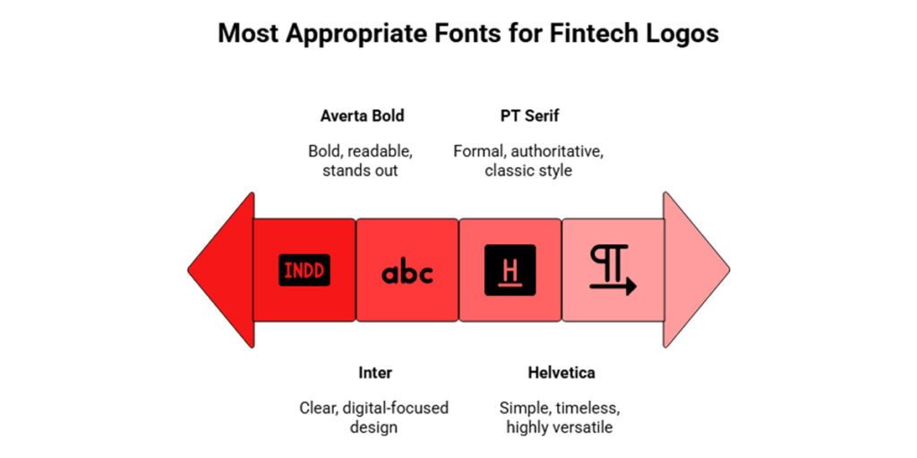
Sans-Serif Fonts: Sans-serif fonts are widely used in FinTech because they appear modern, digital-friendly, and clean, making them highly legible on digital platforms.
Examples:
- Helvetica: Classic, simple, and timeless.
- Inter: A modern font designed for digital screens, known for its clarity.
- Averta Bold: Used by Wise (formerly TransferWise), this font has a bold and contemporary look, making it stand out while remaining highly readable.
Serif Fonts: Serif fonts are ideal for companies that wish to convey tradition, long-term stability, and credibility, which is common in wealth management and traditional banking services.
Examples:
- PT Serif: A popular choice for traditional financial institutions due to its formal, authoritative style.
Typography Guidelines from Experts
Typography in finance needs to prioritize simplicity and legibility, says Daria Karpenko, fintech designer at Devexperts. The goal is to ensure that users can quickly and easily read numbers, symbols, and text without straining, especially in digital-first environments.
- Font Selection Criteria: FinTech fonts should always prioritize legibility, modernity, and trustworthiness. They should be simple and easy to read, especially in small sizes.
- Expert Recommendation: Avoid overly stylized fonts that compromise legibility, as this could cause frustration for users.
What Are the Best Color Palettes for FinTech Logos?
The right color palette is a vital component of any logo, especially in FinTech. Colors can convey emotional and psychological responses, which is crucial in a sector where trust, security, and professionalism are highly valued.
Below are the top color trends and recommendations for FinTech logos:
Traditional Colors & Psychology
The colors you choose for your FinTech logo will help communicate key brand messages such as stability, growth, and authority. Here are some common color choices in FinTech:
Blue: It represents trust, security, loyalty, and stability.
- Usage: Blue remains the dominant color in FinTech logos, appearing in approximately 35% of all logos in the sector.
- Used By: PayPal, Stripe, Deutsche Bank
- Why It Works: Blue invokes a sense of calm and professionalism, which is why it’s commonly used in financial services.
Green: The color reflects growth, prosperity, and sustainability.
- Usage: Green is often used in FinTech logos related to wealth management, savings, and environmental impact.
- Used By: Acorns, BNP Paribas
- Why It Works: Green is synonymous with financial success, making it a natural choice for brands focusing on wealth building and sustainability.
Black: It reflects authority, sophistication, and power.
- Usage: Black is used by many modern FinTech startups to evoke a sense of strength and sophistication.
- Used By: American Express, various modern startups
- Why It Works: Black’s association with authority and professionalism helps FinTech companies project stability and credibility.
Beyond Corporate Blue: Alternative Palettes
As the FinTech industry becomes more competitive, brands are increasingly stepping away from traditional blue tones and experimenting with alternative colors to differentiate themselves.
Here are some emerging trends in color palettes:
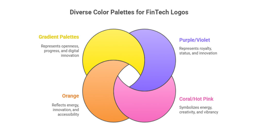
Purple/Violet: It represents royalty, status, and innovation.
- Used By: Ally Bank, many payment platforms
- Why It Works: Purple signifies innovation and status, making it a popular choice for FinTech brands aiming to position themselves as forward-thinking leaders.
Coral/Hot Pink: The color symbolizes energy, creativity, and vibrancy.
- Used By: Monzo
- Why It Works: Monzo’s iconic hot coral color helped the brand stand out in a crowded market, creating instant recognition and organic brand awareness.
Orange: It reflects energy, innovation, and accessibility.
- Why It Works: Orange conveys progress and embraces digitalization, which resonates well with younger, tech-savvy audiences.
Gradient Palettes: They represent openness, progress, and digital innovation.
- Used By: Payoneer, Holded
- Why It Works: Gradient color schemes represent a dynamic, evolving brand. These palettes align well with the digital-first nature of many FinTech companies.
What Are the Top FinTech Logo Design Trends in 2026?
1. Modular & Scalable Logo Systems
Modular logos offer flexibility, allowing brands to use individual elements like icons, wordmarks, or symbols across multiple platforms. This adaptability ensures consistent and cohesive branding on everything from websites to mobile apps.
Example: PayPal’s 2025 redesign, which separated its double-P monogram from the wordmark, is a perfect example of how modular logos allow for versatile and scalable brand identities.
Best Practice: Experts from our team recommend “create modular logos and design brand identities that can be broken down into adaptable elements for various platforms.”
2. Responsive & Mobile-First Design
90% of websites have embraced responsive design, making adaptability a non-negotiable in 2026. FinTech logos need to be scalable and legible across various digital platforms, including apps, wearables, and embedded finance tools.
3. AI-Driven Logo Design
AI is now a key player in the logo design process, enabling logos to be responsive and dynamic across different devices. There are multiple AI tools helping designers to create iterations quickly and incorporate blockchain integration for enhanced security in FinTech branding.
Popular AI Tools: Looka, Canva, LogoAI, and Hatchful by Shopify are leading AI-powered tools, enabling faster and more effective logo creation.
4. Minimalism & Simplification
The trend towards minimalism continues, with FinTech logos favoring clean lines, geometric shapes, and simple forms. These designs are versatile, ensuring logos are impactful and legible across different digital environments, especially on small screens.
5. Purpose-Driven & Ethics-Focused Branding
More FinTech brands are adopting ethical and sustainable business models. Their logos must reflect these values to build trust with consumers. Transparent branding that highlights sustainability, privacy, or social responsibility resonates strongly with today’s consumers.
Example: Aspiration’s branding embeds sustainability metrics directly into its identity, reinforcing their commitment to ethical business practices.
Make Your Logo Adaptable with Modular Design
Ensure your logo works seamlessly across all platforms with a modular design tailored to your brand.
How Much Does a FinTech Logo Cost?
The cost of a FinTech logo can vary widely depending on factors such as the complexity of the design, the experience of the designer, and the type of services required. Here’s a breakdown of logo design costs by service type, backed by industry insights:
1. DIY Logo Makers
DIY logo makers are a budget-friendly option for businesses looking for quick and simple designs. However, these logos may lack the distinctiveness and originality needed for a FinTech brand.
Cost: $5-$50
Examples: Tools like Canva and Logo Maker
2. Freelance Designers
Freelancers typically offer more personalized services and a higher level of customization than DIY tools. They can provide creative concepts, but prices will vary based on the designer’s experience and the complexity of the project.
Hourly Rate: $20-$150 per hour
Project Rate: $100-$2,000+ (most commonly $300-$500)
Average Small Business: Under $1,000
3. Professional Agencies
For FinTech companies looking for a high-quality logo with a well-thought-out brand strategy, professional agencies are the way to go. These agencies bring expertise and a strategic approach to branding, which can be valuable for building trust and standing out in a crowded market.
Range: $2,000-$15,000+
Premium Agencies: $10,000+ with strategy work
4. Branding Packages (Full Identity)
A full branding package includes not only the logo but also essential brand assets like color palettes, typography, and brand guidelines. Agencies offer comprehensive services, while freelancers can offer more affordable packages, though with fewer additional services.
Freelancers: Starting around $200
Agencies: $10,000+
Includes: Logo variants, brand guidelines, additional design assets
Factors Influencing Logo Design Costs
- Designer Experience: More experienced designers or agencies command higher rates due to their expertise and portfolio.
- Project Complexity: Logos that require more concepts, revisions, or specialized design elements will naturally cost more.
- Brand Size: Larger FinTech companies with bigger budgets often invest more in their branding.
- Target Market: B2B businesses may require more formal and polished logos, which could raise the price.
- Additional Deliverables: Costs can rise if you need extra deliverables like brand guidelines, multiple logo formats, or trademark search services.
What Are the Most Common Mistakes in FinTech Logo Design?
Designing a logo for a FinTech company is a unique challenge, your logo must not only be visually appealing but also build trust, credibility, and resonate with your audience. However, many companies make common design mistakes that hinder the effectiveness of their logo.
Here are the top errors to avoid:
1. Excessive Complexity
Problem: Adding too many elements or meanings to a logo can overcomplicate it.
Impact: Complex designs become difficult to recognize, especially at smaller sizes.
Solution: Keep it simple. The most successful logos, like Apple’s and Nike’s, use minimal designs that are easily identifiable even at a glance.
2. Plagiarism & Lack of Originality
Problem: Copying design elements or using generic stock icons can weaken your brand’s uniqueness.
Impact: Borrowing or imitating existing logos may lead to legal issues or brand confusion.
Solution: Always create original designs. A custom logo will set your brand apart and help you stand out in a crowded market.
3. Poor Color Choices
Problem: Using random colors or too many colors that don’t align with your brand’s values.
Impact: Colors carry emotional and psychological weight. Using them haphazardly can confuse your brand message.
Solution: Use color psychology. For FinTech, blue signifies trust, while green indicates growth. Limit your color palette to two or three core colors that align with your values.
4. Wrong Typography
Problem: Choosing overly stylized or hard-to-read fonts.
Impact: Typography that is difficult to read, especially at smaller sizes, can hurt legibility and brand recall.
Solution: Choose modern, legible, sans-serif fonts. Prioritize clarity and simplicity to ensure your logo remains readable across all platforms.
5. Ignoring Your Target Audience
Problem: Designing without considering the needs and preferences of your audience.
Impact: A beautiful logo that doesn’t connect with your customers will fail to resonate.
Solution: Research your target audience and ensure your logo appeals to their expectations and emotions.
6. Lack of Clarity and Simplicity
Problem: Complex designs with unclear messaging can confuse users.
Impact: A logo that’s hard to interpret damages the brand’s credibility and trustworthiness.
Solution: Keep your logo simple and focused on one core message, whether it’s trust, security, or innovation.
7. Following Trends Too Closely
Problem: Relying heavily on design trends can make your logo feel outdated quickly.
Impact: Overuse of trendy elements leads to the need for a redesign sooner than you expect.
Solution: While it’s good to stay current, avoid trends that will quickly become passé. Combine modern elements with timeless design principles for longevity.
8. Poor Scalability
Problem: Logos that don’t scale well across different sizes or platforms.
Impact: Logos may appear distorted or lose clarity when resized, leading to inconsistency across various mediums.
Solution: Ensure your logo works well across multiple sizes, from business cards to large billboards. Use vector files for scalability and test the logo at different sizes.
UX-Specific Mistakes in FinTech
- Unpolished Design: An unrefined design creates a lack of trust, especially in the FinTech industry where security is paramount.
- Weak Trust Signals: A logo missing key visual cues (such as shields or locks) can undermine customer confidence.
- Complicated Onboarding: A confusing logo or unclear design can complicate user flows, leading to poor first impressions.
How to Avoid These Mistakes When Designing a Fintech Logo?
Here are some best practices to ensure your FinTech logo stands out while avoiding common pitfalls:
- Know Your Brand Identity: Define core values like accessibility, transparency, and security and understand what differentiates your brand and reflect that in your logo design.
- Keep It Simple and Scalable: Stick to clean, clear lines and test your logo in multiple sizes to ensure it looks good from business cards to billboards.
- Use Color with Purpose: Choose color combinations that communicate your brand values.
For FinTech:
- Blue for trust and professionalism.
- Green for growth and sustainability.
- Purple for innovation.
- Choose Typography Carefully: Use sans-serif fonts for modern, digital-friendly designs. Avoid overly stylized fonts that compromise legibility.
- Consider Symbolism and Icons: Use meaningful symbols, such as shields for security or arrows for progress. Ensure icons are simple and scalable.
- Design for Digital-First Environments: Prioritize mobile-first design, ensuring your logo works well in app icons and favicons. Consider modular systems, separating the wordmark and icon for flexibility.
- Make Ethics Visible: If sustainability or privacy is a key value, incorporate symbols or colors that highlight these ethics.
- Prioritize Consistency: Ensure your logo is consistently used across all platforms and maintain brand guidelines.
- Test before Launch: Conduct trademark searches, test your logo on various backgrounds, and get feedback from your target audience.
- Invest in Professional Design: A professionally designed logo builds credibility and trust. Invest in quality to ensure your brand stands out.
By following these guidelines, you can avoid common design pitfalls and create a logo that builds trust, resonates with your audience, and differentiates your brand in the competitive FinTech space.
Get a Custom Logo Design Quote
Get a personalized logo design that represents your FinTech values and builds customer confidence.
What Are the Best FinTech Logo Design Examples to Inspire Your Next Logo?
Designing a standout FinTech logo requires a blend of modernity, trust, simplicity, and uniqueness. The best logos in the industry, from Stripe to Monzo, showcase how effective color palettes and minimalistic logo ideas can convey core values like security, professionalism, and innovation.
Here’s the list of some of the best FinTech logo examples to inspire your next design, highlighting innovative color choices, modular structures, and scalable logos that successfully communicate brand values across digital platforms.
Innovative Color Palettes for FinTech
Color plays a significant role in communicating your brand values. In the FinTech industry, colors often symbolize trust, security, innovation, and professionalism. Here are some standout examples of logos with innovative color choices:
Stripe
Stripe uses a clean, modern, and minimalist approach, focusing on functionality. The “Blurple” color represents professionalism while standing out from the typical corporate blue. The high-contrast design ensures clarity and enhances the user experience.
- Design: Wordmark only, with diagonal strokes on ‘t’ and ‘i’.
- Color: The logo uses a unique “Blurple” (blue-purple) hue.
Monzo
Monzo’s distinctive coral color differentiates it from other FinTech logos, generating organic awareness and recognition. It challenges the traditional blue palette while still maintaining an approachable, vibrant feel.
- Design: Hot coral color, which became instantly recognizable.
- Color: Bold coral contrasts with traditional blue tones used in the FinTech space.
Acorns
The acorn symbolizes unlimited potential, mirroring the brand’s focus on helping people grow their savings. The green color connects directly to finance and growth, reinforcing the brand’s promise of financial success.
- Design: Green acorn emblem.
- Color: Green, representing growth, money, and prosperity.
Payoneer
The gradient symbolizes progress and professionalism. It conveys the idea of global reach and forward movement, aligning well with Payoneer’s international financial services.
- Design: The logo uses a rainbow gradient palette.
- Color: A mix of bright and dynamic colors, showcasing progress and diversity.
Examples of Modular Logos in FinTech
Modular logos have become increasingly popular in the FinTech industry. These logos are adaptable and versatile, allowing brands to maintain a consistent identity across various digital platforms. Here are some examples of FinTech companies successfully using modular logos:
PayPal
The overlapping design represents togetherness, while the italics convey a sense of forward movement. This modular design can be used flexibly across various platforms, such as app icons, payment buttons, and more. The colors purple and blue represent reliability and professionalism.
- Design: Double P monogram (overlapping, italicized).
- Color: Purple and blue.
Revolut
Revolut’s logo is minimalist yet modern, focusing on typography for a clean, effective design. The brand’s vibrant colors (used across other branding elements) are separated from the logo, which remains scalable for various contexts, making it adaptable across mobile, desktop, and print media.
- Design: Minimalist black logo, with clean typography.
- Color: Black, with vibrant brand colors used in other elements.
Wise (formerly TransferWise)
The flag is a simple, symbolic image that represents borderless money transfers. The modular flag symbol can be separated from the typography, creating a flexible and scalable design. The clean design makes it ideal for use in various digital environments, from app icons to website headers.
- Design: Sky blue flag symbol.
- Color: Sky blue.
Starling Bank
The sync symbol in the middle of the circle represents interaction and collaboration, making it an excellent choice for a financial brand focused on seamless transactions. The logo’s simple modular structure can be used independently for icons, branding, and apps, enhancing its adaptability.
- Design: Purple circle with sync symbol.
- Color: Purple.
Robinhood
The green feather evokes the legend of Robin Hood, symbolizing fairness and wealth redistribution. The modular nature of the design allows the emblem to stand alone on various platforms, like mobile apps, while the wordmark remains visible in the full logo.
- Design: Green feather emblem with black wordmark.
- Color: Green and black.
Conclusion
The logo of your Fintech Company or institution is more than just a design, it’s a critical element in building trust, credibility, and long-term customer relationships. By focusing on simplicity, professionalism, and consistency, your logo can effectively communicate your brand’s core values.
Future trends like modular designs, AI-driven tools, and purpose-driven branding will continue to shape how logos resonate with consumers. To ensure your FinTech logo stands out and grows with your brand, partnering with experts can make all the difference.
At Logo Design Valley, we specialize in creating impactful logos that not only represent your business but also build trust and recognition in an ever-changing market.
Start Designing Your FinTech Logo Today
Work with experts to create a logo that clearly communicates your brand’s values and stands out in the FinTech space.