Writing about the most expensive business logo designs of all time is not about counting the zeros in the figure – It’s not even just about assuming that Logo design is that heck-of-expensive thing to even think about! Basically, this blog is about what made them so expensive to even afford?
Logo design, business identities or symbols, are knows as the face of any business. Luckily when any giant company plans to set up a whole new level in their field, they often tend to start spending a lot on the Big Face (logo). So let’s today we will look back to those companies who paid over a million dollars to step in the market with the toughest competition to beat and what we can learn from them.
Geometry Matters
PEPSI: $1,000,000 – by Arnell Group
Arnell Group redesigned Pepsi’s latest design that cost over $1 million in 2008. According to Stock Logos, “The listed prices include an over-all branding package that was expected for the quoted price. Initially, we are not here mentioning how these brands started off in the early ages however by the time when they plan to expand their presence such that it remained timeless and composed for every pair of the eyes. With such cost for designing a logo, yes there is breathtaking knowledge and information used to shape the Pepsi logo. Since we are not here to discuss technical aspect in details here is a glimpse of a much of the image revealed about the structure Arnell calls the effort:
Regardless of how spectacular and incredible the earth and space is designed – You will see how Arnell has kept the sphere geometrical by keeping the corresponding lines balance and parallel. When you opt for professional business logo design services, note that the quality logo designs are always optically balanced and never runs out of equilibrium of the design flow.
Simplicity Wins
BBC: $1,800,000 Lambie Nairn Agency
The fact that even after spending a billion, the BBC logo is still criticized for running out of any creative touch. It is the simplest form of any shape it that possibly adheres to importance in a wider perspective. However, in the revolutionary era of digital marketing and advanced methodologies to get attention, the BBC still seems satisfied with the latest pattern of their current logo. The facts behind the logo design of BBC does not seem to have adequate information to justify as to why it has been kept so simple, however, by observing a number of similar based logo designs that are text-based identities such as Samsung, Nike, and Microsoft it is evident that a business logo design is preferred more if kept simple and more prominent even if it requires to be mentioned in a simplified alphabetic pattern
Hues Communicate
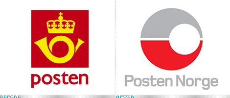
Posten Norge: $55,000,000

The recent yet most unthinkable design of the Posten Norge might seem the oldest coldest one. However, it is the result of an enormous investment that showed up a dual tone basic logo that often makes people wonder if that really cost over $55 million. Understanding the relevance of the logo and Posten Norge the idea is to communicate the audience what is precisely based for the particular audience. If we look at the hues scheme utilized for the logo theme dominant by the red that is taken to represent Norway while the grey ads the subtle art of volume control to create a balanced theme.
We were in the design industry believe that the power of logo design would never lose its worth. Be it rebranding or need of a business logo design, it is mandatory to add value instead of just a substantial cost of money to get the ideal identity for your business representation.


