Most people will judge your app before they ever open it — and they will do it in about five seconds. In that short moment, your app icon becomes the make-or-break factor that determines whether someone taps “install” or scrolls past.
Understanding how to design an app icon that grabs attention instantly is critical in today’s crowded app stores. An icon that is clear, memorable, and aligned with strong app branding can dramatically improve conversion rates.
Whether you refer to it as an app icon or an app logo, it is the visual handshake between your brand and potential users. In this guide, we break down the five second test, explore principles, and reveal how small changes can lead to big download numbers.
Why First Impressions Decide an App’s Fate
Users browsing an app store decide within seconds which icons deserve a closer look. That first glance can determine whether they tap to learn more or keep scrolling. Research on visual perception shows that even brief exposure shapes how people judge design quality, credibility, and relevance.
Mastering how to design an app icon that makes an immediate impact means considering more than just visual appeal. The design should reflect your app branding, convey the app’s purpose, and remain clear at every size.
Simple forms, distinctive colors, and a style that matches your brand identity make it easier for users to recognize and remember your app. In competitive categories, this immediate recognition often plays a deciding role in winning downloads.
With the impact of first impressions in mind, it is important to understand the fundamentals of how to design an app icon.
Designing an app icon means blending simplicity, memorability, and a clear link to your app’s brand and function.
A great design is instantly recognizable, consistent with your product’s style, and adapted to platform-specific guidelines. It should remain clear and effective at any size while showing users exactly what the app offers.
Key steps in creating an effective app icon:
- Keep the layout clean and uncomplicated
- Use shapes and colors that are easy to remember
- Reflect your brand identity and app function
- Follow size and file requirements for each platform
- Test visibility and clarity across multiple screen sizes
Principles of an App Icon Users Instantly Trust
Users are drawn to app icons that feel instantly clear, professional, and worth their time. Trust is built through design choices that communicate purpose and quality without the need for words.
Clarity
Icons should be instantly understandable, even at a quick glance. Overly complex details often get lost at smaller sizes.
Scalability
A strong design maintains sharpness and balance across different display sizes, from app store listings to device screens.
Memorability
Unique shapes, colors, and styles help the icon stand out in a crowded screen or search result.
Relevance
Visuals must align with the app branding, reflecting its core function and target audience.
Aesthetic Appeal
Well-balanced colors, proportions, and visual hierarchy create a polished, professional look that signals quality.
In mobile app icon design, these principles work together to create a visual identity that is easy to recognize, recall, and trust — making it more likely for users to engage. The same principles apply to app logo design, ensuring your brand is instantly recognizable across every platform and marketing channel.
Ready to give your app the visual edge it needs?
Strong design means stronger downloads
App Icon Design Trends in 2025 That Influence Downloads
Design styles evolve quickly, and app icons that feel current often have an edge in attracting new users. Trends in 2025 show a mix of modern minimalism, nostalgic callbacks, and functional adaptations for different viewing environments.
Minimalist and Flat Design
Clean shapes and simplified details make icons more recognizable and adaptable across devices.
Dark Mode Friendly Designs
Icons with balanced contrast and visibility stand out in dark mode interfaces, which are now default for many users.
Gradient and Depth Effects
Layered gradients and soft shadows add dimension without overwhelming clarity.
Retro and Nostalgic Revivals
Subtle nods to early app and web aesthetics tap into emotional familiarity.
Subtle Motion in Supported Formats
Small animations, when supported, can create a sense of interactivity without distracting from the main visual.
Incorporating these approaches into app store icon design can help your product feel fresh, relevant, and in tune with user expectations — a quality that often improves engagement from the very first glance.
The Five Second App Icon Test Explained
The 5 second logo test is a quick way to measure how effectively an app icon communicates its purpose and appeals to potential users. The goal is to simulate the short time frame in which most people decide to engage or move on.
Step 1 – Select a Test Group
Choose a small audience that represents your target users.
Step 2 – Present the Icon Briefly
Show the app icon for no more than five seconds, either on its own or in a grid of other icons.
Step 3 – Ask Key Questions
Find out what users remember, how they interpret the app’s purpose, and whether they would click it.
Step 4 – Record and Compare Responses
Look for patterns in feedback that indicate clarity, recognition, or confusion.
Step 5 – Make Targeted Adjustments
Use insights to refine your mobile app icon design and improve first impressions.
Running this test before launch helps identify design strengths and weaknesses early, giving you time to make improvements that can increase downloads once the app is live. If you are wondering how to test an app logo effectively, start by showing it to a small group for only five seconds, then gather feedback on what they remember and how they interpret the design.
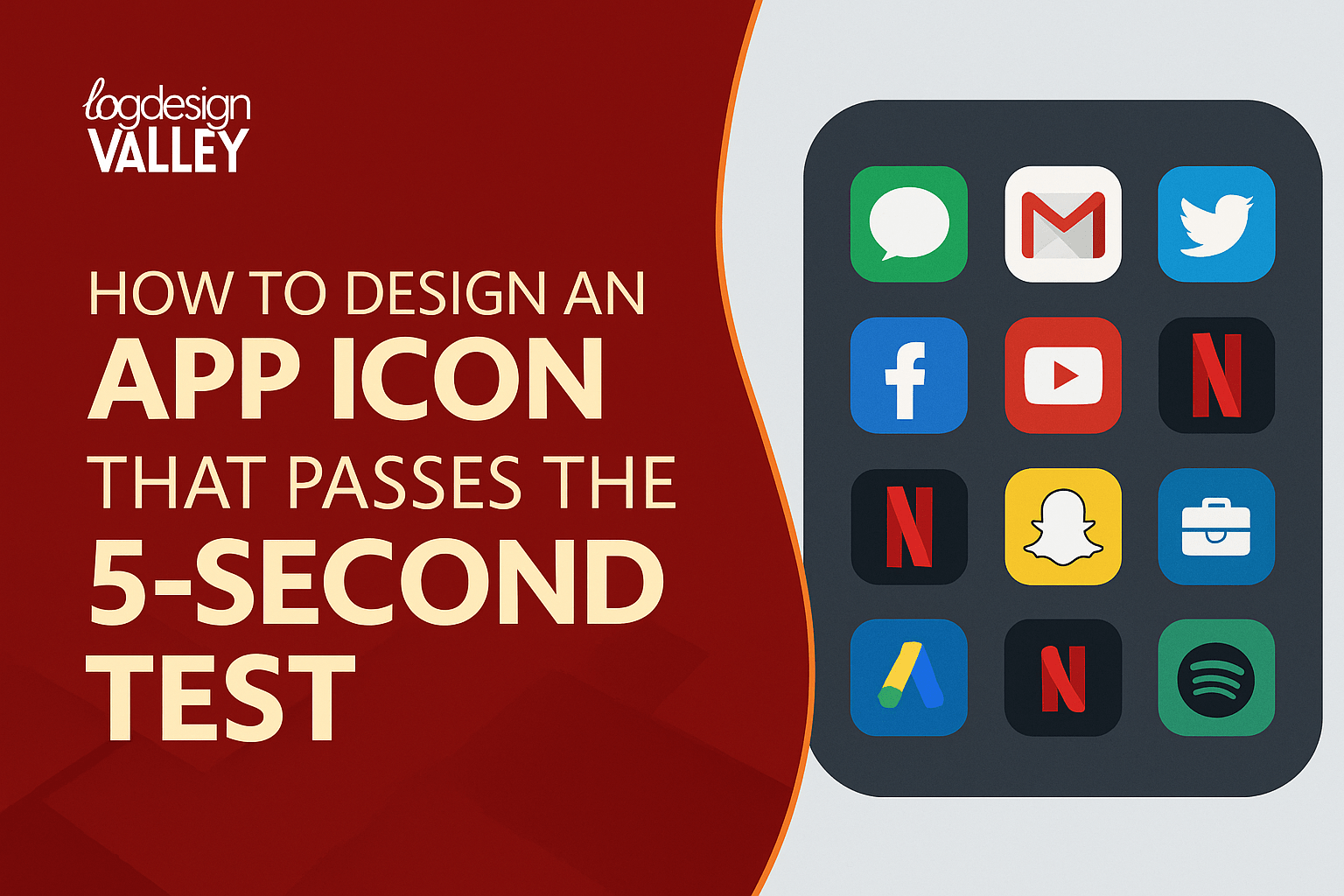
What We Learn from the Icons of Popular Apps
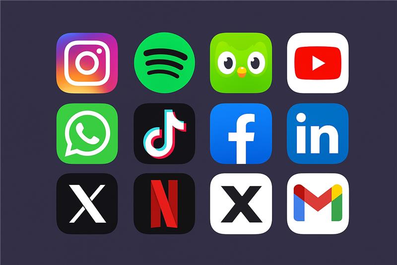
The most successful apps in the world share a common trait — their icons are instantly recognizable, memorable, and emotionally engaging. These designs are built on principles of clarity, strong color identity, and alignment with brand values, all of which can be applied to any mobile app icon design.
The gradient camera icon is modern, friendly, and eye-catching. Its evolving gradient style keeps it fresh while ensuring brand consistency.
Spotify
Vivid green paired with sound wave lines is impossible to mistake. The consistency of the design strengthens recognition across all platforms.
Duolingo
The cheerful owl mascot uses bright colors and expressive eyes to create an emotional connection, making learning feel approachable.
YouTube
A bold red background with a clean white play button conveys its purpose instantly. The simplicity makes it work flawlessly in any size or setting.
The speech bubble and phone icon communicate messaging instantly. Its familiar green is distinctive without being overwhelming.
TikTok
The neon-inspired musical note on a dark background reflects creativity and energy, appealing strongly to younger audiences.
A minimal blue square with a lowercase “f” is simple but highly effective. The consistent use of the shade reinforces brand familiarity.
The clean typography inside a bright blue square creates a professional yet friendly look that resonates with its audience.
Twitter (X)
A single bold letter is all it needs. The design is adaptable, easy to spot, and immediately signals the platform’s identity.
Netflix
The striking red “N” over a dark gradient background has a cinematic feel that reflects the platform’s entertainment focus.
Gmail
A clean envelope shape outlined in Google’s primary colors makes it functional and instantly identifiable.
Across these examples, you’ll notice a recurring theme: simple but distinctive shapes, deliberate color choices, and visuals that align perfectly with brand messaging. They follow key app icon psychology principles, triggering trust, familiarity, or curiosity in less than five seconds — exactly the kind of logo that increases app downloads.
Designing an App Icon for Downloads from Day One
Strong visuals are most effective when they are part of the development process from the very beginning. Waiting until the end to think about your app icon often leads to a design that feels disconnected from the product experience. By integrating branding and functionality early, you can create a cohesive identity that works across every touchpoint.
Working with a mobile app development company that understands the importance of visual identity ensures your icon aligns with the app’s features, target audience, and overall user experience.
Design and development teams can collaborate on color choices, shapes, and styles that not only look appealing but also remain functional across devices and platforms. This alignment builds recognition from the moment users see your icon in the app store, helping to increase downloads and retention.
Working with Professionals for a Logo That Wins Installs
Creating an app icon or refining your app logo design to stand out in competitive markets requires more than design skills alone.
It demands a deep understanding of branding, user behavior, and visual psychology. A leading logo designing company can translate your brand identity into an icon that communicates value in an instant, making it easier for users to choose your app over others.
Specialists bring experience in color theory, shape recognition, and app store requirements, ensuring the final design looks sharp, scales well, and resonates with your audience.
Their expertise also helps maintain consistency between your app icon and other brand assets, building trust from the first impression through every interaction. In categories where users have endless options, a professionally crafted icon can be a decisive advantage.
Conclusion – Will Your Icon Pass the 5-Second Test?
Your app icon is often the first interaction a potential user has with your brand. In just a few seconds, it can inspire curiosity, convey trust, and encourage a download — or it can be overlooked entirely.
Understanding how to design an app icon that is clear, memorable, and aligned with your brand identity is key to standing out in competitive app stores.
From applying proven design principles to adapting for local markets and working with experienced professionals, every decision you make about your icon has a direct impact on how users respond.
The five second logo test is a simple but powerful way to measure that impact before launch. Test your design, refine it with feedback, and make sure it works across devices, sizes, and cultures. If your app icon can win attention in five seconds, it is already one step ahead in winning loyal users.
Your next big app deserves a winning first impression
Let’s design something worth tapping
Frequently Asked Questions
What makes a good app icon and how can it help my app succeed?
A good app icon is simple, memorable, and aligned with your app branding. It should be easy to recognize, use distinctive colors, and communicate your app’s purpose at a glance.
Can a logo increase app installs and improve my conversion rate?
Yes. A well-designed logo can increase app installs by building trust, conveying professionalism, and attracting attention in crowded app store listings.
What are the best colors for app logos that stand out in the app store?
The best colors for app logos are high-contrast combinations that work in light and dark modes. Vibrant gradients, bold brand colors, and balanced contrasts help icons stand out.
What are the app logo size guidelines for app store submissions?
For the App Store, the recommended app logo size is 1024×1024 pixels. This ensures the design scales clearly to smaller sizes without losing sharpness or detail.
How to run a five second logo test to check my design’s impact?
To run a five second logo test, show your icon to a group for exactly five seconds, then ask what they remember and how they interpret the app’s purpose.
What makes a logo that increases app downloads and user engagement?
A logo that increases app downloads is visually appealing, relevant to the app’s purpose, and consistent with its overall branding, making it more likely to be chosen.
How does app icon psychology influence download decisions?
App icon psychology examines how shapes, colors, and visual styles affect perception. Designs that evoke trust, excitement, or familiarity tend to drive more downloads.
What mobile app icon design tips can help me create a winning visual?
Mobile app icon design tips include keeping the design clean, testing it across different screen sizes, ensuring it is scalable, and aligning it with your brand identity.