Your food might be five stars, but your logo looks like clipart.
That’s the quiet reason customers scroll past, walk by, or second-guess your restaurant. Most restaurant logos don’t fail because they look bad, but they fail because they don’t say anything. They decorate, but they don’t define. A great restaurant logo isn’t about food. It’s about feeling, clarity, and trust in an instant.
If you’re searching for restaurant logo ideas or learning how to make a restaurant logo that actually works, start here.
What Makes a Restaurant Logo Actually Work
A good logo isn’t there to impress. It’s there to stick.
Clarity beats cleverness every time. The most famous restaurant logos don’t try to be smart; they aim to be remembered. McDonald’s didn’t need a burger. Just an “M.” Chipotle uses a single chili pepper. No gradients. No overload. Just identity in one stroke.
The most popular restaurant logos don’t chase trends; they distill meaning. They work in black and white. They scale from billboard to business card. And most importantly, they don’t explain, they suggest.
- Simplicity isn’t an aesthetic. It’s a strategy. If your logo needs context to make sense, it’s not working. So what makes a restaurant logo actually work? It’s not color. Not font. Not even food. It’s a single, unshakable idea delivered without noise.
Logo ≠ Picture of Food
Most restaurant logos fail because they try to be literal. A bowl of noodles. A pizza slice. A fork and knife. That’s not a logo. That’s a menu illustration. A strong food restaurant logo doesn’t describe the plate—it captures the promise.
It signals what the brand stands for, not what it serves.
Take Sweetgreen, for example.

They sell salads. Fresh, organic, fast. But their logo? No leaves. No lettuce. No cutlery. Just clean typography; balanced, minimal, scalable. Why? Because the logo isn’t trying to show health, it’s built to feel healthy. Clean. Confident. Direct.
This is the difference:
- A picture tells you what’s on the menu.
- A symbol tells you what you’re buying into.
Good restaurant logos scale to an app icon, a loyalty card, a neon sign. Bad ones fall apart outside a website header.
Test yours:
- Can it survive in black and white?
- Can someone draw it after seeing it once?
- Does it say brand, or just bread?
If you need food in the logo to say what you do, you haven’t said it well enough. Design the feeling. Not the food.
Restaurant Logo Ideas Based on Brand Personality
Not all restaurants are the same. Neither are their logos. Design isn’t style. It’s a signal. And the most effective restaurant logo ideas begin with personality clarity, not pixels.
Here are three enduring archetypes with real-world examples that get it right.
1. Heritage-Focused
Tradition doesn’t shout—it resonates. These logos lean into legacy, not novelty.
- Design cues: serif fonts, muted palettes, tactile textures.
- They feel handcrafted, enduring, rooted.
Example: Gino’s East (Chicago)
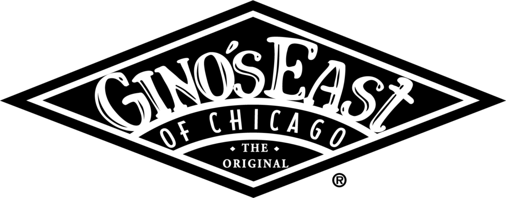
Thick, weathered type with classic tones. It doesn’t look new. It looks trusted. This is restaurant logo design that remembers where it came from.
2. Modern & Fast-Casual
Here, speed meets clarity. The logo has to live on delivery apps, cups, and mobile screens.
- Design cues: sans-serif fonts, geometric shapes, bold contrast.
- Friendly, scalable, and unmistakable in motion.
Example: Shake Shack
Clean lines. A stylized burger. No shadows, no clutter. Modern, but still warm. It knows what it is, and what it’s not. This is branding that moves fast and holds up.
3. Premium Dining
Luxury doesn’t explain! It whispers. These logos are stripped down, but deeply intentional.
- Design cues: minimalist marks, subtle spacing, refined typography.
- Think of it like a high-end watch: it doesn’t need to tell you it’s expensive.
Example: Eleven Madison Park
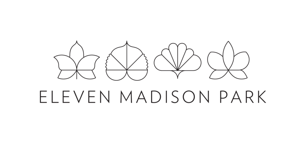
An abstract leaf mark. Airy type. No imagery, no tagline. It’s not trying to sell. It’s inviting you to belong. This is design for those who notice what others miss.
Typography does more than carry words. It carries tone. In smart restaurant logo design, icons are optional. Intent is not.
- The best logos say less—but say it better.
How to Make a Restaurant Logo—The Thoughtful Way
Design is not how it looks. Design is how it works. Most restaurant owners jump straight to symbols and colors. But if you’re serious about how to make a restaurant logo that lasts, start earlier. Start with clarity. Then practice restraint.
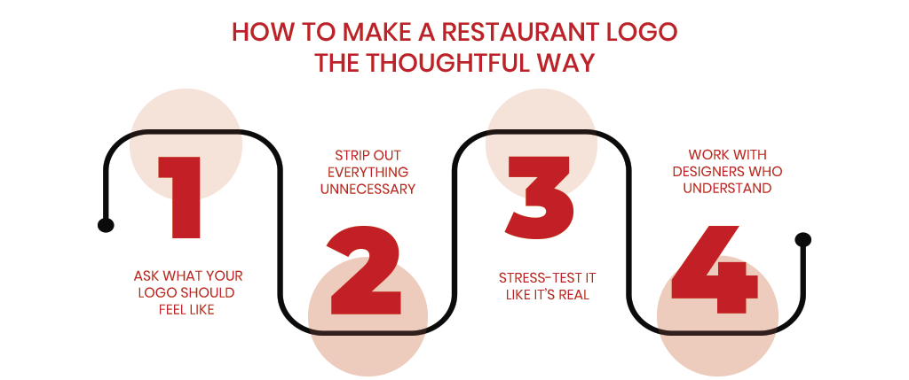
Here’s a framework for thoughtful, high-functioning restaurants logo design:
Step 1: Ask what your logo should feel like
Design without emotion is decoration. Before you open a design tool, answer this:
- Should your logo feel fast?
- Should it feel warm?
- Should it feel premium, traditional, playful?
Write down 3 adjectives. These are your brand inputs. The goal of your logo is to translate those feelings; visually, instantly. If your brand is “fresh, fast, friendly,” your logo shouldn’t be serif-heavy and dark. That mismatch will cause quiet friction.
Example:
CAVA (a Mediterranean fast-casual chain) feels bold, fresh, and direct. Its logo reflects that with a tight, all-caps wordmark and a high-contrast “V” that adds tension and personality. No olives, no hummus bowls—just energy, distilled.
- Your logo isn’t about food. It’s about feeling.
Step 2: Strip out everything unnecessary
The instinct is to add: a fork, a flame, a chef hat, a knife. That’s not design. It’s storytelling with clipart. In professional restaurants logo design, the goal is the opposite: subtract until only meaning remains.
Remove any element that doesn’t serve clarity or emotion. Remove filler typefaces. Remove icons that just repeat the obvious. Your logo should work in one color, one shape, one second. If it needs explanation, it’s not finished.
Example:
In-N-Out Burger has a simple yellow arrow. That’s it. No burgers. No chefs. No ketchup splashes. But the arrow feels fast. Optimistic. Directional. It tells a story in half a second.
- Simplicity is not emptiness. It’s confidence.
Step 3: Stress-test it like it’s real
A logo isn’t just a file; it’s a system. Test your design in the places it will actually live:
- Printed in black and white.
- Shrunk down to 24px for a mobile app.
- Blown up as a neon sign.
- Used on signage, packaging, uniforms, receipts.
Great logos scale across all of them. Poor logos disappear at small sizes or overload at large ones. View it upside down. If it still feels balanced and intentional, you’re close.
Example:
Chipotle’s pepper icon works on tiny app icons, metal signage, brown bags, and Instagram ads. Its thick lines and strong silhouette are made for repetition.
- Design for real surfaces, not just Behance portfolios.
Step 4: Work with designers who understand restraint
A good designer can give you 10 concepts.
A great one can justify why you only need one. Avoid freelancers or agencies who overdecorate. Always consult the Logo Design Valley which understands white space, brand personality, and visual discipline. True design is editing, not just adding. And that’s rare.
Example:
Eleven Madison Park (a 3-star Michelin restaurant) worked with Pentagram to craft a mark so minimal it’s almost silent: three stacked leaves. Elegant, abstract, memorable. Their team didn’t ask for clever, they asked for timeless.
- That kind of design can only come from people who think beyond trends.
Restaurant Logo Design Checklist
Before you finalize your logo, stress-test it like it’s going out into the real world.
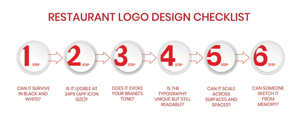
Here’s a quick but critical checklist to ensure your restaurant logo design isn’t just “nice,” but necessary:
⬜ Can it survive in black and white?
Good logos don’t rely on color to communicate meaning. Your mark should be just as effective in monochrome on invoices or window decals.
⬜ Is it legible at 24px (app icon size)?
Most logos die when shrunk. Test yours in a favicon, loyalty app, or delivery icon. If it turns into mush, it’s not ready.
⬜ Does it evoke your brand’s tone?
A fast-casual taco shop and a heritage steakhouse shouldn’t feel the same. Ask yourself: Does your logo feel fast? Friendly? Premium? Minimal? This is the heart of the smart restaurant’s logo design.
⬜ Is the typography unique but still readable?
Custom type is great. Illegibility is not. Your logo’s font should express character without sacrificing clarity.
⬜ Can it scale across surfaces and spaces?
From signage and uniforms to napkins and mobile screens, if your logo doesn’t scale, it won’t survive.
⬜ Can someone sketch it from memory?
Memorability beats complexity. If a customer can’t recall it after one glance, it’s not sticky enough.
✴️ Still unsure?
Work with a restaurant logo design team that values restraint over decoration. Because in branding, what you leave out is just as important as what you put in.
Pro Tip: Don’t chase trends
Trends sell templates. But timeless design builds brands. Minimalism isn’t a style. It’s a commitment to clarity. Typography, spacing, contrast—those age well. Icons of spoons and sushi? Not so much. If you’re building a business for the next decade, design for longevity, not likes.
What We Can Learn from Famous Restaurant Logos
Design isn’t about being loud. It’s about being remembered—with precision. When you study the most famous restaurant logos, you won’t find decoration. You’ll find design systems. Symbols made to last. Marks that feel inevitable—not accidental.
Let’s break down what the popular restaurant logos actually do well:
1. McDonald’s: Shape That Sticks
Those golden arches aren’t just a letter. They’re a landmark. The shape is symmetrical, tall, and instantly recognizable—even without text. You don’t read the McDonald’s logo. You feel it.
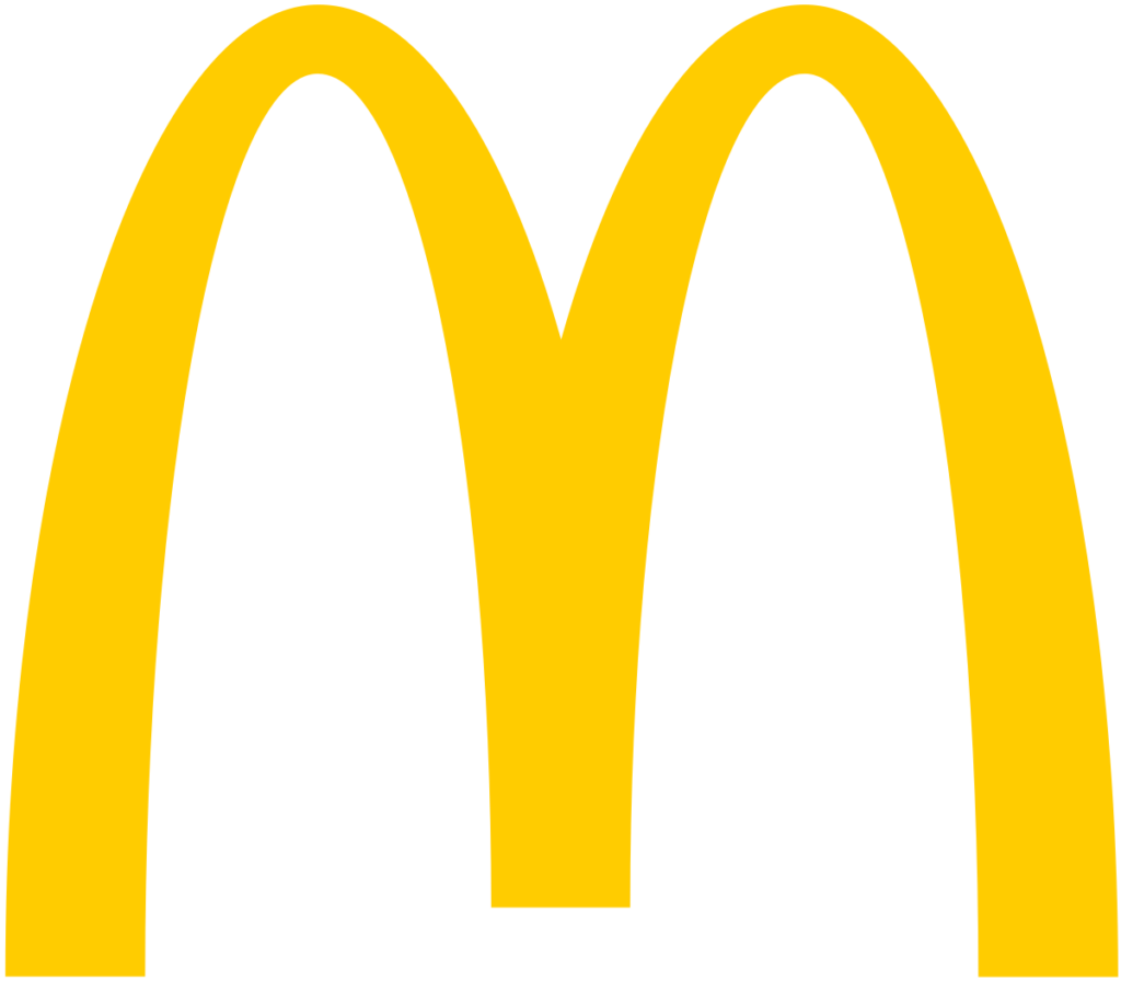
Why it works:
It’s scalable. It’s iconic. It tells your brain “I’ve been here before,” even in a country where you don’t speak the language.
- Lesson: Strong form beats fancy detail.
2. Subway: Movement with Direction
The arrows in the “S” and “Y” aren’t just cute. They carry kinetic energy. The font is bold and modern, but the movement hints at speed, convenience, and forward motion—perfect for a build-your-own lunch spot.
Why it works:
It balances function (bold type) with flair (arrows), keeping it clean without being static.
- Lesson: Motion can live inside stillness.
3. Starbucks: Myth and Identity
A siren is not a coffee bean. It’s a story. Starbucks didn’t pick a generic coffee icon. They built a narrative. A face. A myth. That green circle now means “third place”—not home, not work—but your place.
Why it works:
It isn’t literal. It’s layered. The logo becomes more than the product.
- Lesson: Design doesn’t just represent what you sell. It represents who your customer wants to be.
Good Design Is Cross-Disciplinary
Visual identity isn’t just for restaurants. The same rules apply whether you’re crafting a fast-casual burger logo or exploring podcast cover art ideas. The throughline? Clarity. Consistency. Memorability. In both cases, simplicity scales and emotion leads.
- Your Takeaway! Your restaurant logo doesn’t need to say everything. It needs to be easy to say back. That’s the difference between a design that fades—and one that lasts.
Choosing the Right Logo Design Company
The wrong partner will show you clipart.
The right one will show you restraint.
A good logo design company won’t flood you with choices. They’ll ask better questions. About feeling. About context. About longevity. You’re not buying a graphic. You’re investing in first impressions that work everywhere—app icon to neon sign.
Ask them:
- Can they explain why something should not be in your logo?
- If they can, you’ve found a partner worth keeping.
Final Thought!
Most restaurant logos try too hard to speak. But in design—as in cuisine—flavor comes from restraint. The best dishes don’t overload. The best logos don’t either.
Simplicity isn’t the absence of design. It’s the essence of it.
When you subtract until it hurts, what remains is what truly matters. Your restaurant logo doesn’t need to describe the food. It needs to invite someone into the experience quietly and confidently. It’s not your brand. But it’s the door to your brand. And in a world of noise, clarity is your competitive edge.
So don’t make a logo that tries to impress. Make one that’s impossible to ignore because it says only what’s essential.
Need fresh restaurant logo ideas?
Whether you’re launching a food truck, fine dining experience, or fast-casual brand, our logo design team helps you stand out without the fluff.
FAQs – Restaurant Logo Ideas
1. How to make a restaurant logo?
Start with feeling, not food. Define three brand traits (e.g., bold, fast, warm). Then strip away everything that doesn’t serve that. Test it at 24px, in black and white, and on real-world surfaces like signs and receipts.
2. What makes a good logo for a restaurant?
It’s not about color or cleverness—it’s about clarity. A good restaurant logo is memorable, scalable, and emotionally aligned with your brand. One glance should say everything.
3. Should a restaurant logo include pictures of food?
Not always. The best restaurant logos signal your vibe, not your menu. Icons like forks or burgers often feel generic unless treated uniquely.
4. Can I design a restaurant logo myself?
You can—but should you? Great logos are strategic, not just visual. Unless you have design experience, work with professionals who understand branding.
5. How much should a restaurant logo cost?
Costs vary, from $100 templates to $10,000+ agency work. What matters is not the price, but whether your logo communicates clearly across all platforms.
6. What file formats should I receive for my logo?
A complete restaurant logo package should include:
- Vector files (AI, EPS, SVG)
- High-res PNG and JPG
- A version that works in black and white
- Icon-only version (if applicable)
7. Can one logo work for signage, menus, and apps?
If it’s designed right—yes. Test your logo in grayscale, small sizes (24px), and large formats. If it breaks, it’s not done yet.