There are at least 108,405 businesses operating in the Security Services industry in the United States. Additionally, 87,086 businesses specialize in Security System Services. What are the chances your security business will stand out from the rest?
Security services handle homes, offices, schools, staff, and sensitive data. The logo is the first signal that tells people whether trust is deserved. Your security business needs an outstanding logo design that builds trust and authority in an instant.
A hawk, an eagle, a badge, shields, or a lock can give your business a “daring” look and clearly convey the “security” message. While these are still effective, we’re in 2026, and a security logo design company needs to step up with uniqueness, originality, and an out-of-the-box approach for your business.
Let’s break down what a security logo design needs to look like to stand out, including the latest ideas, niche advice, best practices, and a step-by-step process on how to design a company logo for your security business.
What makes a good security company logo?
A good logo design for a security company communicates trust, authority, and protection under a second using clean, authoritative visuals. If you’re looking for qualities your logo should have, we’ve listed them for you.
Extreme Simplicity: Complicating a design never benefits any business. A simple logo stays clear and memorable, whether it’s on a tiny mobile screen or a patrol vehicle. Simplicity also makes the logo easy to scale.
Industry Relevance: Security services are broad. You could be an alarm system provider, provide physical guards for a location, or focus on cybersecurity. Your niche in the security industry should help you develop a sharp, secure, and robust design that works everywhere.
Recognizable Symbols: A good security company logo uses logo symbols that signal vigilance and defense. Classic logos include shields, keys, locks, hawks, and eyes, or you could go beyond the clichés and experiment with something new.
Authoritative Typography: The font used in the logo needs to be readable across vehicles, uniforms, and digital platforms. People nowadays have the attention span of a security light; your logo should use bold, clean, modern fonts to build authority.
Trustworthy Colors: Use logo color combinations strategically. Muted blues, grays, and blacks project intelligence and dependability. Colors like red, yellow, or green signal alertness or safety. Smart play of color can make an entirely different impact on your business.
Brand Alignment: In the end, it’s about turning your security business into a brand people trust. A strong security logo design works with your branding to drive success across customer touchpoints.
Build a Security Logo People Trust
Your security company needs more than a shield and a bold font. Logo Design Valley creates custom security logos built around your services, audience, and brand, with professional files ready for uniforms, vehicles, websites, and signage.
Why does my security business need a logo?
In the security industry, you’re selling trust directly and indirectly. If people find you worthy of securing them, they’ll hire you or buy your product. Your security company logo is the first interaction point for that signal.
Even before you have a conversation, how you look is judged. Your brand appears on everything from proposals and uniforms to vehicles and property signs, shaping how customers and prospects perceive your company.
Here are some reasons you need to invest in professional logo design services for your security company:
Build trust at first contact: Your security brand is often seen before anyone speaks to your team. A professional logo across your website, proposal, or yard signs can create a stronger first impression.
Help win commercial contracts: Your new security business is competing for commercial contracts, RFPs, and vendor shortlists. A professional logo can strengthen your presentation, helping your company look established and ready to handle serious accounts.
Stand out from generic security brands: Most security logos rely on familiar shields, locks, and badge-style graphics. A unique logo gives your company the advantage of becoming distinct instead of blending into a sea of template-based logos.
Reinforce security on the property: Yard signs, decals, and marked vehicles put your brand where security matters the most. They make it very clear that a property is professionally monitored and protected.
Turn uniforms and vehicles into advertising: Guards, technicians, and company vehicles are the number one spots where you can advertise your security business. Hundreds of people look at them every day. Consistency across these everyday touchpoints turns branding into recognition.
Make referrals easier: When customers recognize your logo and company name, it’s easier for them to remember and recommend you. Consistent branding helps those referrals connect back to the same company.
Support premium pricing: A strong logo can help communicate the level of service behind your price. When every customer touchpoint looks considered and professional, your company is better positioned to present itself as a serious service provider.
What are some security logo examples based on niche?
Your niche in the industry is the first thing to be considered when designing a logo. It sets the entire foundation of differentiating your security business from the rest.
After working with hundreds of security businesses, we’ve compiled some security logo design inspiration for you based on your niche.
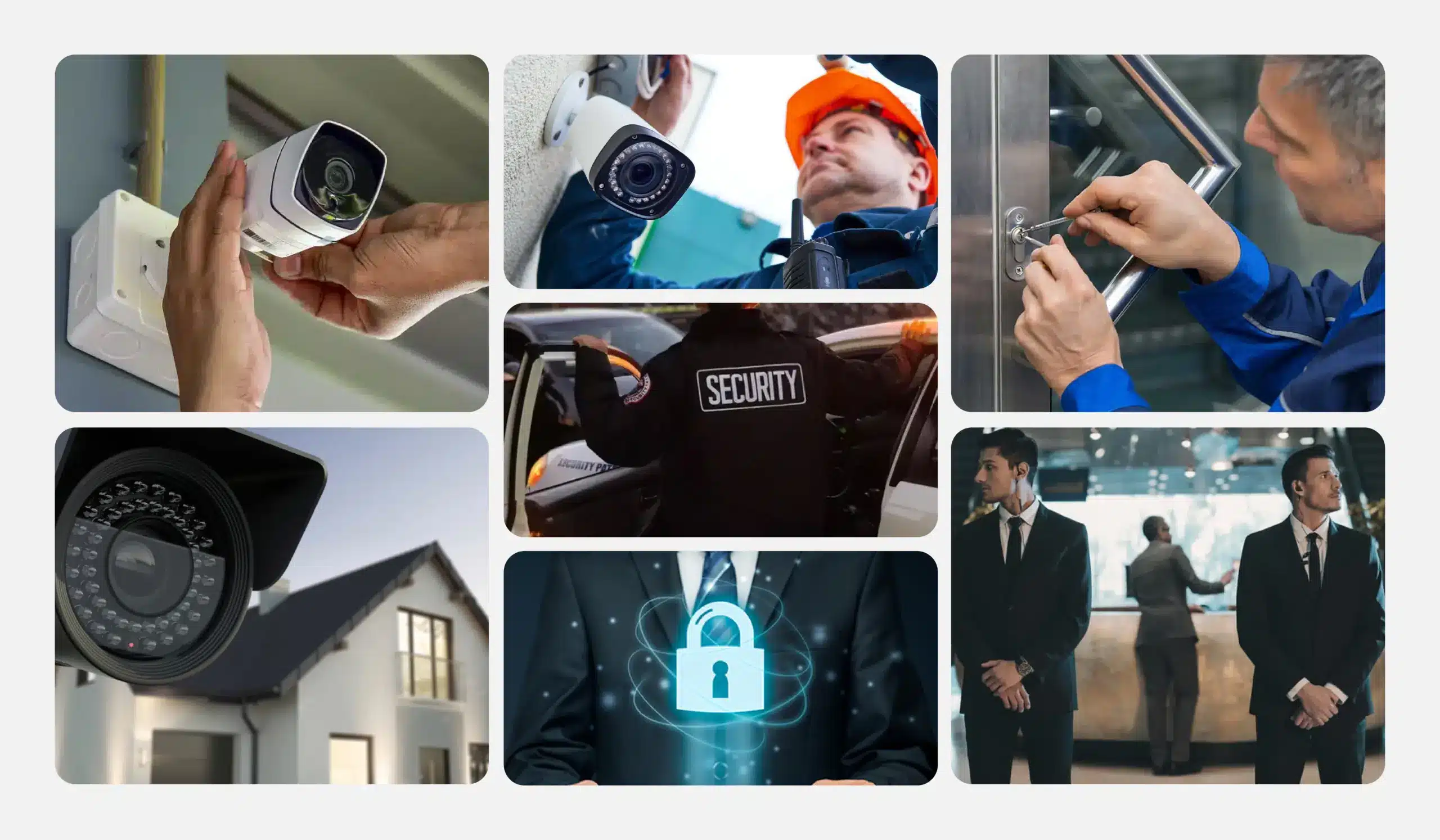
Security guard and patrol services
Audience: Businesses, property managers, homeowners, and organizations hiring guards or patrol teams.
Tone: Authoritative, dependable, professional.
Fitting symbols: Shield, badge, watchtower, patrol vehicle, abstract protection marks.

Pitfall: Overusing shields, badges, or aggressive imagery can make the brand look generic or intimidating.
Home security and alarm companies
Audience: Homeowners, families, landlords, and residential property managers.
Tone: Reassuring, trustworthy, responsive.
Fitting symbols: Home outlines, protective shapes, sensors, connected locks, subtle shield forms.
Pitfall: A literal house-and-lock logo can look like every other residential security company.
Cybersecurity firms
Audience: Businesses, IT teams, startups, and organizations protecting digital systems and data.
Tone: Technical, intelligent, modern, trustworthy.
Fitting symbols: Circuitry, data lines, nodes, abstract geometry, digital locks, and simplified marks that work as app icons.
Pitfall: Filling the cybersecurity logo with tiny circuit details can make it difficult to recognize at small sizes.
Locksmiths
Audience: Homeowners, businesses, property managers, and customers needing immediate lock or key services.
Tone: Reliable, accessible, practical.
Fitting symbols: Keys, keyholes, locks, hardware-inspired shapes, or simplified lettermarks.
Pitfall: Combining a literal key, lock, and house can quickly become cluttered and predictable.
Event and bodyguard security
Audience: Event organizers, executives, celebrities, venues, and private clients.
Tone: Discreet, confident, professional.
Fitting symbols: Abstract shields, strong geometric forms, initials, protective circles, or understated emblem logos.
Pitfall: Aggressive imagery such as weapons or intimidating figures can make the company feel less approachable.
CCTV and security installation companies
Audience: Homeowners, businesses, property managers, and organizations installing surveillance systems.
Tone: Technical, dependable, precise.
Fitting symbols: Camera lenses, surveillance frames, viewing angles, network nodes, sensors, or abstract monitoring symbols.
Pitfall: Using a literal CCTV camera as the entire logo can make the brand feel more like an equipment installer than a complete security company.
What are some security logo examples based on style?
If you’re confused about which one of the logo types to pick, we can help you decide what will work best for your business.
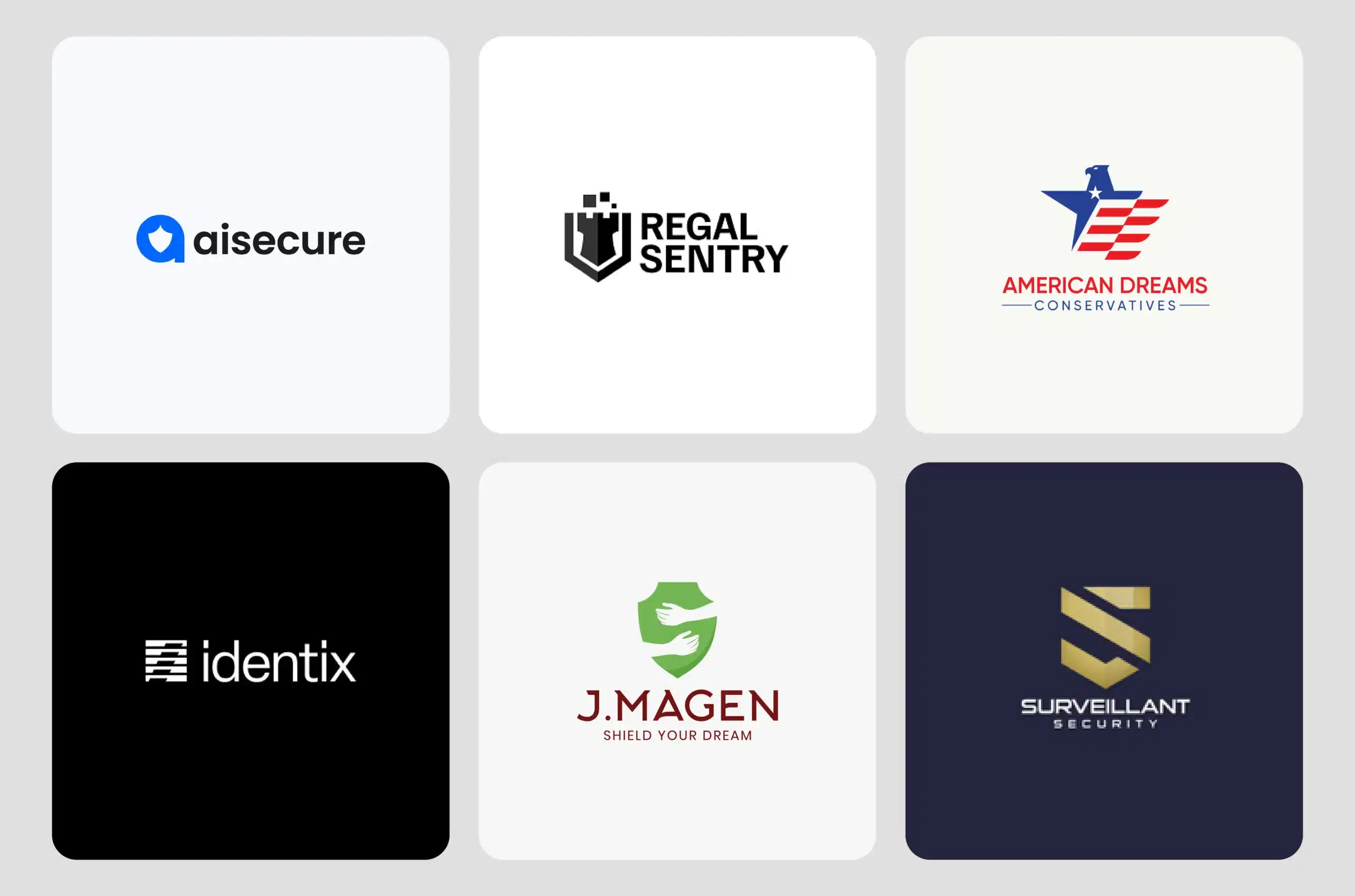
Shield logos: Shield, badge, and emblem logo styles can communicate protection, authority, and trust at a glance. They can also help the brand move beyond the standard security template.
Lock, key, and keyhole logos: These logo shapes naturally connect with security, access, and protection. They can be integrated into letters or abstract marks to create something more distinctive.
Animal and mascot logos: Lions, bulldogs, eagles, owls, and wolves can give guard services a bold and recognizable personality. Mascot logo design can also communicate strength, vigilance, courage, or protection.
Abstract and geometric logos: Abstract marks can create a more distinctive security identity without relying on obvious locks or shields. Circle logo and triangle logo concepts can add structure, balance, and symbolism while remaining simple enough for digital and physical use.
Typographic Logos: A strong wordmark logo puts the company name at the front and center of the identity, making it easier to build recognition around the brand itself. Monograms and letter-based symbols can also create a compact mark for uniforms, vehicles, and app icons.
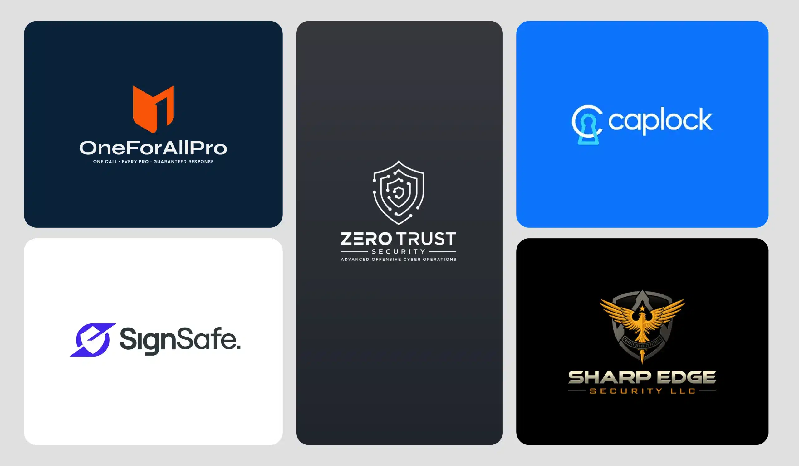
What are the best practices to follow for a security company logo?
Following the best practices for logo design results in impactful, professional logos. We follow the best practices, which is why our logos tend to be timeless, professional, and recognizable.
For security company logos, we recommend considering the following before you get into the actual creative design process.
Can a security company use a police-style logo or badge?
No. A security company can’t use a police-style logo or badge. When we design a healthcare logo, it needs to be HIPAA-compliant; similarly, you have to be very careful with police-style branding.
Rules vary by location. Some areas restrict badges, shields, police-style colors, and wording that could make a private security company look like law enforcement. For example, Vail, Colorado restricts badges or insignia that imply a law enforcement role.
Common elements that can cause problems include:
- Police-style badges or shields.
- Stars or official-looking insignia.
- Government seals or emblems.
- Police-like colors or uniform patterns.
- Words like “police,” “officer,” or “enforcement”.
- Logos that closely resemble a local police agency.

Small Business Tip: Before using these elements, check your local security licensing authority. Rules can differ by state, city, or country. This is general information, not legal advice.
What security logo symbols can be used beyond shields and locks?
Shields and locks are easy to understand, but they are also common across the security industry. If you want something more distinctive, you can build the logo symbol around what your company actually does.
When a shield works: A shield fits guard services, home security, and protection companies because the message is immediate. Give it a custom shape, simplify the details, or work an initial into it to make it feel less generic.
Other alternatives you can use:
Eyes: An eye suggests watchfulness and monitoring. It’s a natural choice for CCTV, surveillance, and security monitoring companies.
Towers: A tower can represent watch, coverage, and protection. It works well for patrol and surveillance brands that want something more visual than a lock.
Animals: Lions, wolves, eagles, and owls can give a security brand a stronger personality. Use a distinctive mascot logo design rather than a stock animal that could belong to any company.
Abstract Marks: Circles, triangles, lines, and custom geometric shapes can create a clean, modern security identity. They’re especially useful for cybersecurity and technology-focused companies.
Monograms: Turn the company initials into the symbol. A well-designed monogram can feel established and professional without relying on a literal security icon.
Negative Space: Hide an eye, animal, letter, or other shape inside the main mark. Negative space adds an extra layer of meaning while keeping the logo simple.
Letter-Built Symbols: Make the letter itself do the work. An “S” could become a shield, eye, gate, or other security-related shape, giving the symbol a direct connection to the company name.
|
Symbol |
Best fit |
Brand feel |
|
Shield |
Guard & protection |
Strong, trusted |
|
Eye |
CCTV & monitoring |
Alert, watchful |
|
Tower |
Patrol & surveillance |
Secure, established |
|
Animal |
Guard services |
Bold, powerful |
|
Abstract mark |
Cybersecurity |
Modern, technical |
|
Monogram |
Premium security |
Professional |
|
Negative space |
Any security brand |
Clever, distinctive |
|
Letter-built symbol |
Established firms |
Custom, memorable |
Small Business Tip: Shields, locks, keyholes, stars, eagles, and checkmarks appear frequently in security logos. The symbol itself isn’t the problem; a predictable execution is.
What logo color combinations are good for a security company logo?
Before a client reads a single word on your website, your logo’s colors have already told them something. Security is a trust business first, and everything else is second. So the palette you choose needs to carry that weight quietly, without screaming for attention.
Some of the best logo color combinations lean into calm authority; others add the energy of warmth, but the best ones all point back to the same idea: this company has things handled.
Navy blue + White: Clean and classic colors. The colors don’t try too hard, which is exactly what most clients want from a security service provider.
Black + Dark Gray: These colors quietly build authority and a sense that this company handles things calmly.
Blue + Orange: An unexpected combination of color, but works effectively. The blue keeps things grounded and trustworthy while the orange adds energy and warmth.
Red + Blue: A bold combination indeed. The colors read as both strong and efficient. Works well for brands that want to be a little more assertive. See blue logo vs. red logo.
Black + White: The colors give a security brand a timeless, sharp, and endlessly versatile look. It’s a safe bet if you want to look like an established, no-nonsense brand.
Navy + Gold or Nude Accents: Adds a touch of elegance to the seriousness of navy, giving the brand a more upscale feel.
Green + Red: Another less common combination, but the contrast creates visual energy and can help a logo stand out in the crowded market.
What typography should be used in security logos?
Security logos need bold, clean, and legible typefaces. The main aim is to use types of fonts that convey trust, professionalism, and strength.
Sans-Serif: Helvetica or Open Sans are clean and modern fonts that offer legibility, scalability, and a contemporary, professional feel.
Serif Fonts: A very traditional approach in our opinion, but they can evoke heritage, reliability, and institutional authority. We recommend using them for established physical protection firms.
Slab Serif Fonts: Rockwell is a great example. The fonts in this category are heavy and structured. The project is industrial-strength, robust, and has a solid structural foundation.

How to use typography the right way
- Use medium-to-bold letter weights to convey the message of stability and power.
- Stick to a maximum of two complementary typefaces.
- Ensure text remains readable in different logo sizes.
- Avoid cursive, handwritten, overly curved, sci-fi-style, or vintage fonts.
Where will your security company logo appear?
Last, but not least, think about where your security company logo will appear. Set a clear direction on where you plan to use the logo because it’s definitely going to impact how the logo is designed.
Your logo will be on uniforms, embroidery, and patches; vehicle wraps, yard signs, and decals. Most importantly, it’s going to be on ID badges and access cards. Then consider digital platforms: website, app icon, favicon, and social profiles.
You need a file checklist of a full-color, one-color, reversed, icon-only, SVG, PNG, PDF, and embroidery file; all scalable versions of the logo without compromising legibility.
How to design a security company logo
Your next concern might be how to design a security company logo. Well, we can’t say it’s easy, but it’s definitely worth it for your business, no matter what approach you take.
Whether you DIY it, use an AI logo maker, or hire a designer, following the right steps can help you create a strong logo.
A typical logo design process looks like this:
1. Know your business
You need to know your business to its core. Ask yourself:
- What do you offer?
- Who are the services for?
- What is your niche or industry?
- What personality do you want your brand to have?
- What values do you want the logo to show?
- What makes you entirely unique?
When you have clarity on these questions, you can easily explain them to a designer or add them to your prompt for a custom security company logo.
2. Research strengthens the foundation
Any logo designer starts a project with in-depth knowledge and research about the industry, audience, business, and most importantly, competitors. Strong research can lay a solid foundation for a security company logo.
Analyze what competitors are doing well, what your audience is responding to, and what’s working in the industry. This way, you get a good start to conceptualizing the design.
3. Check local rules
Before you start designing, check what rules apply in your area. In some places, you’re forbidden to use police-style badges, some specific words, and colors that might confuse your security service with government services.
4. Conceptualizing the design ideas
You need to experiment with a few design directions. Mix and match colors, typography, and icons to come up with a few concepts.
Exploring different design directions can help you decide what works best for your business. Sketching logos on paper, then creating the concepts in the best logo design software in black and white, gives you an overview of which direction you need to take.
5. Testing the logo
Once you finalize a design, the next step is to test the logo. You may wonder why testing a logo is necessary. It’s because you need to find out what it looks like in the real world. Design a few mockups to test the logo in different sizes.
We advise people to always get second opinions. Feedback helps you understand how your logo is perceived by the audience and whether it’s making the impact it’s intended to.
6. Finalize the logo and consider trademarking it
When you’re satisfied with the result, finalize it in all sizes, variations, file formats, and logo usage guidelines. After we deliver the logo and all required files, we ask clients to consider trademarking it.
If you don’t know how to trademark a logo, the USPTO can guide you through the process. You can check the eligibility criteria before you file the application. Similarly, to copyright a logo, visit the U.S. Copyright Office website to file your application.

Helping Jovicard Move Beyond Access Cards
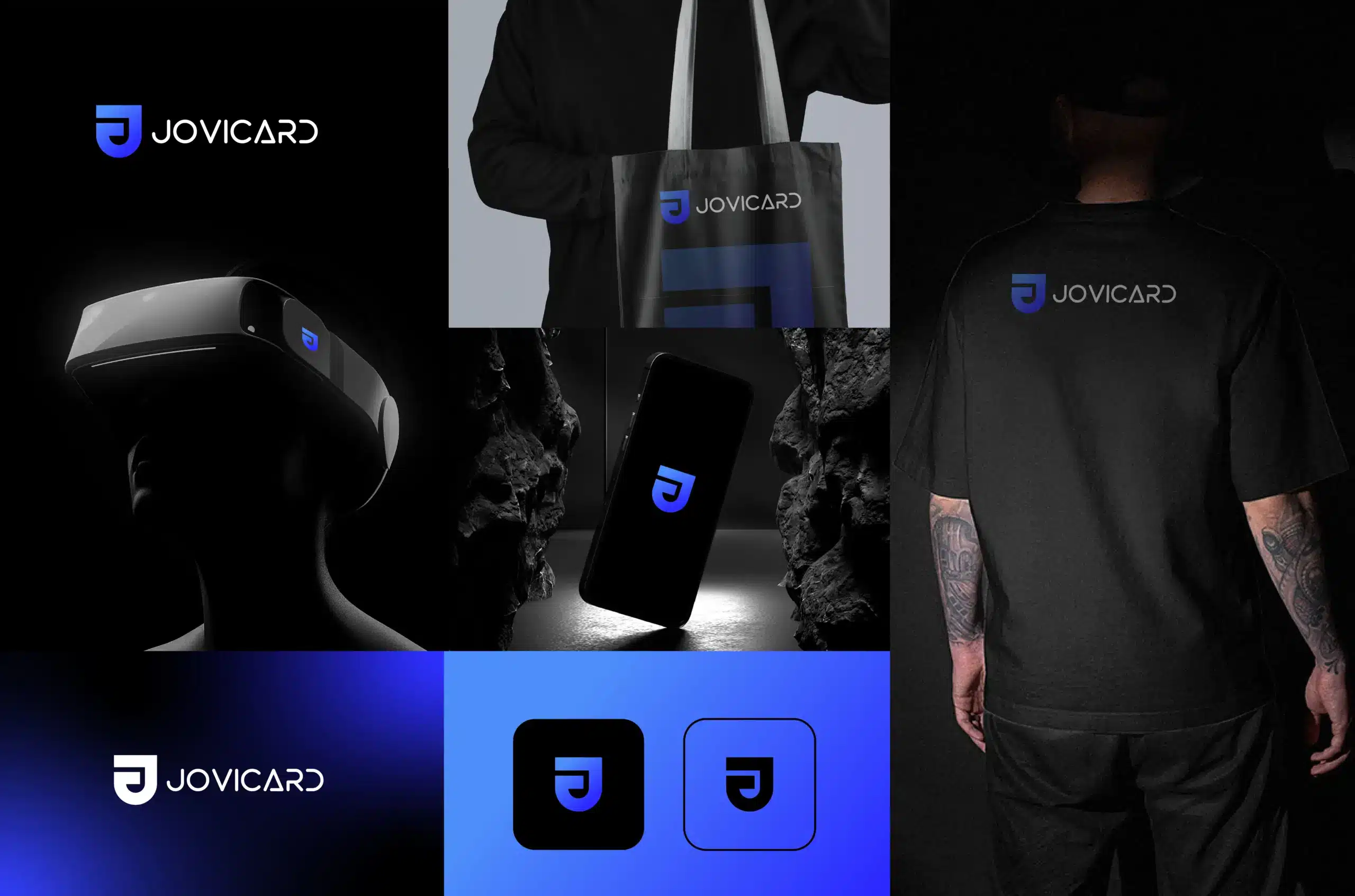
Jovicard is a great example of breaking the security industry norm. They are a leading provider of access cards and electronic security solutions. We worked with them in 2025 on a rebranding project.
Jovicard needed a brand-new identity that matched their transformation in the security tech industry. We approached the rebranding with a minimal, corporate, hi-tech, and sophisticated feel. The idea worked well to reposition Jovicard as a reliable technology and security solutions provider.
What option should I choose: DIY/AI logo maker, logo designer, or logo design company?
When you finally decide to get a logo designed, the hardest choice is choosing among the three most common options.
- Design it yourself using DIY logo makers or AI tools.
- Hire a logo designer.
- Hire a logo design company.
Each option has its own perks and drawbacks. Here’s a quick breakdown of what each offers and the logo design cost to expect.
What are the pros and cons of DIY/AI logo makers?

Pros
- Low cost
- Quick and easy to use
- No design experience needed
- Lots of templates and icons
- Instant results
- Easy to edit yourself
Cons
- Designs can look generic
- Limited originality
- Less control over the final result
- Similar designs may already exist
- Trademark and ownership can require extra checking
- Limited strategic input
Average cost: $0–$50 for DIY and AI logo makers.
Should you hire a logo designer?
Pros
- Custom logo concepts
- Direct communication with the designer
- More originality than DIY tools
- Flexible design direction
- Professional logo files
- More control over the final design
Cons
- Quality can vary by experience
- Timelines may vary
- Strategy may be limited
- Revisions may be limited
- Ownership terms can vary
- You may need separate help for branding
Average cost: $300–$2,500 for a freelance logo designer.
Should you hire a logo design company?
Pros
- Custom logo concepts
- Strategic design direction
- Professional revisions and feedback
- Consistent branding across assets
- Scalable, professional logo files
- Can support your brand as it grows
Cons
- Can cost more than DIY tools or freelancers
- Quality can vary between companies
- Some packages limit revisions
- The process may be more structured
- Branding depth varies by package
- Some companies may offer more than you need
Average cost: $100–$2,500 for a logo design company.
Best logo design companies to hire for your security logo
We’ve shortlisted some of the top-rated logo design companies for your security tech logo:
- Logo Design Valley
- Superside
- Logo in Hours
- Catchword
- Outcrowd
- Gatorworks
Ready for a Security Logo That Looks Professional?
If you’ve decided a logo design company is the right fit, Logo Design Valley can create a custom security logo built around your business and where it needs to appear. Get a professional logo without the agency-sized price tag.
Get yourself a remarkable security company logo
Your security business needs a good logo without a doubt. It’s going to do wonders to position your business as a polished, established, and professional name in the security industry.
Working with a logo design company can bring branding intricacies to your visual identity. At Logo Design Valley, we’ve worked with numerous security businesses. Each one brought us a new challenge. We strategize, design, and achieve with experts.
Our logo design company in Dallas is ready to work with SMBs and established brands across the USA. We design for the present and future of security!
Author Bio

 verified expert
Duaa writes blogs about marketing, branding, web design, and logo design. She enjoys turning ideas into simple, engaging content that helps businesses build stronger brands and connect with their audience in a more meaningful way.
Still choosing the right logo design company?
Get a quick, expert review. No pitch, just clarity on what fits your stage, budget, and growth.