We all have heard how Starbucks logo began its journey in Seattle; from a small scale to eventually gaining global fame. Starbucks has made its way to success like no other coffee brand. It’s a basic image showing a mermaid inside a green circle. This mermaid originates from ancient tales of the ocean. The color green signifies positive concepts such as development and achievement. Starbucks expanded greatly through strategic marketing and widespread store openings. Their logo can now be seen on cups worldwide. The coffee cup is no longer just a symbol for coffee; now, it represents social gatherings, comfort, and a sense of belonging, no matter your location.
A Brief History of Starbucks
Starbucks serves as the coffee brand icon in modern times, was founded as a modest coffee bean roaster at Seattle’s Pike Place Market in 1971. In the past, the old Starbucks logo looked quite different from the famous green siren we recognize now. The initial Starbucks emblem showcased an intricate circular design influenced by a Norse woodcut from the 16th century. The image showed a topless mermaid, a legendary being called a siren in tales, having two tails. The text nearby contained the brand “Starbucks” and mentioned “coffee, tea, and spices,” indicating the wide variety of items they sold back then. This logo featured a deep brown color palette, inspiring feelings of heritage and past.
The choice to include a siren in the logo was influenced by Seattle’s history with the sea. Nevertheless, the initial design caused some disagreements because of the mermaid’s lack of clothing. This set the stage for the logo’s development, which would be pivotal in Starbucks’ transformation into a worldwide coffee powerhouse.
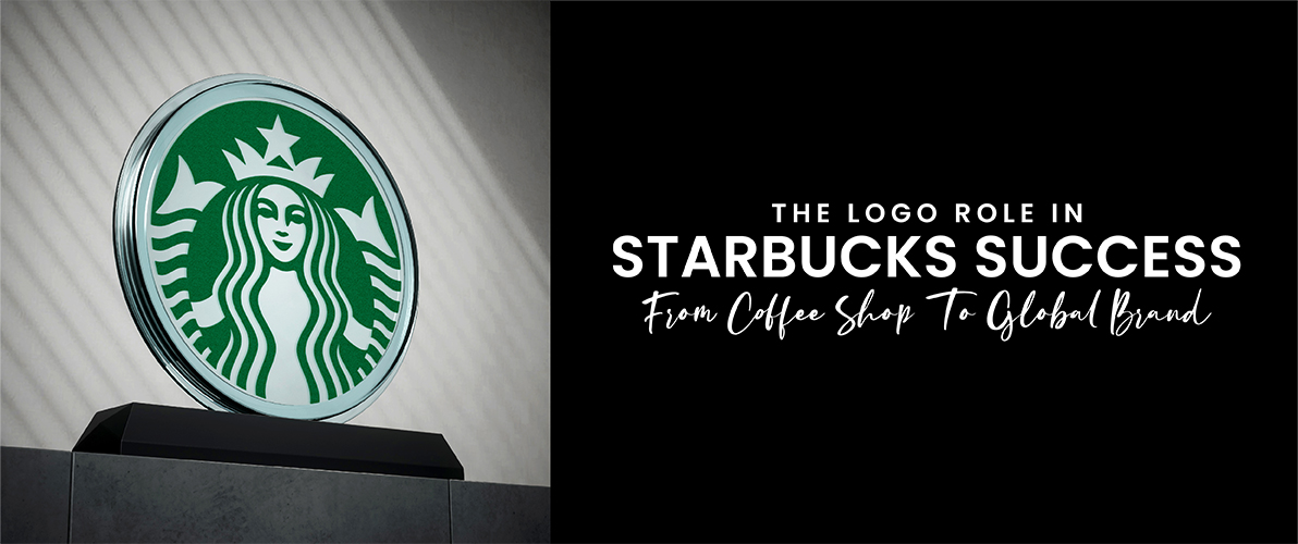
The Logo Role in Starbucks Success
The initial logo, though, provoked some discussion. Not everyone was comfortable with the detailed portrayal of the bare-chested siren. This unforeseen obstacle marked a pivotal moment, laying the groundwork for the logo to grow and change – a shift that played a key role in Starbucks’ journey to worldwide recognition.
Over time, the siren lost her intricate characteristics and revealing clothing. The logo was simplified, made cleaner, and updated to be more modern. The color scheme changed to a lively shade of green, representing renewal, development, and the organic environment of coffee. This simplified layout connected with a larger group of people, causing the Starbucks emblem to be easily identifiable and setting the stage for their global achievement.
Curious about how a logo can achieve global popularity? There is no cheat or hidden formula available! It requires greater exertion and dedication than you anticipate. Only the most skilled designers and imaginative people can bring up concepts like Starbucks logo and similar renowned brands. If you are to establish your brand identity, it is best to acquire the services of a professional logo design company such as Logo Design Valley.
Ready to Brew Up Your Brand Identity?
Our team brews logos as unique as your brand’s story.
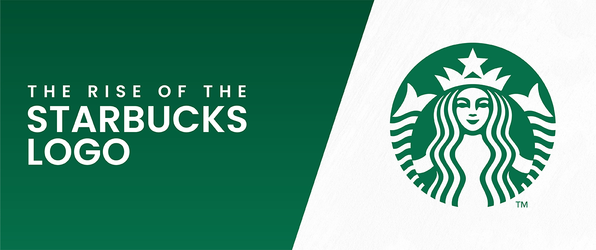
The Rise of the Starbucks Logo
The first starbucks logo showcased an intricate, round depiction of a siren – an enchanting creature with a fish-like tail and upper body. Unlike the well-known green and white, this logo displayed a luxurious brown color palette, bringing to mind tradition and Starbucks history.
It is intriguing that the siren was not only selected for its appearance. It honored Seattle’s maritime legacy, a smart recognition of the city’s connection to the sea.
The Siren’s Legacy
The Starbucks original logo controversy sparked a significant transformation. Throughout time, the Starbucks logo went through multiple improvements. The previously elaborate siren lost her complex characteristics and revealing clothing. The logo adopted a more streamlined, more contemporary, and cleaner aesthetic. The vibrant green color scheme represented freshness, growth, and the natural coffee world.
This simplified layout connected with a larger group of people. The Starbucks logo evolved beyond its original intention and became easily identifiable. It acted as a strong representation, a guiding light for coffee enthusiasts around the globe. The siren, once a source of controversy, is now a worldwide symbol, her legacy forever linked to Starbucks’ impressive success.
A Look at the Evolving Starbucks Logo
Since it first appeared at Pike Place Market in 1971, Starbucks’ logo has been changed. At first, a complex brown alarm with detailed designs showcased their wide range of products. In 1987, a green revolution began, reflecting the company’s transition with a vivid color representing progress. In 1992, the mermaid also changed to become more streamlined and contemporary. In 2011, the siren emerged as a bold representation of Starbucks’ worldwide domination in the coffee industry.
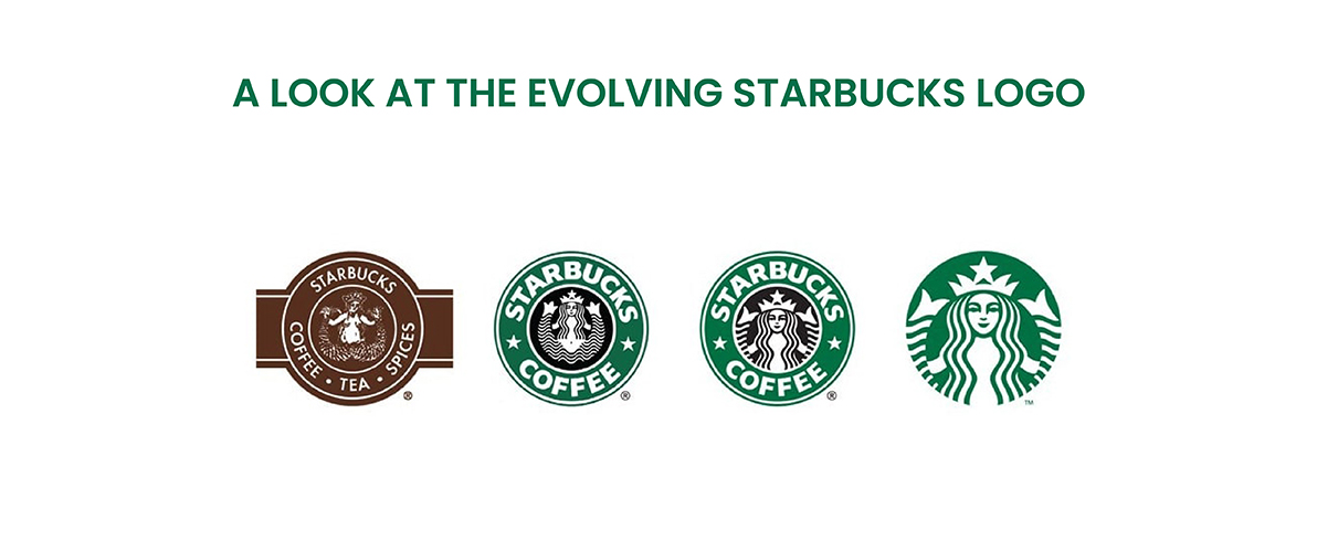
1971: A Bold Beginning
When Starbucks first started in Seattle’s busy Pike Place Market, its logo was very different from the modern, green symbol we recognize now. Based on a woodcut from the 16th century, the Starbucks first logo displayed an intricate circular depiction of a siren, which is a mythical being with an enchanting fishtail and upper body. Contrary to the typical green and white colors, this logo featured a deep brown shade, bringing to mind notions of heritage and past events. The nearby text featured the brand starbucks name origin and the terms “coffee, tea, and spices,” showing the diverse range of products they offered back then.
1987: Green Revolution
Starbucks was experiencing major transformations by the year 1987. The company purchased Il Giornale, a local coffee roaster chain known for its bright green logo. This purchase represented a pivotal moment for the Starbucks emblem. The complex siren was made simpler by removing some of her intricate details. The color scheme experienced a significant change, shifting from brown to a vibrant green. The green color represented freshness, growth, and nature in the coffee industry, fitting well with Starbucks’ increased emphasis on high-quality coffee beans.
1992: A More Modern Mermaid
The green revolution persisted in 1992. The emblem received an additional enhancement of the mermaid logo. The remaining intricate elements had disappeared, being substituted with a more modern and streamlined design. The siren’s representation grew in size and prominence, becoming the focal point in the circular emblem. This more efficient method provided the logo with a modern and fresh sense, more accurately representing Starbucks’ changing brand image.
2011: The Siren Takes Center Stage
Starbucks made a daring move in 2011. They took away the text around the logo so that only the well-known green siren remained by itself. This choice demonstrated Starbucks’ worldwide presence and belief in the popularity of its brand. The simplified logo crossed language barriers because it was a professional logo design, becoming a strong symbol easily recognized by coffee enthusiasts globally. The siren, previously a topic of controversy, is now a worldwide symbol, her impact forever linked to Starbucks’ extraordinary story.
Hidden Details of the Starbucks Mermaid
The Starbucks siren seems basic at first sight, but upon closer inspection, intricate details are uncovered, adding complexity and fascination to the logo. A particular detail is the slight imbalance in her facial features. Designers intentionally made the right nostril lower than the left to add a hint of humanity. In a world where logos are flawlessly created, this imperfection helps the siren seem more accessible and understandable.
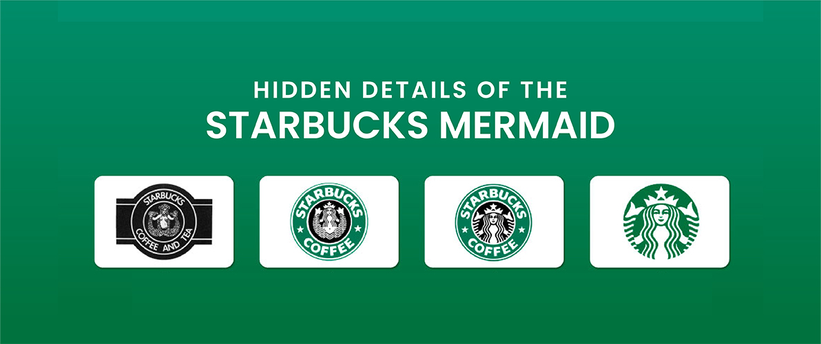
The hidden message is also conveyed through the color green. In addition to representing newness and development, it also connects to Starbucks’ origins in the maritime industry. Historically seen on ancient maritime maps, the green color subtly pays homage to Seattle’s maritime past, a smart nod to the city where this popular coffee company originated.
Design Elements that made Starbucks Logo Successful
The famous Starbucks Logo is more than just aesthetically pleasing; it is an exemplar in design. Below are a few critical components that played a role in its achievement.
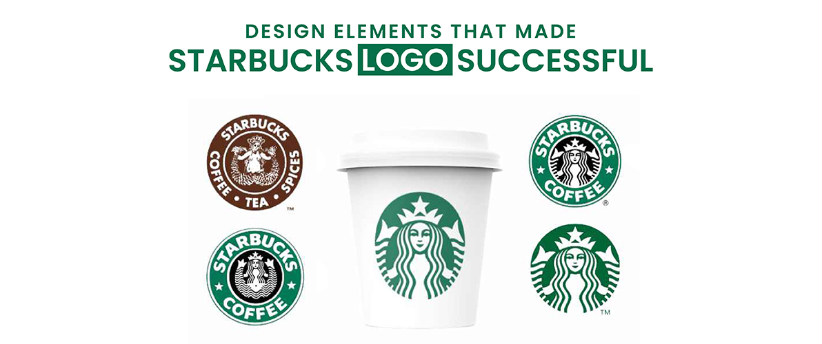
Evolution, not Revolution
No significant changes were made to the logo. Instead, it smartly developed as time passed. The core of the siren was preserved, yet it was streamlined to be sleeker, tidier, and more contemporary. This slow starbucks logo design evolution enabled customers to engage with the brand as it progressed.
Meaningful Symbolism
The mythological sirens, known for their charm and connection to the ocean, honor Seattle’s history as a maritime city. The introduction of the green color represents freshness, growth, and the coffee’s natural world, aligning perfectly with the brand’s emphasis on high-quality coffee beans.
Memorable and Recognizable
The streamlined design featuring the green siren is immediately identifiable. It rises above linguistic barriers and cultural differences, making it a strong worldwide Logo.
Versatility
The minimalist design of the logo makes it simple to use on different platforms, such as coffee cups, storefronts, merchandise, and marketing materials. This uniformity strengthens brand recognition and guarantees the logo’s effectiveness in all situations.
How to Design Your Logo Like Starbucks
Although copying Starbucks’ precise formula may not be recommended, here are key points to consider for creating your own logo design.
Select a symbol or picture that embodies the essence and values of your brand.
Don’t overload your logo with too many details. Strive for a simple and easily identifiable design. Colors can trigger feelings and connections. Select colors that are in line with your brand’s communication. A logo requires a financial commitment. Create a logo that has the ability to change and adjust without straying from its fundamental identity.
Best way is to partner with a logo design company to make a logo that communicates your brand narrative. This is how Brand Logo Design Valley can help you! We have a dedicated team of creative graphic designers. Our sole focus is on creating logos that leave a lasting impact. We take pride in collaborating with top brands to comprehend their vision and transform it into a potent visual Symbol.
Conclusion
The evolution of the Starbucks logo showcases effective branding practices. Starting with a complex pattern, the logo ingeniously transformed into the well-known green siren, captivating an international audience. Factors such as its strong symbolism, enduring design, and adaptability have contributed to its success. The Starbucks symbol represents not just the business itself but also conveys emotions of warmth, community, and pleasure in savoring a tasty coffee.
Key elements in creating a logo that communicates your brand narrative and connects with your target audience include emphasizing a solid concept, simplifying it, taking color psychology into account, and thinking about the future. You can think of types of logo design that represent your brand and remain timeless by adhering to these guidelines and taking inspiration from Starbucks’ triumph.
FAQS
When was Starbucks founded?
Starbucks opened its doors in 1971, starting its journey at Seattle’s Pike Place Market.
What is the Starbucks logo?
It’s a green siren – a mythical creature with a fishtail and upper body.
What does the Starbucks logo mean?
The starbucks logo meaning can be defined as, The siren represents Seattle’s seafaring past, while green signifies freshness and high-quality coffee beans.
What did the original Starbucks logo look like?
Much different! It was a detailed brown image with a two-tailed siren inspired by a historical woodcut.
What is the meaning of siren eyes?
Siren eyes meaning is a popular makeup trend that utilizes eyeliner and eyeshadow to achieve an elongated, seductive eye shape. It draws inspiration from the captivating gazes of mythical sirens and legendary creatures known for their allure.
Author Bio
Still choosing the right logo design company?
Get a quick, expert review. No pitch, just clarity on what fits your stage, budget, and growth.