In this article, we delve into the essential tactics that set exceptional logo design apart. From the art of simplicity and versatility to the psychology of color and shape, this article explores the key principles that professional designers employ to create logos that leave a lasting impression.
In the competitive landscape of business and branding, a top professional logo design serves as a visual cornerstone of a company’s identity. Crafting a logo that not only represents the essence of a brand but also leaves a lasting impact on its audience is a true art. The process involves more than just creative inspiration; it demands a deep understanding of design principles and strategic thinking. In this article, we will explore the essential strategies and techniques employed by top professional logo designers to create logos that stand out and tell a compelling story. Whether you are a seasoned designer seeking to refine your skills or a business owner aiming to gain insights into effective logo design, this guide will provide valuable knowledge to elevate your logo to the next level of excellence.
What makes a good logo?
A good logo is a simple yet powerful visual representation of a brand that instantly communicates its identity, values, and personality. It should be memorable, versatile, and easily recognizable, whether displayed on a billboard or a business card. Effective logos employ a careful balance of shape, color, typography, and symbolism to create a unique and enduring image that resonates with the target audience. Moreover, a good logo transcends design trends, remaining relevant and timeless, thereby establishing a strong and consistent brand identity.
What are some top professional logo design strategies?
A logo’s purpose extends beyond mere aesthetics. Serving as the core of your brand identity, it should encapsulate your company’s character. However, must you engage a designer for this task? Fortunately, no. Today, you can employ a free logo maker to create a professional, visually pleasing, and meaningful logo, even without being a graphic design professional. Regarding professional logo design strategies, there are a handful of fundamental yet crucial principles to remember. From adhering to guidelines about handwritten fonts to grasping the significance of balance and deliberate design, here are our recommendations for crafting a strong logo.
Look for conceptual icons:
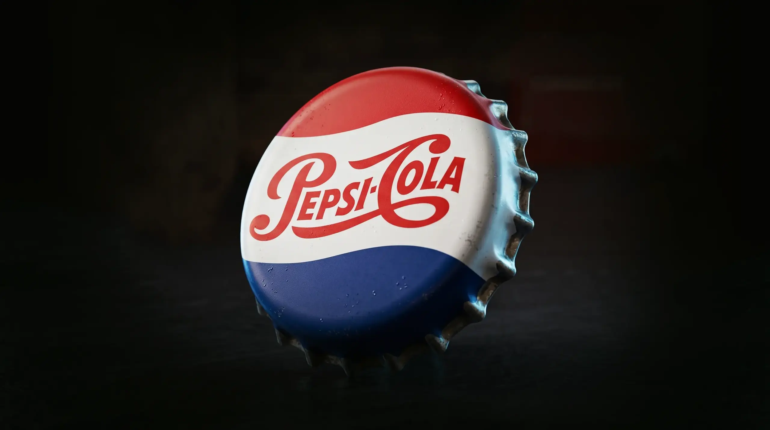
In the world of logo design, an icon is a simplified image that represents the essence of your brand. Many people mistakenly think that the icon must directly show what your product or service is, but that is only necessary for some businesses. Think about creating simple and symbolic images for your logo. Your logo can show something other than what your business does. For instance, the Nike logo, the “swoosh,” represents movement and speed, which works well for a sportswear brand. So, your logo should be like a symbol, not a detailed picture. It should be easy to recognize and make people feel something. A simple, memorable logo is better because people can remember it with just a quick look, whether it’s online or in the real world.
Use the space:
For many businesses, using only an icon only partially conveys their brand’s identity. When you create a logo with a logo maker, you will have several choices to incorporate your company name and tagline. Taglines, also known as slogans, are catchy phrases that capture a brand’s style and message. However, not all companies have taglines, and that is perfectly fine. Nevertheless, you should not overlook this valuable space. If your company name allows, you can split it into two lines, maintaining the same font and size for both lines, even if you do not have a tagline.
Explore using caps or lowercase:
It is often the minor elements that can have a big impact on creating a great logo. Even something as simple as changing how you use capital and small letters can take your design to a higher level. Typically, logos with all capital letters look powerful and authoritative, while logos with all small letters give off a friendly and relaxed feel. But you can also use capital letters and make them look friendlier by choosing the right colors. It is all about finding the right balance.
Try using handwritten fonts:
Using artistic fonts in logo design continues to be a significant trend. In particular, handwritten fonts are among the top choices for creating logos. They provide a unique and genuine quality that can please your customers. Using handwritten fonts for your tagline can be especially effective. If you have chosen one of these font styles, this logo design tip is relevant to you. Sometimes, using capital letters with handwritten fonts can make them appear less genuine, so keep that in mind.
Maintain stability in the tagline:
To make sure your logo remains clear and coherent, there is a straightforward guideline to remember: Your tagline should be shorter than your company name. That Is why we recommend keeping it within a range of 25 to 30 characters. Additionally, if you have chosen a bold or thick font for your company name, it is a good idea to select a thinner or more straightforward font for your tagline. This approach helps maintain a balanced and visually pleasing composition in your logo.
Balance your name and tagline:
The fundamental principle of design revolves around achieving visual equilibrium. Even though the tagline is typically smaller in size, it is crucial to ensure it aligns precisely with your company name. This alignment creates a natural sense of harmony that appeals to viewers and potential clients. In cases where either your name or tagline is substantially longer, you can easily address this by making adjustments to the font or size of either element, maintaining that crucial balance in your logo.
Put your Logo in a frame:
Similar to how the ‘Mona Lisa’ is enhanced by its exquisite frame, certain logos can benefit from an attractive border. If you opt for this approach, it is essential to create adequate space between the frame and your logo. Essentially, you need to provide your logo with some “breathing room.” If you find that the elements seem too close together, a quick solution is to enlarge the frame or reduce the font size. This adjustment ensures that your logo maintains a harmonious and aesthetically pleasing composition.
Improve readability:
Your logo plays a central role in your branding efforts, featuring prominently in various assets such as your website header and business cards. Regardless of where it is displayed, the legibility of the text in your logo is paramount. To ensure this, pay attention to the text size and font choices and assess the final outcome across different platforms like Facebook, Twitter, and Instagram, as well as on various devices such as desktops, smartphones, and tablets. After all, what is the use of designing a logo if it is too challenging to read? To fully realize the purpose of your logo, it must be easily legible in any context for every potential customer.
Make a scalable design:
Creating an effective logo involves ensuring its scalability. Regardless of the size or context, your logo should maintain its sharpness and recognition. This applies to both the text and any additional elements within the design. Logos that possess intricate or highly detailed features can be problematic when scaling down to smaller sizes. While there is no universal size that fits all, having a high-resolution vector logo that can be adjusted to different sizes and file types ensures its versatility and visual appeal in any setting. To gain a deeper understanding of logo sizing for various contexts, you can explore further resources on the topic.
Give a contrasting background:
Continuing the discussion about ensuring visibility, another method to ensure your logo is consistently noticeable is by opting for a background color that creates ample contrast with your text. For instance, if your text is white, selecting a darker background color like black can be a simple yet highly effective choice. It is essential to be conscious of your overall color scheme since colors possess significant influence in evoking specific emotions, whether it is feelings of love, joy, motivation, or something else. To make informed decisions about your logo’s color choices, consider delving into the realm of color psychology, exploring the color wheel, and understanding the concept of color space, all of which contribute to creating the most suitable combination of colors for your logo.
Size up your icon:
The dimensions of your icon play a crucial role in determining the arrangement of various elements within your logo. It is essential to ensure that your icon’s height is equal to that of your text. To address this, you have the option to resize your icon so that it matches the height of your text or even consider making it slightly larger. Maintaining a balanced proportion between the icon and text in your logo is key to achieving a harmonious and visually appealing design. By ensuring that the icon stands at a similar or slightly greater height than the text, you create a logo that exudes a sense of coherence and professionalism, enhancing its overall impact.
Keep in mind your competitors:
It is important to take a close look at the logos of competing brands to understand what effectively resonates with your target audience and identify areas where others might be falling short. Analyzing the logos of your competitors serves as a valuable exercise, offering not only strategic insights but also the opportunity to distinguish your brand from the crowd. For instance, if you observe that all your competitors predominantly use monochromatic wordmark logos, this presents an opportunity to set your brand apart by considering the use of color or unique typography in your logo design.
In conclusion, professional logo design is an art and science that requires careful consideration of various elements to create a powerful and memorable brand identity. From understanding the target audience to employing design principles effectively, these strategies play a pivotal role in shaping a successful logo. By following these top professional logo design strategies, businesses can establish a strong and enduring presence in the market, leaving a lasting impression on customers and setting the stage for long-term success. In an increasingly competitive business landscape, a well-crafted logo can be the key to differentiation and recognition. It is an invaluable asset for any company aiming to stand out and thrive.
Please visit Our Design Blog
Author Bio
Still choosing the right logo design company?
Get a quick, expert review. No pitch, just clarity on what fits your stage, budget, and growth.