Walmart Logo History for Design Inspiration
Bringing customers to a business repeatedly demands efficient branding, high service quality, effective promotion, and an iconic logo. Designing a logo that influences a mass audience is challenging and time-consuming. It takes a deeper understanding of attractive designs, the influence of elements, and audience appeal. Additionally, the idea behind any design needs inspiration for a captivating design. Nike Swoosh, UPS Shield, and Walmart Star logo are some of the best sources of inspiration for designers.
Logos of famous brands provide valuable insights into their story, history, and design elements that enhance a brand’s image. Learning from such designs can take your brand to the epitome of success and build customer trust. We will discuss the meaning, history, evolution, and strategies behind the famous Walmart logo for design inspiration. We will also list the strategies that could empower a logo for maximum influence, leading to audience engagement.

What Does the Walmart Symbol Mean?
The surname of founders Samuel Moore Walton and James Lawrence Walton inspired the name of the retail giant. Instead of the full name Walton, Samuel decided to use Wal and Mart to represent a store offering retail services. The same text was used in the old Walmart logo; the name has been a symbol of quality worldwide since then. However, understanding what does the Walmart symbol mean is beyond the meaning of the text in the logo.
Let’s review the origin and history of the brand and the story of Walmart logo evolution over the years. Exploring the design and changes is essential to enlighten the Walmart logo meaning further. Reading the entire blog will allow you to grasp precisely what is Walmart’s logo.
A Brief History of Walmart
1. The Origin
In 1945, Samuel Walton (Sam) acquired a Rogers, Arkansas branch of the Ben Franklin stores along with his brother James Walton (Bud). The two brothers focused on a low-margin-high-volume approach for their business and contacted low-cost suppliers to tackle competition. Revenues grew 45% in the first year, and within five years, the store generated $250,000 in revenues.
The first challenge to the business was the expiration of its location’s lease. Sam opened a new store in Bentonville and named it “Walton’s Five and Dime”. In 1962, the first Wal-Mart Discount City store opened in Rogers. FedMart, another famous store chain, inspired the new name. The next five years brought growth as 18 Arkansas stores opened, making $9 million in revenues.
2. Nationwide Expansion
In 1968, stores were opened in Sikeston, Missouri, and Claremore, Oklahoma, laying the foundation for nationwide expansion. In 1969, the company went public as Wal-Mart Inc. and later changed the name to Wal-Mart Stores Inc. in 1970. It now had 38 stores in five US states, making around $44 million in revenues. More stores in Tennessee, Kentucky, and Mississippi opened in 1973 and 1974. The first Texas store was inaugurated in 1975 when 125 stores were operating with over $340 million in sales.
The year 1980 saw the emergence of 4 hypermarts offering various product lines. By the company’s silver jubilee, it had around 1200 stores, with sales reaching nearly $16 billion. In the same year, a $24 million investment was made in a satellite network allowing the firm to operate. The largest private satellite system made tracking inventory, sales, and operations easier while assisting communication. In 1988, Sam stepped down as the CEO, and the firm opened the first Walmart Supercenter in Washington. It expanded to California and Pennsylvania in 1990.

3. Multinational Expansion
Walmart entered Mexico in 1991 and Canada in 1994 as the first expansion beyond the US. It further expanded to Brazil, Argentina, and Europe in 1995. The company bought the British supermarket chain Asda for $10 billion in 1999 and continued building its global empire. By 2005, Walmart had over 3500 stores in the US and over 2500 global stores and sales over $312 billion. Surprisingly, it was 2.4% of the US GDP, which stood at $13 trillion. In 2007, the company rolled out the current slogan in advertisements: “Save Money. Live Better”.
According to Global Insight, the company helped save around $957 per person, amounting to $287 billion in 2006. In 2011, it started the “Walmart To Go” online delivery service. The company was the biggest commercial producer of solar energy in 2015, with 17 energy projects. Acquiring ‘Parcel’ (a tech-based same-day delivery service), it began deliveries under the brand “Spark” with private vehicle owners. In 2019, it launched a free one-day shipping service on more than 200,000 items on a minimum $35 purchase. Sales increased by 10% as online sales rose due to the COVID-19 pandemic when people ate at home.
Walmart Logo History and Evolution
The history and evolution of the Walmart symbol are a great source of inspiration to designers and managers. It provides key insights into its branding and logotype to attract and retain its clients. The brand’s logo seems like a wordmark that uses no design, but wait till we evaluate the history and evolution of its logo in different aspects. The Walmart logo evolution also tells a lot about why rebranding is important, as the Wal-Mart logo moved to using Walmart.
1945-1962
The old Walmart logo went through many changes, enhancing the Walmart logo over the years. The original logo was a simple name display, rather than an emblem, used for mentioning the store. It had no styling, no design, and not even a color palette. A general misconception is that Sam used the Wal to save board space. The low-price policy empowered the Wal-Mart logo.

1962-1964
One major issue with wordmarks is that no design elements add creativity. The brand’s first logo was plain and simple and used a font style as the first store board. However, using capital letters and a blue fill made it appealing and attractive for the audience. The font of the brand name was printed on any available printer. The design paved a new path in Walmart logo history.

1964-1981
It was the first time that the company decided to use a font and styling. The Frontier font logo was stylish, used all caps, and featured a hyphen between the Wal and Mart. For years, it glorified the brand in black and remained a symbol of economic pricing and grocery shopping.
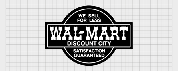
1968-1981
The Discount City emblem was also apparent in advertisements and employee uniforms. Never used as a logo, the emblem also enjoyed a high perceived value among customers. It helped bring customers without exterior display or even showing up on the annual company reports.

1981-1992
The frontier text styling was dropped, and the all-caps letters with a hyphen were retained. The bold font adopted a dark brown shade that symbolized service quality and prestige at that time. The company was set to expand offshore, and the change helped it gain global attention.

1992-2008
The first time the company used a design element in its logo was in 1992. A star was used, replacing the hyphen in its symbol. The blue star shape reflected its US origin and presented it as a top-performing star. It can still be seen in some remote store locations.

2008-2025
The company adopted modern styling, removing the star and using a Walmart Spark in its logo. Capitalizing only the initial letter and using a softer Sans-serif font appears friendly and attractive. The modern Walmart star with six sparks also reflects its key values and ideas, empowering its image. The star uses a gold-yellow color that promises inspiration and ingenuity.
Strategies That Empower the Logo
Understanding the Walmart logo meaning also demands analysis of the strategies that empower a logo. Let’s review some strategies defining the true Walmart symbol meaning. Businesses can adopt the following strategies to grow and build better customer relationships.
1. Price Leadership
The leading factor in Walmart’s growth over the years is price leadership. Companies that take necessary measures to provide valuable products and services at economical rates grow rapidly. The slogan best describes this strategy: “Save Money. Live Better”.
2. Expansion and Replication
Most businesses become stagnant with time and need newer markets to grow. Expansion and replication of business models in other regions can lead to success. A business’s continuous growth and expansion are necessary for building a global, influential, and powerful brand image.
3. Adaptability
Businesses must be adaptable to change, branding, or rebranding according to situations. The small Walmart logo, known as Spark, signifies the importance of flexibility. Walmart old logo was too dry, and the absence of a symbol made the Walmart old logo appear rigid.
4. Social Responsibility
The small Walmart logo, the Spark, claims “Working Together to Spark Change”. It reflects the value of socially and environmentally responsible branding. The company’s focus on going green, reducing greenhouse gas emissions, and rescue services in Hurricane Katrina reflect its responsibility. Walmart Plus program further helps its customers to save money.

5. The Power of Colors
Walmart colors have been changing since the first logo. The reasons for these changes are expansion, target audience preferences, and changing trends. Selecting Walmart colors alone would not do wonders for your brand. It’s the audience’s emotions and value-driven reasons behind the Walmart color that play their part.
Conclusion
The purpose of this writing is to convey the Walmart symbol meaning. The answer to what is Walmart’s logo depends on whether you are a business manager, marketing professional, or graphic designer. The blog offers vital insights into the history, logo evolution, and empowering strategies that help glorify Walmart Spark. People from every field can take inspiration and utilize concepts from famous brands to boost their business revenues.
Effective strategies bring growth by influencing the audience, assisting expansion, and enhancing the brand’s image. The new Walmart colors reflect its value proposition and customer service by influencing the audience visually. A custom logo design company with expertise and experience in creating professional logo designs can boost revenues and bring growth.
Author Bio
Still choosing the right logo design company?
Get a quick, expert review. No pitch, just clarity on what fits your stage, budget, and growth.