Is there a way for your logo to gain attention without being loud but instead by charming with a subtle assurance? Negative space is the secret weapon behind iconic logos. The important element is not the bright colors or complex patterns but the gaps separating them. It’s the soft words that remain even after the loud ones disappear. Negative space, when utilized strategically, has the power to add concealed significance, generate surprising complexity, and change your logo from easily forgotten to memorable.
Using negative space in your logo can create curiosity and prompt a stronger bond with your brand. If your logo seems to get lost in the visual chaos, don’t worry! In this manual, we will reveal the mysteries of negative space and teach you how to utilize its potential to create a logo that communicates a lot, even in a subtle manner.
What is Negative Space?
Have you ever observed a piece of artwork and realized how the blank spaces surrounding the primary focus can be equally mesmerizing? That is the wonder of empty space. It’s more than just empty space; it’s a thoughtfully planned area that is essential to the entire design.
Imagine it as an empty canvas encircling the protagonist of a theatrical performance. The absence of space enables the character to be prominent, to have room to move, and to share its narrative. In negative space art, artists intentionally use blank areas to form shapes, structures, and concealed messages that hold equal significance to the main elements.

This idea transitions seamlessly into the realm of design, particularly negative space logos. The empty void in the logo’s identity is not just a passive space; it plays an active role. It is capable of forming surprising forms, providing a sense of depth and dimension, and concealing hidden messages in the design.
Why Negative Space Matters in Logo Design?
Negative space is crucial in logo design for several reasons.
Utilizing negative space in a logo can simplify it, creating a more clear and memorable design. This is especially important in the current digital era, as logos must appear visually appealing in small dimensions. Negative space in a logo can give the impression of depth, making it more captivating and visually appealing.
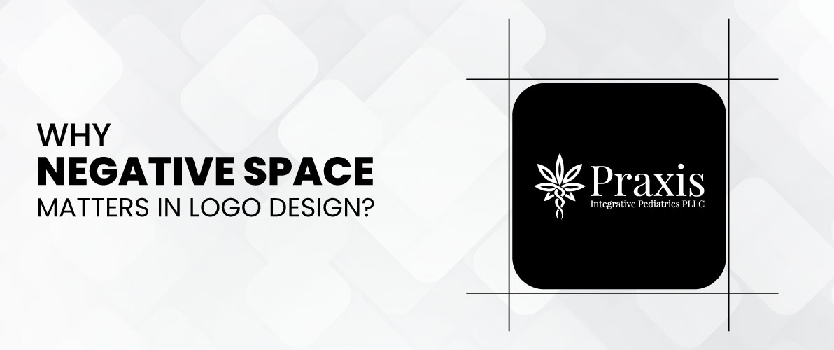
Utilizing negative space in a logo can cleverly incorporate messages or symbols, enhancing the brand identity with an extra dimension. This has the potential to ignite interest and establish a deeper bond with audiences. Logos utilizing negative space are typically more flexible and versatile. Their effectiveness is versatile in various settings and scales, making them a valuable resource for any brand.
By making good use of negative space, you can design a logo that goes beyond the constraints of positive space elements and becomes a truly iconic symbol for your brand.
How Negative Space Conveys Hidden Meanings?
Negative space can serve as a covert tool in communication, enabling the subtle conveyance of messages and emotions without being too direct. Below are a few instances demonstrating how empty space can communicate concealed messages.
Double Entendre logos contain two meanings, one derived from the primary design and another from the empty space. A delivery company could use a negative space arrow as a symbol of speed.
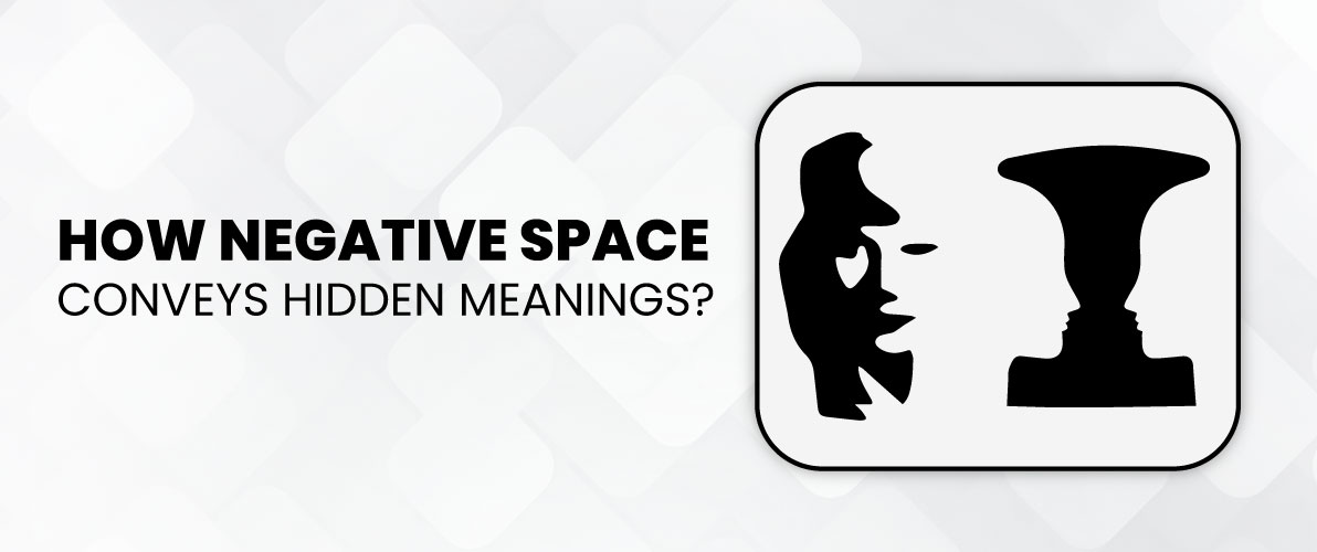
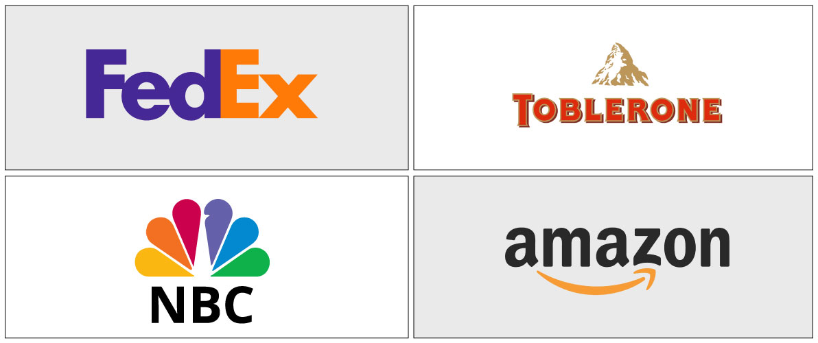
Some logos hide an image or message within the empty areas. Consider the Toblerone emblem, in which the empty space amid the peak shapes creates a bear, symbolizing the place of its foundation.
Utilizing the potential of empty space allows you to design a logo that communicates a narrative, leaving a strong impact on your viewers.
Why Negative Space is a Design Game Changer?
Negative space is often overlooked, but it has the power to make your design stand out and become unforgettable. What is it about negative space that makes it so revolutionary?
Negative space is not just void but an intentional decision. By strategically incorporating “empty space” around your main design elements, you create a feeling of simplicity and elegance. This minimalist design showcases your main message, ensuring it stands out and is more memorable, especially in today’s quick-paced online environment where logos are often seen briefly.

Negative space doesn’t just indicate what’s missing; it actually generates surprising depth. Picture a simple logo that lies flat in one dimension. Now, imagine the identical logo incorporating negative space to cleverly generate a feeling of depth. All of a sudden, it becomes visually captivating, piquing interest and encouraging the viewer to delve into its complexities.
Negative space provides the opportunity to convey more profound messages, adding depth to your design through hidden meanings. Consider it a gentle murmur in contrast to the loudness of bright hues and eye-catching designs. A well-designed empty space in a logo can incorporate hidden meanings, symbols, or whimsical gestures that engage the viewer and establish a strong bond. Picture a symbol for a group focused on environmental issues.
Find Out the Power of Negative Space Design!
Explore the creative possibilities of negative space and create a truly unique logo.
Utilizing empty space to create the outline of a tree effectively conveys your purpose in a visually engaging manner. Negative space designs are versatile, unlike logos, which have a lot of details. They are able to adjust to various sizes and contexts while maintaining their effectiveness. This feature makes them a valuable investment for any brand, guaranteeing that your logo will appear fantastic on any platform, whether it be social media icons or billboards.
Some Common Types of Negative Space
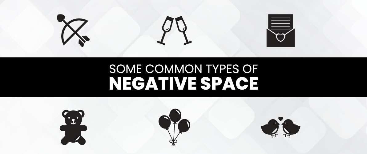
Designers can use negative space as a creative opportunity to enhance a logo with depth and significance. Below are some of the most frequent types of empty space you may come across.
Typography Logos
Manipulating letters and fonts can be used to produce negative space magic. Picture a logo with negative space inside a letter, creating a relevant image or symbol for the brand. This method brings a sense of mystery and highlights the designer’s innovation.
Consider the FedEx Professional Logo Design as a case in point. The arrow formed by the empty area between the “E” and the “x” suggests speed and efficiency in a clever way.
Double Entendre Logos
These logos use negative space creatively to create two different meanings, engaging in a fun game of visual perception. One interpretation comes from the primary design element, while the second subtly appears from the unused space. This method generates an element of unexpectedness and joy, enhancing the logo’s memorability.
An iconic instance is the Amazon logo. The negative space arrow playfully directs from “A” to “Z,” showcasing a wide range of products within a single symbol.
Hidden Image Logos
These logos elevate the element of surprise to the next level. They hide a picture or message in the empty spaces, ready to be found by the observer. This method generates interest and encourages a stronger bond with the brand, prompting viewers to take part in a visual “scavenger hunt.”
The Toblerone logo is an excellent illustration. The empty space among the peaks of the Matterhorn mountain creates a bear shape, as a gentle reference to Bern, where the chocolate is from (Berner Bär).
These are only a couple of methods designers can use negative space to make logos that are influential and unforgettable. While delving into the realm of logos, be on the lookout for these innovative strategies and observe how the use of “negative space” can add intrigue to the design.
Famous Logos That Use Negative Space Brilliantly
Let’s examine how these famous logos have utilized negative space to create a lasting impression.
FedEx
The FedEx Business Logo demonstrates expert use of negative space to communicate a precise message. The slight arrow created by the “E” and the “x” immediately suggests a feeling of quickness and moving forward. This is in perfect harmony with FedEx’s main focus – ensuring swift and effective package delivery.
Amazon
At first glance, Amazon’s logo may appear simple, but the negative space is vital. The gap between “A” and “Z” creates an arrow suggesting a wide range of products, covering everything from A to Z. This minimalistic yet impactful design solidifies their image as a convenient destination for all your shopping necessities.
Toblerone
The Toblerone logo is a charming demonstration of negative space-hiding images. The silhouette of a bear is cleverly created by the negative space between the peaks of the Matterhorn mountain. This fun design not only creates a visual appeal but also honors Bern (Berner Bär), the Swiss city where the chocolate is from.
NBC
The NBC emblem demonstrates how negative space can be utilized to form a detailed design. The vibrant plumes skillfully create the form of a splendid peacock’s body and tail. This design decision represents the energy and innovation connected with broadcasting, making it an appropriate emblem for a TV channel.
These examples demonstrate how logos have been elevated to iconic status through the use of negative space from these logos you can get logo design ideas with negative space. Designers can use its potential to create logos that are visually appealing, convey a clear message, and leave a lasting impression on viewers. Next time you see a logo, pause and try to identify the hidden power of negative space in action!
How to Design Your Negative Space Logo?
The undeniable power of empty space. Now, you’re prepared for designing a logo that is unique and catches people’s attention. This manual will provide you with the necessary tools to navigate the thrilling realm of negative space logo design!
Begin by understanding your brand’s fundamental principles and communication. What sets your brand apart from others? Which feelings do you hope to arouse? This will help you make decisions about your design. Create rough drafts of your thoughts! Do not hesitate to try new things. Utilize mind maps to examine various ideas and experiment with the empty spaces in typography, figures, or icons that connect to your brand.
Drawing your idea
Transform your brainstormed ideas into preliminary sketches. This is the place to enhance the negative space elements and observe their interaction with the main design components. Keep in mind that negative space benefits from simplicity. Avoid cramming too many elements in your design. Maintain a neat, easily understood, and visually symmetrical appearance.
Improving Your Design
After creating a couple of potentially good sketches, use a design program such as Adobe Illustrator. At this place, you have the opportunity to perfect the outlines, experiment with different color combinations, and observe how the empty spaces are interpreted in a digital form. Receive input from friends, coworkers, or a design group. Utilize their feedback to enhance your logo and guarantee it effectively conveys your brand’s message.
Conclusion
Negative space, when utilized strategically, has the power to add concealed significance, generate surprising complexity, and change your logo from easily forgotten to memorable. By grasping the relationship between positive space and negative space, you can design logos that are visually appealing and align closely with your brand identity. When creating a Modern logo design, utilize the impact of negative space to achieve an iconic symbol for your brand.
Still choosing the right logo design company?
Get a quick, expert review. No pitch, just clarity on what fits your stage, budget, and growth.


