Have you ever pondered the reason behind the worldwide recognition of the simple Nike logo design? The Hype is real Since everyone loves the Nike sign and (obviously) Nike products!
Cool Nike Logo is seen on a wide range of items, such as sneakers, jerseys, Nike Bags, Socks, and more. quickly communicating a feeling of sportsmanship and success. However, there is additional information to the story that is not immediately obvious. This famous symbol has a fascinating background, significant symbolism, and a classic design that still appeals to both athletes and ordinary individuals.
The Creation of a Symbol Worth One Billion Dollars and Who Created the Nike Logo?
This might be hard to believe but there was not any team of high-priced designers to design the Nike logo. It was In 1971 when an enthusiastic graphic design student named Carolyn Davidson sketched the now-famous Nike symbol for a mere $35! Back then, the company was called Blue Ribbon Sports, and co-founder Phil Knight wasn’t initially sold on the design.
Nevertheless, he eventually liked it, and as the saying goes, it is now part of the past.
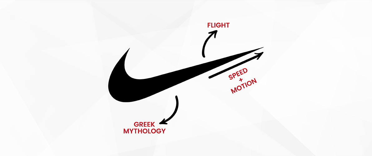
The Nike symbol was highly inspired by the Greek goddess of victory, as it symbolizes the brand’s fundamental principles of movement and speed.
How a Simple Logo Design Sparked the Sporting Empire
At one point, we all stopped to consider why the Nike logo is so famous! just a single Nike swoosh, is so easily identifiable globally? It’s displayed on various items like shoes and sports uniforms, instantly suggesting a feeling of being active and successful. However, there’s more to the tale than what initially appears. The famous Nike logo has a long history, significant meaning, and classic design that still appeals to athletes and regular people.
The simplicity of the Nike swoosh is what makes it nice and attractive that people want to buy it. It is one continuous line that suggests a strong feeling of movement and progress. Nike logo design implies the sensation of the wind speeding by you while surpassing a personal best or the burst of vitality felt when testing your boundaries. Apart from how it looks, the swoosh symbolizes something deeper. It represents success obtained through effort and commitment, a theme that connects with athletes and individuals working towards their objectives.
Evolution of an Icon: The Swoosh Through the Years
The Nike logo history has remained remarkably consistent over the years, a testament to its timeless design. However, the brand has experimented with color variations and placement, adapting the swoosh to different campaigns and products. This adaptability showcases the logo’s versatility, allowing it to maintain its core identity while remaining fresh and relevant.
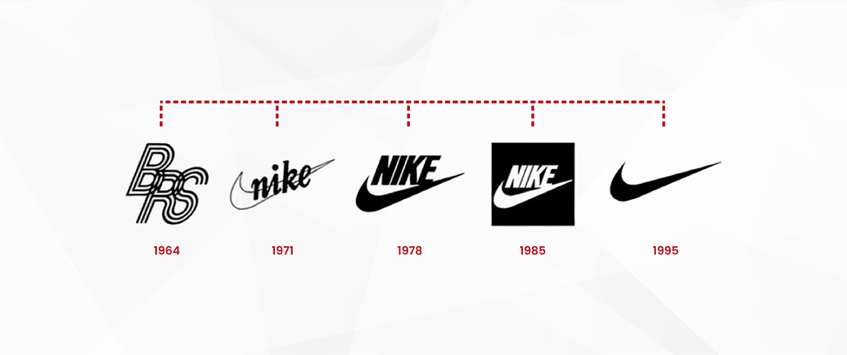
Early Beginnings (1971)
The birth of the now-iconic swoosh is a story in itself. In 1971, the logo debuted alongside the name “Blue Ribbon Sports,” the company’s original name. Back then, the swoosh appeared in various colors, a strategy to stand out amongst competitors.
Red and White Take Center Stage (Late 1970s)
As Nike established itself, the red and white color palette became more prominent. Red symbolises passion, energy, and the joy of movement, perfectly aligning with the brand’s message. White added a touch of nobility and purity.
The Swoosh Takes Flight (1980s)
The 1980s saw the swoosh gaining further prominence. The company name “Nike” was often displayed within the swoosh itself, using the Futura Bold font. This bold move solidified the swoosh as the central element of the brand identity.
The Swoosh Soars Solo (1995 – Present)
A significant shift occurred in 1995. Nike, confident in its brand recognition, took a daring step. The company name was removed, leaving the swoosh to stand alone. This bold move proved successful, solidifying the swoosh as a universally recognized symbol of athletic achievement.
A Colorful Canvas (Throughout the Years)
While the core red and white remain popular, Swoosh Nike hasn’t shied away from color variations. Limited edition releases and specific campaigns often feature unique color palettes, showcasing the swoosh’s adaptability without compromising its core identity.
Nike vs Adidas: The Epic Clash of Two Leading Sports Brands
When it comes to athletic footwear and apparel, Nike and Adidas reign as the two leading brands in the global market. As of 2024, Nike captures a commanding 27% market share in the sports footwear industry, while Adidas closely trails with a 12% market share.
This competitive landscape fuels a rivalry that significantly influences consumer preferences and shapes industry trends. With Nike reporting over $51 billion in annual sales compared to Adidas’s $25 billion, the stakes are high. Both brands have effectively utilized their unique brand identities to foster loyal customer bases and drive significant revenues, making them iconic players in the sports and lifestyle sectors.
Innovation is a critical factor propelling the success of Nike and Adidas. Nike’s groundbreaking technologies, such as Nike Air and Flyknit, enhance both performance and comfort, making them a favorite among athletes. Meanwhile, Adidas has gained traction with its Boost technology, which provides impressive energy return in footwear. Sustainability is another focus for both companies, with Nike’s Move to Zero initiative aiming for a zero-carbon footprint, while Adidas commits to producing 100% of its products from recycled materials by 2024.
This commitment to eco-friendly practices resonates with today’s environmentally conscious consumers, further solidifying their market positions. As they continue to innovate and adapt, Nike and Adidas remain at the forefront of the athletic apparel industry, driving trends and capturing the attention of a diverse audience.
Get an Iconic Logo for your Brand
A well-designed logo can make all the difference. Let our experts create a powerful symbol for your business.
Historic Controversies Around the Nike Logo
While the Nike swoosh is widely admired, it hasn’t been without controversy. The brand has faced criticism regarding labor practices in its manufacturing facilities. These controversies highlight the importance of social responsibility for major corporations. Nike then showed a commitment to ethical practices and took strict actions to address concerns alongside its iconic logo.
Sweatshop Allegations
The media raised many issues regarding the hectic working environment, which led to an overburden in employees. The allegations were long working hours, low wages, and unsafe conditions for workers, and they also raised concerns over the employment of underage workers. The allegations drastically tarnished Nike’s brand image and stirred up outrage among the community.
Customers then decided to boycott Nike products, which forced the brand to enhance working conditions and make things better.
How Did Nike Overcome the Allegations?
In the beginning, things were unclear. The sales were also drowning, but Nike’s management faced mounting pressure, and Nike took steps to address these concerns. The company implemented stricter labor codes for its suppliers, increased wages, and provided a safer workplace. They also had a ban on child labor.
Sense of Remembrance in the Nike Logo
The Nike swoosh is more than just a cool logo; it evokes a sense of nostalgia and personal connection for many. For athletes, it might represent a childhood dream of competing on the world stage. For casual wearers, it might symbolise a commitment to fitness or a personal best achieved. This emotional connection is a powerful force behind the logo’s enduring popularity.
The Ever-Green Impact of the Nike Logo
Unlike trends that come and go, the Nike swoosh has transcended time. Its simple design allows it to remain relevant year after year. The brand has experimented with color variations and placement for different campaigns, showcasing the swoosh’s adaptability without compromising its core identity. This timeless quality ensures the logo stays fresh and continues to resonate with new generations.
Nike Swoosh vs. Overloaded Logos
| Feature | Nike Swoosh | Overloaded Logos |
| Complexity | Simple, single dynamic line | Many intricate details |
| Memorability | Highly recognizable, easy to remember | Difficult to remember, details blend together |
| Versatility | Adapts to different sizes and applications | May lose impact when resized or simplified |
| Meaning | Evokes movement, victory, achievement | May lack a clear or memorable meaning |
| Timelessness | Classic design, endures through trends | Can become outdated or lose relevance |
| Emotional Impact | Creates a sense of energy and motivation | May overwhelm or confuse viewers |
Why the Nike Logo Works
The simplicity of the Nike Air logo is what makes it brilliant. heavy graphics, simple logos are often more memorable and versatile in their applications. The intricate details make the swoosh instantly identifiable. It can be replicated, embellished, and copied with ease.
Adaptability is crucial: An effective logo should be able to adjust to various uses and platforms while still making a strong impression.
How You Can Design An Iconic Logo Like Nike
While creating another Nike swoosh might be unrealistic, you can certainly incorporate these lessons into your own logo design process. Here’s how:
Identify Your Brand Essence
What are your brand’s core values and target audience? Distilling this into a clear message will guide your design choices.
Sketch and Refine
Don’t be afraid to experiment with different concepts. Simple geometric shapes and strong lines can be surprisingly effective.
Seek Feedback
Get honest opinions from potential customers and design professionals. Their insights can help you refine your logo and ensure it resonates with your audience.
Consider Professional Help
A keen and skilled graphic designer is all you need to create an amazing logo like Nike. He will be the one to ensure your logo is technically sound for various applications.
Why Must You Hire A Professional Logo Designer?
While creating a logo yourself is admirable, collaborating with a professional logo designer offers numerous advantages that can significantly enhance your brand identity.
Expertise and Experience
Professional designers possess a deep understanding of design principles that make a logo effective and memorable. Their expertise enables them to translate your brand essence into a visually compelling symbol that resonates with your target audience. According to industry studies, well-designed logos can increase brand recognition by up to 80%, showcasing the importance of investing in professional help.
Technical Knowledge
A skilled designer has a solid grasp of vector graphics, color theory, and other technical aspects that are crucial for producing high-quality logos. This knowledge ensures that your logo will look stunning across various platforms, from business cards to billboards. For instance, logos designed using vector graphics maintain their quality regardless of size, ensuring your brand appears professional everywhere it’s showcased.
Brand Consistency
Professional designers excel in creating logos that seamlessly fit into your existing branding components, guaranteeing a unified brand identity. This consistency is vital; brands with cohesive visual identities experience an average revenue increase of 23%. A designer can help you create a logo that not only stands out but also aligns with your overall brand strategy.
Save Time
Opting for a professional logo design company like Logo Design Valley allows you to access comprehensive logo design services, ensuring you receive a polished product without the hassle. Our expertise includes crafting logos that mirror the impactful branding strategies of industry leaders like Nike, helping you establish a strong presence in a crowded market. By employing a designer, you free up valuable time to focus on other critical areas of your business.
Remember, your logo is often the first impression your brand makes. Investing in a thoughtfully designed logo can significantly influence your brand’s recognition and overall success, making it a worthwhile endeavor. With the right design, you can set your brand on the path to achieving lasting impact and loyalty among consumers.
FAQs
When was the Nike logo created?
The Nike logo origin dates to 1971 when Carolyn Davidson created the iconic logo for the brand’s athletic line. This Nike logo was chosen for its representation of motion and speed by co-founder Phil Knight.
What does Nike mean?
In Greek mythology, Nike was the goddess of victory! The swoosh logo we all know is actually a wing representing the speed and triumph associated with Nike.
What role does the swoosh account play in Nike branding?
The swoosh is Nike’s signature! Seeing it conjures up images of athletes, victory, and achievement. It’s a powerful symbol that instantly tells you: “This is Nike – gear for winners.”
How does Nike shape its influence and evolution in the sports industry?
Nike stays on top of the sports game by listening to athletes, creating innovative gear, and sponsoring superstar teams and athletes. They’re like the cool kid at school who everyone wants to hang with, always pushing boundaries and redefining what sports look like.
Why is the Nike swoosh design so effective?
The brilliance of the Nike logo lies in its simplicity. Unlike complex logos, the swoosh is memorable, easily printed or embroidered, and adapts well to various products.
Can I design a logo like Nike’s Swoosh?
While creating another swoosh might be unrealistic, you can incorporate these lessons! Identify your brand essence, experiment with basic shapes, seek feedback, and consider professional help from Logo Design Valley for a logo that reflects your brand identity.
What lessons can we learn from the Nike logo design?
The Nike swoosh is a legend! It teaches us that logos can be simple yet powerful. Just a checkmark-like symbol hints at speed and motion, perfect for a sports brand. Plus, a shorter, catchy name like Nike is easier to remember than a long one. So, keep it simple, make it meaningful, and pick a name that sticks!
Author Bio
Still choosing the right logo design company?
Get a quick, expert review. No pitch, just clarity on what fits your stage, budget, and growth.