Businesses are striving to cut through the marketing clutter and engage their audience. Branding helps in many ways, but marketers need to study famous brand logos and their design elements. It helps bring the logo to life while adding value to branding campaigns.
The Nike logo has the simplest yet most inspiring design elements that brands can adopt. What started as a $35 design is now worth millions. But how? This article breaks down the elements, history, and thinking behind the Nike swoosh logo.
![]()
Overview of the Nike Swoosh Logo
Design inspirations are necessary for creativity and innovation, and researching industry leaders proves beneficial. Nike is a strong sports brand recognized globally. It has over 14,000 products, all featuring one logo: the swoosh. The brand’s journey is a great example of how creativity, innovation, and rebranding can create the top sports brand globally.
You’d be surprised to know that there’s no billion-dollar team behind the Nike swoosh logo. It was designed by a graphic design student at $2 an hour. It’s an inspiring design that follows best practices for logo design.
- It is simple and memorable.
- Versatility and scalability are evident in every piece of marketing material.
- The logo is relevant to its audience and is a core part of the brand’s story.
- The Nike logo swoosh combines color and shape psychology with bold typography.
- It is an original design and is known all over the world.
Following these principles sets a quality benchmark for any business logo. Moreover, it will help us design an iconic logo to transform any business for better growth and revenue. Companies belonging to the sports industry can learn a lot from Nike’s branding.
Key Design Elements in the Nike Swoosh Logo
At first glance, the Nike logo is simple. But it’s more than just a symbol. Each element in the Nike logo is for a purpose.
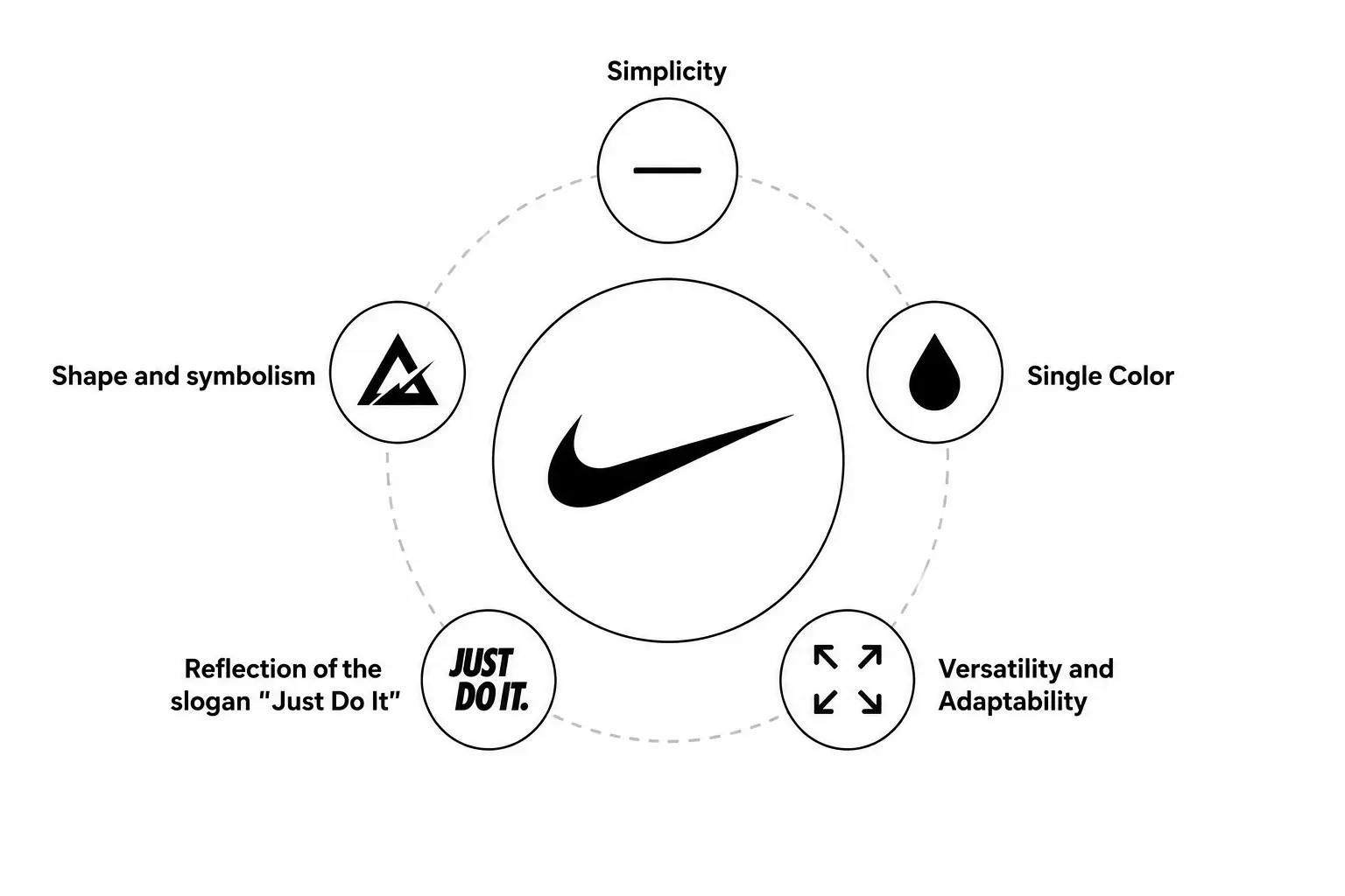
1. Simplicity
Simplicity is a standard. What do all famous logos have in common? It’s simplicity. The Nike logo is one of the simplest and most elegant. It uses a single checkmark shape that is memorable and recognizable. Logo designs using too many elements might create confusion and lose their attraction. The black and white palette helps to promote the brand around the world with high acceptance. The Nike symbol “swoosh” has the perfect geometric shape; simple and meaningful.
2. Single Color
Nike uses a single color throughout the Nike logo evolution, with or without a Futura bold font for its name in capital letters. The solid black swoosh uses a white background and vice versa to appear prominent and attractive. The Nike name uses the same color as the logo in clothing design and on Nike shoes.
As their campaigns change, they create variants of the same logo with the best logo color combinations to attract the right audience. One important thing to learn here is that choosing the right color contrast is a game-changer.
3. Perfect Curvature
The Nike logo history has seen many modifications, but the shape and curvature of the logo have never changed. It has the perfect curvature that empowers the Nike swoosh logo and ends up perfectly at the Swoosh’s tail, representing growth and success. The curvature also matches the winged Goddess, which inspired the new mark in the first place. The logo is an ideal example of how logo shapes influence brand perception.
4. Reflection of the Slogan
The Nike logo is also a reflection of approval that complies with its slogan, “Just Do It”. It has been fueling the marketing strategies to gain objectives and provides inspiration to any branding agency to think critically. The marketing strategies of Nike for its shoes and other business divisions are effective, and the emblem enhances its impact.
5. Adaptability and Versatility
The company uses the Nike Swoosh logo with many variations because of its adaptability and flexibility. The Nike Air logo, Nike SB logo, and Nike Orange logo are some examples. The versatility of the brand is also reflected in the iconic swoosh, which is used for branding, promotions, and merchandise across different media with multiple color modifications accordingly.
Do you want an iconic logo too?
Logo Design Valley is the perfect choice to get started.
Rebranding of Blue Ribbon Sports to Nike. Inc
Nike wasn’t always Nike. It was Bue Ribbon Sports. This company was a joint venture of Bill Bowerman, an American track and field coach, and Phil Knight, Bowerman’s former athlete and an accounting professor at Portland State University.
Phil Knight initiated the rebranding of Blue Ribbon Sports to Nike, deriving the name from the Greek Goddess of Victory. He assigned the logo design task to his student, Carolyn Davidson, who was a graphic design student at Portland State University. Carolyn Davidson sketched the check mark shape and used a Cursive Serif Typeface with lowercase letters.
It had a white palette color representing the wing of the Greek Goddess Nike. The rebranding and Swoosh logo helped achieve wide reach and exceptional growth. Nike sponsored players across all sports, including Basketball, Football, Baseball, Golf, and Soccer.
The most famous of them are Tiger Woods, Kobe Bryant, LeBron James, Michael Jordan, and Cristiano Ronaldo. The marketing strategies and influencer campaigns led the Nike Swoosh logo to the peak of audience engagement. Brands can learn how rebranding can impact a business’s growth and revenue.
![]()
Who Designed the Nike Logo? The Carolyn Davidson Story
Who designed the Nike logo is no secret. The designer behind the Nike logo is Carolyn Davidson. She designed the logo for just $35. Who knew it would become so iconic?
Carolyn Davidson was a student at Portland State University in 1971. Phil Knight, Nike’s co-founder, met her when she was a design student. He was her professor. She was sketching in the hallway when Knight hired her to make charts and graphics for his side business. After that, she created ads, brochures, and catalogs, and eventually, the iconic Nike logo. The deal was closed at $2 per hour.
Initially, Carolyn Davidson submitted 5 designs. Knight gathered two employees to evaluate them. None of the designs fit what they had in mind, but they settled for the swoosh. Carolyn suggested the swoosh signaled motion and growth. Knight told her, “Well, I don’t love it, but it’ll grow on me.” And guess what? It did!
You might be wondering, “How much did Nike pay for the logo?” The final logo design cost was $35. That would be equal to today’s $260. No one anticipated Nike’s growth to be so rapid. In 1983, Phil invited Carolyn to a company dinner. He gave her a diamond swoosh ring and 500 shares of Nike stock, which would be over $1 million today.
This is a lesson for businesses when hiring a logo design company. It’s not about the budget. A good logo design is the result of the right brief and skills.
Nike Logo Evolution: A Complete History Timeline
The Nike logo is iconic and timeless. It’s a result of constant refinements and experiments with color variations, typographies, and placements.
![]()
1964: Nike was Blue Ribbon Sports before the rebrand. It had no Blue Ribbon Sports logo, and they were a distributor of the Japanese Onitsuka shoes.
1971: It’s when the Nike logo evolution started. Carolyn Davidson was hired to create the logo for Nike. She designed different concepts, but the swoosh paired with a lowercase Serif typeface, and the cursive “Nike” wordmark stood out. The Nike swoosh logo we see today is very different from the original version. It’s larger and bolder.
1978: The experimentation begins. Nike replaced the cursive wordmark with Futura Bold in all capitals. The update was used for most of the 1980s.
1985: The wordmark and logo were used separately for the first time in 1985. The swoosh appeared on shoes and apparel without the text. This was the beginning of a new era.
1995: Nike officially dropped the wordmark from the primary logo. The swoosh became the Nike symbol. This is still considered one of the boldest moves in corporate history. Removing the company name from the logo was a risk.
Present Day: The Nike logo swoosh became iconic. It doesn’t even need the wordmark to be recognized. The swoosh is the foundation of all of Nike’s products and branding campaigns.
The Nike logo history timeline shows bold moves and a minimalist approach. Now, Nike is instantly recognized by the swoosh that emerged in 1971.
What is the Psychology Behind Nike Color Codes?
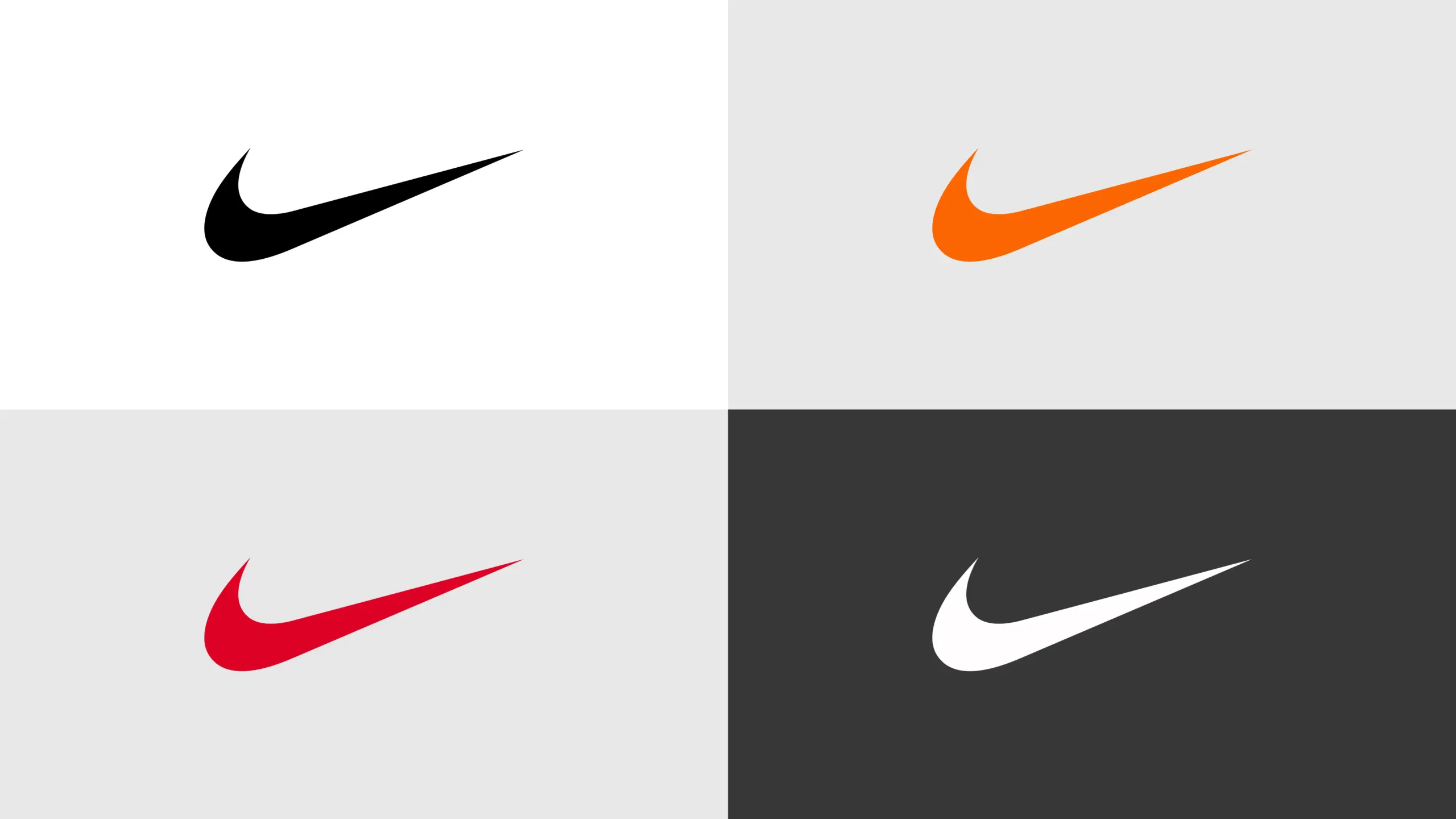
The Nike logo uses black and white as its primary color palette. This allows the logo to appear on any colored background. The Nike brand colors are chosen with calculated and scientific reasoning. Nike’s branding uses color psychology as their emotional strategy to evoke feelings of power, speed, and innovation. And they manage to do that successfully.
Although the primary color palette is black and white, you’ll see all sorts of variations in color for branding, marketing, and apparel. Neon, orange, and red are among the most common colors used with OG black-and-white.
|
Color Name |
Hex |
RGB |
CMYK |
Pantone |
|
Nike Black |
#111111 |
17, 17, 17 |
0, 0, 0, 93 |
Black C |
|
Nike White |
#FFFFFF |
255, 255, 255 |
0, 0, 0, 0 |
White |
|
Nike Orange |
#F96302 |
249, 99, 2 |
0, 60, 99, 2 |
1665 C |
|
University Red |
#E4002B |
228, 0, 43 |
0, 100, 81, 11 |
1795 C |
Black and white are the most versatile colors for any sports brand. It’s because they ensure scalability. They work equally on shoes, clothing, packaging, and digital formats. They are also ideal colors for their psychological effects. Black conveys power and authority. White conveys purity and performance. Similarly, orange and red convey energy and athletic drive.
The best approach to designing a logo is to start in black and white. It’s easier to add color later on. The approach also ensures the logo works across different platforms and print material.
What Does the Nike Swoosh Mean?
There’s significant symbolism behind Nike’s logo.
- The Nike swoosh represents the wing of Nike, the Greek goddess of victory (Νίκη). The name ‘Nike’ itself means ‘victory’ in Greek.
- It reads as a universal checkmark in line with its slogan, “Just Do It.” A sign of completion, a push to check it off the list. It’s the symbol of approval.
- As Carolyn suggested, the Nike logo symbolism suggests motion and speed. The shape curves upwards and ends at a higher point, determining success. It creates the visual sense of moving forward.
- The lower point of the Nike logo swoosh and elevated tail represent the growth arc. Something starting from the ground and rising.
The logo has no clutter and no extra elements to confuse its audience. The negative space and simplicity amplify the Nike swoosh meaning allowing people to interpret it however they want: as a wing, checkmark, a growth trajectory, or a speed arc. The Nike logo remains constant across cultures, languages, and colors.
What Font Does Nike Use?
The Nike logo font is Futura Bold, designed by Paul Renner in 1927. The Nike logo uses it in all capitals. It’s the right choice because it is a geometric sans-serif font with clean lines and no decorative elements. The font is bold, indicating strength, modernity, and forward motion.
Futura Bold is a primary font for other brands like Red Bull, Supreme, and Louis Vuitton, giving the same high-status, versatile effect. Nike uses other modern fonts from time to time, but Futura Bold remains the logo standard.
If you’re looking for fonts for your sports brand, here’s a list of some similar paid and free fonts to try:
|
Font Name |
Cost |
Where to Get It |
|
Futura Bold |
Paid (~$35) |
Monotype or Adobe Fonts |
|
Josefin Sans |
Free |
Google Fonts |
|
Nunito Bold |
Free |
Google Fonts |
|
Nexa Bold |
Paid |
Fontfabric.com |
|
Circular Bold |
Paid |
Lineto.com |
Nike Swoosh vs Adidas Three Stripes
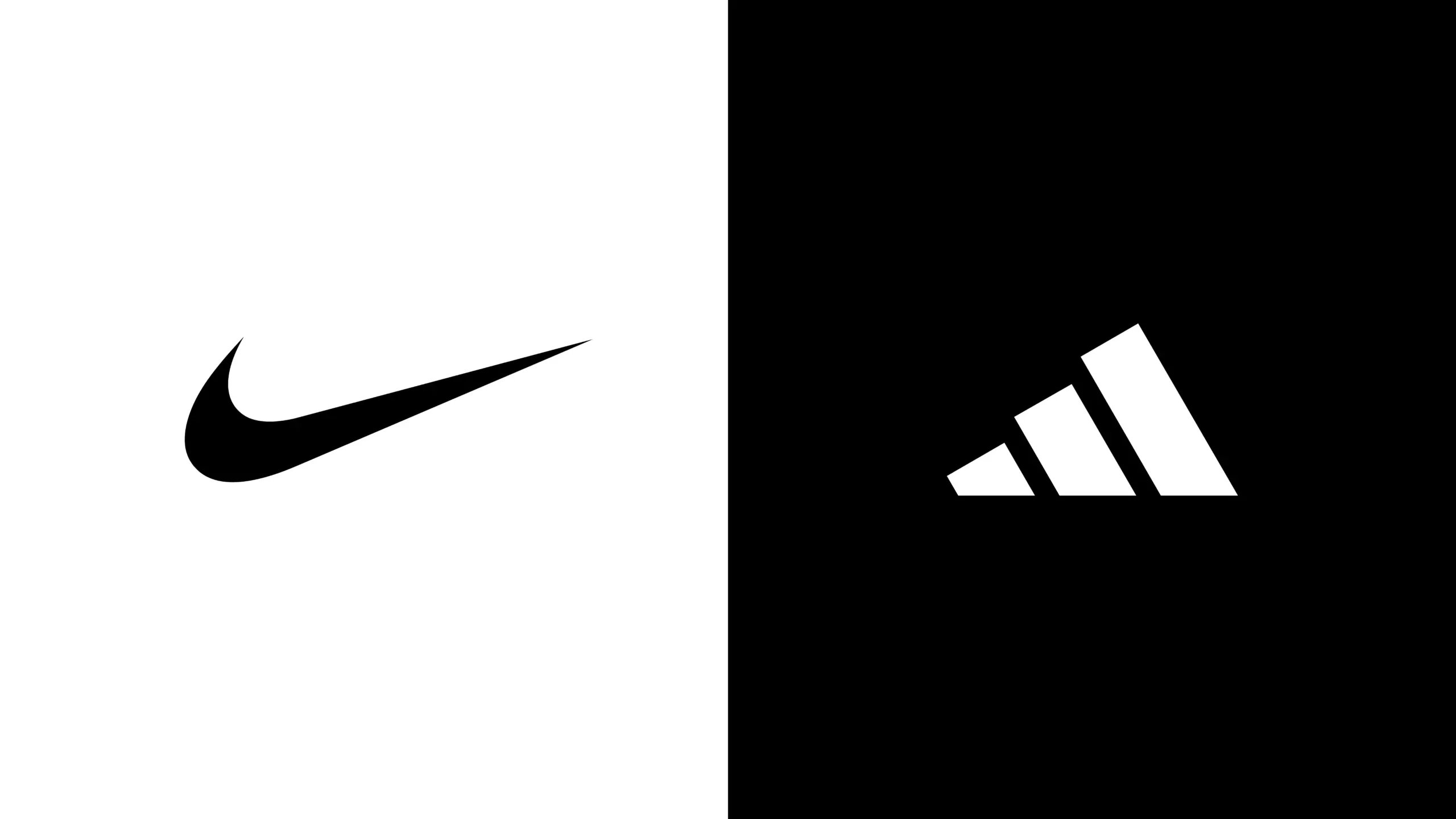
Nike and Adidas are the best-known sports brands in the world. There’s no clear comparison of the Nike vs Adidas logo on who does it better and why. We’ll break it down for you so you can decide for yourself.
|
Feature |
Nike Logo |
Adidas Logo |
|
Logo Name |
Swoosh |
Three Stripes |
|
Founded |
1971 |
1949 |
|
Designer |
Carolyn Davidson |
Adolf Dassler |
|
Shape |
Curved check mark |
Three parallel stripes |
|
Meaning |
Movement, speed, victory |
Performance, strength, mountain challenge |
|
Style |
Minimal and sleek |
Bold and geometric |
|
Main Colors |
Usually black or white |
Usually black or white |
|
Brand Feel |
Modern, fast, energetic |
Sporty, classic, reliable |
|
Most Recognizable Element |
Single swoosh mark |
Triple-stripe pattern |
|
Popular Usage |
Shoes, apparel, sports gear |
Shoes, apparel, sports gear |
Both logos follow the same design principles and practices. So does Logo Design Valley.
Inspired by these famous logo designs?
We follow the same logo design principles to create the best designs for you.
Key Takeaways
The Nike logo is definitely an inspiration for many. Marketers and entrepreneurs must study the different branding and promotional strategies of famous companies. Nike, Puma, Amazon, and Apple are some of the best to start with. The research will help in designing effective campaigns and efficient branding designs. The design elements of the Nike icon are worth a million words.
Author Bio
Duaa writes blogs about marketing, branding, web design, and logo design. She enjoys turning ideas into simple, engaging content that helps businesses build stronger brands and connect with their audience in a more meaningful way.
Still choosing the right logo design company?
Get a quick, expert review. No pitch, just clarity on what fits your stage, budget, and growth.