The short but impactful presence of a TV logo can leave a lasting impression. It acts as the visual representation, an opening sequence that introduces the upcoming stories. You might have heard different terms related to TV logos: television logos, channel logos, TV show logos, or TV network logos. Let me clear the dust, these are all referring to the same thing! These types of logos can hook you in seconds and become as iconic as the shows they represent.
The opening credits of your favorite show. The familiar tune. The title card. All make an impact! But what truly captures your eye in those first crucial seconds? The logo, of course!
These small design marvels are more than just identifying a show; they’re a visual introduction to its world, a promise of the entertainment to come. So, let’s delve into the art of the TV show logo, ranking the most well-known according to certain criteria.
Just like the shows we are going to mention, a well-designed logo can spark recognition, establish your brand identity, and set the stage for your future success. If you are someone looking to create a logo for your TV show then consult with a professional logo design company, Let Logo Design Valley help you create a logo that uplifts your vision.
Before we get started, let’s consider what design elements make a great TV show logo.
Memorable Design
Does the logo linger in your mind after the intro sequence fades? Think of bold fonts or striking imagery that leave a lasting impression, like the dripping font of Stranger Things or the imposing iron throne of Game of Thrones. These designs become instantly recognizable, staying with you long after the intro.
Clarity and Simplicity
Can you easily understand and recall the logo at a glance? The best logos avoid complex imagery or overly ornate fonts. They opt for clean lines and clear visuals that register quickly. Shows like The Walking Dead (blood-splattered “D”) and Cheers (simple, cheerful font) achieve this perfectly.
Relevance to Branding
Does the logo accurately reflect the show’s genre, themes, or overall tone? Yes, it does, A great logo isn’t just catchy; it’s a visual metaphor for the show’s essence. Look at Breaking Bad (periodic table + hazmat suit hinting at dark science) or Mad Men (sleek font reflecting sophisticated setting). The logo design should set the stage for the stories to come.
Uniqueness
Does the logo stand out from the crowd, avoiding clichés and predictability? Clichés and generic designs are easily forgotten. Shows like “Squid Game” (hidden message in the font) and The Muppet Show (colorful, whimsical design) embrace this. A unique logo grabs attention and reflects the show’s individuality.
Need a Logo That Stands Out?
Let our designers create a logo that will make your brand unforgettable.
Here are the top 13 Best TV show Logos
Stranger Things
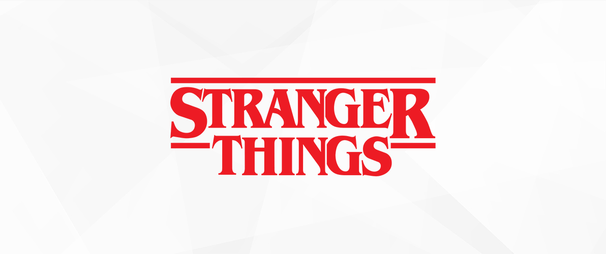
The logo of Stranger Things makes a strong statement, just like the show does. Immersed in a font that brings to mind 80s horror films, it immediately takes viewers back to that time. The striking red color stands out on the dark background, creating a memorable impact even after the synth-heavy intro sequence diminishes.
Game of Thrones
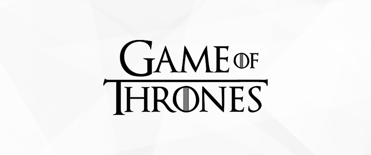
The Game of Thrones logo represents strength and conflict. It is the most expensive brand logo on this list. The impressive iron throne, carefully constructed from swords, symbolizes the ongoing battle for power over Westeros in the show. The detailed pattern and pointed corners create a feeling of peril and cruelty, capturing the harsh and violent vibe of the show flawlessly.
The X-Files
The supernatural and the FBI agents Mulder and Scully searching for the truth. A green X-shape, universally recognized as a symbol for the unknown, is prominently displayed. It is surrounded by two rays of light, symbolizing Mulder’s steadfast trust in the mysterious. The logo for X-Files cleverly combines the show’s main elements. This straightforward but powerful design captures the interest of viewers, mirroring the show’s investigation of government plots and alien meetings.
Breaking Bad
Combined with two recognizable symbols from the series: the periodic table, which signifies the scientific domain of chemistry, and a yellow hazmat suit, which symbolizes the criminal underworld. The logo of Breaking Bad exemplifies expert visual storytelling. This clever mix immediately suggests the key themes of the show – the evolution of a gentle teacher into a brutal drug lord and the unclear boundaries between what is legal and what is moral. Employing straightforward, impactful typography highlights the noticeable difference between Walter White’s everyday existence and his spiral into shadow.
The Walking Dead
Making a strong impact with just one blood-stained letter, “D.” The strong visual elements represent the graphic content and post-apocalyptic zombie world of the show. The red stain dripping creates a feeling of dread and immediacy, highlighting the peril confronting the characters in the show. This basic but efficient design effectively depicts the constant battle for survival in a world that is overwhelmed by zombies.
Dexter
A fine line between purity and shadows makes the Dexter logo balanced. The blood splatter design cleverly hides a smiling droplet, suggesting the main character of the show – Dexter Morgan, a blood splatter expert who also happens to be a serial killer. Using a neat sans-serif font contributes a sense of normality, reflecting Dexter’s seemingly regular lifestyle. However, the hidden blood splatter reveals the darkness that lurks beneath the surface, perfectly encapsulating Dexter’s complex duality and the show’s exploration of morality and justice.
Mad Men
The Mad Men logo represents the chic and elegant environment of advertising on Madison Avenue during the 1960s. It showcases a simple, minimalistic layout with a traditional typeface. This simplicity creates a feeling of grace and sophistication, ideal for a television channel logo or show logo that embodies the high-energy world of advertising agencies. The absence of color contributes to the feeling of elegance, letting observers use their imagination to envision modern offices and stylish attire. This particular design is easily identifiable to viewers of the show and individuals who admire television logos that display a timeless and elegant appeal.

Squid Game
The design of the Squid Game logo is both playful and unsettling, cleverly alluding to the dark themes of the show. It features a bold, cartoonish font that appears welcoming at first, a strategy commonly employed in numerous television and show logos to attract viewers. Yet upon further examination, it becomes evident that there is a concealed meaning – the forms inside the characters bear a resemblance to a squid and a guard, hinting at the intense rivalry and societal critique present in the performance. The bright pink color intensifies the feeling of unease, contrasting sharply with the violent and disturbing content of the show. This distinctive design is now a representation of the show, easily identifiable by fans, and a great way to initiate conversations for viewers who admire TV logos that are visually striking and deep.
That 70’s Show
This Show’s logo is a nostalgic blast from the past, capturing the lighthearted essence of the 1970s perfectly. The cool, trippy font, with its curved edges and bold colors, quickly takes viewers back to that time, a sensation that many television channel logos and show logos aim to create. Incorporating a yellow smiley face enhances the jovial atmosphere, mirroring the series’ emphasis on companionship, maturing experiences, and amusing circumstances. This design is now a well-known symbol of the show, easily identified by fans and loved by those who appreciate TV and broadcasting logos that convey a feeling of playfulness and joy.
Cheers
The logo for Cheers emits a feeling of warmth and hospitality, effectively capturing the essence of this timeless television show. The glowing yellow sun provides the backdrop for the title of the show, displayed in a warm, rounded font that brings a feeling of comfort and nostalgia. This font, found in numerous TV logos and show logos over the years, creates a sense of warmth and friendliness. The addition of a clinking beer mug perfectly finishes the scene, immediately indicating the location of the show – a welcoming local bar where everyone is familiar. This basic but efficient design is now widely known as a popular TV show logo linked with joy and fun, a common sight among TV channel logos and loved by fans of sitcoms worldwide.
Lost
cleverly reflecting the show’s key themes of mystery, isolation, and the search for answers, the logo for Lost is one of the best. The show’s title is presented in a bold, slightly modified font, indicating the complex reality the characters are facing. The lack of a space between “L” and “O” heightens curiosity, leading viewers to ponder what might be omitted. Using a simple black-and-white color scheme intensifies the sense of tension, establishing a stark contrast with the vibrant scenery of the island featured in the show. The logo of this TV series is now widely recognized in popular culture, appealing to fans and viewers who appreciate distinctive and mysterious logos, especially those who enjoy engaging shows.
Friends
The logo for Friends symbolizes the joy of companionship and unity. The show’s six central characters are represented by the show’s title’s six colorful dots, each in a different color. This immediately fosters a feeling of closeness and solidarity, mirroring the main circle of friends who support each other through life’s obstacles. Utilizing a basic, whimsical font contributes to the cheerful vibe of the show, which stands in sharp contrast to the bold logos of certain dramatic TV shows. This iconic design is now a symbol of friendship that fans instantly recognize and use as a conversation starter to bond over the show’s themes of camaraderie and loyalty. This logo shows how a basic design with color and shapes can become a popular symbol in the world of television show logos.
The Muppet Show
The title of the show is a chaotic mix of various fonts, with every letter in a unique style and size, representing the diverse Muppet characters. This eccentricity immediately captures interest and establishes the atmosphere for the show’s unexpected comedy and diverse performances. The logo of the Muppet Show is full of playful and enjoyable elements, capturing the essence of this famous variety show perfectly. In contrast to numerous serious TV channels and show logos, it opts for a whimsical, mismatched design instead of following traditional conventions. The utilization of cheerful, vibrant colors highlights the happy and welcoming environment for all ages. This distinct design is now easily identifiable as the logo of a well-known television program, a beloved aspect of pop culture’s past, and a preferred choice for enthusiasts of every generation. It differentiates itself from the rest of the serious TV logos and show logos, demonstrating that a successful logo can be memorable without being strict or realistic.
Conclusion
Ultimately, a fantastic television show logo goes beyond its brief appearance on screen. It serves as a visual introduction, a small flame that triggers recollections and prepares for future narratives. The logos we’ve examined highlight the influence of design in representing the core of a show – such as the retro feel of Stranger Things or the eerie tone of The Walking Dead.
These famous designs made by professional logo designers make a lasting impact and serve as both conversation starters and touchstones in popular culture. The logos of Cheers and The Muppet Show evoke the power of television to take us to new places and create enduring relationships. Next time you spot a logo you recognize on the screen, pause to admire the creativity and narrative behind that small image.
The power of a well-designed logo is undeniable, as evidenced by the iconic TV show logos we explored. Just like these shows, your brand deserves a visual identity that resonates with your target audience.
We can align you with the professional logo design team from logo design valley. You will get to work closely with them and rest assured they will deliver a logo that’s both memorable and meaningful.
Still choosing the right logo design company?
Get a quick, expert review. No pitch, just clarity on what fits your stage, budget, and growth.


