The telecom pioneer Nokia, hailing from Finland, is well-known in the industry. The company has embarked on a journey to revamp its classic logo in line with a modern strategic direction. The primary objective behind this transformation is to craft a brand image that resonates profoundly with its modern clientele. Let’s delve into the details of Nokia’s redesigning and explore further.
In the chronicles of the mobile phone domain, Nokia dominated the market. Nevertheless, the tides of time saw other mobile phone brands ascend, eating up the market share swiftly. The company now aspires to be a B2B technology leader, forging a path in networks and industrial digitization. Thus, the challenge lies in mutating the public’s perception of the company and transitioning the brand to a new echelon.
Envisioning a Strategy Shift
Today, Nokia’s focus has shifted to digital networking to emerge as a pioneering B2B technology innovation pioneer. The shift in focus necessitated a profound rebranding of its iconic logo while revamping its essence. On the 26th of February 2023, Nokia unveiled its new logo ahead of the Mobile World Congress, marking a milestone.
As the fulcrum of a brand’s visual identity, the logo holds vital importance to the audience. After all, it beautifies a brand’s products, services, website, social media, promotions, and every other asset, serving as a dynamo. It was inevitable for the company to revamp its logo to convey the new brand message. The shift in focus led to Nokia’s first logo revamp in the last six decades, adopting an entirely fresh look for its visual identity.
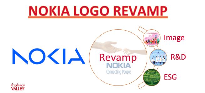
1. Six Main Pillars
The brand declared its rebranding along with six main pillars forming the foundation of its new business approach. These pillars encompass:
- Projecting the brand as a tech-enabled services leader to boost market share.
- Introducing new business models to achieve new objectives.
- Aiming to expand the contributions from enterprises.
- Creating opportunities by investing in research & development.
- Proactively managing its portfolio to attain leadership in various market segments.
- Developing Environmental, Social, and Corporate Governance (ESG) as an edge.
Branding and Promotion for New Image
The pillars are establishing a new brand image as the leading technology service that deals in various networking equipment. A business’s branding and promotional design must unify to help achieve its objectives. It works by aligning the offerings and platforms with the audience’s expectations to provide a fit between the two.
Investments in Research and Development
Investing in research and development is crucial, whether it’s an investment firm, trading company, or tech/dev enterprise. It helps find new ways to resolve and deliver by trying to innovate and upgrade its structure or offerings. Leveraging the existing resources to discover new avenues brings growth and prosperity.
Competitive Advantage of the ESG Approach
Environmental and Social Governance (ESG) prioritizes environmental and social business impact. It assures a sustainable business approach and elevates the brand’s perception as a responsible enterprise. Social and environmental groups support such corporate governance, adding to its reputation and respect.
2. Revamp Announcement
Nokia officials convoyed the logo redesign expressing the rationale behind this transformation. Pekka Lundmark, CEO of Nokia, stated, “Our new visual identity captures Nokia as we are today, with renewed energy and commitment as pioneers of digital transformation. We built on the heritage of the previous logo but made it feel more contemporary and digital to reflect our current identity.”
Furthermore, the company illustrated the new design on its website, expressing that it represents an energized, dynamic, modern Nokia. The logo shines as a symbol of collaboration, an element critical for realizing the massive potential of networks, sustainability, and accessibility.
Design Elements of the New Nokia Logo
It is essential to discuss the design elements of the new wordmark for reference for graphic design students and businesses. The elements will help formulate a logo that distinctively portrays a brand while embedding the relevant features. Following are the design elements forming the new identity of the Nokia brand while representing its fundamental values.
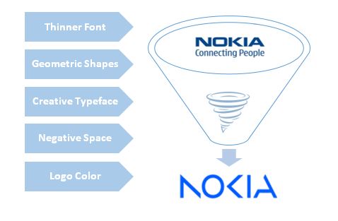
1. Thinner Font
The most apparent change in the new logo lies in the letters’ weight, dropping the thick font of its predecessor. Thin fonts mirror the friendly business nature, conveying a touch of technology. Thick typefaces generally depict a business’s authoritative and rigid nature. In contrast, thin fonts induce a participative feeling in the audience while maintaining delight.
2. Geometric Shapes
The new logo ingeniously fashions the brand’s name using different geometric shapes – three triangles and a circular form. Its artistic evolution reflects the company’s ambitious expedition into the technology market. Furthermore, it caters to the aesthetic visual tastes of viewers by using precise shapes and flawless curvature, amusing their vision.
3. Creative Typeface
The letters “N,” “K,” and “A” in the new logo are creatively half-drawn, radiating a distinct digital impression. Its styling choice effectively communicates Nokia’s entry into digital networking, appealing to the sensibility of the intended audience seeking relative solutions. The thin letters still retain a boldness that signifies quality and reliability.
4. Negative Space
The new logo artfully employs negative white space to convey the company’s transition into new markets and ventures. Two digital buttons are cleverly shaped within the white space between the letters “K” and “I” and the letter “A.” These elements serve as an inspiration, signifying the brand’s ambitions with time. It awakens the imaginative capacity of its spectator for inference.
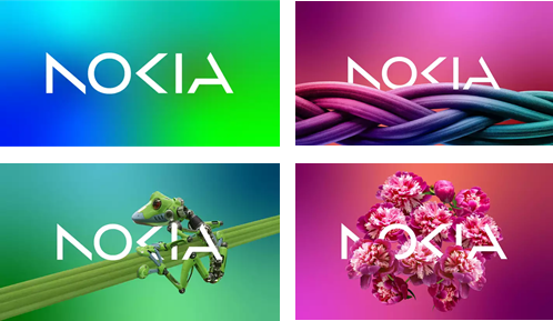
5. Logo Color
Transitioning from its primary focus to mobile phones and telecom equipment, Nokia used a fresh color palette for its logo. The logo now boasts four background variants, each employed depending on usage, effectively replacing the former blue logo. All the other four variants are rich in background and images that soothe the observer’s photoreceptors.
Conclusion
Historically leading the mobile phone manufacturing industry, Nokia begins transforming into a digital networking company. Its shift in focus demanded a rebranding of its logo as well as its promotion strategies. The new logo boasts sleeker letters, a creative typeface, white space, geometric shapes, and a new color. All the design elements collectively reflect the company’s strategic shift toward digital networking. It is vital for businesses to regularly assess their brand’s objectives, to modify the branding and promotion design elements. If you find yourself in need of a logo design service, consider hiring Logo Design Valley.
Please visit Our Design Blog
Author Bio
Still choosing the right logo design company?
Get a quick, expert review. No pitch, just clarity on what fits your stage, budget, and growth.