At some point in creating a business, you’ll have to sit and think about what logo type will work for you. What will people think about your business when they see your logo? Will it help people remember your business? Before a customer interacts with your brand, what does the logo tell about it?
Not all logo types are the same. If you’re designing a logo from scratch or considering a redesign, deciding between the different logo types is an important decision. As a creative branding agency, we’ve worked with over 3,500 businesses, and based on our experience, we’ve created this ultimate guide to choosing the right logo type for your business.
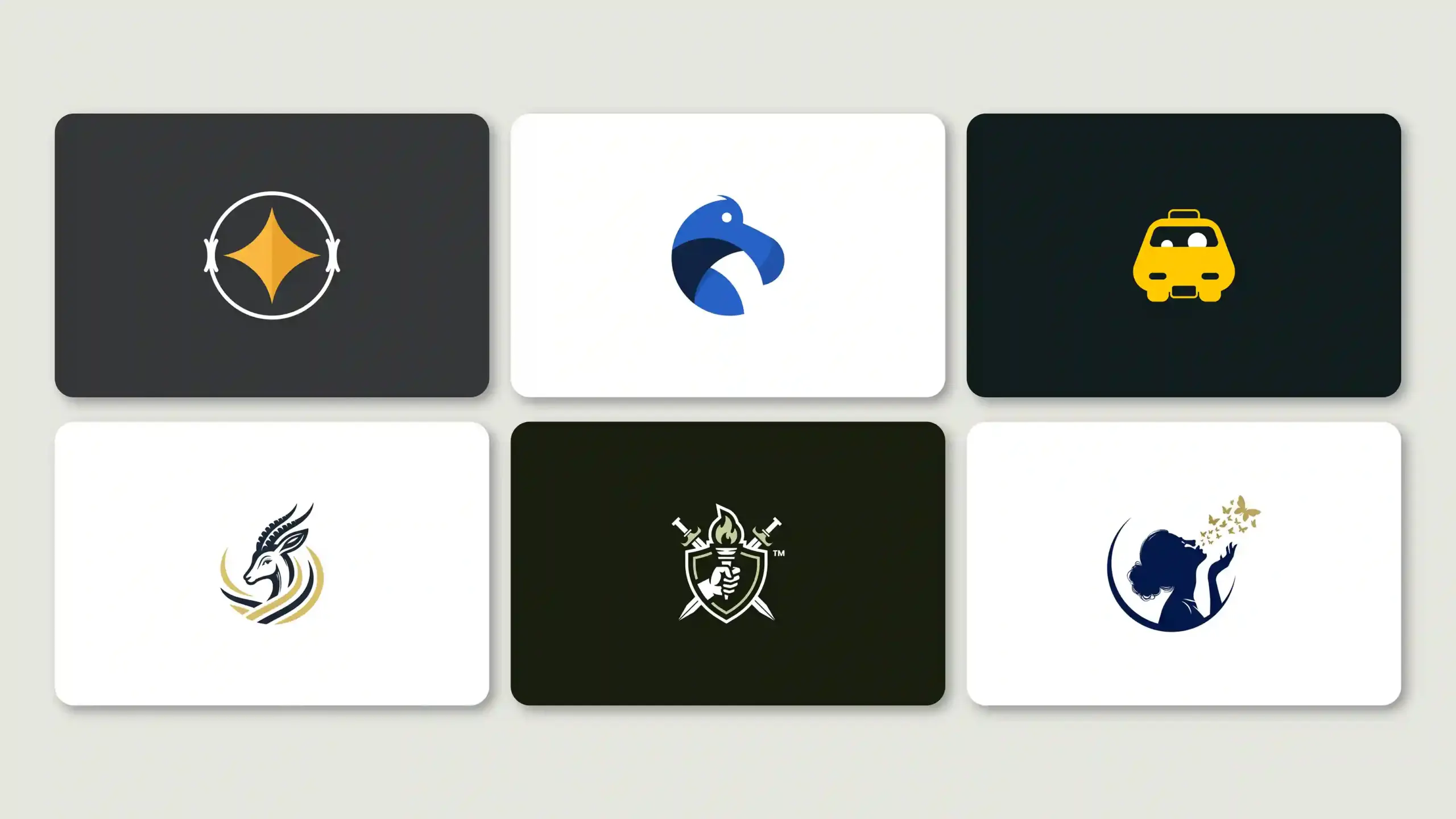
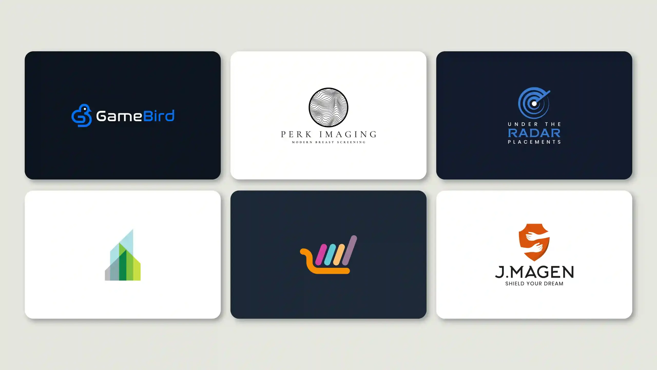
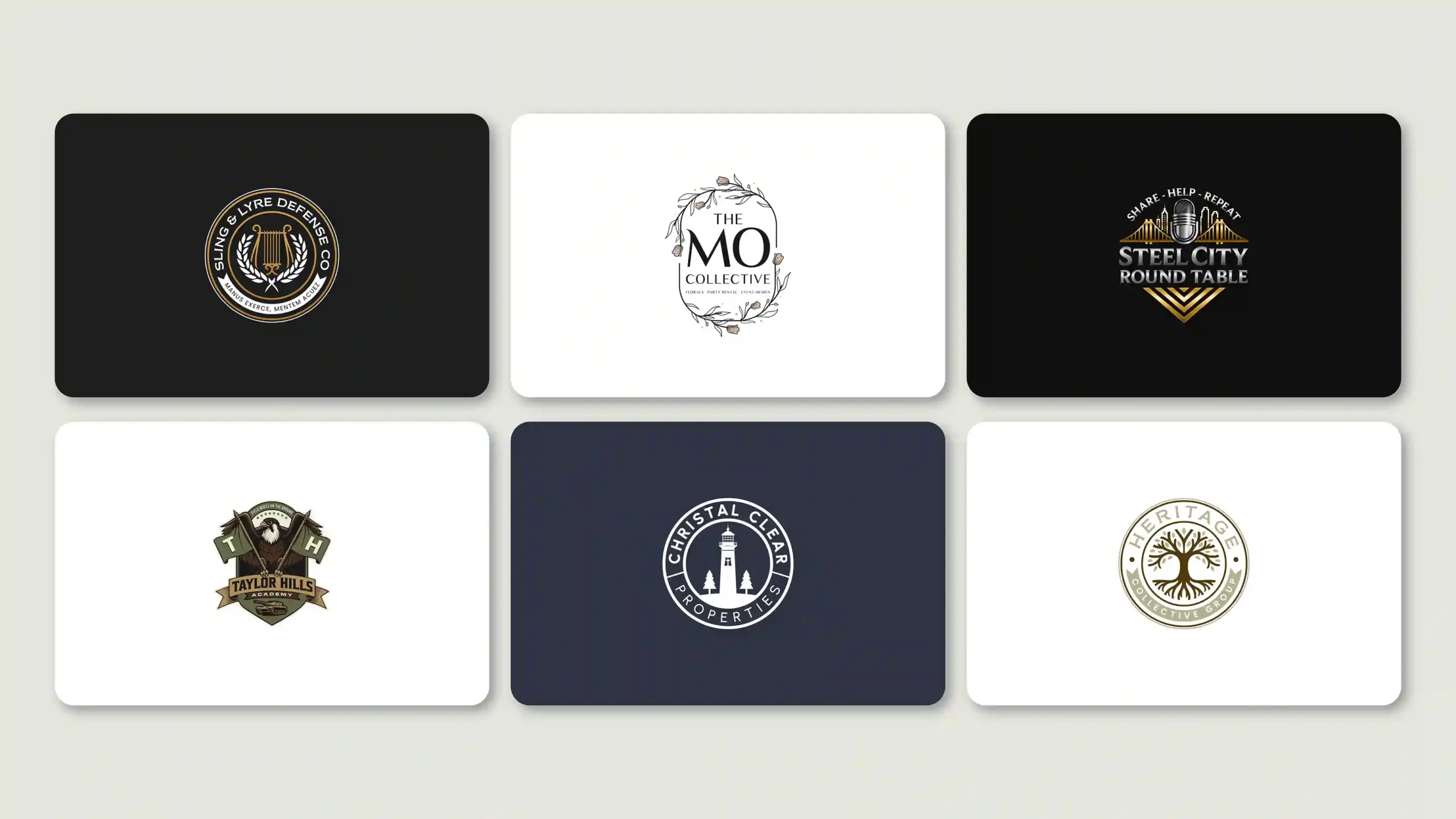
The 7 Core Logo Types Every Business Should Know
Every business uses 7 types of logo design. Each has a different look, purpose, and use. Let’s break down each one of them.
1. Wordmark Logo (Logotype) — When Your Name IS Your Brand
Wordmarks are a type of text-based logo design. The brand name is written using creative typography and brand colors. It is one of the most common types of logos used by businesses. It includes no icons or symbols, just unique text.
If your business has a short and unique name, this type will work best to make it memorable. Coca-Cola, Disney, FedEx, and Google are some of the most popular examples. They’ve created their name as a symbol of their identity, using distinctive fonts for modern logos.
Best For: New businesses with a short, unique name.
| Pros | Cons |
| Builds strong name recognition quickly | Long names become hard to read at small sizes |
| Easy to trademark with a unique font | No icon to fall back on for app icons or favicons |
| Clean and minimal, works in any layout | Less memorable than a strong visual symbol |
| No visual ambiguity, name speaks for itself | Relies on a truly unique or interesting name |
2. Lettermark Logo (Monogram) — Initials with Impact
A lettermark logo uses the initials of the brand name. Businesses whose names are too complex to fit in a wordmark use a lettermark instead. Longer brand names don’t fit well as app icons or on small screens, so lettermarks are a good alternative. They’re designed the same way as a wordmark, including a stylized font and brand colors. CNN, HBO, IBM, and NASA are some really good examples of the lettermark.
Best For: Businesses with longer names, professional service firms, and agencies that need their logos to be suitable for digital use.
| Pros | Cons |
| Ideal for long or complex brand names | Unknown initials mean nothing to new audiences |
| Clean fit for app icons, favicons, and profile pictures | Requires time and marketing to build recognition |
| Scales perfectly, works at any size | Initials may clash with other brands |
| Feels professional and minimal | Limited design expression compared to symbols |
3. Pictorial Mark — A Symbol That Speaks for Itself
Target, Shell, Apple, and many other brands are instantly recognized by their logo. A pictorial mark is a graphic image that’s relevant to your brand name. This is one of the most powerful logo types. A simple image makes you instantly recognizable to your customers.
Choosing an image or a symbol as your logo is a critical aspect of the process. It either needs to be relevant to your brand’s name or the service you provide. It needs to be a timeless design that grows with your brand. The only downside with a pictorial logo is that it takes time to build recognition. If you’re a new business considering a pictorial logo, you might want to include your brand name in it. You can drop it off later as more people start recognizing you.
Best For: Established brands, photography, and design companies
| Pros | Cons |
| Instantly recognizable once established | Risky for new and unknown brands |
| Works across all sizes, from billboard to favicon | Needs years of exposure to build recognition alone |
| Works globally across countries, cultures, and languages | Symbol must be truly distinct and ownable |
| Strong visual recall and emotional connection | Hard to redesign later without losing equity |
4. Abstract Logo Mark — Owning a Concept, Not an Image
An abstract logo is similar to a pictorial logo. It is a combination of geometric logo shapes, symbols, or colors that represent your brand but do not directly relate to any object. Abstract logos are among the most flexible types of logo design in terms of creative freedom.
Pepsi and Adidas are common examples. The image they use isn’t directly related to their brand name or service, yet it still stands out as unique. One problem with abstract logos is that they’re harder to trademark than the other types of logo designs.
Best For: Businesses with a strong brand identity, and if you are clear on what perception you want your audience to build based on the logo
| Pros | Cons |
| 100% ownable — not tied to any literal object | Harder to trademark, must be very distinctive |
| Works across cultures and languages | Meaning is not obvious without brand context |
| Highly versatile in color, size, and placement | Can look generic if not designed with care |
| Can subtly encode brand values in the shape | Requires significant investment to build meaning |
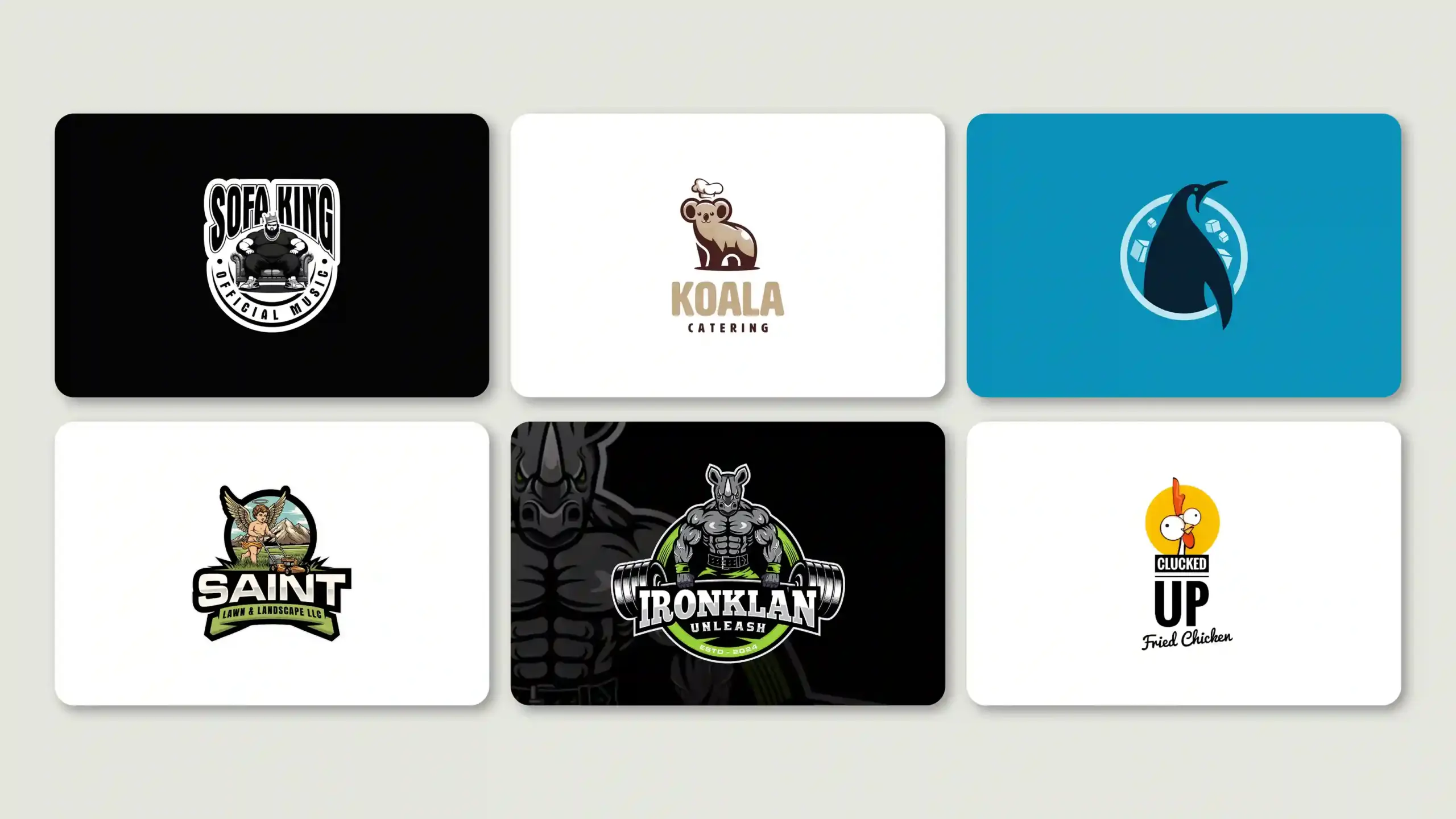
5. Mascot Logo — A Character-Driven Brand Identity
Mascot logos are a fun touch to give to your brand identity. For instance, the Pringles man or KFC’s Colonel Sanders, the logos of these brands feel incomplete without their mascots. They act as brand ambassadors for the brands.
An illustrated character gives your brand a personality that most customers can relate to on an emotional level. Once you’ve gained success, the character becomes the face of the business. They even cost more to design than other logos. Mascot logos don’t work for every business, especially if you belong to healthcare, finance, legal firms, or B2B.
Best For: Children’s brand, family-friendly ventures, food and beverage companies
| Pros | Cons |
| Creates a strong emotional and personal connection | Feels unprofessional in B2B, finance, or healthcare |
| Memorable, especially for families and children | Difficult to scale down for small digital formats |
| Gives the brand a clear personality and voice | Character updates can confuse loyal customers |
| Great for food, sports, and entertainment industries | High design cost to illustrate well |
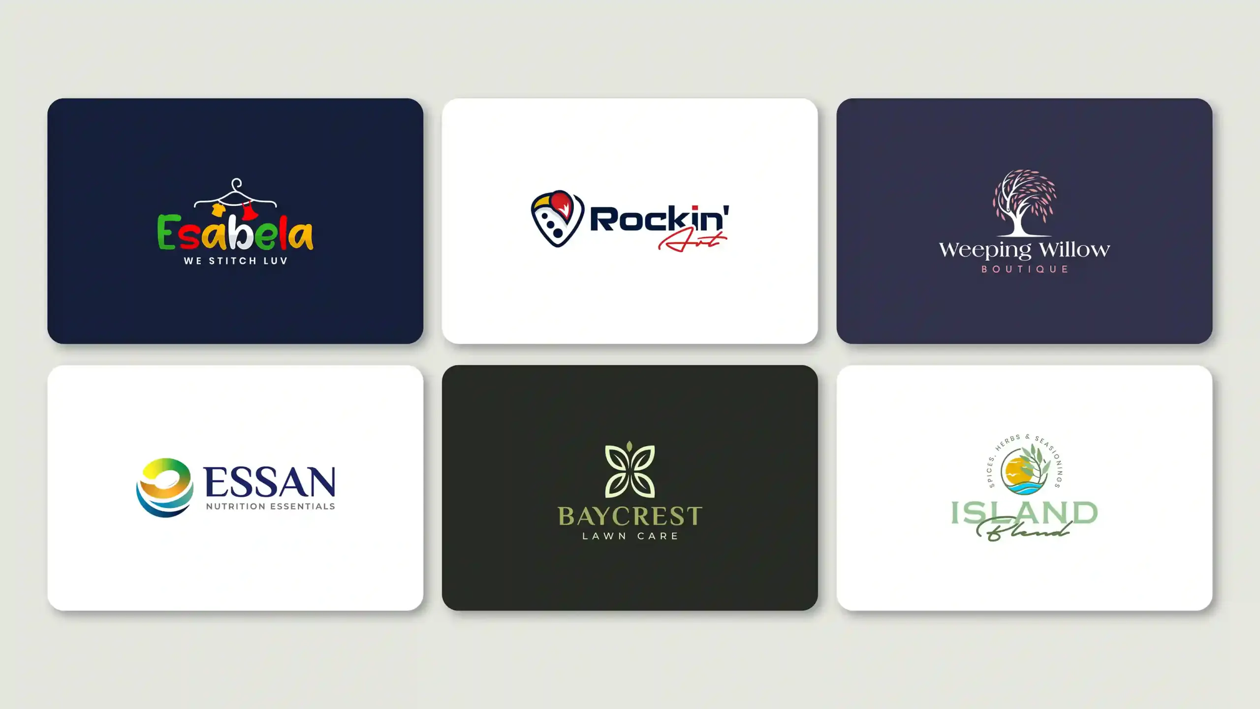
6. Combination Mark — The Most Versatile Logo Type
As its name suggests, a combination mark combines an image, symbol, or mascot with text. They’re both combined to work as a unit, but can also be used separately at times. The combination logo gives the best of both worlds.
Burger King and Lacoste use combination marks. Combination logos give the audience something to visualize and clarity on the brand name. For early-stage startups and new businesses, the most recommended logo type is the combination logo.
Best For: Startups, growing businesses, e-commerce brands, companies that want flexibility in marketing materials and representation on different platforms
| Pros | Cons |
| Icon and text can be used separately | Can feel crowded if not designed carefully |
| Best of both worlds: visual + name clarity | Full version is too complex for tiny formats |
| Ideal for new brands building recognition | Requires a separate submark version for icons |
| Easiest to trademark (text + image combined) | More design time and cost than simpler types |
7. Emblem Logo — Authority and Heritage in One Mark
An emblem logo is a badge, shield, seal, or crest that incorporates the brand name within a shape or symbol. They text and icon go together and cannot be separated. Emblem logos are designed intricately, which is why they give any brand a regal or traditional look.
Starbucks, Ferrari, and Warner Bros all use emblem logos. They are an ideal choice for companies belonging to professional industries, the education sector, or the government. Logo designers often create simplified versions of emblem logos for use across platforms and branding materials.
Best For: Businesses that want to communicate history, tradition, and authority
| Pros | Cons |
| Projects authority, heritage, and prestige | Hard to read at small sizes or on screens |
| Timeless look, great for established institutions | No flexibility, icon and text are always locked together |
| Strong sense of unity, everything in one mark | Can look outdated without careful updates |
| Works well for schools, automotive, and government | Complex designs are harder to embroider or engrave |
Logo Types Compared: Scalability, Versatility, and Digital-First Performance
Choosing between logo types is not all about how it looks on paper. You need to carefully consider its performance across different screen sizes, printing materials, and use cases. How would it look on a giant billboard or in a 32px app icon?
How Each Logo Type Performs on Mobile, Social Media, and App Icons
Lettermarks and pictorial logos are the best logo types for digital use. Emblems and mascots are harder to scale down to smaller screen sizes. Combination logos work well overall, but need simplified versions in case they’re needed separately as a submark, an app icon, or a fav icon.
| Logo Type | Mobile | Social Profile | App Icon | Favicon |
| Wordmark | Good | Good | Poor | Poor |
| Lettermark | Excellent | Excellent | Excellent | Excellent |
| Pictorial Mark | Excellent | Excellent | Excellent | Excellent |
| Abstract Mark | Good | Good | Good | Good |
| Mascot | Fair | Good | Poor | Poor |
| Combination Mark | Good | Good | Fair | Poor |
| Emblem | Fair | Fair | Poor | Poor |
Trademark Potential and Ownership Risk by Logo Type
Some types of logo designs are easier to trademark than others. Wordmarks use custom typography to be unique, while combination marks stand out distinctly with the icon and text. These two logo types are the easiest to trademark. Read our complete guide on “How to trademark a logo” for complete insights.
| Logo Type | Trademark Ease | Risk Level |
| Wordmark | High | Low, easier to protect |
| Lettermark | Medium | Low to Medium |
| Pictorial Mark | High | Low if truly unique |
| Abstract Mark | Medium | Medium, must be very unique |
| Mascot | High | Low, original artwork can be protected |
| Combination Mark | High | Low, the image and text need to be unique |
| Emblem | Medium | Medium, busy designs are harder to register |
How to Choose the Right Logo Type for Your Business
You need to pick the logo type that speaks your brand’s language. But with so many different types of logo, how do you decide which one’s best for you?
You need to know your brand’s personality, target audience, and industry first. Find out what design styles competitors have used, and then you’ll have a clear idea of what you want for your business.
Best Logo Types for Startups, SaaS, and Investor-Ready Brands
Startups and investor-ready brands need a brand identity that’s professional, unique, and ambitious. The ideal logo design types for early-stage startups, businesses in their pre-launch phase, and SaaS brands are wordmarks, combination marks, and abstract marks. Through your logo, you need to communicate that your brand is built for growth. Mascots and emblems are not ideal choices because they lack scalability.
Best Logo Types for E-Commerce, Retail, and Consumer Brands
A combination mark is the best logo type if you’re running an online/e-commerce business because it looks good everywhere (on websites, packaging, and social media). Fashion and lifestyle companies tend to use wordmarks or pictorial logos because these logos can create clean, aesthetically pleasing photos of the brand image.
The use of mascot/emblem logos will communicate the company brand through personality and history, so they would be great options for food/beverage businesses. Wordmarks or abstract logos can give any health and beauty brand a clean and premium appearance.
Best Logo Types for Professional Services and Rebranding
Law firms, consultancies, financial advisors, and healthcare providers need logos that convey trust and credibility.
- Wordmarks are suitable for law and finance firms to focus on their name and reputation.
- Consulting and marketing agencies need a branding that’s versatile enough to be used across proposals, presentations, and websites. Combination marks work well for them.
- Businesses with slightly longer names can use lettermarks to create a clean, professional logo.
- B2B professional services should avoid mascot logos because they can alter customer perception and undermine your authority.
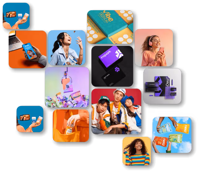
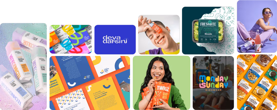
We Design the Best Logos for Any Industry
Logo Design Valley has served over 3500 startups in the USA across different industries.
Consult an Expert
How Logo Type Affects Trust, Perception, and Conversion Rate
Customers form their first impression within seconds. And in many cases, that impression is entirely based on the logo. How logo types affect trust, perception, and conversions isn’t just theory; it’s real insight backed by research.
Different types of logo styles trigger subconscious associations. Simple and more legible logos generate higher trust scores than complex designs. This is the reason why wordmarks and combination logos outperform other types, especially emblems and mascots. Here is what we and researchers agree on:
- Simple logos are the code that crack brand recall and memorability.
- Combination logos or logos with strong visual hierarchy create faster brand recognition at the point of sale.
- Color and typography significantly influence conversions, but the type sets the right direction for the trust signal.
- Brands that use logo variations across print materials and digital platforms see stronger brand equity over time.
Industry-Specific Logo Type Patterns and What They Signal
This breakdown of logo types used across different industries will give you a better overview of how brand perception and logo types are interlinked.
| Industry | Type of Logo | What It Signals |
| FinTech / Finance | Wordmark, Lettermark | Stability, clarity, trustworthiness |
| Healthcare | Combination Mark, Abstract Mark | Care, professionalism, approachability |
| Retail / E-Commerce | Combination Mark, Wordmark | Recognition, accessibility, brand personality |
| Food & Beverage | Mascot, Emblem, Combination | Taste, tradition, personality |
| Technology / SaaS | Wordmark, Lettermark, Abstract | Innovation, simplicity, scalability |
| Education | Emblem, Combination Mark | Authority, tradition, credibility |
| Entertainment / Sports | Mascot, Combination, Pictorial | Energy, passion, community |
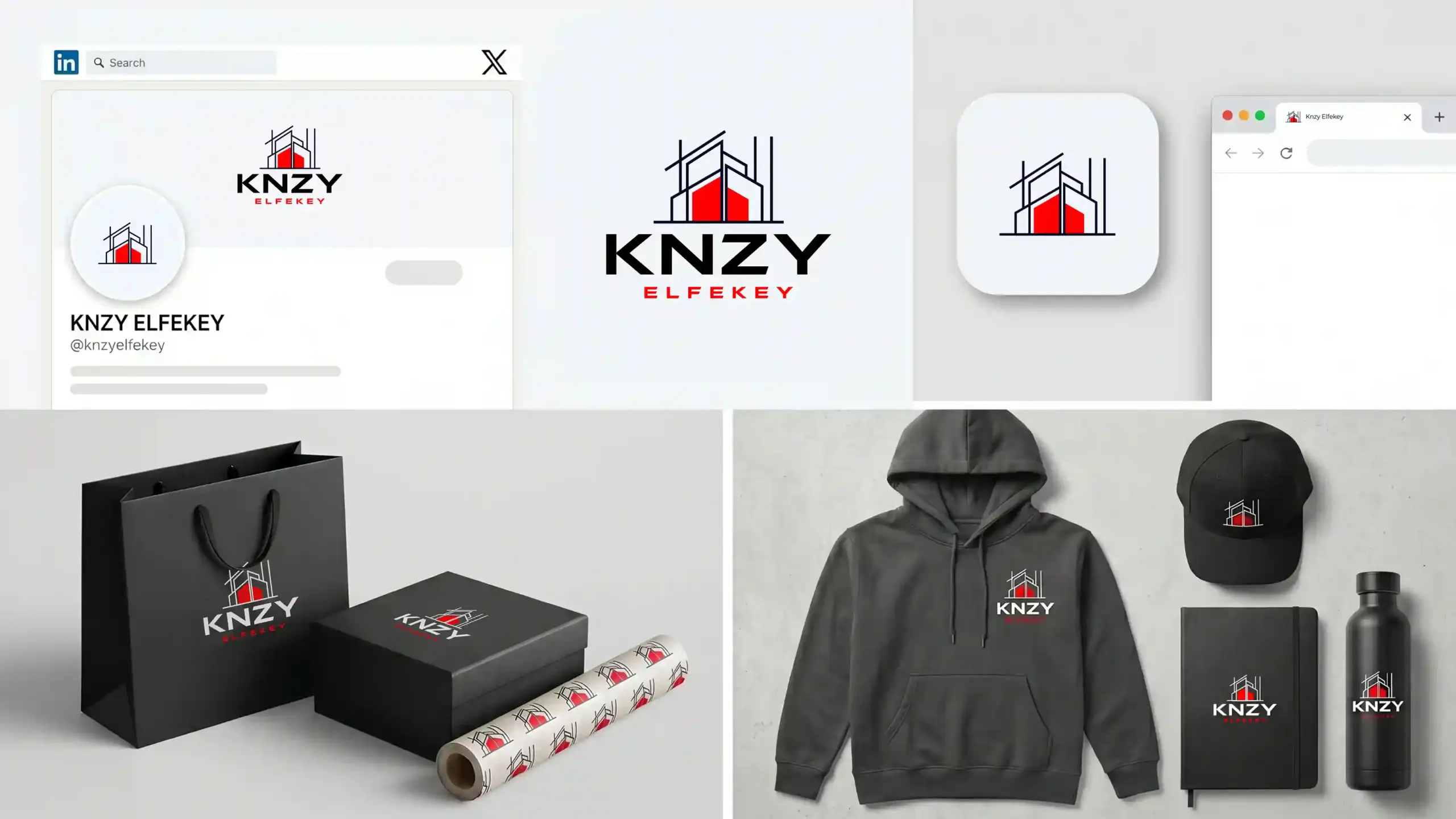
Logo Variations: The 4 Files Every Brand Needs Beyond the Core Type
Most businesses think their work is done with one logo. It’s not. The work just starts after the first logo is finalized. A brand needs 4 different logo variations to ensure scalability and versatility across all touchpoints.
Primary Logo: This is your complete logo. Based on the logo type you’ve chosen, it includes the icon, name, or initials; in short, it’s the main layout. It’ll be used on your website header, business cards, letterhead, and main branding materials.
Secondary Logo: The secondary logo is a rearranged, stacked, or horizontal variation of the primary logo. It’s used across social media banners, presentations, and when space is limited.
Submark: A simplified version of the original logo. It either includes the icon or the initials. Best use cases for a submark include app icons, profile pictures, and small merchandise items.
Watermark: The watermark is the transparent or light version of the logo. It’s used on photos, videos, documents, and branded templates to prevent other businesses from reusing them.
Some people also often confuse a logomark vs logotype vs logo. You’ll need to learn their key differences before you proceed any further.![]()
Final Thoughts
It’s totally up to you what you choose between the different logo types for your business. But you need to keep in mind that this is one of the most powerful brand decisions you’ll ever make. The right approach to choosing a logo type is to select one that aligns with your brand’s values, audience expectations, and business goals.
Every logo type has its strengths. The best brands do not pick what looks pretty. They pick the right type that matches where they are today and where they want to go in the future. If you’re still confused about what logo type would be best for your business, Logo Design Valley will help you clear your doubts about how to design a company logo.
Want a Logo That Stands Out?
Logo Design Valley has over 7 years of experience in helping brands stand out from the rest.
Get in TouchAuthor Bio
Duaa writes blogs about marketing, branding, web design, and logo design. She enjoys turning ideas into simple, engaging content that helps businesses build stronger brands and connect with their audience in a more meaningful way.
Still choosing the right logo design company?
Get a quick, expert review. No pitch, just clarity on what fits your stage, budget, and growth.