Recently, Spotify celebrated its 20th anniversary. As part of its campaign, the platform updated its app icon to an emerald green disco ball on May 14th, 2026. And there are very mixed reviews. We guess not every birthday gift lands the way we intend.
If you’re also wondering why the Spotify new logo changed, what is the hype about it, and whether the change is temporary, you’re at the right place.
Why Is The Spotify New Logo a Disco Ball? The Update No One Expected
Without warning, Spotify last week updated the logo of its mobile app on Apple’s iOS. It changed from a flat green circle to a glittering disco ball. It still has the original elements, though: the green color, the three soundwave lines, the original logo shape, and the original brand heritage. The update was unexpected, and so was the reaction of Spotify users around the world.
The new Spotify logo is similar to the traditional one, except it’s sparkly. We get it. Not every logo change lands the way we expect. But people have been a little too harsh with their criticism. It was their 20th anniversary celebration. And honestly, what better way is there to celebrate it with an “iconic” (pun intended) update?
![]()
Why Did Spotify Change Their Logo? 20th Anniversary Campaign
The Spotify new logo changed to a glittering emerald disco ball to celebrate its 20th anniversary. The campaign “Spotify 20: Your Party of the Year(s)” was designed to symbolize music, dance culture, and nostalgia.
Besides the change in the Spotify app logo, the “Party of the Year(s)” mobile feature was meant to provide Spotify users with insights into their music history, such as their first day on Spotify, first song, most-streamed artist, and the total number of songs they have listened to.
But why a disco ball? It’s a celebration of music!
![]()
The original Spotify logo represents digital streaming and modern simplicity. The disco ball brings a celebratory dimension to its brand identity. Here’s why the decision is a smart one:
- Disco balls are a part of parties, music, dance, and celebrations all over. The redesign signifies a milestone as Spotify celebrates its 20th anniversary.
- Y2K style is coming back in fashion, music, branding, and social media. Old 2000s design elements are really liked by Gen Z and Millennials. The new Spotify logo feels right for today’s culture. Also, reminds people of the history of music. See “Vintage-Inspired Logo Aesthetics.”
- One of the things about disco balls is how they shine light everywhere. The change shows how Spotify brings together millions of listeners, artists, playlists, and music types from around the world.
- The disco ball is like a connection between the dance floor vibe and the music experience we have today with algorithms.
Create a Meaningful Logo For Your Brand
Your logo represents your brand personality, its story, values, and goals. It should be meaningful.
Consult an Expert
The Backlash: Why People Hate the New Spotify Logo Disco Ball
“The person who designed this logo should be fired,” someone commented on social media.
Another person commented, “Looks so tacky, I’m removing it from my home screen.”
The redesign caught the attention of a number of people. Social media was flooded with reactions to the new Spotify logo. The Spotify logo change was well received by some, while others called it ugly, awful, and pixelated.
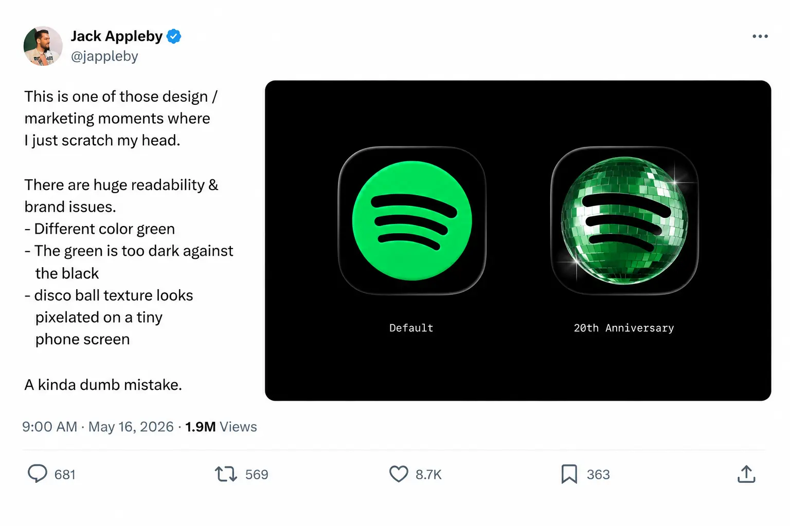
One of the most viral tweets from a design critique read:
“This is one of those design/marketing moments where I just scratch my head.
There are huge readability & brand issues.
– Different color green
– The green is too dark against the black
– disco ball texture looks pixelated on a tiny phone screen
A kinda dumb mistake.”
Logos holds emotions and feelings. A change in an app icon feels more personal because it has already established a sense of familiarity with its user. People interact with it every single day. The brain begins to associate it with comfort, routine, and memories.
A sudden change disrupts visual habit. Users feel confused, irritated, and disconnected, even if the redesign is better. A few years back, this is exactly what happened with the Instagram logo when it had a major upgrade. And now it happened with Spotify’s new logo. A small redesign affected the emotional familiarity users had with it.
The Other Side: Users Who Loved the Spotify Logo Disco Ball
But not everyone hated it. Some people loved the pizzazz.
A user commented on their Instagram celebration post, “PLEASE KEEP THE DISCO BALL LOGO PLEASE.”
“Personally, I love the disco ball one,” a user wrote on X. “It stands out, it’s flashy, and it’s so clean.”
On the brighter side, there were fans who wanted to keep the logo. Honestly, it’s not a bad logo. It just disturbed the emotional familiarity. But the real deal here is, are we bored with minimalist logos?
Flat, minimalist logo designs became popular because they felt clean, modern, and recognizable across different screen sizes. The Apple logo, Google logo, and Spotify logo embrace minimalism, making their brand identities simple, scalable, and instantly identifiable.
Critics argue that extreme minimalism might be removing personality, emotion, and uniqueness from brands. That is why maybe people have started to realize that minimalism is actually not necessary. A branding agency can approach a logo design with depth, effects, gradients, textures, and 3D-inspired visuals. Just one problem: they’ll be slightly difficult to scale.
Y2K nostalgia is fully embraced by Gen Z and millennials. Younger audiences enjoy glossy buttons, reflective surfaces, and playful aesthetics. These are more expressive than flat designs. The Spotify new logo, a disco ball, fits this trend.
This does not mean minimalism is dead. It will always work great for usability and clarity. But maybe experimenting with a minimalist logo will add a personality to it that people actually love and enjoy.
Spotify’s Response: “Glitter Is Not for Everyone”
Eventually, the discussions got so intense that Spotify had to reply to some of the hate tweets.
“We know glitter is not for everyone. Our temp glow up ends soon. Your regularly scheduled Spotify icon returns next week.”
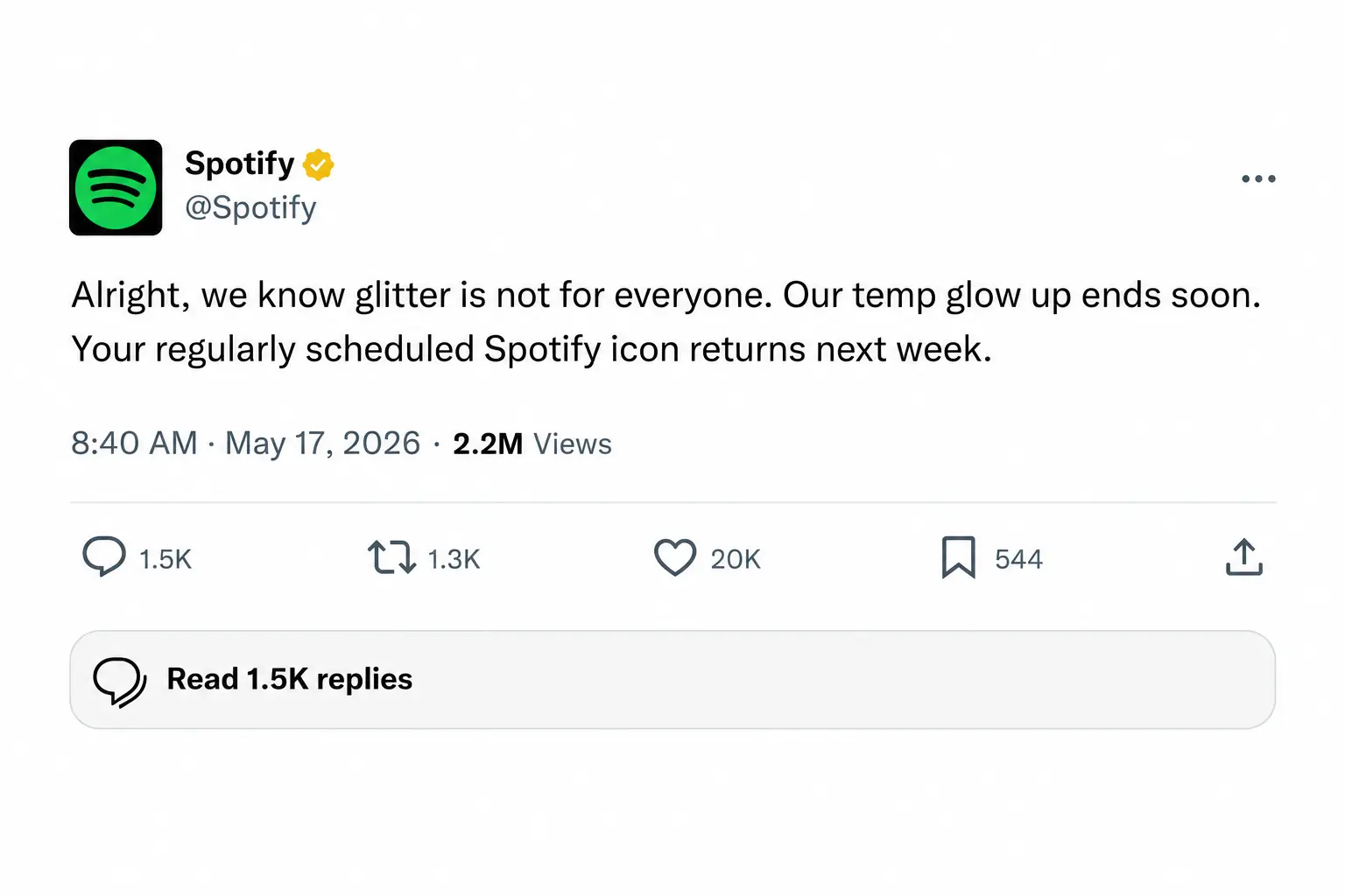
This statement makes it clear. The new, cool Spotify logo was meant to be temporary, in honor of a significant milestone the company has achieved. Spotify rarely changes its logo, but this limited-edition anniversary app icon created hype.
What the Timeline Reveals About the New Logo: Is It Temporary?
|
2006 |
Spotify’s original logo was introduced in 2006 on its launch in Stockholm, Sweden. The logo was very simple: a flat, stylized green circle with a soundwave mark. |
|
2013 – 2015 |
2013 – 2015 was when the actual Spotify logo evolution began. The green palette refines, and the sound wave is simplified into three clean arcs. |
|
May 12, 2026 |
Fast forward to May 12, 2026. Spotify launched its campaign “Spotify 20: Your Party of the Year(s)” to celebrate its 20th anniversary globally. The company introduced a new feature that shows the user’s complete lifetime listening history. |
|
May 13, 2026 |
On May 13, 2026, the Spotify new logo, the disco ball, rolled out on iOS. The original icon was replaced by a dark green 3D mirror ball. |
|
May 13 – 15, 2026 |
Users were not given a warning, which is probably why on May 13 – 15, 2026, Spotify users started reacting to it on X, Reddit, and other social platforms. Users called it ugly, pixelated, horrific. Design critics broke down each element and commented on why it was bad. |
|
May 15, 2026 |
Those in favor of the disco ball logo came out and said the idea adds personality to apps. Some users even requested that it be kept. |
|
May 17, 2026 |
The discussions got so intense that Spotify had to respond to some of the hate tweets, saying the redesign was intended to be temporary. |
|
May 18, 2026 |
The viral logo change and user reactions got a lot of media coverage |
|
May 19 – 25, 2026 |
The classic flat green Spotify logo will return by the end of the week, May 19 – 25, 2026. |
Why Does Spotify Get To Have All The Fun
The Spotify logo change triggered other brands to channel their inner disco logos, too. KitKat, Notion, ChatGPT, Solana, and MoonPay took this opportunity to redesign their logos just for fun.
![]()
The trend is now called “discomorphism.” The word combines “disco” with “skeuomorphism“, a design concept where digital objects mimic the appearance, texture, or functionality of their real-world counterparts.
A Brief History of Spotify’s Logo: How the Brand Has Evolved Since 2006
Spotify’s original logo was introduced in 2006; since then, there have been very subtle changes in the Spotify logo evolution.
| Year | Logo Evolution | Key Design Features | What It Represented |
| 2006 | Early Spotify Concept Logo | Experimental typography with a more playful and startup-like appearance | Reflected Spotify’s beginnings as a new music streaming platform, trying to disrupt the industry |
| 2008 | Official Launch Era Logo | Green wordmark with the iconic curved sound waves | Introduced the recognizable audio-inspired identity tied to streaming and connectivity |
| 2013 | Refined Modern Identity | Cleaner typography, smoother icon proportions, brighter green color | Showed Spotify’s transition from startup to global tech brand |
| 2015 | Flat Design Refresh | Simplified icon, flatter design style, modern sans-serif typography | Matched the rise of minimalist digital branding and mobile-first design |
| 2020 | Subtle Brand Optimization | Minor spacing, scaling, and usability improvements across devices | Focused on consistency across apps, smart devices, and marketing platforms |
| 2026 | 20th Anniversary Disco Ball Logo | Disco ball-inspired texture with reflective Y2K aesthetics while keeping the core icon recognizable | Celebrated Spotify’s cultural impact, music nostalgia, and emotional connection with users |
Key Takeaways: Why Familiarity Still Wins in Branding
Spotify users all over the world are wondering when the old Spotify logo will be back. It isn’t known for sure when the classic green Spotify icon will be back, but it’s expected to change back in the week of May 19-25, 2026.
As a leading logo design company in the USA, we have our views on the redesign, too. We found the Spotify new logo redesign an interesting experiment. It revealed an important truth about modern branding: people don’t like it very much when their emotional familiarity with digital products is disrupted. The reactions show how much users associate Spotify’s identity with their daily routines, playlists, and personal memories. This is what we call “branding done right.“
The temporary redesign was likely intended to spark conversation about the evolution of music culture, Y2K nostalgia, and the company’s significant milestone. In that sense, the campaign succeeded. It gained attention and engagement, which is very rare for an anniversary update.
The backlash highlights the user trust in digital branding. Users expect stability across apps, which is why even a temporary change can feel disruptive.
Logos are a core part of the digital experiences we’re creating for our users as branding agencies. They’re no longer just static symbols. They play a significant role in users’ emotional habits, their daily routine, and brand recognition. Spotify’s disco ball logo was more than a design change. It was a test of how far a brand can evolve without making users feel disconnected from the product they know.
Thinking of Redesigning Your Logo?
You’re at the right place. Logo Design Valley has experts on board who can redesign your logo without compromising on your brand identity.
Discuss Your ProjectAuthor Bio
Duaa writes blogs about marketing, branding, web design, and logo design. She enjoys turning ideas into simple, engaging content that helps businesses build stronger brands and connect with their audience in a more meaningful way.
Still choosing the right logo design company?
Get a quick, expert review. No pitch, just clarity on what fits your stage, budget, and growth.