Cracker Barrel made its first rebranding effort in 48 years, and it turned into a total disaster.
In August, 2025, Cracker Barrel, America’s beloved food chain known for its Southern comfort food and antique aesthetic, attempted a rebrand. It changed to the Cracker Barrel new logo, and seven days later, changed it back. Also, fired the branding company responsible for it.
The Cracker Barrel new logo controversy exploded on the internet. Not just because people didn’t like it, but because the loss was huge.
- Cracker Barrel lost approximately $200M market cap within days.
- -8% customer traffic dropped in the first month.
- Reversed the new Cracker Barrel logo within 7 days of launch.
- The failed rebrand cost at least $70M.
Here’s what happened, why it went so wrong, and what any business can learn before touching their own brand identity.
Want a Mascot Designed to Add Personality to Your Branding?
You’re at the right place! At Logo Design Valley, we create mascot logo designs that instantly grab your customers’ attention.
Design a Mascot LogoWhat Actually Changed in the Cracker Barrel New Logo
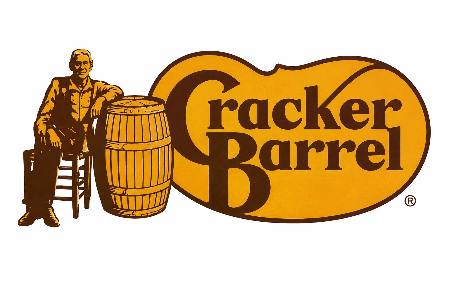
The Cracker Barrel new logo removed its iconic graphic “Uncle Herschel” and tried to rebrand with a minimalist approach. To understand the backlash, you’ll have to understand the major difference between the Cracker Barrel old and new logo.
The Old Logo: Uncle Herschel’s 48-year Reign
The old Cracker Barrel logo wasn’t the work of a trend-chasing design agency. It was designed in 1977 by a Nashville-based commercial artist, Bill Holley. The idea behind it was to evoke nostalgia through the “old timer” illustration. The logo included Uncle Herschel dressed in overalls, leaning back in a wicker chair, and resting comfortably against a wooden barrel. The illustration was inspired by Dan Evins’s real-life uncle.
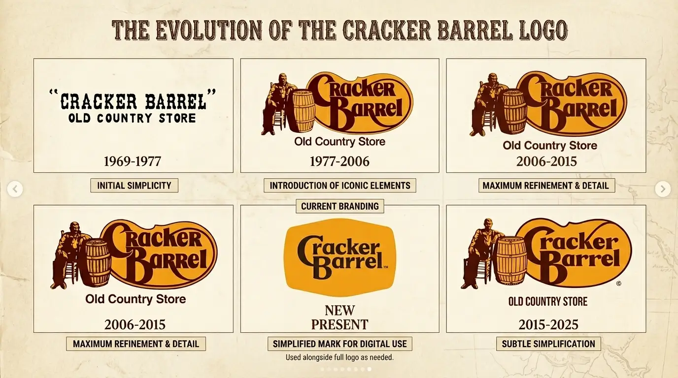
Cracker Barrel was founded in 1969. Initially, it had a text-only logo. A wordmark logo is what we call it in the language of logo design. Then, in 1977, eight years after its founding, the original Uncle Herschel Cracker Barrel logo was designed.
The transformation from a wordmark to a mascot logo design was loved by many. Uncle Herschel gradually became a powerful mascot in America’s quick-service dining experience. For 48 consecutive years, the illustration reigned across the Cracker Barrel sign, menu, and marketing touchpoints across more than 660 locations in 44 states.
The Cracker Barrel New Logo: What the Minimalism Approach Brought
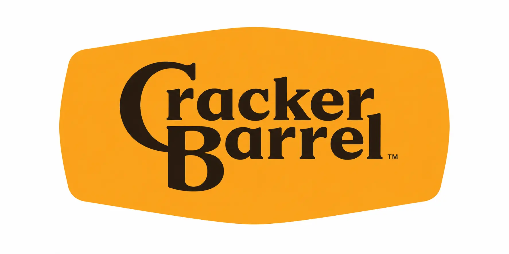
In August, 2025, Cracker Barrel revealed its new logo as part of its “All the More” campaign, designed by Prophet. Unfortunately, the redesign took everything away from the logo. Uncle Herschel was gone. The barrel was gone. The wicker chair was gone. “The Old Country Store” phrase was also gone.
What was left was a minimalist logo design, just the words “Cracker Barrel” set against a gold, vaguely barrel-shaped background. The Cracker Barrel new logo stripped off the personality, the visual warmth, and the familiarity of the old logo.
The company described the new logo as being “rooted even more closely to the iconic barrel shape and word mark that started it all.” The CMO added it was designed to “work seamlessly in the digital age,” scaling cleanly across apps, delivery platforms, and digital menus. The CEO later revealed that the simplified mark was meant to be more legible on highway billboards to passing motorists.
| Element | Old Logo | New Logo |
| Central character | Uncle Herschel (illustration) | None |
| Background shape | Detailed barrel with chair | Abstract barrel outline |
| Brand tagline | “Old Country Store” | Removed |
| Visual style | Illustrative, nostalgic | Minimalist wordmark |
| Color palette | Gold + deep brown | Gold + lighter brown |
| First introduced | 1977 | August 19, 2025 |
| Lifespan | 48 years | 7 days |
A Quick Guide to the Cracker Barrel Logo Evolution
Cracker Barrel initially operated with a text-only logo with its slogan. In 1977, Bill Holley designed the “old timer” logo featuring Uncle Hersechel. Since then, Cracker Barrel hasn’t made any significant changes to its logo, but it completely rebranded in August 2025 after 48 years. After the redesigned logo drew backlash, Cracker Barrel reverted to the old one seven days after launch.
What “All the More” Intended vs. What Customers Saw
Brands that have existed for years want to modernize their branding approach. They’re trying their best to adapt to minimalist, corporate-style logos and branding. But sometimes they’re not executed well, or the customers don’t like them.
Cracker Barrel’s “All the More” campaign wanted to do the same. It wanted to rebrand into a modern dining experience for the new generation, while staying true to its heritage logo color combinations. What customers saw was a logo that looked, as one Reddit commenter put it, like “a Dollar General knockoff.” The visual warmth that had built half a century of loyalty had been flattened into a corporate wordmark indistinguishable from hundreds of other casual dining chains.
The Backlash: The Cracker Barrel New Logo Controversy
The backlash to Cracker Barrel’s new logo was immediate and intense. After the redesign launched on August 19, searches for “Cracker Barrel new logo” jumped more than 5,000%, while #NotMyCrackerBarrel trended across social media. Critics argued the brand had removed the nostalgic identity that made it recognizable, with many mocking the simplified design online.
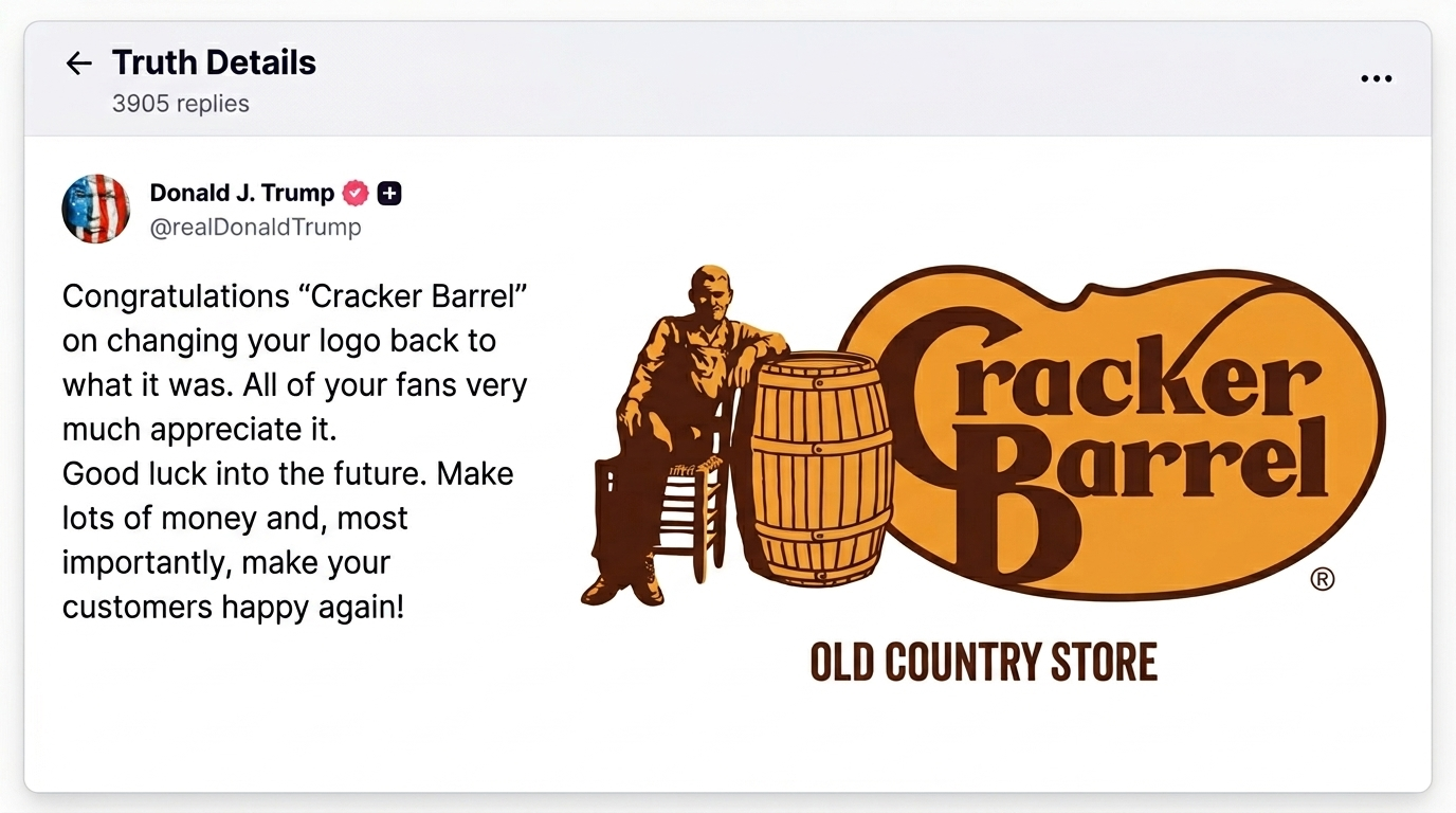
The Cracker Barrel new logo soon caught the eye of politicians. The company was accused of abandoning the traditional American imagery. The phrase “go woke, go broke” spread widely online. President Donald Trump also commented on the situation, saying the company had gained massive publicity and should use it to “make Cracker Barrel a WINNER again.” Even the White House’s official X account joined the conversation with an edited version of the logo featuring Trump. Later, he even congratulated Cracker Barrel on changing the logo back.
Cracker Barrel explained the redesign as an effort to create a more inclusive image, but the statement only intensified debate. Investors reacted sharply as well. The company’s stock dropped more than 12% at its lowest point, erasing an estimated $140–$200 million in market value in a single day. Customer traffic also declined in the weeks following the launch.
| August 19, 2025 | New logo launches with “All the More” campaign |
| August 21, 2025 | Stock falls 8%; social media controversy begins |
| August 22, 2025 | #NotMyCrackerBarrel trends nationally |
| August 25, 2026 | Cracker Barrel issues statement: “we could’ve done a better job” |
| August 26, 2025 | Trump posts and Cracker Barrel announces reversal hours later |
| September 12, 2025 | Media declares it a full brand retreat |
| October 3, 2025 | Cracker Barrel fires Prophet, its design agency |
Why Removing a Brand Mascot is Always a High-Risk Design Move
Mascots aren’t just decorations. They provide an immediate, memorable face to associate with your brand. Eventually, they become the face of your product.
What Brand Mascots Actually Do
The human brain relies on faces, personalities, and stories to develop an emotional connection. A well-loved mascot serves as an emotional anchor by creating parasocial familiarity, the sense of knowing someone, even from a logo seen at 70 mph on a highway.
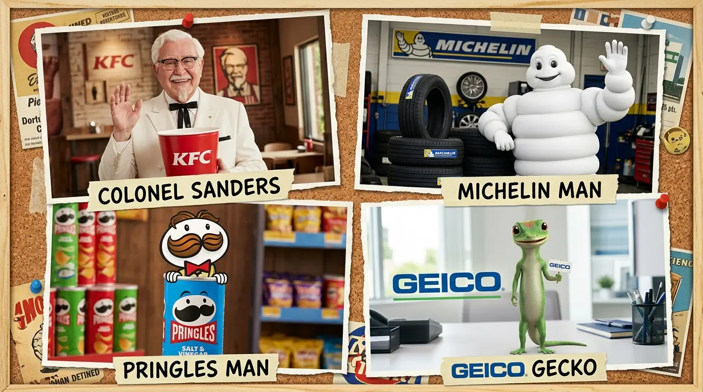
Think of what Colonel Sanders means to KFC. How the Michelin Man represents safety and reliability on the road. What the Geico Gecko does for a faceless insurance product. They’re not just recognized by their names. They are actual characters and people in the minds of their consumers. Uncle Herschel operated the same way for Cracker Barrel.
Consequences of Removing a Brand Mascot
Removing the mascot from a logo design is a bold, high-risk move. It’s the loss of an instant visual recognition. It can also result in the destruction of brand equity. Many brands ditch their mascots to appear modern, inclusive, and trend-aware. Sometimes the idea doesn’t backfire. But when a character or mascot becomes a design asset, and you remove it, consumers think your brand is going through an identity crisis. This is exactly why people didn’t like the Cracker Barrel new logo.
Uncle Herschel was a beloved character. Removing him from the old Cracker Barrel logo was not a redesign. It was the loss of a core branding asset. Mascot equity is not instantly measurable. It’s built over the years with implicit associations. Cracker Barrel and Prophet, their design agency, ignored how customers felt about Uncle Herschel and instead optimized for modernization. They passed the functionality test, but failed the emotional one.
The Prophet Design Firm – What Went Wrong
In March 2025, Cracker Barrel hired the Prophet, a San Francisco-based design and branding agency, to lead a comprehensive brand transformation.
The scope of the work was complete restaurant branding. Redesigning restaurants, overhauling marketing campaigns, informed brand communication, and redefining employee value proposition. It was supposed to be a strategic transformation that cost approximately $70M-$700M to attract young diners while preserving its heritage appeal. The new Cracker Barrel logo was just one piece of this massive transformation.
On October 3, 2025, Cracker Barrel said it ended its engagement with the Prophet. All other restaurant redesigns were stopped. A $70M-$700M restaurant rebranding is a risky bet. The real question here is whether the Prophet was neglectful of the Cracker Barrel’s actual customer base? Or did the leadership at Cracker Barrel override branding concerns just to appear a modernized brand?
Interesting Read: Revamping Your Logo: When and How to Do It Right
From a Logo Design Company’s POV: What Should Have Happened
As a leading logo design company in the USA, we think the Cracker Barrel new logo didn’t work because it didn’t follow a responsible logo redesign process. We think these best practices for logo design should have been followed:
1. Evolving Uncle Herschel
The most successful brands preserve the emotional connection while modernizing with subtle tweaks. A good example is the Starbucks logo. Starbucks has updated its logo several times. Each time, it has removed something complex, refined the art style, or adjusted the crop. But one thing is always there: the siren. You always know it is Starbucks. Cracker Barrel didn’t need to remove Uncle Herschel. They should’ve evolved him with a refined illustration style for better scalability.
2. Communicating the Change Before the Launch
Cracker Barrel acknowledged that they could’ve done a better job with sharing who they were and who they’ll always be.
Communication is a strategy equally important as the design. Customers want to feel included in a brand’s evolution. Cracker Barrel’s “All the More” campaign just came with a logo launch, not a story. Customers knew what was changing, but didn’t know why. A pre-launch campaign honoring Uncle Herschel’s legacy would’ve changed the entire narrative.
3. Test With Your Core Target Audience
Yes, young diners do respond better to minimalism and a digital-native design. But Cracker Barrel applied it to the wrong problem. The main objective of the redesign should’ve been to retain the existing client base, not attract a young diner who’s never eaten there. A logo redesign that fails to acknowledge existing customers’ sentiments is unlikely to survive a rebrand.
How to Modernize a Legacy Brand Logo Without Losing Loyal Customers
The Cracker Barrel new logo controversy shouldn’t be a reason to never modernize your logo with modern restaurant logo ideas. You just need to know how to do it right. At Logo Design Valley, we would have adopted this 3-step approach.
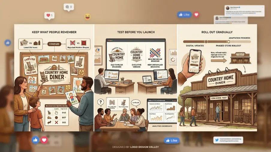
Step 1: Analyze What Makes Your Brand Recognizable
Before a redesign, think about:
- Which logo elements appear in user-generated content and fan art?
- When someone asks, “What does your logo look like?” which visual components do your customers describe?
- Which elements create the most recognition in logo tests?
Step 2: Test the Logo Before Public Reveal
Modern brand testing tools allow you to test logo variants with different target audience segments through controlled exposure. When testing, it’s not just about which one you like better. It’s more about the emotional connection and recognition. Cracker Barrel spent millions on a rollout. A fraction of the budget invested in the variant testing would’ve saved them before it became a crisis.
Step 3: Phased Roll Out
Transitioning everything within suddenly will most likely feel like a betrayal to customers. Plan a phased rollout. Try changing things digitally first, then move to a few existing locations. This gives your customers time to accept the change.
Planning a Logo Refresh for Your Restaurant Brand?
Talk to our restaurant logo design experts at Logo Design Valley.
Consult an ExpertWhat Lesson Brands Can Learn From the Cracker Barrel New Logo
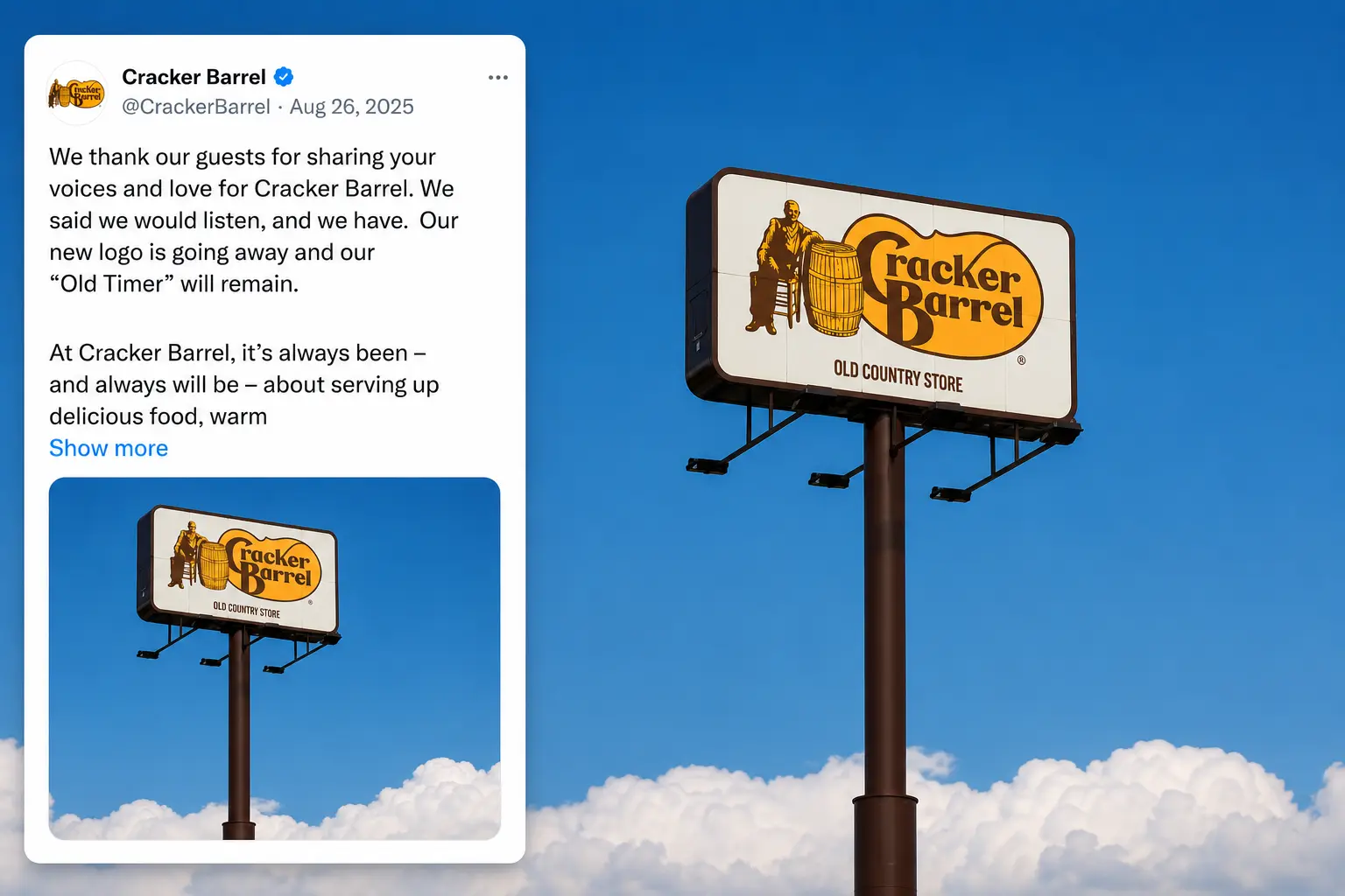
The Cracker Barrel new logo was reversed seven days later with an official statement shared on social media:
“We thank our guests for sharing your voices and love for Cracker Barrel. We said we would listen, and we have. Our new logo is going away, and our ‘Old Timer’ will remain.”
Cracker Barrel managed to retreat from a disastrous rebrand with dignity. A rebrand or a logo redesign is not always a bad choice. It just needs the right approach and the right time. Cracker Barrel’s underlying brand equity was already stronger. Sometimes the best brand strategy is to trust what you’ve already built.
Author Bio

 verified expert
Duaa writes blogs about marketing, branding, web design, and logo design. She enjoys turning ideas into simple, engaging content that helps businesses build stronger brands and connect with their audience in a more meaningful way.
Still choosing the right logo design company?
Get a quick, expert review. No pitch, just clarity on what fits your stage, budget, and growth.