Even though a logo and an icon can be used as substitutes, they serve entirely different purposes. A logo builds brand identity and trust, while an icon’s job is to provide functionality and navigation.
It’s important to know the difference between a logo and an icon when you’re looking into building your own brand identity. It’s a mistake most first-time founders make, thinking they both do the same job. They don’t. And not using them right can cost you your branding.
Let’s clear up the confusion once and for all about the logo vs. icon debate. But first, let’s define them.
![]()
Looking For a Full-Service Design Agency?
Logo Design Valley is a leading design agency in the USA. We’ve served over 3,500 customers with logo design, branding, and web design services.
Start Conversation
What is a Logo?
A logo is a visual symbol used to identify a company, brand, or organization. It’s the element that supports your brand identity. The colors, typography, shape, and symbols all tie together to represent your company across different branding touchpoints.
Your logo is everywhere. It’s on your packaging, signage, pitches, website, letterheads, contracts, etc. It’s not a regular, generic icon. It’s an identity asset that’s going to get your brand trademarked.
There are seven logo types in total:
- Wordmark: Consists of your brand’s name.
- Lettermark: Your brand’s initials are your logo.
- Pictorial Mark: Image relevant to your brand name.
- Abstract Logo Mark: Geometric logo shapes and symbols combined to create an abstract image.
- Mascot Logo: An illustrated character represents your brand.
- Combination Mark: Combines image, symbol, or mascot with text.
- Emblem: A badge, shield, or crest that encapsulates the brand name and image or symbol.
![]()
What is an Icon?
In the simplest words, an icon is a symbol, picture, or representation. It plays an entirely different role than a logo.
They are used to optimize navigation in user interfaces. These are generic UI icons. The cart, the arrows, the trash bin, and the menu icon are just some of the examples of generic UI icons.
But there’s also another side to this: a brand icon. It is a simplified version of the logo used across web and mobile applications. It’s built to work at very small sizes in app home screens, browser tabs (favicons), and digital dashboard buttons. The apple from the Apple logo or the N from the Netflix logo is a good example of a brand icon.
The best brands know the difference between a logo and an icon, value their usage, and understand their importance in building a cohesive brand identity.
![]()
Understanding the Difference Between a Logo and an Icon
Here are some of the key differences between a logo and icon design.
Primary Purpose
One major difference between an icon and a logo is how they’re used. We’ve already established the fact that they serve completely different purposes. A logo is a major branding asset. It’s used across all touchpoints. It’s on your websites, pitch decks, posts, packaging, business cards, or even stationery design.
An icon, on the other hand, is a logo variation that is used as a favicon, social media avatar, an app tile, UI button, or a notification badge. Your icon is a standalone symbol that represents your brand on digital platforms.
![]()
Text vs. No Text
Logo designs for brands can vary based on the type of logo. There are seven. But most logos, especially for new businesses, are a combination logo that is more commonly used. So, in total, a logo relies on an image and text to represent your brand. It’s the same with a wordmark logo. Your brand name becomes the logo.
But icons are a little bit different. They do not include text. Icons are a simplified version of the logo designed to be legible in the smallest sizes. We’re talking 16 px to 32 px icon sizes. Adding too much text at that size would compromise the icon’s legibility. It’ll look cluttered and will be 0% understandable.
![]()
Design Complexity
When you design a logo, you have the creative freedom to experiment with multiple elements, logo color combinations, symbols, and taglines. You can make it as simple or complex as you want. The only condition is that it needs to be scalable, because it’ll be used in different sizes and file formats.
The reason you need a scalable logo is that it’s the foundation of your app logo design. An icon that represents your brand needs to be simplified to a shape or a silhouette and still be clearly visible to represent your brand. A logo that looks great at full size but turns into visual noise at icon size is not what you want for your brand.
![]()
Trademark and Legal Ownership
A logo is the face of your brand. You can trademark it as your primary brand mark once it’s ready for commercial use. However, icons that are unique and distinctive are trademarkable. You cannot trademark generic UI icons or widely-used symbols. They cannot be exclusively owned by any one business. ![]()
File Formats
| Logo | Icon | |
| Master File Formats | AI, EPS, SVG, PDF (vector) | PNG, ICO, SVG (fixed small-size exports) |
| Why It Matters | Needs to scale infinitely for print and signage | Needs to render sharply at fixed tiny sizes |
Your logo needs to be scalable for print, physical, and digital touchpoints, which is why you need different file formats. Your icon needs to look sharp at tiny sizes. Also, icons are used on different devices. If your mobile app design is for Android, you’ll need a different size; for the Apple App Store, it has other requirements.
![]()
Do You Need Both a Logo and an Icon?
Yes, you need both because they serve very distinct purposes. As a branding agency, we highly recommend that you consider having both. But before you get them designed, you need to consider the stage your business is currently in.
Pre-Launch/ MVP Founders: This is the first stage of your business. You definitely need a logo. Start with a combination logo. You can later dissect it as a standalone symbol. A well-built combination mark should be easy to scale down to an icon.
Rebranding or Growth-Stage SMBs: Instead of completely disregarding the brand image you’ve already built, we suggest you evolve your logo. Redesign it in such a way that it cleanly reduces to a 32px icon. Update your brand guidelines to include the icon.
Established SMBs: When you’re on the established level, scaling or raising good revenue, investors look for more than just a logo. You need a complete branding system that includes logo variations, different file formats, and icons.
![]()
Will An Icon Be Enough For Your Brand Identity?
No, it won’t. While it has some perks, it does not play a role in building a strong brand identity or help with brand recall.
| Pros of Icon-Only | Cons of Icon-Only |
| Clean and modern look | Harder for people to recognize a new brand |
| Works well on apps and favicons | Not ideal for documents or signs |
| Fits popular app styles | Can be risky for businesses that depend on their name being remembered |
Logo vs. Icon in Practice: Real Brand Examples
Most of the famous brands we see today had logos in a time when there was no concept of an icon. Eventually, every one of them evolved to meet the needs of our digital-first world. Today, a brand identity is incomplete without an app, a website, or a digital platform.
Here are some iconic examples to better understand the difference between an icon and a logo:
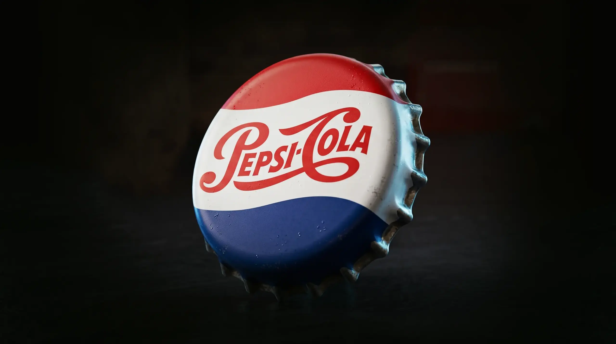
Target: The bullseye serves as a standalone symbol whether it’s a logo or an icon.
Apple: The bitten apple is used as Apple’s pictorial mark and icon.
Slack: The Slack logo is a combination mark. The image is used as a standalone symbol for the icon or favicon.
KFC: The KFC logo is scaled down to Colonel Sanders to represent the brand as an app icon.
Amazon: The Amazon logo is one of the iconic logos, but on the Google Play Store and the Apple App Store, the icon is a simplified version of the original.
![]()
File Formats and Sizing Considerations for Logos and Icons
When your logo exists in the right file formats and sizes, you’re making sure it’s sharp across platforms, renders well, and displays correctly across print and digital mediums. Here’s a quick table guide for which formats and sizes you’ll need to maintain consistency during scalability.
| Use Case | Recommended Format | Typical Size |
| Website Header Logo | SVG | Scalable |
| Favicon | ICO / PNG | 16×16, 32×32, 48×48 |
| App Icon (iOS/Android) | PNG | 1024×1024 master, auto-scaled |
| Social Media Avatar | PNG / JPG | 400×400 minimum |
| Print / Signage Master Logo | AI / EPS / PDF | Vector, CMYK |
Can You Trademark a Logo and an Icon?
Most small business owners do not know how to trademark a logo or an icon. You can trademark both of them as long as they are not generic.
Poorly designed logos are often derived from stock images or have very generic elements. This causes trademark issues when you want to differentiate your products and services. You can trademark icons the same way you trademark a logo. The only condition here is that it is distinctive. You cannot trademark generic UI icons.
Have a trademark attorney review your logo and company icon. They can help you with all the legalities once you have full commercial rights to all logo variations.
What Small Businesses Get Wrong About Logos and Icons
Most business owners fail to understand that logos and icons work in very different ways. “Just make me an icon.” They assume an icon would cost less or that it can replace the logo everywhere. We hate to break it to you, but it does none of that.
A logo is an identity asset, whereas an icon represents your brand in small sizes. A logo should be your first priority in design. Ignoring basic branding needs and saying “we’re just a small business” will make you lack consistency when you have strong business growth plans.
If your business is a hobby project, sure, go ahead; you can use an AI logo design. But if you’re serious about business growth, scalability, and expansion, a well-designed logo will solve most of your future problems.
We cannot emphasize the importance of testing your logos and icons. Whether it’s a logo design process or you’re discovering how to design an app logo, testing both will determine legibility across platforms and branding touchpoints. You have no margin to get that wrong!
![]()
Tips to Build a Logo and Icon System That Scales
- Get your logo designed by a professional. A good logo design is refined in quality so it survives being scaled down to a 32px icon.
- When you’re discussing pricing or getting a quote, discuss deliverables so you’re not paying extra for favicons, app icons, or a social avatar.
- Make sure your final brand guidelines document the icon lockup, not just the primary logo.
- If you’re launching on multiple platforms like web, app, and socials, ask for icons that are specifically built for those platforms.
- From your logo, choose an element that could work as a standalone symbol as your brand grows. It can also be used as an icon.
- Consider including a social media design kit in your branding budget to use your icon with consistency across avatars and templates.
![]()
What Does a Logo and Icon Design Cost at Logo Design Valley?
Logo Design Valley supports SMBs and seed-stage startups with founder-friendly prices. We understand that not every business has the budget to invest in enterprise-level branding. But what if there was an agency that gave enterprise-level quality at affordable rates? That is Logo Design Valley for you!
Our custom logo design package starts at $129. The result will be a scalable logo design that can be scaled down to a clean icon later. Businesses looking into packages that consist of different variations in the logo can opt for other logo design packages. But wait, there’s more. You can find branding and web design services at founder-friendly prices, too. Everything you need to build a brand is in one place!
With our logo design company, you don’t pay the price of two designs. You pay for one and enjoy the benefits of two.
Know The Difference
The key difference between a logo and an icon lies in their purpose and role within a brand identity. Your logo completes your branding system, while an icon is a scaled-down version of your logo that represents you on browser tabs, on your home screens, and dashboards.
You cannot undermine their need. For new businesses, a logo does the job. But if you’re launching your business on multiple platforms, rebranding, or your growth scale is at an all-time high, a logo in various file formats and an icon in different sizes are a must-have.
Author Bio
Duaa writes blogs about marketing, branding, web design, and logo design. She enjoys turning ideas into simple, engaging content that helps businesses build stronger brands and connect with their audience in a more meaningful way.
Still choosing the right logo design company?
Get a quick, expert review. No pitch, just clarity on what fits your stage, budget, and growth.