Any restaurant logo, no matter how small, is essential to the restaurant’s success. Even without smelling or seeing the food, customers are enticed to think about the experience you offer. And it doesn’t even have to show the food.
The real challenge is how everything in the restaurant logo is put together. The colors, the style, and the font should work together to encourage customers to take a peek inside and see what you offer.
No matter how good a cook you are, your logo design and branding are the sole reason why customers first decide to come in. If you are launching a fast-food place, bakery, cafe, food truck, or fine-dining restaurant any time soon, we’ve picked 12 famous restaurant logos for you to get inspired by.
Don’t Know What Your Restaurant Logo Should Look Like?
Branding your restaurant shouldn’t be stressful at all. Let’s work together on finding a visual direction for your restaurant logo. Fill out the form below, and we’ll take it from there.
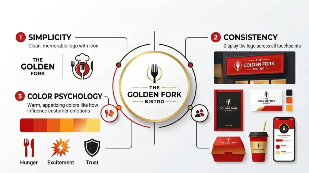
What Makes a Restaurant Logo Famous?
The famous restaurant logos we see today have a history of redesigns, subtle changes, additions, and subtractions of elements. Some got popular because their branding actually encouraged people to try them out and make them trend on social media. But the principles are always the same.
Simplicity
If you’ve noticed, all famous restaurant logos are visually simple. It doesn’t matter whether the logo is on a billboard or a tiny app icon; you can recognize it in milliseconds. McDonald’s golden arches, the bitten apple in the Apple logo, or the Nike swoosh; these are all famous logos, yet have one thing in common, and that is simplicity.
Color Psychology
Most new founders underestimate the power of color. When used strategically, logo color combinations can trigger emotions and appetite. Famous fast food restaurant logos use a brighter color palette to convey high energy and their QSR experience. Fine-dining restaurants use a darker color palette to exude luxury and sophistication.
Consistency
A logo only becomes famous when it is backed by consistency. For any restaurant to become recognizable, it needs to maintain logo consistency across staff uniforms, packaging, menu, signage, social media, and website.
12 Famous Restaurant Logos
Here’s a list of logos from your favorite restaurants in the US.
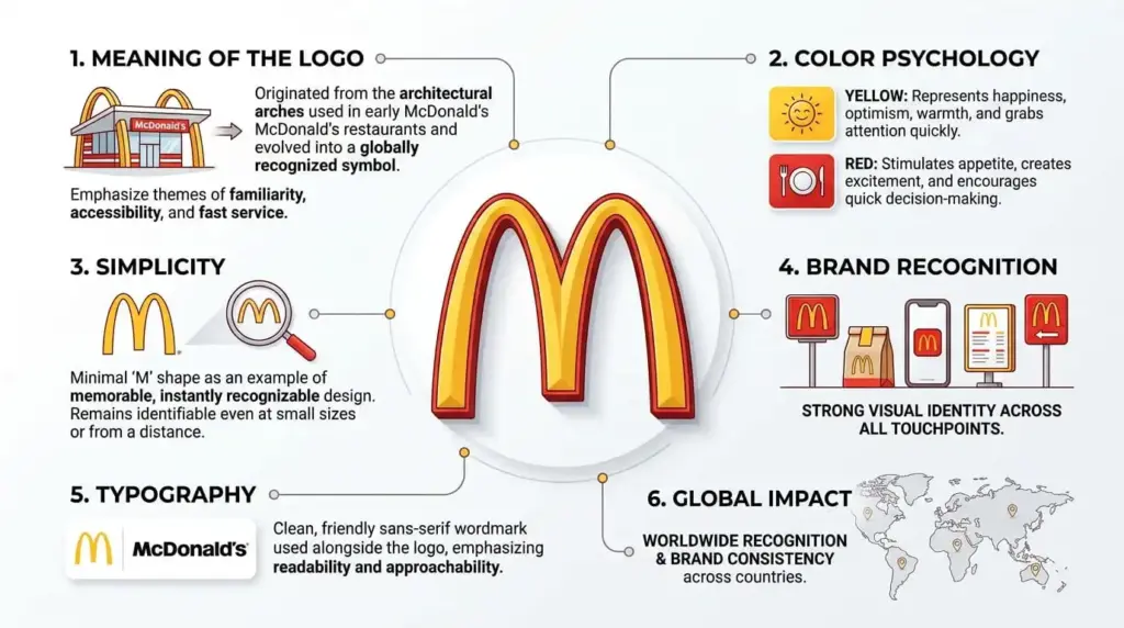
1. McDonald’s
Not just in the US, the McDonald’s logo is one of the most famous fast food restaurant logos in the world.
Originally, the Golden Arches were part of the first franchise’s physical architecture. But in 1962, they officially became a part of the logo. The logo has remained consistent for years, and now it’s globally recognized.
Colors: The color palette for the McDonald’s logo is red and yellow. The colors are known to stimulate appetite and grab attention fast.
Redesigns: The McDonald’s logo hasn’t changed much since the Golden Arches were adapted into the official logo. However, the look of the logo is modernized and flattened to meet the needs of the digital era.

Design Tip
If there’s something from your restaurant’s exterior or interior that can become a brand asset on its own, it’s a smart choice to use it.
2. Starbucks
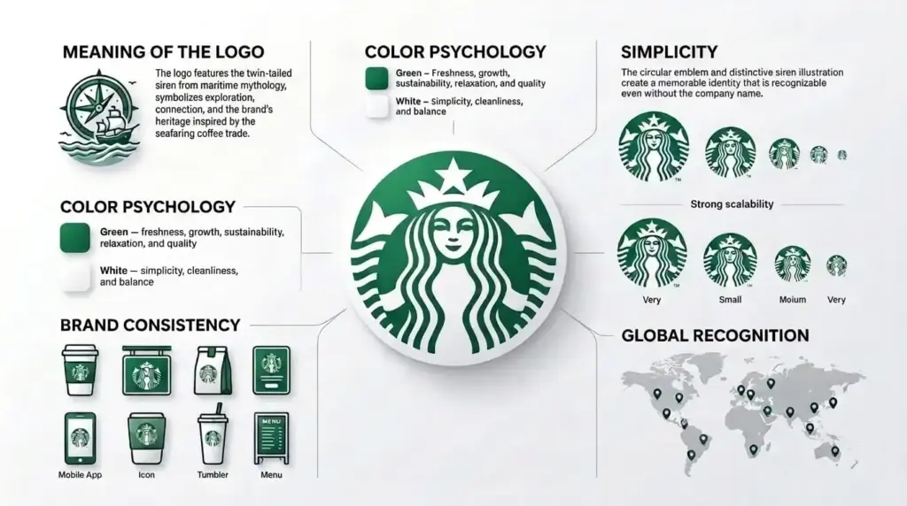
The Starbucks logo features a twin-tailed siren as the center element in an emblem logo type. The logo represents the company’s original roots in Seattle’s maritime history and the trade of coffee. If you’re looking for coffee shop logo design inspiration, your moodboard would be incomplete without the Starbucks logo.
Color: The deep green color associates the coffee shop with a calm, relaxing vibe.
Redesigns: The original Starbucks logo featured a bare-breasted siren; then the logo was redesigned to be modest. From then on, the logo has been simplified a lot, lost its wordmark, and the outer ring was dropped.
Design Tip
Your logo should be designed in a way that works even when the wordmark is dropped; it remains recognizable.
3. KFC
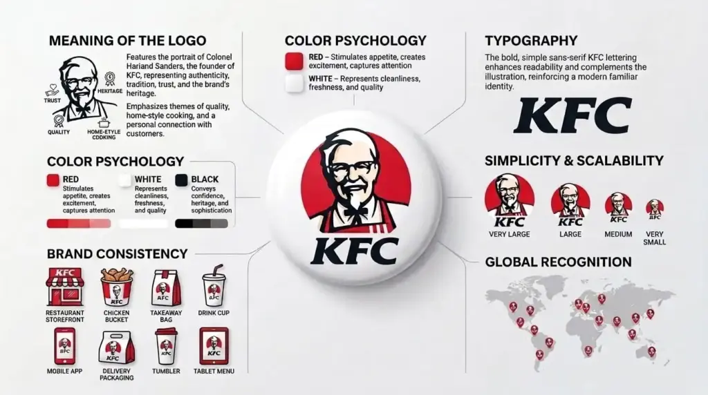
The KFC logo is a timeless example of a mascot logo. The logo features Colonel Harland Sanders, the founder of KFC. The logo is an ode to his life and branding decisions. The original logo for KFC was a wordmark logo. Later on, Colonel Sanders became a part of it. The logo is a tool for visual storytelling of the history of KFC.
Color: The colors commonly used in the KFC logo are red and white, with the Colonel’s black bow and tie as a signature detail.
Redesigns: The KFC logo was recently redesigned as part of a brand refresh. The logo was redesigned many times to improve typography and refine the Colonel. Whatever the redesign featured, the KFC mascot always remains recognizable.
Design Tip
A founder-based logo only works if your founder’s story is interesting and a core part of your marketing. Otherwise, it can outdate your brand.
4. Chipotle
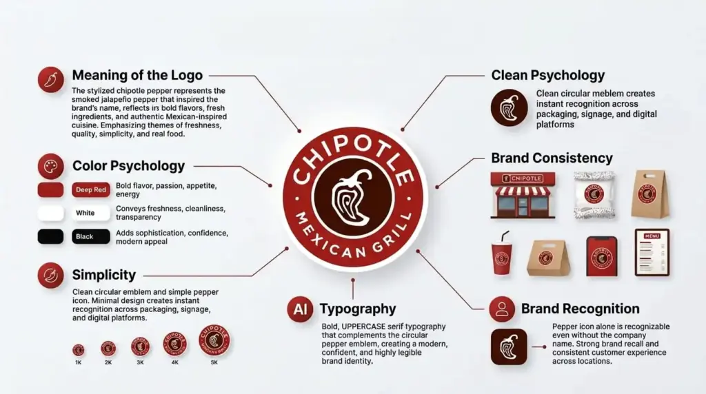
Chipotle Mexican Grill is a famous restaurant food chain. As its name suggests, the Chipotle logo features a stylized red chili pepper in a circle logo design. The logo overall is designed to honor Mexican food and its bold flavors in a casual dining experience. As a logo design company, we recommend that most restaurants highlight their specialty in their logo. This way, people will get an idea about what you serve.
Color: The color palette for the Chipotle logo features red, a deep red-brown, and white.
Redesigns: The Chipotle logo hasn’t changed since 2009. The redesigns before the current logo were a major shift from a wordmark to a rounded logo with a pepper in the middle.
Design Tip
Your specialty can be shown through your logo and the colors you use. When we look at the Chipotle logo, we expect spice, bold flavors, and a true Mexican experience.
5. Domino’s
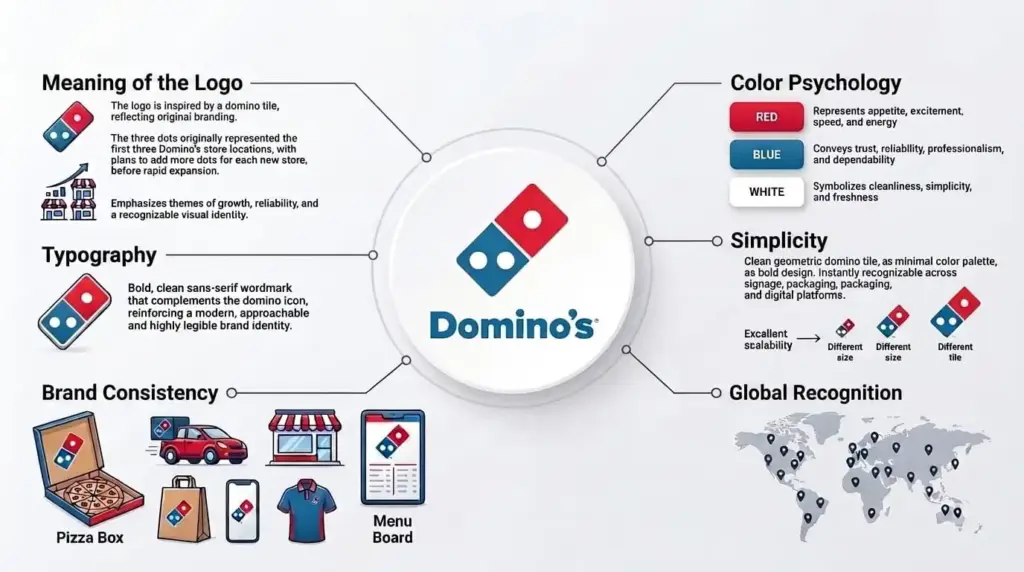
If you are planning to open a local pizza shop, the Domino’s logo is the famous pizza restaurant logo you should take a look at. The logo features a red and blue domino piece containing three white dots that represent the franchise’s first three restaurants in the United States.
Colors: The colors red, blue, and white represent energy, quality, and reliability. The colors work great across packaging.
Redesigns: Domino’s dropped “pizza” from the logo in 2012 to signal a broader menu.
Design Tip
If you have an origin story, make sure your restaurant logo hints at it, like the Domino’s logo hints at the first three franchises.
6. Dunkin’
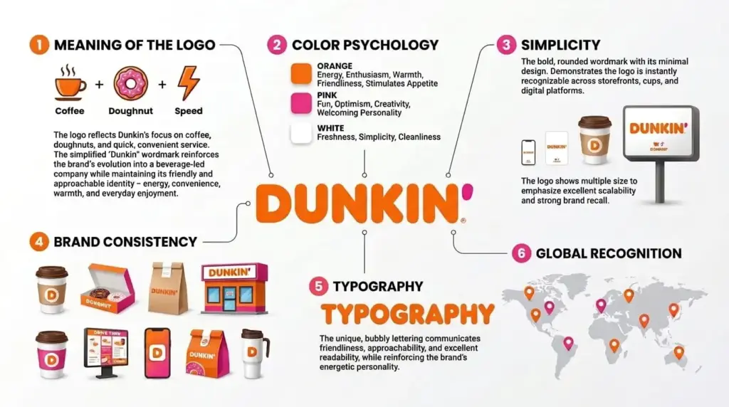
The pink-and-orange wordmark logo for Dunkin’ is one of the most eye-catching designs to date. The pink color made its debut on the logo in 1960, and orange later appeared on the emblem. The current logo only features the company’s name.
Colors: The color palette is strategically used to create a cheerful, happy mood. Even though it’s an unusual color pairing, the combination works effectively in grabbing attention.
Redesigns: The original Dunkin’ logo was far from what we have today. It featured a handwritten typeface in brown. Later on, the colors were brought in, and cheerful, modern fonts add to the vibe. “Donuts” was dropped back in 2018 to position the company as a coffee-first server.
Design Tip
Sometimes unexpected color pairings can work out in your favor. When most coffee shops go for a more sophisticated, calming color palette, using color blocking or unexpected combinations can be a competitive advantage.
7. Wendy’s
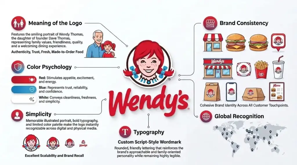
Today, Wendy’s has one of the most famous restaurant logos in the US. The portrait of the red-haired girl with the two pigtails is the highlight of the logo. The logo was inspired by the real-life daughter of Wendy’s founder, Dave Thomas. Her face gives the restaurant a family-oriented identity and a homely feel to visitors.
Colors: Red and blue are the primary colors of the logo. They make it stand out in the competitive QSR landscape. Also, the colors make the restaurant recognizable even from a distance.
Redesigns: The red-haired girl has always remained the core part of the logo. In 2013, the logo was modernized in 2013 with a fresher illustration, and the tagline “Old-Fashioned Hamburgers” was removed.
Design Tip
Small restaurant businesses with a mascot need to redesign it with subtle changes and refinements over time.
8. Taco Bell
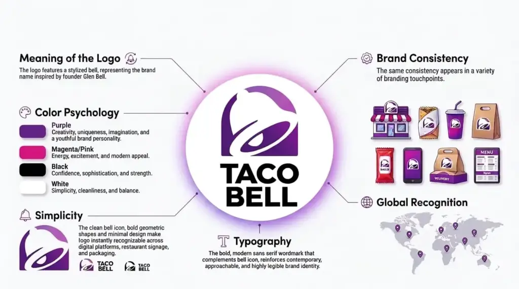
In the Taco Bell logo, the bell is the star of the show. It represents the founder’s surname, Glen Bell. It also serves as a visual that grabs attention in an instant. The original logo was a simple wordmark. It was not until 1985 that the bell was brought into the logo as a central design element.
Colors: Purple gives viewers a break from the traditional reds and browns used in most fast-food chains. The colors make Taco Bell stand out instantly.
Redesigns: The abstracted purple bell mark is a result of years of design evolution. The original logo was a wordmark, then the bell was added, and now we have a modernized version of the logo that works as a minimalist logo design.
Design Tip
Abstracting a literal object, like the bell, into a simple shape works better when the logo is used scaled to small sizes. A detailed illustration can lose its legibility when scaled.
9. Cracker Barrel
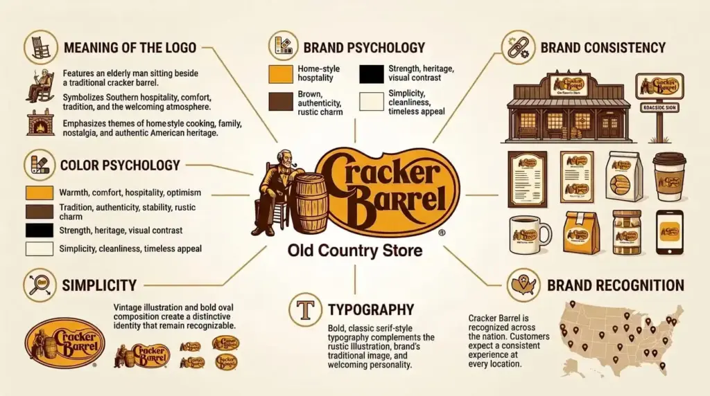
The Cracker Barrel logo has a nostalgic feel to it. They recently changed their logo and dropped Uncle Herschel, which immediately turned into a controversy because people didn’t like the redesign.
Colors: Warm brown and gold give the logo a very rustic, homestyle feel. The colors are meant to evoke nostalgia.
Redesigns: Cracker Barrel recently rebranded after 47 years. The Cracker Barrel restaurant new logo was simplified in 2024. They dropped Uncle Herschel and the barrel from the logo. The backlash was so harsh that they had to bring the original design elements back.
Design Tip
Before rolling out the logo changes, test how your customers respond to it. Sometimes the redesign can backfire, as it did for Cracker Barrel.
10. Cinnabon
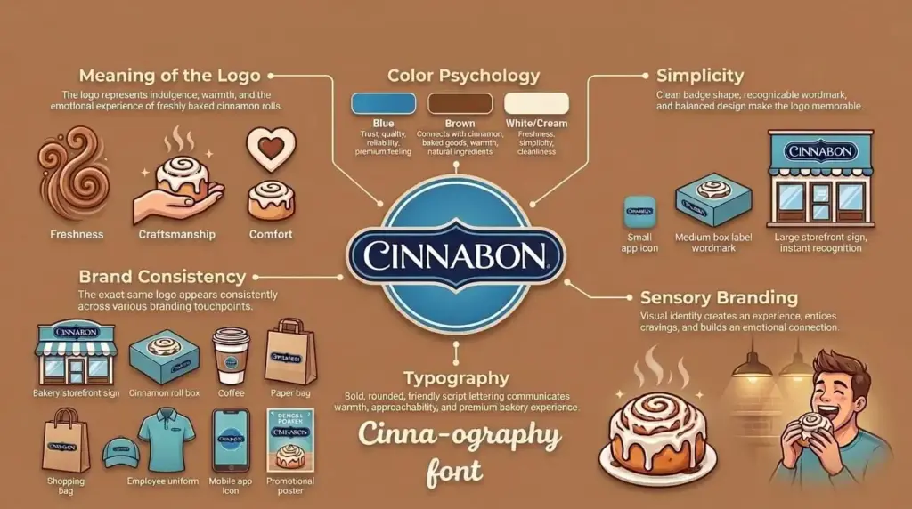
Cinnabon is an American bakery brand known for its cinnamon bun rolls. The bakery’s logo reflects its best seller: the cinnamon roll. In their current logo, the swirled cinnamon roll shape doubles as the letter “C”, making the product the logo.
Colors: The deep blue color of the badge and the white wordmark create an elegant feel to evoke baking and freshness.
Redesigns: The Cinnabon logo is refined over the years to become a cleaner, flat logo design without losing the swirl of the cinnamon roll.
Design Tip
If there’s a menu item that has a distinctive shape, turn it into your icon. It’s going to make your logo more memorable than any other abstract or invented symbol.
11. The Halal Guys
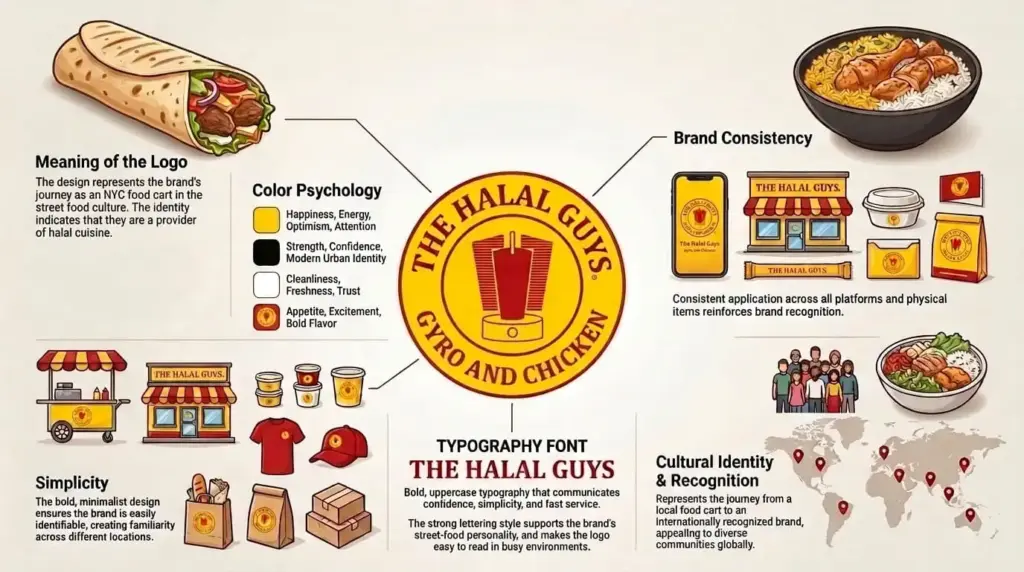
The Halal Guys began as a hot dog cart in 1990. Now, it’s become a national chain. In our opinion, branding for food trucks and carts is slightly different than the others. The colors, the font, and the imagery need to work together in harmony to be visible to potential customers on the move. You need to be especially recognizable from a distance.
Colors: The logo features a red and yellow palette that makes it attractive from a distance and builds appetite.
Redesigns: The Halal Guys logo changed minimally as they expanded to brick-and-mortar locations. The redesigns still maintain the iconic NYC cart look.
Design Tip
Starting small doesn’t mean you can’t have a logo that scales with your expansion. Always have a few ideas in mind to build authenticity as you scale.
12. Ruth’s Chris Steak House
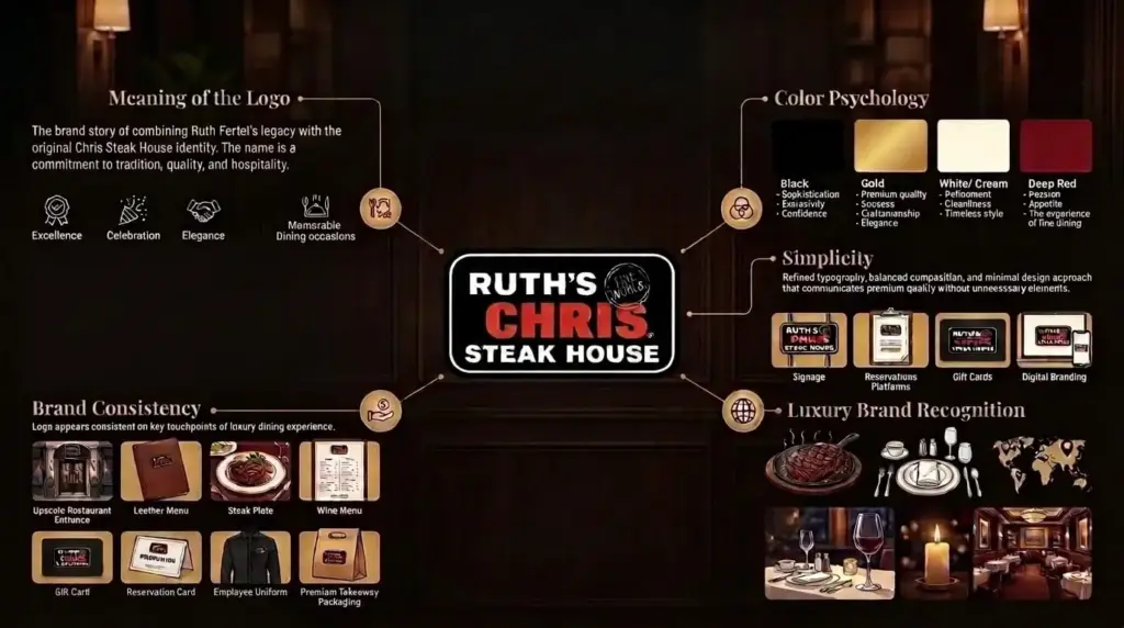
When it comes to famous restaurant logos, most lists skip fine-dining restaurants. Ruth’s Chris Steak House is known for premium beef cuts and impeccable service. In the logo for Ruth’s Chris Steak House, the typeface does all the work. It does not have any icon, mascot, or illustration. A clean serif wordmark works to show it as a fine-dining restaurant.
Colors: The logo avoids saturated, bright color palettes completely. The black, white, and red support its fine-dining position.
Redesigns: The logo has undergone minor typographic changes, nothing major.
Design Tip
To justify premium pricing, your logo needs to read “premium.” A brighter color palette or a mascot would completely change how customers see you. In short, don’t use them.
Elements of a Good Restaurant Logo
Across all 12 restaurant logo examples, these elements show up again and again. Here’s a checklist you can use to find out whether your logo meets the “famous restaurant logos” criteria.

Note:
Simplicity: Can you describe your logo in a few words?
Color Psychology: Does your color palette build appetite or stand out in a crowded category?
Scalability: Will it work as a tiny app icon, a large banner, and everything in between?
Typography: Does the typography suit your brand personality?
Timelessness: Are you chasing a trend or creating a logo that’ll be recognizable decades later?
How Much Does a Restaurant Logo Cost?
The logo design cost depends on the scope. Here’s a quick overview of what to expect in 2026:
| Option | Typical Range | Best For |
| DIY / AI logo maker | Free–$50 | Placeholder logos, early concepting |
| Freelance designer / boutique agency | $200–$2,000 | Startups, small businesses, restaurants, and growing brands that want custom design without enterprise agency pricing |
| Traditional design agency / full brand identity | $2,000–$10,000+ | Multi-location restaurants, franchise brands, and businesses requiring comprehensive brand strategy |
For small businesses, often a restaurant logo isn’t enough. They’ll eventually need a matching color system, typography, and the logo in different file formats for scalability. This is where restaurant branding services for Logo Design Valley come in. We’re a branding agency with over seven years of experience in cohesive restaurant branding for new startups, growing businesses, and established diners.
Does Your Restaurant Logo Stand Out In the Crowd?
If your restaurant logo is struggling to bring in customers, it needs a redesign. Discuss with experts how to improve your logo.
Should You DIY, Use AI, or Hire a Professional Designer?
This topic is debatable. We think that each of these choices reflects a different business stage and the needs of a new restaurant owner.
DIY tools or AI logo generators work well when you want a placement logo or your business is just a hobby, and you don’t plan to invest much in it. But if you are serious about your restaurant business, its growth, and finding investors, a professional designer or a logo design company can help you build a brand identity that scales as you grow.
DIY or AI Tools
Pros Cons

Professional Logo Designer
Pros
- Custom, original logo tailored to your brand
- Strategic design backed by branding expertise
- Scalable identity with professional, production-ready files
Cons
- Higher upfront cost than DIY or AI tools
- Takes longer than automated logo generators
- Quality varies depending on the designer or agency
Design a Logo That Can Grow With Your Brand
Famous restaurant logos don’t become famous overnight. They take time and consistency to be recognized at first glance. Restaurant logo ideas for a new business don’t come naturally. You need to research based on your niche. See what colors are popular. Analyze what competitors are doing better. Find out what design elements are working. Only then will you have a solid foundation to build your own famous restaurant logo.
Author Bio

 verified expert
Duaa writes blogs about marketing, branding, web design, and logo design. She enjoys turning ideas into simple, engaging content that helps businesses build stronger brands and connect with their audience in a more meaningful way.
Still choosing the right logo design company?
Get a quick, expert review. No pitch, just clarity on what fits your stage, budget, and growth.