The launch of ChatGPT in November 2022 was a revolution in the conversational AI industry. Since then, it has been a core part of our lives. It’s a go-to platform for all information, queries, and advice. ChatGPT’s branding was one of the main reasons it instantly stood out.
But there’s so much more that went into creating a logo worth remembering for a chatbot. Does anyone know the ChatGPT logo history? What makes the logo successful?
The ChatGPT logo has depth and meaning despite being a simple design. It represents connections, communication, intelligence, and the human-AI relationship in the best way possible. The minimalist logo design makes it easier to be used across apps, APIs, websites, and other digital interfaces.
This blog discusses the ChatGPT logo history in depth and breaks down each design element.
Custom Logo Designs for Small Startups
Logo Design Valley is the go-to place for small businesses in the USA for logo design services.
Get a Custom LogoWhat is ChatGPT?
ChatGPT is a generative AI chatbot developed by OpenAI. GPT stands for Generative Pre-trained Transformer, while Chat refers to its chatbot interface. It was launched in November, 2022 to assist with basic tasks, answer questions, and interact conversationally in the most natural and human way possible.
Advantages of ChatGPT
People around the world use ChatGPT for small tasks like finding the meaning, to tasks like determining full business scalability. Here are some of its advantages:
- Users get answers in an instant.
- ChatGPT has a large amount of pre-trained data, making it easy to access a wide range of information.
- The interface is designed to be simple and user-friendly. It’s like having a conversation.
- The AI tool is available 24/7 from anywhere. You just need to have a stable internet connection.
Complete Breakdown of the ChatGPT Logo Design
Logos for AI platforms need a very thoughtful design. They need to be simple yet symbolize the complexity behind creating a huge neural network. The logo needs to appeal to both users who do and those who do not have in-depth technical knowledge. Almost all AI platforms have a logo that’s both simple and complex, representing the intelligence behind an easy-to-use platform.
Among recently developed AI tools, ChatGPT has gained attention because of its distinctive logo and branding. Each element in the logo design is strategically placed. Here’s a quick breakdown of the ChatGPT logo.
Origin
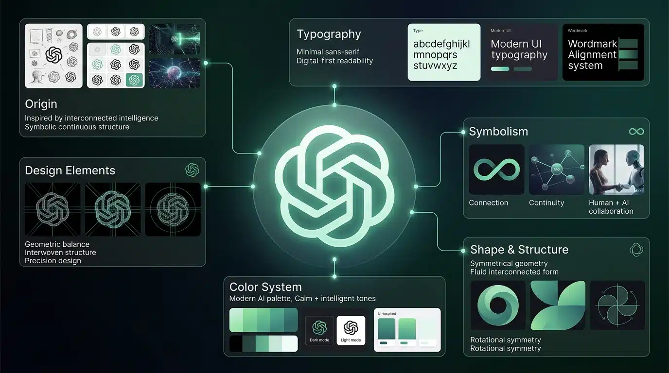
The ChatGPT logo history dates back to November, 2022, when OpenAI released the chatbot and introduced the logo. It’s called the “Blossom.” There is no big branding agency behind the design. The initial logo was designed by Ben Barry and Ludwig Peterson to reflect the idea behind ChatGPT’s existence. Later on, the changes were made by OpenAI’s internal design team. The flat logo design makes it ideal for scalability across different platforms.
Design Elements
Among the seven different logo types, ChatGPT is an abstract logo. Each design element symbolizes something about the platform:
Six Interlocking Loops: They represent a network, conversations, and the exchange of infinite knowledge.
Symmetry: The logo has strong rotational symmetry. It repeats consistently around a center point, indicating balanced proportions and evenly distributed curved forms.
Color Choice: The colors used by ChatGPT are very muted and monochrome.
Negative Space: The smart use of the negative space between the loops forms a hexagon.
Symbolism
It’s impossible to have all design elements used without any significant symbolism. The OpenAI ChatGPT logo carries several meaningful layers:
- The woven loops suggest interconnection. Collaboration, networks, interconnected intelligence, and human-AI interaction are the core ideas behind the logo.
- The endless looping implies iteration, adaptation, and evolving systems.
- Geometric elements and negative space simultaneously symbolize sophistication, complexity, and simplicity.
- The soft curves make the brand appear approachable, thoughtful, and less of a tech brand.
- The open, flowing geometric design symbolizes the “Open” in OpenAI.
- The circle logo design symbolizes fluidity and a human-centered approach to thinking.
Shape
The ChatGPT symbol is called the “Blossom.” The shape is a circular structure of six interlocked curved forms. It visually appears to be a knot, a woven structure, an infinite loop, or a flower-like pattern. The key characteristics of its logo shape are:
- Geometrical pattern
- Rotational symmetry
- Loops and woven curves that are continuous/infinite
- Balanced negative space forming a hexagon
- No hard edges, smooth curves
Typography/Font
The original wordmark was created using a sans-serif font similar to Helvetica/Arial before OpenAI changed the typeface for the logo as part of their new brand identity introduced in 2025. OpenAI has developed its own typeface (called “OpenAI Sans”) to provide uniformity across all logos, various products, marketing materials, and overall brand identity. The shift reduces reliance on generic logo fonts. Before OpenAI Sans, OpenAI and ChatGPT used basic sans-serif fonts.
Colors
ChatGPT’s logo uses a more muted, monochrome color palette. The main logo color combinations used are black and white. They are ideal colors for simplicity, neutrality, and clarity. For digital interfaces, you’ll see dark gray or soft gradients used. In the app UI, the logo remains neutral in color, while the background uses green accents.
The colors are used strategically to show professionalism, build trust and clarity, represent modern technology, and focus on function over decoration. The color palette also allows the logo to work across different platforms, interfaces, websites, and icons.
Want a Logo That Has All Design Elements?
At Logo Design Valley, we create meaningful logos where each element is strategically placed.
Discuss Logo ConceptChatGPT Logo History: How Much Has the ChatGPT Logo Evolved?
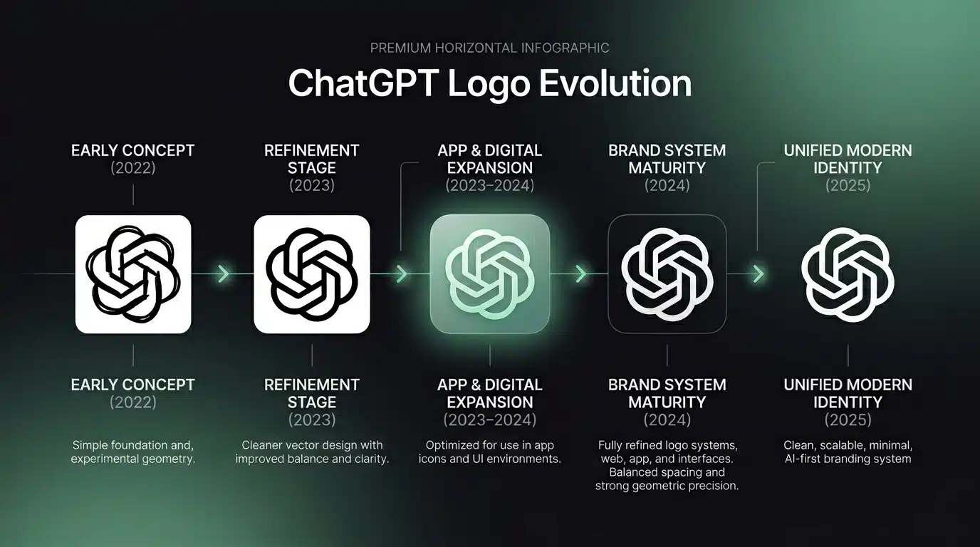
There weren’t any major transformations in the ChaGPT logo history. The changes were very minimal, like color upgrade, shape refinement, and updated typography. All changes were made to improve clarity, flexibility, and consistency across branding touchpoints. One significant upgrade is the introduction of OpenAI Sans as part of their 2025 brand refresh.
| Period | What changed |
| 2022 (Launch) | Original black-and-white knot logo introduced by OpenAI |
| 2023 | Minor refinements to smooth shapes and improve clarity |
| 2023–2024 | Added flexible color/gradient use in app icons |
| 2024 | More consistent branding across app, web, and UI |
| 2025 | Unified brand system with new typography (OpenAI Sans) |
How ChatGPT Logo Compares to Other Similar AI Brands
Every year, there’s a new chatbot. Even small businesses are investing in custom chatbots tailored to their industry, fully trained and capable of having conversations with humans. The generative AI industry is getting crowded.
A logo that makes a platform stand out as modern and still be distinct from competitors is exactly what it needs. A professional logo design company needs to get creative and think outside the box to create a unique logo for a platform like ChatGPT.
Here’s how the ChatGPT icon stands out from its competitors:
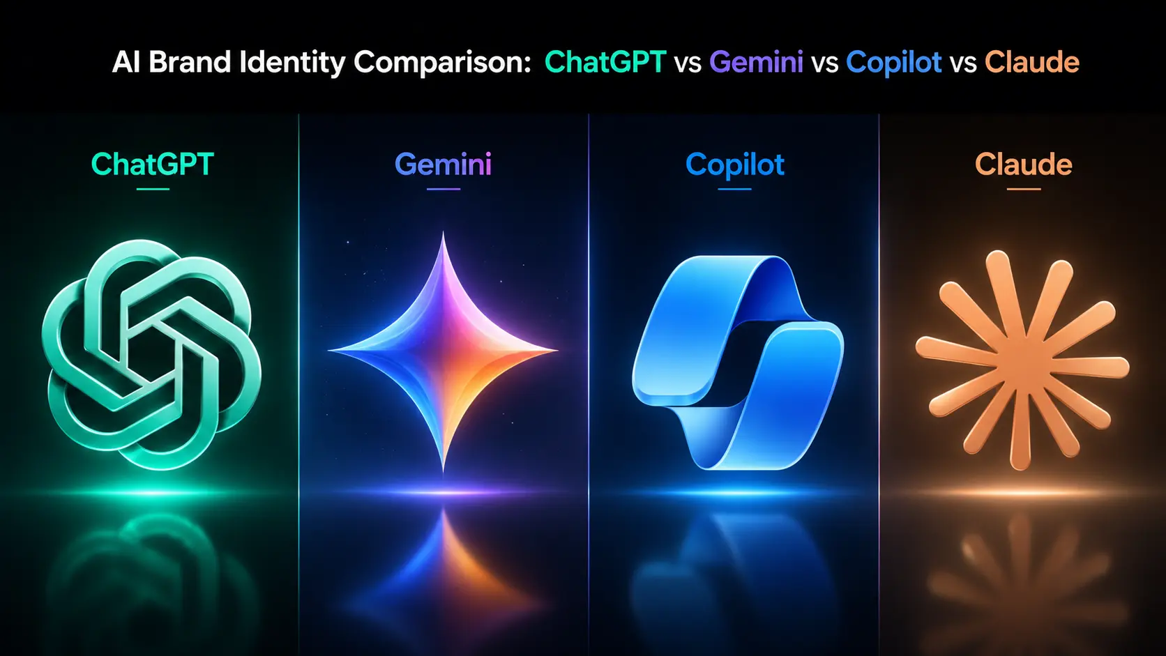
Google Gemini
- Style: Spark, star-like shape
- Type: The logo is an abstract logo type
- Look: Bright, starburst gradient form
- Meaning/Symbolism: The spark symbolizes intelligence, illumination, spark of ideas
- Tone: Futuristic and vibrant
- Compared to ChatGPT: The Gemini logo is energetic and flashy
Microsoft Copilot
- Style: Fluid ribbon-like loop
- Type: Abstract logo
- Look: A gradient wave forming a looped shape
- Meaning/Symbolism: Assistance across tools and apps
- Tone: Corporate, smooth
- Compared to ChatGPT: The logo is more fluid in terms of motion as compared to ChatGPT’s woven structure
Anthropic Claude
- Style: Wordmark and an abstract icon
- Type: It is a combination logo
- Look: Simple, soft, and minimal
- Meaning/Symbolism: Conversational AI, safety, clarity
- Tone: Text-focused, restrained
- Compared to ChatGPT: Less symbolic and more typographic
Want to read more on tech logos? Read about the Google logo and Apple logo.
Conclusion
The ChatGPT logo history is a perfect example of the modern evolution of a tech product. Each element has a thought process behind it. The ChatGPT logo is simple yet holds symbolic depth. This adds to the overall experience it serves to its users. The complexity of its intelligence converges into a simplified logo. It’s just how the platform works. The algorithms, data, and code behind the platform are complex, but on the front, the user interface makes it all simple.
Author Bio

 verified expert
Duaa writes blogs about marketing, branding, web design, and logo design. She enjoys turning ideas into simple, engaging content that helps businesses build stronger brands and connect with their audience in a more meaningful way.
Still choosing the right logo design company?
Get a quick, expert review. No pitch, just clarity on what fits your stage, budget, and growth.