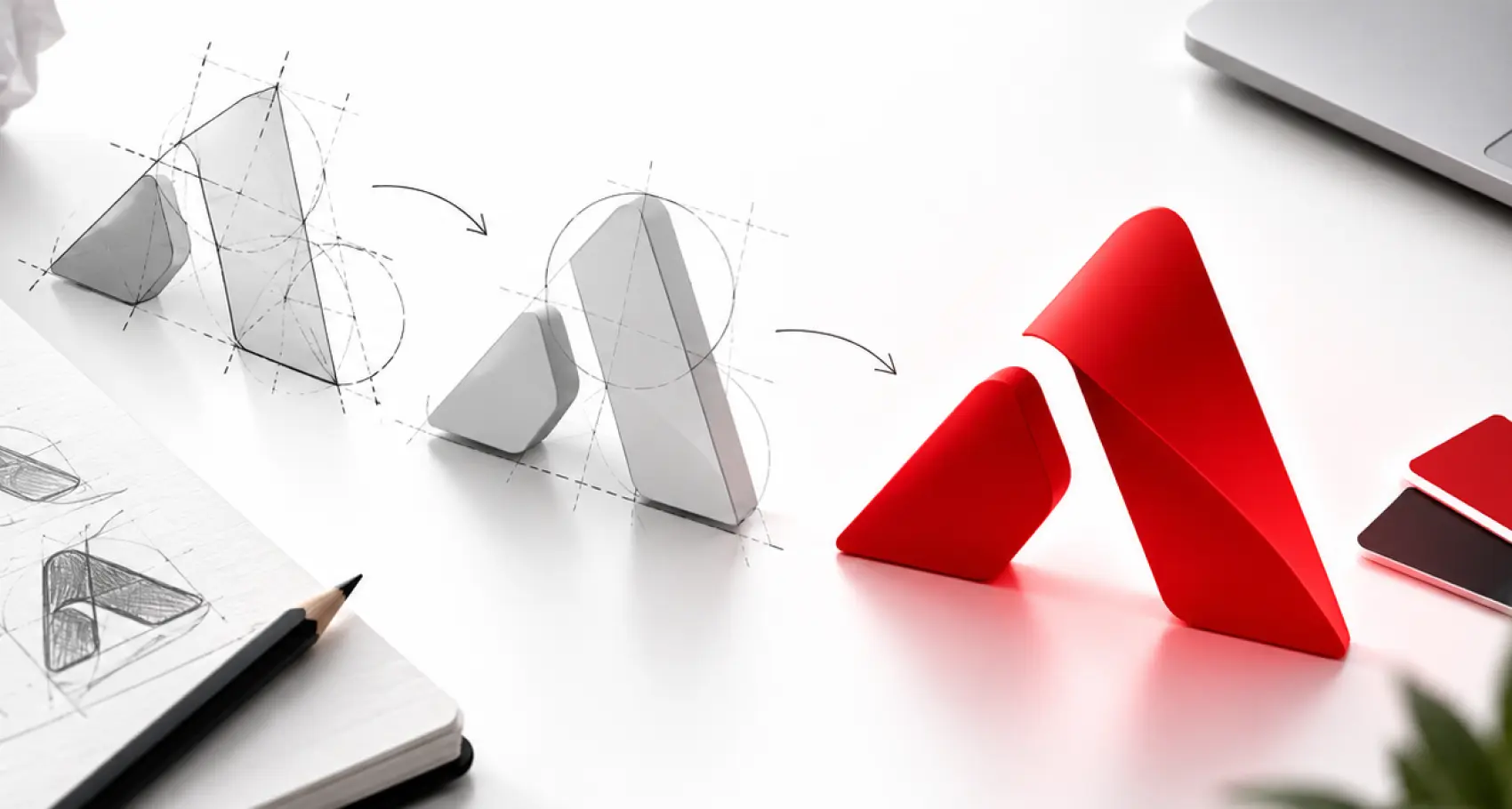
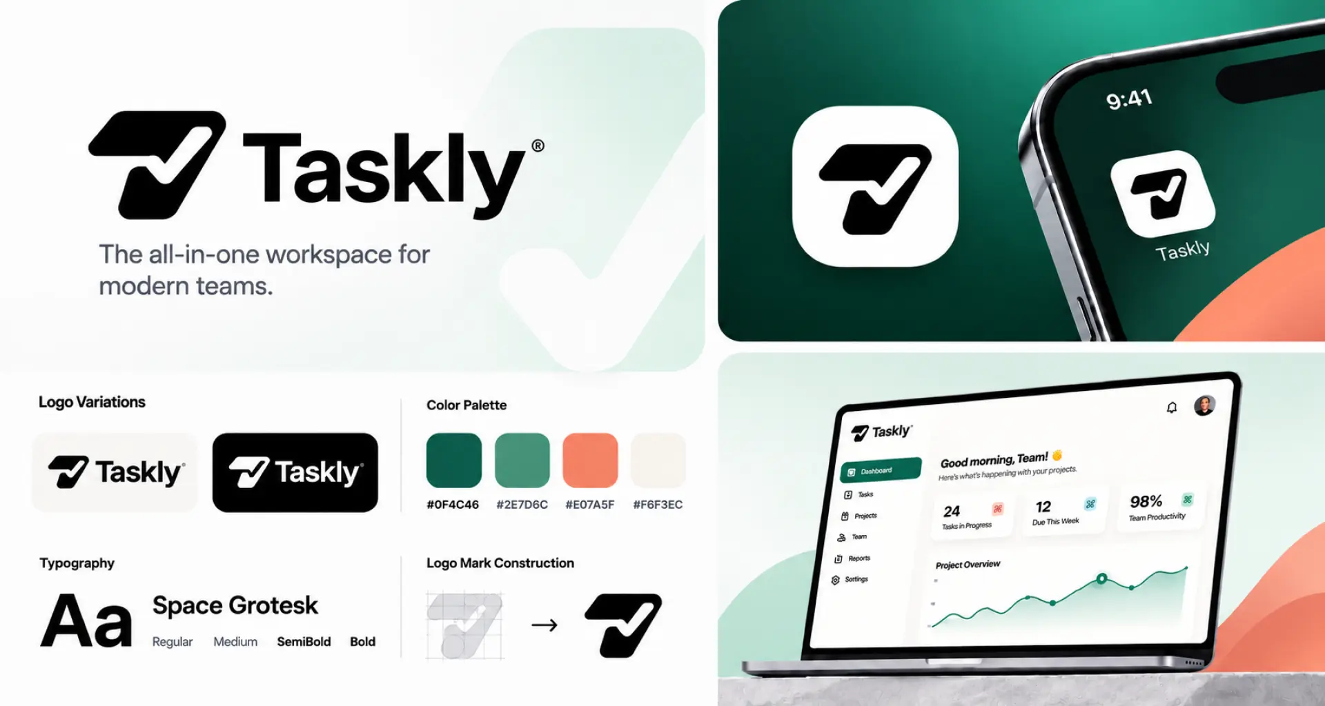
All the SaaS brands we’ve worked with recently have had the same logo design brief: gradients, random abstract shapes, microdetails, or trendy designs. The tech and SaaS industry is saturated with similar-looking logos.

Radek Sienkiewicz noted a pattern behind most AI company logos: a circle, usually with a gradient, built around a central opening, with elements radiating outward in soft, organic curves.
The SaaS logo needs to work as a favicon, an app icon, in light and dark backgrounds, and in the website header. But if it blends in with the others, the design may be a problem.
If you’re also struggling to define a visual direction for your SaaS brand, the best solution is to hire a logo design company. But first, read our guide on how to do it right.
Why Do SaaS Logos Need To Work Harder
Products and tools are having a hard time standing out. The logos aren’t unique anymore. You scroll through search results and see the same blue-and-white logo color combinations or logos that make no sense at all.
As a SaaS company, you’re selling something intangible. Your product is complex, and people struggle to relate to it. Here, trust becomes everything. Your logo has a few seconds to form a first impression.
A fresh, distinct SaaS logo design makes people stop and explore what it offers. It takes seconds for you to understand what the SaaS brand does and why it matters. It needs to work harder to stand out from other competing SaaS and tech brands.
What Are the Qualities a SaaS Logo Should Have
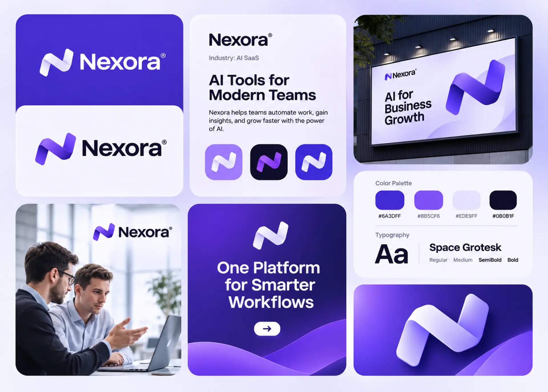
A good logo design for a SaaS brand conveys clarity, credibility, and connection. It needs to bridge the gap between product complexity and people’s understanding of what problem the product solves.
The Squint Test: Or as we call it ”adaptability”. A logo must remain crisp, clear, and unblurred when scaled to tiny sizes like a browser favicon, an app logo design, or small toolbars. Your logo needs to work at all logo sizes.
Simplicity: A strong SaaS logo isn’t overly complicated with fine lines, complex gradients, or overlapping shapes. These turn a logo into a blob when scaled down. Keep the logo simple and clutter-free.
Perennial Durability: In simple terms, we call it timelessness. A logo that’s meant to represent your SaaS brand needs to avoid trendy, hyper-futuristic, and fad-driven aesthetics.
Black-and-White Adaptability: A logo that works in full color doesn’t necessarily mean it’s going to work in monochrome. A well-designed logo doesn’t lose its legibility in black and white. A design that relies heavily on gradients, shadow effects, or heavily on color often fails the functionality test.
Controlled Color Palette: When discussing the color palette with the brands we work with, we ask them to limit their palette to 2-3 colors. This improves digital recognition. It also improves adaptability to a SaaS product’s light and dark modes.
Product-Led Relevance: Do not copy generic tech logo design trends. For your design, draw inspiration from what makes you different or from your software functionalities like workflows, nodes, data streams, timelines, and structured typography.
Don't Settle for Another Generic Tech Logo.
Get a custom SaaS identity with carefully chosen colors, typography, and a distinctive design that works wherever customers see your brand.
Where Does a SaaS Logo Need To Work
Your logo is often seen on digital platforms more than it is seen in print. That doesn’t mean you shouldn’t design your logo without print in mind. It simply means you need to prioritize its use and create clear logo usage guidelines.
| Touchpoint | What It Demands | Approximate Size |
| Website header | Clear, readable logo that fits the navigation | 120–200 px wide |
| Browser favicon | Simple mark recognizable at tiny sizes | 16 × 16 to 32 × 32 px |
| SaaS dashboard | Compact logo that works in sidebars and navigation | 24–40 px high |
| Mobile app icon | Distinct symbol that stays recognizable in a square | 1024 × 1024 px master file |
| Social media profiles | Clear logo that survives circular cropping | 400 × 400 px |
| Email signature | Small, sharp logo that doesn’t overpower the message | 100–200 px wide |
| Pitch decks and presentations | High-quality logo that stays sharp on large screens | 300–600 px wide |
| Dark mode interface | Version with enough contrast against dark backgrounds | Depends on placement |
| Loading screens | Simple mark that remains clear during app startup | 64–128 px wide |
These are approximate sizes, not fixed universal specifications. Actual requirements vary by platform, layout, and device. When you get it designed, request all logo file formats: vector files (SVG, AI, or EPS) and transparent PNG versions for flexible use.
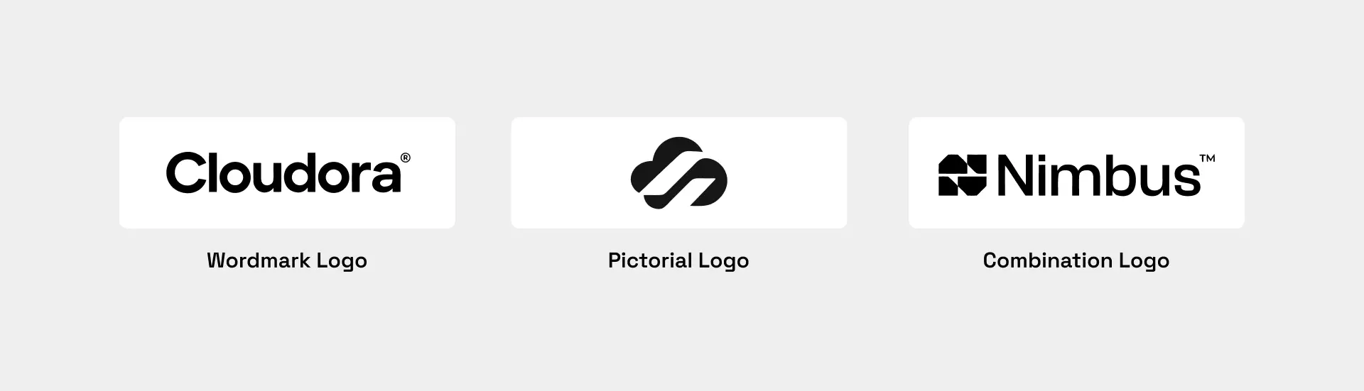
Should a SaaS Logo Be a Wordmark, Pictorial, or a Combination Logo?
In our experience, most tech startups need both: a wordmark and an icon. For any new tech startup looking for a custom logo design, a combination logo is usually the best choice.
The wordmark logo can be used for websites, presentations, and professional documentation, while the logo symbol works for everything smaller.
Wordmark: Puts your business name front and center, but works best when the company name is short and distinctive.
Symbol: Can be used anywhere you want to represent your SaaS brand in smaller sizes.
Combination: A practical choice for new businesses. You could use the wordmark and the symbol together. They can be used separately depending on where they’re being used.
What Colors Work Best For SaaS Logos?
With our years of experience designing brand identities, we don’t limit color choices. If you’ve noticed, most SaaS company logos use a blue-and-white palette. That’s not bad if it works for you, but often your tool or product ends up blending in.
We cannot say there’s a specific color you should use for SaaS company logos. It’s all up to you how to design a company logo that actually represents your product.
People worldwide link colors to emotions in strikingly similar ways. Find the feeling you want to evoke in your customers. Describe it using a few adjectives. This way you’ll have a better view of how you want your target audience to perceive your SaaS logo.
Study your industry. Take a look at your ten closest competitors. If you see a pattern or something generic, try a different approach.
The colors you choose will be a core part of your user interface (UI). Some will be used as the colors of your buttons, others for the text. Check for contrast against light and dark modes.
Keep your color palette limited to two or three colors. These are more than enough for a SaaS logo. One can be your main color; the other can be a neutral tone for logo fonts.
A logo can work in color, but does it still read well in black and white? Your logo needs to stay clear, readable, and understandable in black and white.
What Fonts Work Best For a SaaS Logo
Modern fonts give your brand a personality. Clean sans-serif fonts are a default in the tech industry. This is because they render well on screens and stay readable even at small sizes.
Start with a strong sans-serif typeface. The ChatGPT logo is the best example to study. OpenAI initially used a sans-serif typeface for its branding, but later customized it to OpenAI Sans. The font’s rounded feel makes it more approachable.
The font you choose needs to work in all sizes. Test for readability on different screens and sizes before you choose one.
The font needs to complement the interface font. They don’t have to match, but they shouldn’t make your brand feel like two different brands when someone looks at your logo and interface.

Lessons from CogniQuip’s Tech Logo
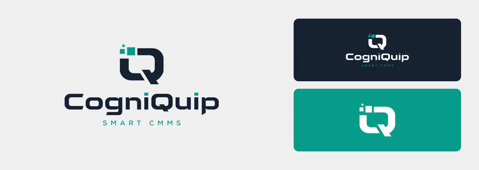
We recently worked with CogniQuip, a smart CMMS platform, to create a logo that reflects its modern, tech-focused approach. The goal was to build a visual identity that looks just as good in the interface as it does on its own.
We paired deep navy with teal to balance trust and innovation. The bold, geometric font gives the brand a strong, modern look, while the custom Q symbol makes it easy to recognize.
How Can You Test Your SaaS Logo
Testing the logo is as important as designing it for people. We divide logo testing into two phases: logo functionality and audience perception.
Logo Functionality
- Blur Test: Blur the logo and check if it’s still legible.
- Scalability Test: Shrink the logo down to smaller sizes.
- Inversion/Monochromatic Test: Test the logo in black and white, and inverted on light and dark backgrounds.
- Contextual Testing: Check how the logo appears in real product environments like browser tabs, dashboards, marketing collateral, ads, and against 5-10 competitors.
Audience Perception
- Surveys: Get feedback from real people through survey platforms.
- Qualitative Association: Ask open-ended questions about the subconscious thoughts people have after seeing the logo.
- Memory Recall: Flash the logo before a tester for at least five seconds, then ask them to describe or sketch it.
What Can You Learn From Popular Tech and SaaS Brands
We live in a world where there’s a new tool launching almost every day. The SaaS market size is expected to grow to $65.99 billion in 2026. And we’re nearing the end of 2026. It’s been an incredible yet competitive year for the tech industry.
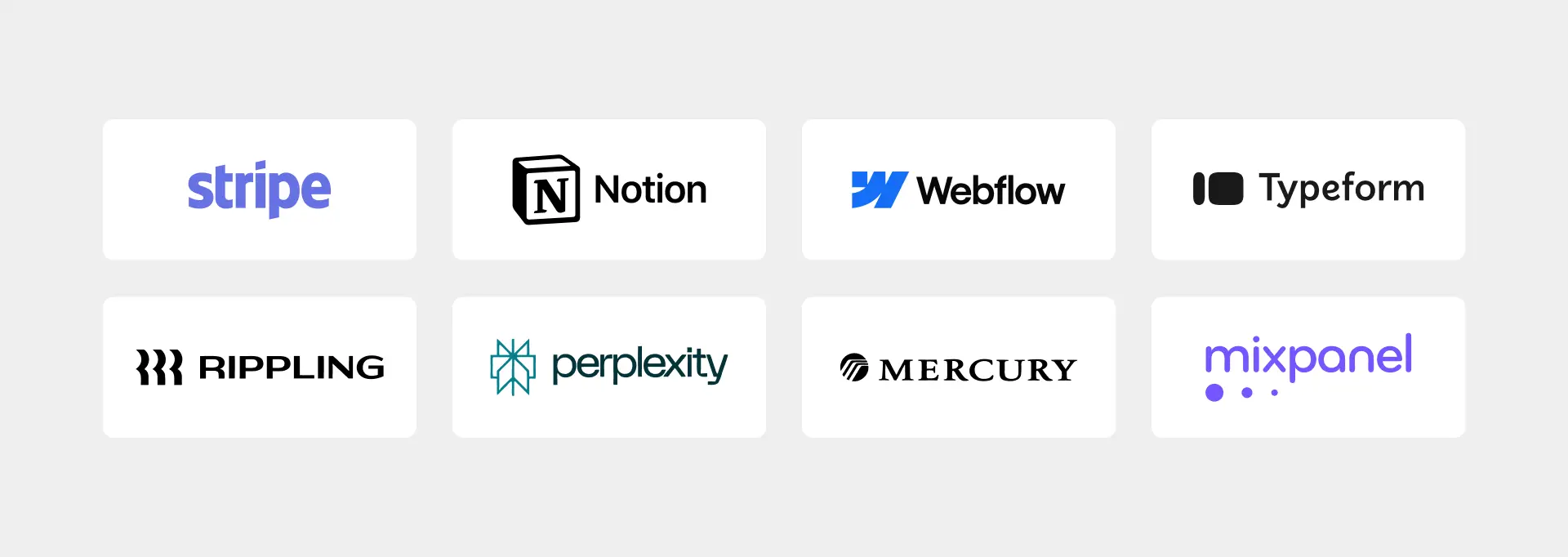
For new SaaS startups launching soon, there’s a lesson in every logo. Some of the most popular SaaS company logos we loved this year were:
Stripe
Stripe uses a lowercase, custom sans-serif wordmark with tight letter spacing. It skips a separate icon and lets the brand name do the talking.
Learn: You don’t always need a complicated symbol. A distinctive wordmark can build recognition and make your SaaS brand look professional and confident.
Notion
Notion‘s titled square symbol resembles a folded page or open notebook. Its simple black-and-white treatment keeps the identity clean and flexible.
Learn: If your product is designed to simplify work, your logo should reflect that simplicity. Avoid unnecessary details and choose a design that works on both light and dark interfaces.
Webflow
Webflow‘s geometric W combines letterform design with the idea of connected building blocks and workflows. The blue gives it a modern, capable feel.
Learn: Look for ways to connect your brand name with your product’s purpose. A letter-based symbol can make your logo more meaningful and easier to associate with your business.
Typeform
Typeform uses lowercase lettering and rounded sans-serif typography. The soft letterforms create a friendly, conversational personality without needing an additional symbol.
Learn: Typography plays a big role in brand personality. If your product serves everyday users, rounded and approachable lettering can help make your brand feel less technical and more human.
Mixpanel
Mixpanel turns the letter M into three vertical bars of descending height. The symbol cleverly combines the brand initial with the familiar visual language of data charts.
Learn: Your logo can communicate two things at once. Try turning a brand initial into a visual reference to your product’s main function instead of relying on a generic industry icon.
Mercury
Mercury takes a different approach from many fintech brands. Its slightly condensed serif typography gives the wordmark a more established and traditional banking feel.
Learn: Don’t automatically follow the visual trends in your industry. A carefully chosen font can help your brand stand apart while communicating the trust and credibility customers expect.
Rippling
Rippling‘s symbol builds the letter R from concentric arcs, connecting the design directly to the idea of ripples. Its bright yellow also helps it stand out in a category filled with corporate blues.
Learn: A strong logo can connect your brand name, product concept, and visual identity. Look for a meaningful idea that can bring all three together.
Perplexity
Perplexity uses an abstract petal-like symbol with hints of a question mark and a cyclic search process. Its teal color helps it stand apart from the purple gradients and dark palettes common in AI branding.
Learn: You don’t have to use the same colors as everyone else in your industry. Research competitor identities and find a color that makes your brand recognizable without losing relevance to your audience.
DIY vs. Freelancer vs. Logo Design Company: Which Is the Right Approach?
Every startup has a different budget, timeline, and idea of what its brand should look like. Some founders want to get a logo ready before launch without spending much. Others want a custom design that gives their business a professional look from day one.
The good news is you have options. You can design a logo yourself using DIY tools, hire a freelance logo designer, or work with a logo design company.
But which approach makes the most sense for your SaaS startup? Let’s compare all three based on cost, design quality, customization, and the support you get.
DIY Logo Design: Best for Testing Ideas on a Tight Budget
If you’re working with a limited budget, DIY logo design is a good place to start. AI logo makers and online design tools let you create a logo without hiring a professional.
You enter your business name, choose an industry, add a few design preferences, and let the tool generate concepts. You can experiment with different colors, fonts, and layouts until you find something you like.
Cost: $0 to $50
Time Taken: Minutes to 1 hour

Pros
- Very affordable with several tools available.
- Generate multiple logo concepts in minutes.
- No professional design skills required.
- Experiment with different colors, fonts, and styles.
- Useful for testing an early business idea.

Cons
- Designs can look similar to other businesses.
- Limited control over customization.
- Hard to create a logo that reflects your brand personality.
- Some tools charge extra for high-resolution and vector files.
- Similar existing designs can create trademark concerns.
DIY or AI logo design works best when you’re still testing your business idea or need a temporary identity for an MVP. You can get something up quickly without committing much money.
However, things change when you start attracting customers. Your logo needs to work across your website, social media, app icon, presentations, and marketing materials. A design that looks good in an online preview may not work everywhere. This is why big brands still hire logo designers.
Our take: Use DIY tools to explore ideas, but don’t mistake a quick logo for a complete brand identity. Once your startup is ready to enter the market, consider investing in a custom design.
Freelance Logo Designer: Best for One-on-One Collaboration
Hiring a logo designer near you gives you more control over the creative process. Instead of relying on automated designs, you work directly with someone who can understand your business, audience, and design preferences.
You share your ideas, discuss the visual direction, review concepts, and request changes. A skilled freelancer can create a logo that feels more personal and fits your startup’s identity.
Cost: $50 to $400
Time Taken: 2–3 weeks
Pros
- More affordable than most design companies.
- Direct communication with the designer.
- More room to discuss your ideas and preferences.
- Custom designs based on your business requirements.
- Opportunity to request refinements and revisions.
Cons
- Design quality depends heavily on the freelancer’s experience.
- Some freelancers may lack branding expertise.
- One person may not offer additional design services.
- Delays can happen when a freelancer handles multiple projects.
- Long-term support depends on the freelancer’s availability.
Freelancers are a good choice if you already have a clear idea of what you want and prefer working closely with one designer. You can share references, explain your expectations, and stay involved throughout the process.
However, don’t choose someone based on the logo design cost alone. Review their portfolio, ask about their design process, and confirm what you’ll receive at the end. Make sure the agreement covers revisions, source files, commercial usage rights, and delivery dates.
Our take: A freelancer can be a great investment when you find someone with the right experience. But if your startup needs more than a logo, such as brand guidelines, social media designs, or a website, you may need additional specialists.
Logo Design Company: Best for Structured, Professional Process
A logo design company brings a team and a defined process to your project. Instead of relying on one person’s availability and skill set, you benefit from multiple design perspectives and a more organized workflow.
The logo design process usually starts with understanding your business, target audience, competitors, and brand personality. Designers then develop concepts, gather your feedback, and refine the chosen direction.
You also get clearer expectations around deliverables, revisions, ownership, and timelines.
Cost: $100 to $2,500+
Time Taken: 5–7 days
Pros
- Custom logo designs based on your industry and audience.
- Access to designers with different skills and experience.
- A structured process from briefing to final delivery.
- Support with colors, typography, and brand guidelines.
- Opportunities to expand into branding and other design services.
Cons
- Usually costs more than some freelancers and DIY tools.
- Feedback and revisions may follow a set process.
- Timelines depend on the project scope and package.
- Additional services may increase the overall cost.
- Service quality varies between companies.
A logo design company makes sense when you’re serious about building a recognizable brand. You aren’t just looking for an attractive logo. You need an identity that works across your website, social media, product interface, pitch deck, and other customer touchpoints.
For startups planning to grow, having access to additional branding services can also save time. You can keep your logo, brand guidelines, social media designs, and website aligned instead of hiring different people for every project.
Our take: If you have a launch deadline and want a custom logo without managing the entire design process yourself, a logo design company is worth considering. Just make sure the company offers clear pricing, defined deliverables, and a process that fits your budget.
Build Your SaaS Brand Under One Roof
Get more than a logo. Logo Design Valley helps you create a consistent brand identity, from custom logos and brand guidelines to social media designs and websites.
So, What Should You Choose?
| Startup Stage | Best Approach |
| Testing a business idea | DIY logo design |
| Limited budget | DIY logo design |
| Clear design direction | Freelance designer |
| Direct collaboration | Freelance designer |
| Custom, professional identity | Logo design company |
| Logo and additional branding assets | Logo design company |
| Launch deadline | Logo design company |

What Deliverables Should You Expect
Business owners who are not sure about what deliverables you’ll be getting in the end need this:
Logo variations: Primary logo, secondary logo, icon/symbol
File formats: PNG, JPG, AI, EPS, or SVG vector files
Color versions: Full color, black, white, and monochrome
Transparent background: PNG files for easy use across different backgrounds
Social media assets: Profile-ready logo or icon
High-resolution files: Suitable for print materials and large displays
Brand colors and fonts: Exact color codes and font names
Logo usage guidelines: A logo usage guideline on how to use it correctly
Usage rights: Complete written ownership of commercial usage rights
What Are Some Common Mistakes Founders Make in a SaaS Logo?
A SaaS logo needs to do more than look good on a website. It should represent your product, fit your audience, and work across different digital touchpoints. However, many founders make avoidable mistakes when designing their first logo.
Here are some common ones to watch out for:
- Following Every Industry Trend: Using the same gradients, abstract shapes, or futuristic fonts as other SaaS companies makes it harder to stand out. Take inspiration from competitors, but give your brand its own visual identity.
- Choosing Complicated Symbols: Too many details, shapes, or design elements can make your logo difficult to recognize. Keep it simple enough to work as a small app icon or browser favicon.
- Ignoring the Product Interface: Your logo may look great on a white background but disappear inside your software. Test it against your actual interface colors, navigation bars, and dark mode.
- Picking Colors Without a Purpose: Don’t choose colors just because they look modern. Consider your audience, brand personality, and competitors before settling on a palette.
- Designing Only for the Launch: Your logo should work beyond your homepage. Think about social profiles, pitch decks, emails, app icons, and future marketing materials.
Building a SaaS Logo That Grows With Your Product
A great SaaS logo doesn’t need flashy gradients or complicated symbols to stand out. It needs to be clear, recognizable, and relevant to your product. From choosing the right colors and fonts to testing how your logo looks inside your interface, every design decision matters.
Whether you use a DIY tool, hire a freelancer, or work with Logo Design Valley, think beyond your launch. Your logo should support your brand as your product evolves, reaches new customers, and grows into a recognizable name.
Ready to Give Your SaaS Brand a Professional Look?
Get a custom SaaS logo that fits your product, connects with your audience, and grows with your business. Logo Design Valley makes it easier to build a brand you're proud to put in front of customers.
Author Bio

 verified expert
Duaa writes blogs about marketing, branding, web design, and logo design. She enjoys turning ideas into simple, engaging content that helps businesses build stronger brands and connect with their audience in a more meaningful way.
Still choosing the right logo design company?
Get a quick, expert review. No pitch, just clarity on what fits your stage, budget, and growth.