When the world’s biggest fast food chain changes its logo, the whole design world pays attention, and so should you!
KFC has recently launched a 360-degree rebranding campaign with JKR, a popular creative agency, in which the popular fast-food chain has upgraded its logo, branding, and menu. The rebrand will be enforced globally in the 35,000+ restaurants in 150+ countries.
The update touches everything: the KFC logo, the typeface, the bucket, the Colonel Sanders mascot, the expanded color palette, packaging, restaurant interiors, and app design. This is indeed the “next chapter” for KFC, as design critics would say.
The KFC logo has been a staple in the design industry for years. Whenever we talk about mascot logos, it’s the first reference we mention, which is why their recent rebrand needs to be discussed in depth. So, here we go!
Want the Best Restaurant Logo in 2026?
Well, you’re at the right place! Our expert logo designers in New York, San Francisco, Los Angeles, Dallas, and across the USA design the best restaurant logos!
Get a Restaurant Logo
KFC’s 2026 Brand Refresh: Why Now, What Changed, and Will It Last?
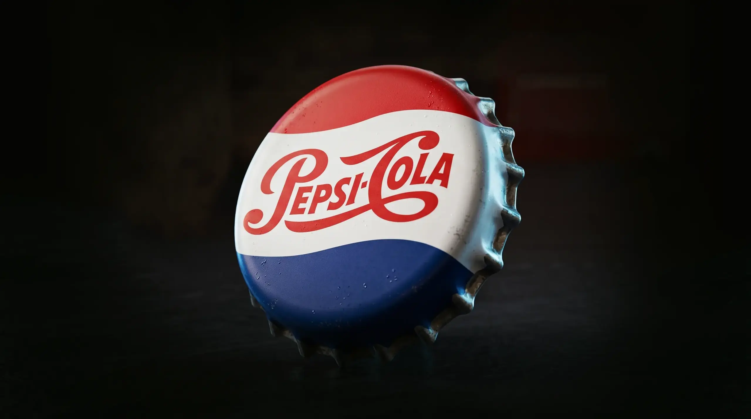
Every other brand is looking to adopt a minimalist approach to appeal to modern consumers. Recently, we’ve seen quite a few rebrands in the food and beverage industry. The Pepsi logo was upgraded a while back, and now we have the new KFC logo. Well, thankfully, the refresh isn’t a controversy like the Cracker Barrel new logo.
Why Did KFC Rebrand in 2026?
When businesses come to us for a brand refresh, they’re mostly struggling with their current brand identity. Sometimes their first logo is poorly designed; other times, they complain that people don’t resonate with their logo.
But none of this is the case with KFC’s 2026 brand refresh. Chick-fil-A, McDonald’s, Popeyes, and other growing chicken QSR brands have made the market more competitive. There’s always a new branding strategy, an upgrade, or a campaign to get the customers. Brands that lag in upgrades fall behind in sales.
Another reason KFC’s rebranding makes sense is that it’s trying to appeal to modern consumers. Today, eaters want personalization, sauce-driven menus, and immersive dining experiences. They’ve targeted all of that and more in their brand refresh.
KFC is a global brand. With a new branch opening in 3.5 hours on average, and over 35,000 branches already in operation across 150+ countries, there was an urgent need for a standardized branding system. The new upgrade relates to people across cultures and countries, and is scalable at the same time.
What’s the Purpose Behind the ‘Bucketverse’ Concept?
JKR leveraged the best physical asset of KFC: its bucket. The bucket has now become the framing system of the KFC new logo, photography, illustrations, messaging, and campaign content.
The bucket is now the main hero, well, of course, along with Colonel Harland Sanders. Also, they’re not calling it a QSR (quick service restaurant) anymore. It’s a QXR, a quick experience restaurant.
Are People Happy With the New KFC Logo?
The new KFC logo hasn’t caused controversy. The upgrade was calm. And the best part is that the people have accepted it without any backlash or outrage.
This is what a classic brand refresh looks like to us. The KFC logo was not upgraded for virality. It is designed to serve its purpose for the next decade.
The brand refresh is not a reinvention of KFC. The “Bucketverse” idea and the new typeface are smart, subtle upgrades. The original logo color combinations remain, along with an expanded color palette. Colonel Sanders got a glow-up.
All the elements that were the foundation of KFC’s branding are still there. JKR should be praised for protecting the brand’s equity, rather than discarding it. We don’t think people would see KFC the same way if there were no Colonel Sanders, the colors were different, or the typeface were completely different.
But the design community has some concerns:
The design changes are subtle. Will people notice the new rollout?
Will the 3D logo still be legible on receipts, packaging, or as small app icons?
Will consumers be able to grasp the concept of a QXR?
Breaking Down Every Element of the New KFC Logo
The design elements from the old KFC logo are still a part of the new one. But each change was a strategic decision. Here’s the complete breakdown of the latest KFC logo.
The 3D Logo
The current KFC logo is a 3D design. Previously, it was flat and squared-off. The older design served the early digital platforms well. But the newer design is noticeably three-dimensional to build depth and volume in current digital and physical environments. The upgrade from a flat logo design to a 3D logo is a strategic move to increase the visual weight in advertising and shelf presence on packaging.
![]()
The Subtle Colonel Refresh
Colonel Sanders now has a refined, thicker outline for better scalability across small screens and packaging. It also moves away from the “stickman figure” claims with the addition of a neck/collar. The expression has gotten warmer and more human. Colonel Sanders is what made the KFC logo an iconic mascot logo design. The branding agency did a good job preserving the mascot’s originality, rather than completely disregarding it in the brand refresh.
![]()
The Bucket as the Hero
The bucket was introduced by Colonel Sanders in 1957. Since then, it has been an asset to its menu and marketing campaigns. JKR elevated the bucket to a standardized brand identity. It’s become the central element, especially in the KFC logo. Now, it can also be used as a framing system for brand photography, illustrations, and campaign messaging.
![]()
Custom Typography
The shift from Kentucky Fried Serif to Kentuck Fried Sans is the most exciting one so far. We love the lettermark upgrade. Custom typography is a sign of brand maturity. The new font adds more weight to the visual identity. A lettermark logo needs to be simple yet executed smartly. The best part of the custom typeface is the chicken leg in the “C”.
![]()
Expanded Color Palette
Red, black, and white have always been the colors associated with KFC. The rebrand adds a fresher touch of new colors that represent the “Herbs and Spices”. The newer addition is to make usage flexible and vibrant, and to utilize it in upcoming campaigns.
| Color Role | Colors | Purpose |
| Primary | Red, White, Black | Core brand recognition |
| Secondary | ‘Herbs and Spices’ palette | Flexibility, vibrancy, campaign use |
| Application | Packaging, digital, apparel | 360-degree consistency |
Finger Lickin’ Good
How can we miss the iconic KFC slogan? In 2026, Finger Lickin’ Good is more than just a slogan. Now, it’s brand behavior. It has become a global brand asset. The Finger Lickin’ Good lettering was designed by Tobias Hall. It’s not part of the custom KFC typeface.
![]()
KFC Logo History: A Full Evolution From 1952 to 2026
There are very few brands that have stayed true to their original identity. One of them is KFC. Here’s the detailed KFC logo evolution from 1952 to 2026:
1954 to 1959
The original KFC logo was a handwritten wordmark logo with the brand’s full name. All the letters “C” were italicized to add character. The old logo had four chickens popping out of their eggs next to the capital letters.
![]()
1959 to 1978
In 1959, the chickens were removed from the KFC old logo. The “K”, “F”, and “C” were enlarged. Colonel Sanders was added to the logo at the end of the wordmark. From then on, Colonel Sanders became KFC’s mascot. This was a smart decision, indicating that the founder is the brand.
![]()
1978 to 1991
In the 1978 KFC logo redesign, Colonel Sanders was shifted to the left, and the typography was now written in three layers. The font was modernized, and the K got an upgrade with an elongated tail, making it a main element in the complete logo.
![]()
1991 to 1997
The 1991 redesign marks the start of the lettermark logo. The reason behind this redesign was to remove “fried” as it was no longer serving its purpose. Consumers were getting more health-conscious, and KFC wanted to expand its menu to include more than just chicken. This was also the peak when competition among QSRs grew tougher. The redesign also added color to stay unique and competitive. Colonel Sanders was more refined, but the outline now was blue instead of black.
![]()
1997 to 2006
Landor Associates was behind the complete rebrand of KFC in 1997. The logo was redesigned to a square logo with Colonel Sanders in his tuxedo and the KFC wordmark in red. There were also some significant changes in the restaurant interiors.
![]()
2006 to 2018
2006 marked the era of a flat design and a digital-first approach to the KFC chicken logo. The logo was redesigned from a square to a circle logo. The red got darker. And the image of Colonel Sanders was rethought into a dark red apron instead of the tuxedo. KFC lettermark was now written in white as the darker shade of red took over the background.
In between these years, the old KFC logo made a comeback with a minimalist logo design. The 1959 wordmark was also brought back as a secondary logo in 2014. Later on, it was paired with the mascot and used globally as the new KFC logo.
![]()
2018 to 2026
A newer version of the KFC restaurant logo was introduced in late 2018. The shape was changed from a circle to a trapeze. The portrait of Colonel Sanders was refined. The background now featured three vertical lines, and the wordmark was italicized. The redesign was warm and hospitable.
![]()
2026
The KFC logo evolution is incomplete without discussing the latest 3D upgrade. The bucket has become a more obvious part of the design. The custom typeface gives the logo more character. Colonel Sanders remains iconic as always, but slightly more simplified. The familiarity with the logo still exists, with all the original design elements upgraded.
![]()
If you’ve noticed one thing about all the redesigns, Colonel Sanders, the iconic KFC logo man, remains constant. He might be in a tuxedo or an apron, but that familiar face represents KFC internationally. Removing him would completely change how people associate with the fast-food brand. Here’s the catch for small businesses: Choose your logo design wisely the first time, maintain consistency, and refine it as you grow.
What Small Businesses Can Learn From KFC’s Branding Strategy
KFC is owned by Yum! Brands, and its global value is estimated to be $36 billion. The recognition was not built all of a sudden. It took time and a few redesigns to reach where it stands today. But the logo’s success does not depend on its global value or hefty marketing budgets.
The design and strategy principles they’ve used over the years can be used at any scale. For business owners making branding decisions for the first time, this is a lesson in how to design a company logo in the food and beverage industry.
Lesson 1:
You need one iconic asset to build around. KFC used their bucket and made it a central element. You need to decide what makes your brand recognizable. Is it your logo mark, the color, or the character? Once you have one decided, build your brand around it.
Lesson 2:
You need to evolve your logo. Don’t erase the elements that make your brand recognized. This is exactly what happened with the Cracker Barrel logo. During their rebranding, they completely disregarded Uncle Herschel. KFC made changes that were subtle, but kept the original elements that mattered. You don’t have to rebrand from scratch. Just refine what already works.
Lesson 3:
KFC made Colonel Sanders, the founder, its brand equity. Colonel Sanders is the face of the brand. For small businesses and first-time founders, this can be a good way of storytelling.
Lesson 4:
Maintain consistency across branding touchpoints. We’ve talked about this in almost every logo design blog of ours. It is a non-negotiable. KFC’s 2026 brand refresh has standardized branding for all 35,000+ locations and the new ones opening soon. Make sure all of the branches look like they belong to the same brand, whether it’s the USA, Asia, or Europe.
Lesson 5:
Choose your typeface wisely. KFC created custom modern fonts for its branding. You might not need one at your launch, but you do need to pick two fonts that complement each other and maintain consistency in using them.
Lesson 6:
Color psychology plays a key role in branding. KFC’s red symbolizes energy, appetite, and urgency. Pick a color palette that has a purpose behind it, not preference.
Branding Tips for Food and Beverage Businesses Launching in 2026
If you’re a food and beverage business launching in 2026, here are some useful tips for you coming from a logo design company with over seven years of experience:
- Think about the food you serve, and incorporate it in your logo. Your logo should tell about the kind of food you serve even before your customer reads your menu.
- Design for legibility across packaging. As a food brand, your logo would be on the bags, cups, boxes, and tissues. Make sure it works on all backgrounds.
- Colors that drive appetite should be your brand colors. Think of warm colors like reds, oranges, and yellows. These colors play a psychological role in driving appetite, which is why they’re used for most food and beverage brands. Make sure you pick the color palette that drives appetite.
- As a small business owner, you might treat brand guidelines as an afterthought. But here’s the point you’re missing. Brand guidelines will help maintain consistency as you grow and expand to different locations.
- A social media design kit is probably one of the first things you need to think about before you launch. You need to get your consumers engaged and build brand awareness. Your Instagram grid, story templates, and video thumbnails need to be consistent.
- Your website is a growth tool, and you cannot skip it in 2026. For anyone searching for your restaurant online, a well-designed, fast-loading website serves your customers the experience before you do. Learn how to design a web page before you launch; it’ll help you understand the need and process to the core.
- Ensure your logo is scalable. It’s the one brand asset that’ll represent you everywhere. It’s going to be on your packaging, billboards, menu, signage, app, and even receipts. Test it in all sizes and file formats before you launch.
![]()
Need a Logo Like KFC?
We design logos that grow with your food business as KFC’s did. And that too for just $129!
Design a Similar Logo
The Bottom Line
KFC has a history of logos that spans 70 years. The KFC logo we have today is a refined version of all the previous logos. But all the design elements still exist and still have the same impact on its consumers.
For small businesses, this is a lesson in consistency. Yes, sometimes rebranding doesn’t go well, but that only happens when it’s executed the wrong way. KFC’s 2026 brand refresh is a classic example of how rebranding is done right. Without losing existing customers. Without losing brand equity. Without losing the elements that make what the brand is today.
Launching Your Brand Soon?
Logo Design Valley is the branding agency you need to partner with for the best logos, brand kits, and web designs.
Discuss MoreAuthor Bio
Duaa writes blogs about marketing, branding, web design, and logo design. She enjoys turning ideas into simple, engaging content that helps businesses build stronger brands and connect with their audience in a more meaningful way.
Still choosing the right logo design company?
Get a quick, expert review. No pitch, just clarity on what fits your stage, budget, and growth.