Apps have become a core part of our daily routine. They are everywhere. There’s an app for almost everything. But we’re not here to talk about apps. We’re going to talk about the most important part of an app: its icon!
When you open your phone, the first thing you see is an app logo. They’ve created a sort of connection between you and the application you use as part of your daily routine. You recognize it in an instant. You know what it does just by looking at it.
You’re reading this because you’re probably a small business owner with an app that has no logo or icon yet. And you want to know how to design an app logo in the most effective way. We’ve got you covered, because this guide is all you need to create a great app logo design.
What Makes a Great App Logo?
A great app logo has these three characteristics:
- Simple
- Recognizable
- Communicates the app’s purpose
![]()
With that said, your mobile app logo design should have these characteristics, too. Have you looked at the basic apps we use? If not, we want you to take a look at them now. Take the calculator app, for instance. Its logo is simple, recognizable, and tells you exactly what it does. The same goes for the alarm clock app logo.
Whether it’s the Apple App Store or Google Play Store, your app icon is the first thing your users will judge you by. If it doesn’t show what the app is built for or what your brand represents, it’s definitely going to lose its potential users. Think of the last time you didn’t install an app just because you didn’t like the logo.
There are hundreds of app launches on a daily basis. Your app logo design is how you remain memorable among the apps that give the same service as yours. Your icon prevents your app from being lost in the crowded market.
Don’t Let Your First Impressions Go To Waste
We design app icons that are a 10/10 reflection of what your application does.
How To Design an App Logo in 6 Easy Steps
As a logo design company, we’ve cracked the code of how to design an app logo. You need to know this process to create the perfect app logo design. Here are six easy steps to brief any app logo designer for your icon.
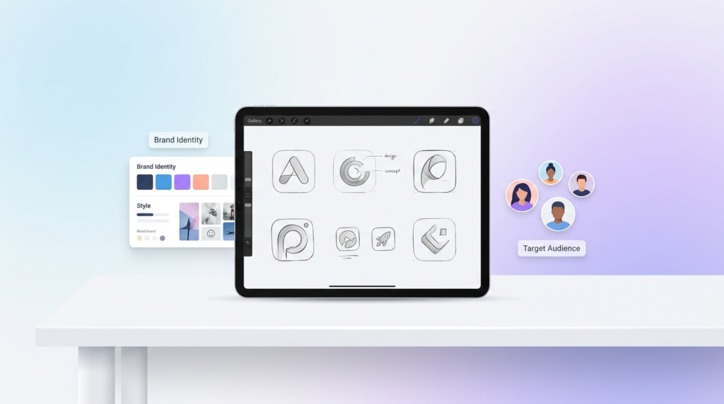
1. Define Your Brand Identity and Target Audience
How do you want to position yourself in the market?
When you have the answers to these questions, you’re on the right path. You cannot build a logo without having any clarity on who your users are, how often they will use the app, how it appeals to them, and what it says about your business.
Having a brand identity and your target audience is the first step to starting any design project. It’s no big deal. You already have the business ready to launch, so you clearly know your target audience and the identity you want to position yourself in the market with.
2. Choose Color Palette and Typography Direction
The logo color combinations you choose play a key role in making an eye-catching app logo. You need to carefully decide on color contrasts because they directly impact your icon’s visual appeal.
Typography, on the other hand, isn’t a part of most logos. But if it is a part of yours, use modern fonts that are minimalistic and are still legible across different sizes.
You probably already have a logo designed for your business. We suggest you use the same color palette for your mobile app icon design. Your app icons are summed-up versions of your logo design. And they also help maintain brand consistency.
![]()
3. Align the App Icon With Your Branding
Your app is a branding touchpoint. It’ll be a real disappointment if it doesn’t align with your brand identity.
When we’re designing an app icon, we design with a mindset that your user wants a unified, connected brand experience, whether they look at your website, logo, social media profile, or app icon.
An app logo that complements your logo design and branding is one way to strengthen your credibility, authenticity, and reliability in the market.
![]()
4. Review Concepts and Request Revisions
Your app logo designer will submit a few concepts. Each of those designs would resonate with your audience and the purpose in a different way.
Experiment with different types of logo designs. In our experience as a logo design company, we find lettermarks and pictorial logo types to work best for an app icon. The Facebook logo and the Instagram logo are the best examples of each.
Once you’ve reviewed the concepts, you’ll have to choose one that you like the most. It might not be exactly what you had in mind, but you can definitely request revisions for a few tweaks. After the refinements and changes, your app icon is good to go.
5. Confirm File Formats
You’re designing an app logo for different screens. It’ll look different as an app store logo and completely different as a Play Store logo.
The standard for an Apple App Store icon used for iPhones, iPads, and Apple devices is:
File Format: PNG
Color: sRGB for color, Grey Gamma 2.2 for grayscale
The standard for a Google Play Store app icon is:
File Format: 32-bit PNG
Color Space: sRGB
Note: The file should not exceed 1024 KB
![]()
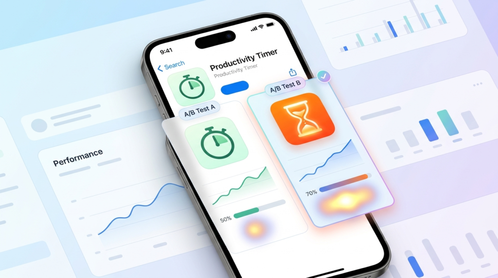
6. Run A/B Testing
Once you have the app icon ready, don’t just launch the app. Testing helps you find out the issues and determine if users will even like it. The best method to find out if your app icon works or not is A/B testing.
A second opinion from different groups of people is a quick survey that will help you make it better and more likable to all audiences. Conducting A/B testing also helps you increase conversion rates and app downloads.
This is exactly how we design an app icon that passes the 5 second test.
Key Design Elements for a Professional App Logo
The design industry may have new things coming up every day, but one thing that remains constant is the elements that set a quality benchmark. Whether it’s logos, brand kits, social media designs, pitch decks, or app icons, designers swear by the importance of these elements.
When you’re on your quest for “how to design an app logo”, here are the app icon design elements you should never compromise on:
Color and Contrast
When you see things, you see them through color. You remember them through color. It’s the same with an app icon. Using complementary colors and high and low contrasts is a great way to divert the attention of your users. For us, when clients say they want the app icon to pop up. We know they mean for the color and contrast to be perfect.
Just open your phone, and take a look at the app icons. Spotify’s icon has a green and black color contrast, but the WhatsApp logo is green and white. Very different shades, very different color contrasts, but the visibility and remembrance remain the same.
Color Psychology
We’ll give you a good example here. You’ve always seen an orange carrot, but there’s a purple carrot, too. For a second, you’ll be like, “That’s not a carrot!” But it is, what happens is it doesn’t fit the image of a carrot you had in mind. The carrot hasn’t changed; the purple color is unfamiliar to you.
This is what the right use of color does to your app icon. It’s the same principle. You’ll be remembered for the colors you use. The human brain has the tendency to relate to everything with color. And not every color works for every industry. Choosing the colors that suit your industry and brand personality will matter in the long run, influencing brand perception and recall.
![]()
Shape and Composition
It’s still fascinating how app icon or logo shapes influence the perception people create of your business. The right shape conveys what you want your users to think about you. Using the wrong shape leaves your users confused and wondering.
Composition is how the elements are arranged in the design. Trust us, you do not want an app icon that’s all over the place. It’s going to be hard to recognize at smaller sizes, and make it even harder to understand what your app does.
Take the Notes App, for example. The app icon tells it’s a note-taking app. The composition is clean and minimal, conveying its functionality. Compare it to the Instagram logo. It plays with shapes, colors, and composition, conveying the nature of the app.
Here’s a quick checklist to see if your mobile app icon is ready to use:
- Simplicity: Minimal design
- Contrast: High-contrast colors
- Color Palette: Use 2 to 3 colors
- Scalability: Test at different sizes
- Brand Alignment: Aligns with all branding touchpoints
DIY vs. Hiring a Professional App Logo Designer
This is a dilemma every small business owner faces. Should I hire a professional designer or just DIY it?
![]()
There will be mixed reviews on this debate. The approach you take depends on your app’s growth rate, current positioning, budget, and timeline. If you’re in the MVP stage or pre-launch, you might be just testing the app or not have the budget for a professional. Here, opting for a DIY or template-based app icon makes more sense.
But if you’re on a stage where you’re thinking about how to design an app logo that reaches the right audience, drives business growth, and brings in conversions or leads, you should consider hiring a professional designer.
| Factor | DIY | Professional Designer |
| Cost | Low | Higher |
| Time | More of your time | Less of your time |
| Quality | Depends on your skills | Usually higher |
| Branding | Basic, Generic | More professional |
| Best For | Small budgets | Business apps |
Risks of Using Canva, Fiverr, or Free Logo Makers
The biggest risk is that they do a basic job. There’s no originality in the design. Everything looks too generic. You don’t have complete ownership; there’s always going to be the risk of trademark infringement. This is one of the reasons why one should never duplicate a mobile app or an icon.
The app icon you made using a free logo maker is going to kill your business. Here’s why:
- You will not have the legal ownership of the design, because a designer has to legally transfer the commercial ownership to you.
- There is no trademark protection for using DIY tools. Freelancers often use stock images that they customize slightly for your design.
- Your app icon design does not look unique at all. It’s going to lack originality.
- Scalability is a problem because free logo makers like Canva can give poor-res files.
- Your design will look generic and not complement your branding.
What to Look for in a Professional App Icon Design Service
Finding the right service for your app icon design shouldn’t be that hard, right? But there are so many design companies, you can easily get confused. Who has the best prices? Do they have a structured process? Have they worked in my industry before? How long will they take?
Before you blow your head with overthinking, here’s the best approach to find a professional app icon design service:
- Shortlist a few design services.
- See if there are any authentic testimonials and reviews available online. Or, if you can get in touch with a previous client to ask about their experience with the designers.
- Ask for a portfolio. Their design experience speaks volumes about who they work with and how they work.
- Look for clarity in communication, pricing, and the design process.
- Verify that they provide complete ownership of the icon in the end.
We’re the Design Service That Checks All Boxes
Take a look at our portfolio, pricing, and process. We’re the logo design company your small business needs to partner with!
How Much Does App Logo Design Cost?
Your app logo is an extension or a variation of your logo design. It shouldn’t cost you a fortune to design one.
With the logo design already implemented, the app icon already has a foundation to build on. You’ll have to make a few tweaks to make it appropriate. Here’s the expected app icon cost in 2026:
| Service Level | Typical Cost (USD) |
| DIY (using design tools) | $0–$50 |
| Freelance Designer | $50–$300 |
| Experienced Designer | $300–$1,000 |
| Design Agency | $1,000+ |
However, if you don’t have a logo yet. You can always come to us. We design custom logos for startups for just $129. The designs are 100% original and authentic, giving you a head start for a top-rated mobile app design!
Best App Logo Design Ideas for Your Inspiration
Here’s a list of some of the app icon designs that are simple, timeless, and a part of our daily lives.
Instagram App Logo: The most popular social media app logo design is the Instagram logo icon. The camera and color gradients reflect its creative and sharing nature.
Amazon App Logo: Symbolizes customer satisfaction and the range of products the platform offers.
CapCut App Logo: Abstract ribbon-like design that reflects creativity, video editing, and content creation.
Roblox App Logo: Features a tilted square cutout, representing imagination, gaming, and user-generated experiences.
Calculator App Logo: Displays mathematical symbols and buttons, making it instantly recognizable as a utility tool.
TikTok App Logo: Combines a musical note with vibrant colors, highlighting entertainment, music, and short-form video content.
YouTube App Logo: Features a play button inside a red, rounded rectangle, symbolizing video streaming and content consumption.
Band App Logo: Uses a clean and friendly design that reflects community building, group communication, and collaboration.
Cash App Logo: Emphasizes quick, simple, and accessible digital payments.
WhatsApp Logo: Combines a speech bubble with a phone icon, representing instant messaging and communication.
Spotify App Logo: Curved sound waves inside a green circle symbolize music streaming and audio entertainment.
Netflix App Logo: Uses a bold red “N” that reflects modern entertainment, streaming, and premium content.
Camera App Logo: Commonly features a lens graphic, representing photography, image capture, and visual creativity.
Ending Note
We made this guide for you to understand how to design an app logo, what options you have, design elements, and some of the best ideas for your inspiration. Building a brand is not easy. Handling all growth assets is even harder. But as someone new in any industry, you need to know how the logo design process works, or how to design an app icon.
Guides like these help when you’re hiring someone. It shows you have the necessary knowledge to manage a business. Whether you are designing a utility app logo, or a social media app logo design, it’s important to know the process and what it costs, especially if you are a startup launching in 2026.
Author Bio
Still choosing the right logo design company?
Get a quick, expert review. No pitch, just clarity on what fits your stage, budget, and growth.