We’ve seen very few logos change as boldly and as publicly as the Pepsi logo. Since 1898, the company has redesigned its logo a dozen times, invested millions in rebranding, and sparked interesting, heated debates across the design industry.
Over the years, the logo has transformed from a handwritten typographic wordmark to a minimal, optimized-for-the-digital-screens, abstract emblem logo design. The Pepsi logo history is more than a design story. It is a masterclass for beverage companies on how to stay culturally relevant, competent, and target new generations of consumers through a visual identity.
This deep dive into the history of Pepsi logo gives you insights into how to strategically use your logo and brand identity to build your beverage brand from scratch or rebrand an established SMB.
Millions Spent on Rebranding
125+ Years of Existence Consumers
Across 200+ Countries
Brief History of Pepsi: Where It All Began
Pepsi is America’s most famous soda brand, and you probably will not believe when we say it all began in a pharmacy in New Bern, North Carolina. Caleb Bradham, a pharmacist, invented it in 1893 and named it “Brad’s Drink”.
Originally, the drink was meant to be an energizing concoction or a digestive aid. Its main ingredients were water, sugar, caramel, lemon oil, nutmeg, and cola nuts. It was not until 1898 that Brad’s Drink turned into Pepsi-Cola, and officially, a logo was made to encourage the distribution of the beverage. From then on, the Pepsi logo history is a story of legacy.
The original Pepsi logo looked so much like the Coca-Cola logo. It was very modest compared to the logo design ideas we have today. Pepsi-Cola handwritten in a typography drawn from the late Victorian era, and that was it.
Pepsi remained second to Coca-Cola. It went bankrupt twice before becoming a drink loved by generations and a true international competitor of Coca-Cola. Today, the new Pepsi logo is one of the most expensive logo designs in the world.
The Pepsi Logo History Timeline: 1898–2023
The Pepsi logo evolution history is more than just about aesthetics. Every redesign was a business decision worth millions to remain competitive, appeal to the younger generations of consumers, and respond to the cultural shifts and digital demands.
This table serves as the complete Pepsi logo history timeline at a glance:
| Year | Logo Style | Main Change |
| 1898–1940 | Fancy Script Logo | Hand-drawn “Pepsi-Cola” with decorative lettering |
| 1940–1950 | Cleaner Script Logo | Smoother, more even lettering and banner shape |
| 1950 | Bottle Cap Logo | Added a red, white, and blue bottle cap with “Pepsi-Cola” inside |
| 1962 | Simplified Bottle Cap | Dropped “Cola”; used just “Pepsi” with a cleaner cap design |
| 1973 | Pepsi Globe v1 | Replaced the bottle cap with the red-white-blue globe; text separated |
| 1991 | Polished Globe Logo | Made the globe smoother and added a bold “PEPSI” wordmark |
| 1998 | Refined Wordmark | Stronger, bold sans-serif “PEPSI” text |
| 1998 | 3D Metallic Globe | Added shiny 3D effects; changed text to lowercase italic |
| 2003–2006 | Refined 3D Globe | Small updates to gradients and text |
| 2008 | Arnell Redesign | Redrew the globe “smile,” tilted the wave, changed the font and blue color |
| 2014 | Diet Pepsi Redesign | Vertical can layout and bolder typography |
| 2023 | Retro-Modern Rebrand | Added black, placed the Pepsi wordmark inside the globe, and brought back a retro-inspired look |
1898–1940
The original Pepsi logo was just a simple wordmark. “Pepsi-Cola” was written in a weird font with uneven spacing between letters. It was one of the most popular vintage fonts back then. The handwritten typography was more Victorian and human. It also reflected the drink’s market positioning as a digestive aid.
Over the next four decades, the design was refined to be cleaner and more in line with Art Deco fonts for logo design, with much more even spacing. In between these years, the Pepsi logo changed three times:
- The original Pepsi logo has spiky embellishments in the font.
- Then a softer and thicker version appeared.
- In the third, the “P” and “C” were made slightly taller than the rest, and the logo was inclined upward to create the effect of a wave symbolizing motion and energy.
1950–1962
If you’ve noticed, when we think of the color most associated with Pepsi, blue comes to mind. The same goes for Coca-Cola; we relate red to the brand. Before 1950, there was no blue in the Pepsi logo history.
In this redesign, the red-white-blue logo color combinations were introduced along with the circular bottle cap. This logo design was a turning point in the Pepsi logo evolution. The colors signified the American colors, communicating patriotism right after World War II. The colors were fresh and optimistic, and they also played a significant role in differentiating them from the Coca-Cola logo.
In 1962, the company dropped “Cola” from the brand name. Another bold move and an attempt at a distinct branding. The bottle cap, the colors, and the wave-effect remained the same; the font changed to a script font. By the 60s, Pepsi had become the drink of the younger generation, so the minimal logo redesign was a smart idea to appeal to the audience.
1973–1991
The minimal, flat logo design of the 60s was here to stay. Maintaining the original aesthetic and vibe, the bottle cap was replaced with an abstract globe in 1973, turning it into a circle logo design. Then the approach was to experiment with futuristic, modern fonts, creating the 90s Pepsi logo most people became familiar with.
In 1991, the redesign removed Pepsi from the wavy globe. It was the first time that the two core elements of the logo were used separately. A banner was the latest addition to the design. The lines between the elements narrowed. The globe and the font were polished, marking the peak visual era of the Pepsi logo history.
Most design critics consider the redesign as one of the boldest, cleanest, and most unmistakably modern. It gave the logo freshness while maintaining its core equity. For most startups, the 90s Pepsi logo era is a masterclass on simplification.
1998–2006
1998 came with a major design upgrade in the Pepsi logo history. The company opted for a 3D logo, ditched the banner, and made blue the logo’s most prominent color. The redesigns during these years were heavily influenced by the Internet era. The metallic sheen and gradient effects marked the digital designs of the 2000s.
In 2006, there was a slight yet meaningful logo change in the Pepsi new logo. The Pepsi globe now had condensation droplets that symbolized the chilled cold drink. In our opinion, this was indeed a complex design change, but also a bold move. We’ve talked about how chasing trends can increase the chances for a redesign, but we still think this was a pretty cool upgrade.
2008
Even as a top-rated logo design company, we can’t decide if this Pepsi logo change was an innovation or an overreach. The Pepsi logo redesign and rebranding by the Arnell Group cost over $1M, sparking a huge controversy at the time.
The 27-page document by the Arnell Group was called “Breathtaking Design Strategy.” They justified the simplistic logo redesign with pseudo-science and grand historical comparisons, like Feng Shui, Earth’s magnetic field, the Pythagorean theorem, the Mona Lisa, and the Golden Ratio.
The branding agency presented an absurd 27-page document justifying the simplistic redesign. It was mocked and faced a lot of backlash. However, Pepsi stuck with the logo. The importance of logo redesign lies in achieving something real, and Pepsi did. It modernized the logo for the digital screens.
The minimal logo design was better suited for digital advertising. The strategy might have been flawed, but the intention was clear. Not everyone loves change. We learned this lesson from the Spotify new logo.
2023–2024
Would it be safe to say that the 2023 redesign marks the retro revival era in the Pepsi logo history? We think, yes.
In 2023, Pepsi brought back the globe, referencing the 90s Pepsi logo and honoring the company’s 125th anniversary. For the first time, the “Pepsi” wordmark turned all black, and it was added back to the globe, completing the circle emblem logo. The black logo font creates a strong contrast against the red, blue, and white globe.
This isn’t a simple throwback. It’s a full-circle moment. Pepsi has returned to a logo that is nostalgic yet feels modern. It maintains the core concept: motion, energy, and youth. The redesign honors the brand’s identity throughout the years without looking outdated. It is among the best 2023 logo redesigns, in our opinion.
How Pepsi Has Adapted Its Logo to Appeal to Changing Generations
One of the most underappreciated dimensions of the Pepsi logo history is how it’s always been aligned with major generational shifts in the company’s audience. Pepsi’s branding team understands what most first-time founders don’t: your logo communication tool with the audience you’re targeting.
| Generation | Time Period | Logo Direction | Key Traits |
| Baby Boomers | 1950s–1970s | Bottle Cap Logo | Patriotic, familiar, trustworthy, red-white-blue colors |
| Gen X & Millennials | 1980s–2000s | Pepsi Globe Logo | Bold, modern, youthful, international image |
| Gen Z | 2010s–2024 | 2023 Retro-Modern Logo | Digital-first, minimal, bold, retro-inspired, authentic |
Study your primary audience before designing your logo.
Great logos speak the preferred visual direction of the generation.
Pepsi’s redesigns were conversions aimed at a specific audience; they were not a generic refresh.
Pepsi vs. Coca-Cola: Two Brands, Two Opposite Logo Strategies
How can we not talk about Pepsi’s biggest rival when talking about the Pepsi logo history? Coca-Cola and Pepsi have a long-standing battle of taste, branding, advertising, and logos. The two represent very different fundamental philosophies of a brand identity and have produced some of the most valuable business logo designs.
Coca-Cola’s power is its restraint. The company logo has hardly undergone 2-3 redesigns and has resisted chasing trends for the past 140 years. The result of the restraint is a timeless logo design that does not feel outdated to any set of audience. The Coca-Cola wordmark logo is the face of the brand. Sabotaging it would be a complete loss of brand identity.
Pepsi did not have the advantage Coca-Cola had. The company has always had to work hard to get attention, and the logo redesigns are part of that effort. Each redesign was meant to drive social conversations, appeal to the generational audience, and address a cultural shift.
![]()
Which Strategy Should Your Brand Follow?
Your brand belongs to an industry where trust and longevity are business-driving factors.
Your investment in brand equity and building brand recognition is fairly large.
The audience you prioritize values tradition, reliability, and familiarity.
Your existing logo is already strong and working.
You belong to an industry where changes are a competitive advantage.
Your audience is young and responds to cultural relevance.
Your existing logo does not reflect your product quality and brand positioning.
You’re considering business expansion.
Were All Pepsi’s Logo Redesigns Worth It?
Logo redesigns are investment decisions. Each costs money and time, putting all your brand equity at risk. Being a logo design agency with more than 7 years of experience across industries, we vouch for the approach to execute the logo right in the first try.
In the Pepsi logo history, every redesign has a business rationale behind it, which founders need to understand.
1975: The Pepsi challenge was inviting direct comparison to Coca-Cola. Pepsi’s market share significantly increased in the late 1970s and early 1980s.
2008: The Arnell rebranding was a $1M investment. The most mocked redesign in the Pepsi logo history timeline. And yet the redesign achieved a cleaner, more scalable mark for digital use.
2023: The 2023 rebranding was widely praised by the design community. The design had genuine cultural resonance, and the ROI lay in positioning Pepsi as a legacy brand.
What Beverage Startups Can Learn From the Pepsi Logo History?
The food and beverage industry is on a constant growth track. For many startups, the Pepsi logo history is a textbook designed with lessons on design decisions. Here’s what you can learn:
Lesson 1: Start With a Strong Wordmark
The original Pepsi logo was a wordmark. The Coca-Cola logo is still a wordmark. For new brands with no recognition, a legible wordmark is a more effective choice than an abstract or combination logo.
Lesson 2: Maintaining Color Consistency
The red, white, and blue have never changed in the Pepsi logo history. The color consistency is a design decision that is above everything else. We all know colors trigger emotions faster than logo shapes or words. Even if you redesign your logo but maintain your brand colors, your consumers will still recognize you.
Lesson 3: Simplify With Purpose
Following trends without clear strategic reasoning will always put your branding at risk. For beverage startups, we have one piece of advice: simplify when complexity no longer serves you. Not when there’s a new design trend and definitely not when your competitor simplifies their logo.
Lesson 4: Budget Your Logo
Pepsi spent $1M on a logo redesign in 2008. We do not recommend that. Start with a clean, strategic investment in a durable design direction. For startups, the budget can be lower, but the principle is the same. A minimum logo design cost of $129 is enough for startups to get a custom logo design and its complete commercial ownership. The cost of a custom, modern logo design from Logo Design Valley is a fraction of the cost of rebranding three years later, after you’ve built a strong brand identity.
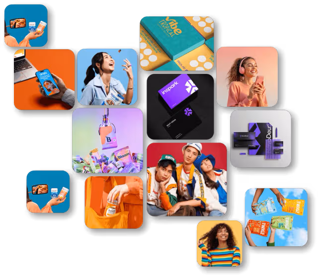
Beverage Brand Logo Design at Just $129
Not sure where to start? Get a custom logo design for your beverage brand at a founder-frienldy price.
Design Logo
2026 Trends in Beverage Brand Logo Design
Broader trends in beverage logo design are shaping the industry in 2026. If you’re building a beverage this year, these trends can give your logo a refreshing twist.
Retro Revival: Retro design elements like vintage typography, muted palettes, and hand-drawn textures are back in 2026.
Bold Watermarks Over Complex Icons: Gradient-heavy icons are no longer valid for beverage brands. Now, the shift is toward confident, high-contrast wordmarks.
High-Contrast Color Blocking: Flat, high-contrast color combinations are replacing soft gradients and 3D effects.
Motion-Ready Logos: Logos are going beyond static designs. Social media and digital advertising platforms require logos in motion. In 2026, the designs are built with motion scalability in mind.
Your Beverage Brand Identity Awaits You
The Pepsi logo history spans 125 years! Dozens of designers have worked together, hundreds of millions of dollars have been spent on marketing, and more than a billion consumers later, the Pepsi logo is the perfect case study. They learned it the expensive way, but you don’t have to. Here’s your beverage brand identity checklist:
- Distinctive wordmark
- Two or three primary brand colors
- Logo works in all versions
- Full commercial ownership or original source files
- One-page brand guideline document
- Test your logo
- Build social media assets
- Invest in professional photography and a website
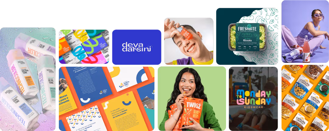
Creating Timeless Beverage Brand Identities
If you’re looking a partner to build the next iconic beverage brand identity, Logo Design Valley is your answer!
Start BrandingAuthor Bio
Duaa writes blogs about marketing, branding, web design, and logo design. She enjoys turning ideas into simple, engaging content that helps businesses build stronger brands and connect with their audience in a more meaningful way.
Still choosing the right logo design company?
Get a quick, expert review. No pitch, just clarity on what fits your stage, budget, and growth.