Your website is a growth tool. It’s where your users interact with your business the most. It builds awareness about what you do. It also lays the foundation for your credibility. It’s basically your 24/7 salesperson.
You put so much work into it, but it only takes 50 milliseconds for a visitor to develop an impression of what you have to offer. For small businesses, first-time founders, and growing businesses, a well-designed web page isn’t a luxury. It’s a necessity.
Yes, we get it, you might be worried about the technical side of a web page, but what’s even more important is that you design the perfect web page layout. We’ve come up with the best guide for a step-by-step tutorial on how to design a web page the right way.

What is a Web Page Design, and Why Do You Need It?
A web page design is the structural layout of a single page on your website. The process involves a lot of planning, developing concepts, and figuring out how to arrange the design elements and content to enhance the user experience.
For a web page to work in the best way possible, the work is more than just aesthetics. You need to consider the website’s overall functionality, the look and feel of the complete layout, user interface (UI), and user experience (UX). Your web page design is the front-end experience of what visitors see and interact with.
For businesses in competitive markets, knowing the best way to design a web page is a perk. We’ve seen good businesses struggle, only because of a lack of good web design. We solved the problem with layouts that were tailored to their industry, conversion-focused, and elevated in user experience and navigation.
Why Do Small Businesses Need a Web Design?
If you’re still looking for reasons why a web design is important, here are some:
- A poor layout might not navigate your users on your web page, but it does lead them to competitor websites. A clean, modern layout keeps your users engaged.
- Your website’s credibility depends on your website’s page layout. 70% of users judge a company’s credibility based on the aesthetics it serves and how easy it is to navigate.
- Using web design elements strategically drives conversions. Each element needs to be placed and used to bring user attention to it, boosting sales.
- Your web design is also a merit for how much Google loves your website. Search engines disregard websites that are low and clunky. A web design optimized for proper site structure, accessibility, and loading speed increases organic reach.
- Mobile-first optimization is also a necessity. Users all over the world are using their mobiles for internet surfing and browsing more than any other device. A responsive custom web design makes sure your website works well across all screens.
Need a Web Design That Outperforms Your Competitors?
Logo Design Valley is the ideal place for web designs that outperform competitors and bring in measurable results for small businesses and first-time founders.
How to Design a Web Page in 7 Easy Steps
At our web design agency, we understand how important it is for business owners to know how to design a web page. But most don’t know how to. Honestly, you don’t even need to know. What you need to understand are the steps to design a web page, to make it easier for you to decide on an approach, or when you’re hiring a professional web designer.
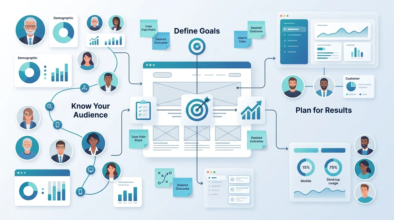
Step 1: Define Your Page Goal and Target Audience
Before you work on design decisions, answer these two most important questions:
Who is the web page for?
What is the primary purpose of the web page?
Our first rule of web design is to design for the user first. If your web page is not achieving its primary goal with the user interactions, then it’s not doing enough. Here’s a table to help you understand the primary purpose of the web pages a website includes.
| Web Page Type | Primary Purpose | Primary Goal |
| Homepage | Introduce the business and guide visitors | Build trust and encourage exploration |
| Landing Page | Focus on a specific offer or campaign | Generate leads or sales |
| Services Page | Explain products or services | Help visitors understand offerings |
| Product Page | Showcase a product or solution | Drive purchases |
| About Page | Share the company story and values | Build credibility and connection |
| Contact Page | Provide communication options | Encourage inquiries and consultations |
It is equally important to know who your visitors are. Do they know about your business? What are they looking for? What should their design preferences be based on your industry?
Everything that follows later. The design, layout, elements, and content are based on these two questions; you must have answers to these two questions before you begin designing your web page.
Action Items Before You Design
- Decide on your primary goal for the web page.
- Choose the audience you want the web page for.
- Research about user preferences
- Define the action you want them to take.
Step 2: Plan Your Page Layout and Information Hierarchy
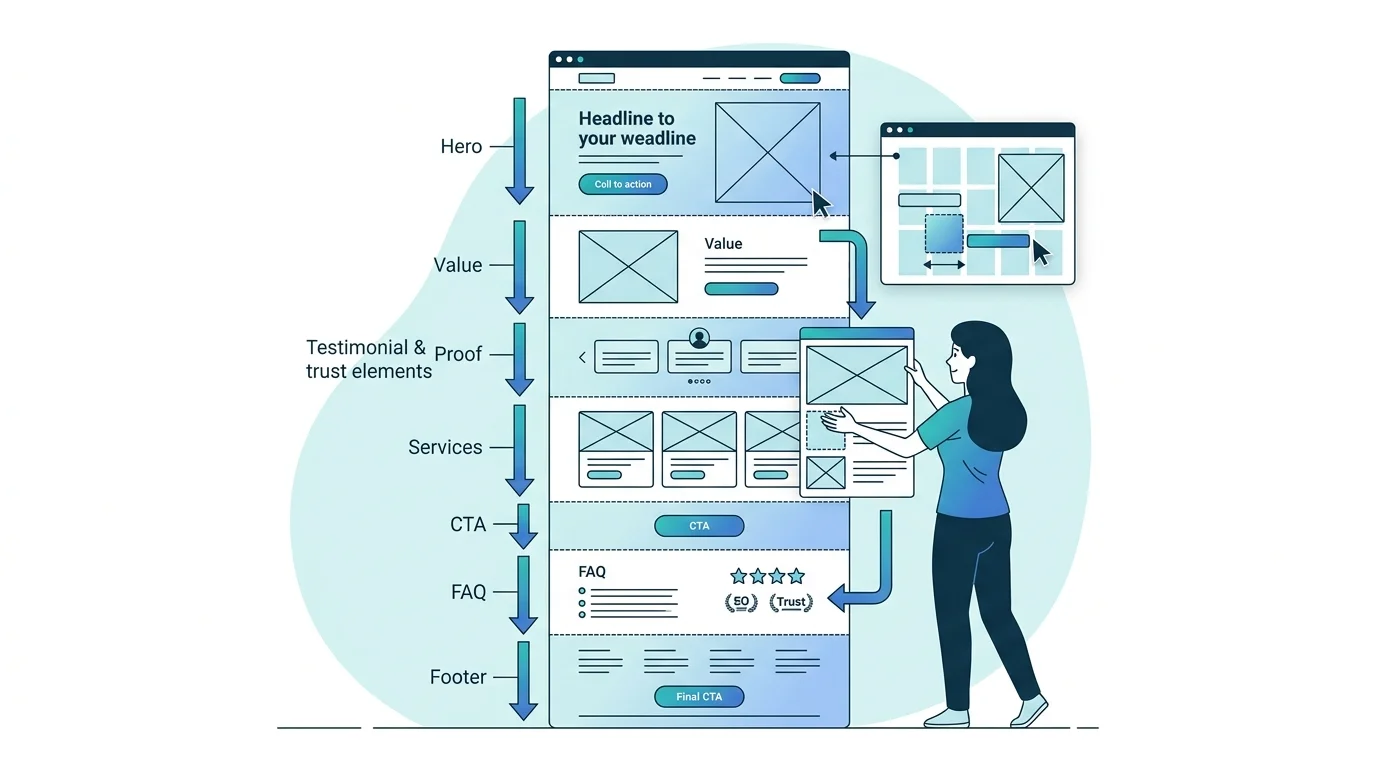
You’ve probably seen cluttered websites with elements all over the place. Frustrating, right? You don’t know where to go, what to look at. A web page shouldn’t look like that!
A solid structure is the skeleton that holds everything together. It makes sure that search engines and users can navigate the page effectively.
Lay out the wireframe design for the website. Plan using pencil and paper or search for the best wireframe tools like Figma or Whimsical, how you want the web page to look like. Common sections a web page must have are:
Hero Section: Above the fold content. It includes your headline, subheadline, and primary CTA.
Value Block: The section talks about what you do and why it matters.
Proof of Achievement: Testimonials, case studies, achievements, and ratings can make a huge difference in earning trust.
Features/Services: Cards of chunks explaining your services or what you offer.
Secondary CTA: A mid-page converting opportunity right after your services section.
FAQ or Trust Section: Addresses the common concerns your users have.
Footer CTA: A final conversion opportunity before your visitor leaves.
Information hierarchy refers to the content your visitors should see first, second, and third. Most information goes in above the fold content, information about services, features, and offerings goes mid-page, while CTAs and proof of credibility are sprinkled throughout.
Step 3: Choose the Right Color Palette and Typography
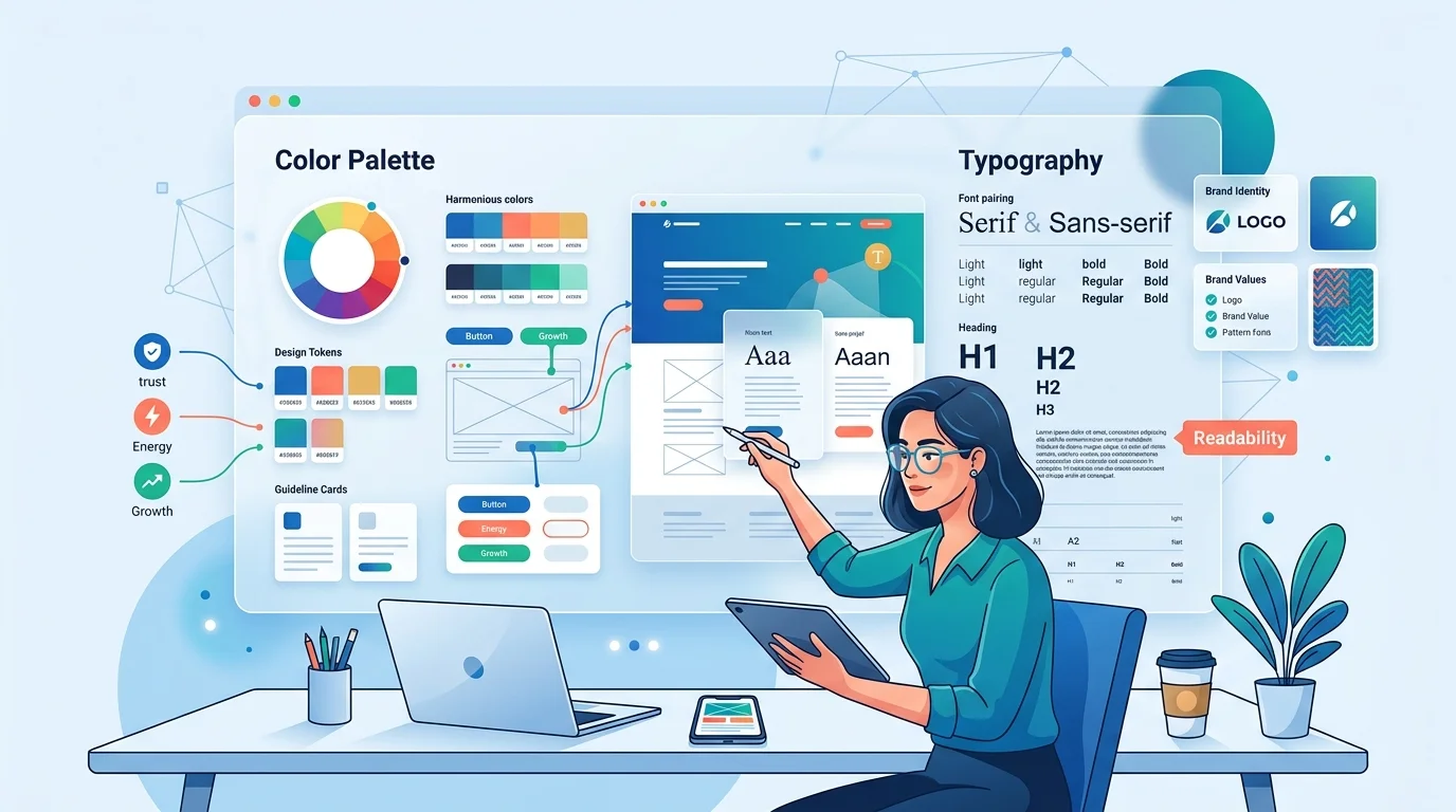
Our favorite discussions are definitely about color and typography. As a logo design company, we cannot emphasize enough the importance of using color and modern fonts to attract customers. You need to know how to use complementary colors in website design for the best appearance.
Color and typography add personality to your web page. They contribute to the visual hierarchy and guide the user through to encourage action. When you play your cards right, you cannot imagine the impact they have on your website.
If you already have a logo, you are already on a good start. The logo color combinations can be used as your brand colors.
- Your primary brand color is ideal for headlines, buttons, and key accents,
- Secondary colors are the right choice for hover states, highlights, and section backgrounds.
- Neutral colors like white or off-white can be a good choice for backgrounds, while dark grey for body text.
The ideal number of colors is 2 or 3. It’ll make your website look visually appealing. Otherwise, it’ll look cluttered, and that’s one way to frustrate your user.
A maximum of two typefaces is enough for any web page. You can use one for headings, and the other one for body text. Variations in weight can be used to differentiate in the visual hierarchy. The ideal size of body text is 16px, and headings should be written in a font and in a size that can be read at a glance.
Step 4: Design Each Section Based on Reader Psychology
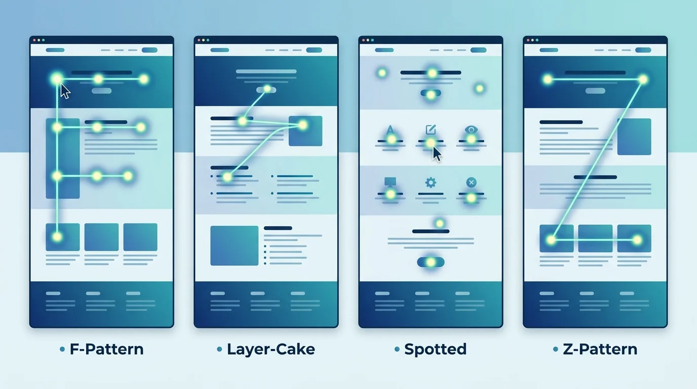
This is the step that sets apart a good web page from an average web page. Eye tracking studies show that users rarely read the whole page. Instead of reading it word-for-word, they scan the web page for the information they need.
Based on these studies, there are four major scanning patterns:
F-Pattern: Scan the upper horizontal part of the web page first, reading from left to right. Drop down and read a second, shorter text part. Then, read the first few words of each line on the left side of the text.
Layer-Cake Pattern: Users read horizontally in layers. They focus on headings, subheadings, and bullet points.
Spotted Pattern: Readers skip around the web page looking for visual anchors and target words.
Z-Pattern: Users begin scanning at the header. Then move across to the right, cut down diagonally to the bottom left, and finish with a horizontal scan again, completing the Z.
Prioritize designing a web page with these scanning patterns in mind. Break up paragraphs, use white space wisely, and include icons and imagery to make content more digestible.
Take a look at the ideal placements of web design elements on a web page to support reading patterns:
| Page Element | Where to Place It | Why It Works |
| Primary CTA Button | Hero section (top), and repeated mid-page | Catches visitors before scroll fatigue sets in |
| Headline | Top-left, large, and bold | F-pattern: first thing eyes land on |
| Trust badges / logos | Directly below hero or near CTA | Reduces risk perception at the moment of decision |
| Testimonials | After your features/services block | Social proof works best after value is established |
| Pricing or offers | Mid-page, after social proof | Visitors need to trust before they evaluate price |
| Secondary CTA | Bottom of page, in a contrasting section | Catches scrollers who didn’t convert at the top |
| Contact form or button | Right side or bottom of page | Z-pattern endpoint, where the eye naturally finishes |
Step 5: Add CTAs, Buttons, and Conversion Elements Strategically
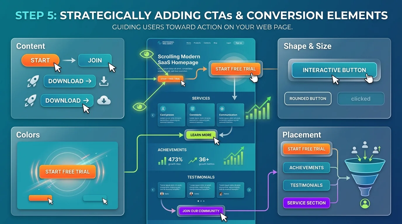
Your call-to-action buttons are important on the web page. They encourage the reader to take action. Weak CTAs are one of the major reasons a web page fails, and users don’t convert.
Content: Using action verbs to make the user decide. For example: Download, Start, Join. Also, highlight what comes next when they actually convert.
Colors: Using complementary colors brings attention to the content you want your visitor to read.
Shape and Size: To make them interactive, buttons should have clear borders, rounded corners, or change color when they hover.
Placement: You need one primary CTA in the hero section. It helps users make a decision before they get bored scrolling through. Secondary CTAs can be placed after you’ve mentioned your achievements or services.
Step 6: Optimize for Mobile and Page Speed
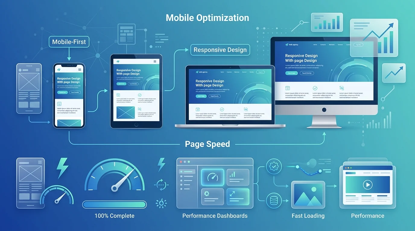
Good web pages load under 3 seconds. Google’s Core Web Vitals considers page load speed as one of the ranking factors. Here are some of our tips for less load time:
- Reduce image size before uploading.
- Do not overuse scripts or plugins.
- Choose a fast hosting provider.
A web page that loads faster has a higher chance of conversion. When web pages take 4-5 seconds to load, they drive users away.
About 60% of the web traffic comes from mobile devices. A web page might work well on a desktop. But if it fails on mobile devices, you’re losing more than half of your audience. You need to prioritize mobile users first.
Here’s what an ideal mobile-first web design looks like:
- Navigation bar that collapses into a hamburger menu or bottom bar.
- Text should be readable without zooming in.
- Buttons should be full-width or thumb-friendly.
- Images should scale proportionally and not overflow the screen.
- Reduce form fields to the absolute minimum.
Step 7: Review, Test, and Launch
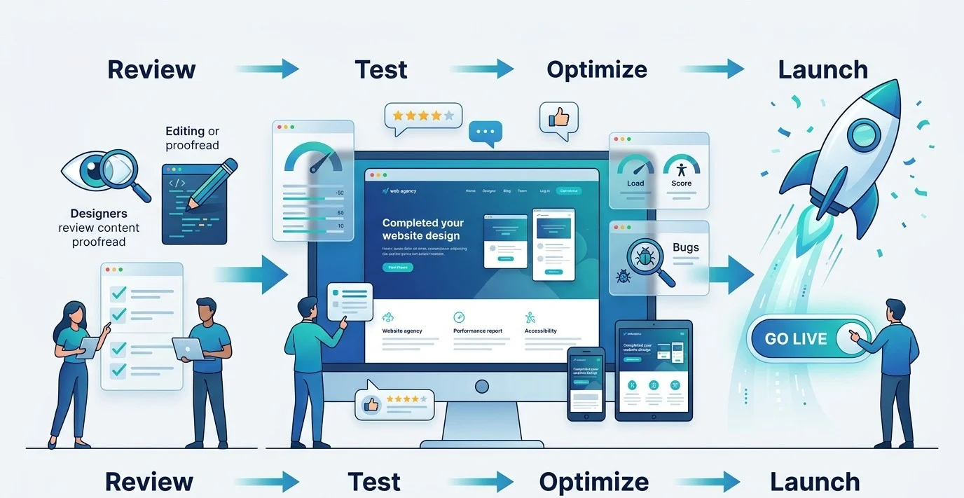
In the end, what’s left is for you to review and test the page. Before your page goes live, review your web page with this quick checklist:
- Proofread every word. See if there are any spelling and grammar mistakes. These reduce credibility in an instant.
- Test on multiple devices. Make sure everything works in different screen sizes.
- Test all links and buttons. CTAs, navigation links, and form submission need to work correctly.
- Use tools like Google PageSpeed Insights or GTMetrix for a free audit of page speed.
- You need to maintain consistency across your web page, logo, social media profiles, and any other branding touchpoints.
- Always ask for someone else’s feedback on the design. They’ll tell you better how it looks from a user’s POV.
- Measure performance from the start with Google Analytics.
The Psychology Behind Web Page Design: Where to Place Every Element
To optimize user experience with an expert website navigation design, you need to know how to design a web page by leveraging consumer psychology.
Behind a good web design, there is psychology. Before you design, you need to understand what elements will guide your user toward the content that matters the most.
You need to understand how the human brain processes visual information to create a web page that drives conversions. Here are three basic principles every business owner should know about how to design a good web page:
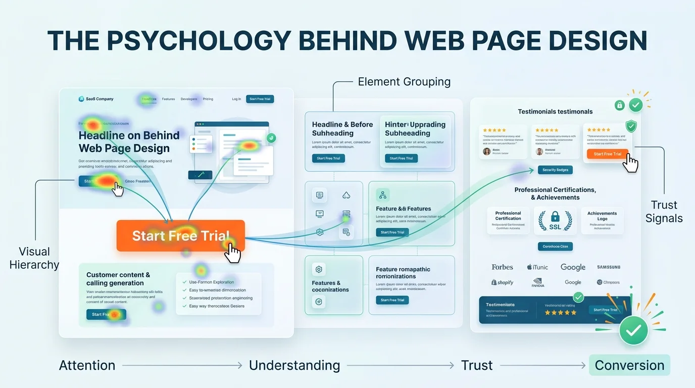
Visual Hierarchy: Understand the reading patterns. Design your page to make your most important information stand out visually. Use different sizes, weights, and colors to guide the user in the direction you want them to go.
Element Grouping: Elements that are placed together are considered to be related. That’s why headlines and subheadlines go together, followed by an immediate CTA button.
Trust Signals: When the user is so close to taking an action, they’re still worried about trust, credibility, and authenticity. Place your testimonials, achievements, certifications, and ratings close to CTA buttons.
A pretty web page will attract, but never convert. Web pages designed with strong research in how the human brain works when it sees a web page are some of the best that bring in measurable results.
Branding and Web Design: Why They Must Work Together
Most small business owners treat web design, logo design and branding as separate projects. New Flash! They’re not.
Web design and branding go together. Your brand colors, your logo, and website should reflect the same brand with consistency. If you have a logo that has navy blue and gold, but your web page is designed in teal and orange, you are immediately losing credibility.
Your brand should look like everything belongs together at every touchpoint. When these elements are inconsistent, your brand feels disconnected. When they’re aligned, your brand feels more credible, authentic, and reliable.
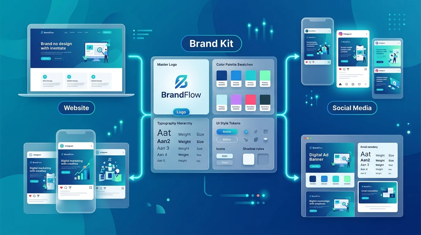
This is where your brand guidelines come into play. When we develop a brand kit for a small business like yours, we submit a brand guidelines document. This document has all the information about the logo, colors, typography, imagery, and usage guidelines. So, even if you get a logo or a brand identity first, you have the reference of your brand guideline to build the website with consistency
Build Brands That Feel Consistent Everywhere
At Logo Design Valley, we design logos, brand kits, and web designs as an integrated system. This way, you get a custom brand identity and a website design that’s built with consistency.
AI Website Builders vs. Professional Web Designers: An Honest Comparison
We’ve been designing websites for years. We’ve seen the phase of the design industry when AI tools weren’t even popular. We’re still a leading web design agency in an era in which AI website builders have made things easier, faster, and cheaper. But the real question is, are they completely reliable?
If you’re looking for an honest answer, yes, they are reliable, but with limitations. They’re ideal in some scenarios, like for a personal blog or a very early-stage MVP. For businesses with strong growth plans, we do not recommend using AI web design tools.
A professional web designer, on the other hand, pays for their credibility and originality. Their web design process is rooted in user psychology, and the work actually looks finished and professional.
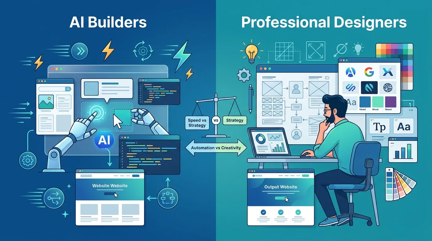
For a better comparison of the two, take a look at this table:
| Factor | AI Website Builders | Professional Web Designer |
| Cost | Free – $50/month subscription | $999 – $1,699+ (one-time project) |
| Time to launch | Hours to 2 days | 5 – 14 business days |
| Brand consistency | Generic templates, limited customization | Fully aligned to your brand identity |
| Source file ownership | Locked to platform, no portability | Full ownership of all design files |
| Custom functionality | Limited to platform plugins | Built to your exact requirements |
| Design quality | Template-level; often looks generic | Custom, professional, differentiated |
| SEO optimization | Basic built-in SEO tools | Strategic SEO architecture from the start |
| Scalability | May outgrow the platform | Scales with your business needs |
| Best for | Hobby projects, early test MVPs | Business-ready, investor-ready web pages |
If you’re looking to invest in a web design as a small business, our template-based design package starts at $999, and a custom web design for $1,299.
Best Platforms for Template-Based Web Design
Template-based web designs are also something that businesses are using to make launching easier. If you’re building your first web page, you must know about these untold truths of free website builders and template-based web design platforms:
| Platform | Best For | Key Limitation |
| Wix | Beginners, service businesses needing a fast, simple presence | Limited design flexibility, locked to Wix ecosystem |
| Squarespace | Creatives, portfolios, lifestyle brands needing polished templates | Less flexible for complex e-commerce or custom layouts |
| Webflow | Designers or tech-savvy founders wanting full design control without coding | Steep learning curve for non-designers |
| WordPress + Elementor/Divi | SMBs wanting flexibility, SEO control, and scalability | Requires maintenance (updates, plugins, hosting management) |
| Framer | Modern SaaS and startup landing pages, great for animations and speed | Newer platform, smaller template library than Wix/Squarespace |
| Shopify | E-commerce businesses, product-focused pages with built-in payment processing | Higher ongoing cost, less flexible for non-commerce pages |
Our recommendation for a template-based web design platform is WordPress. It works great with premium themes like Astra and GeneratePress, giving you the perfect balance of flexibility. For more high-end designs, Squarespace gives you a better experience.
With that said, template-based designs need to be customized to fit your business needs, too. A generic web page designed with your logo on the top isn’t a branded web page. It’s just a web page with your name on it.
When to Hire a Professional Web Page Design Firm
Template-based designs are a good starting point. But when you want a website that looks better and performs even better, the best approach is to hire a professional web page design firm to do the job.
Hire a Professional Web Page Design Firm When:
- You want your web page to bring in sales, or when you want to use it as a lead generation tool.
- You’re preparing for investor meetings or funding rounds.
- You’re rebranding and want consistency across all touchpoints.
- Your current web page doesn’t look credible enough, or it isn’t optimized for conversion.
- You want enhanced functionalities on your website.
- You’ve outgrown your DIY web page and need to scale.
- You want full ownership and control over your web page.
Build Web Pages That Actually Convert
You’re underestimating the power of a well-designed website when you’re not investing in one. For small businesses, the need for a website is beyond a luxury in 2026. It’s a necessity for growth.
Your web pages need to be designed to support that growth. If you’re a small business owner, learning how to design a web page, we hope this guide has helped you find your way. One thing you need to know is that you need to design a web page for your users first; the rest of the elements fall in place.
Web Design Packages at the Most Affordable Prices
We offer a range of services in web design for small businesses and growing SMEs. Our template-based web design package starts at $999, custom WordPress web design at $1,299, and a custom ecommerce website at $1,699.
Author Bio
Duaa writes blogs about marketing, branding, web design, and logo design. She enjoys turning ideas into simple, engaging content that helps businesses build stronger brands and connect with their audience in a more meaningful way.
Still choosing the right logo design company?
Get a quick, expert review. No pitch, just clarity on what fits your stage, budget, and growth.