
Think about Nike for a second. What if its logo looked different on every product? Or Apple’s famous apple had a different bite every time? Would you still recognize them instantly?
One reason these brands are recognizable all over the world is that they maintained consistent, high-quality logos across every product they created for their customers. For a logo to be iconic, it needs to be consistent first.
But how did they maintain this consistency for all these years? Well, we’ve got the answer for you. Brands use logo usage guidelines to maintain consistency. Every single person on the team follows the same set of rules to make the logo use intentional. If you’re reading this as a small business, you need them, too. Here’s why.
Is Your Logo Being Used Consistently?
Let’s find out if your logo is being used consistently across digital platforms and branding touchpoints. Fill out the form, and we’ll get back to you.
What Are Logo Usage Guidelines?
Logo usage guidelines are rules that keep your logo consistent, clear, and clean everywhere. These set a standard of how you put your brand out there for the world. When you follow a set of rules, you avoid mistakes like stretching, blurring, or changing the logo colors.
The logo guidelines could be their own document or be a part of the brand guidelines. Small businesses need these logo usage guidelines to maintain consistency, clarity, and recognizability across print, digital, packaging, social media, and merchandise.

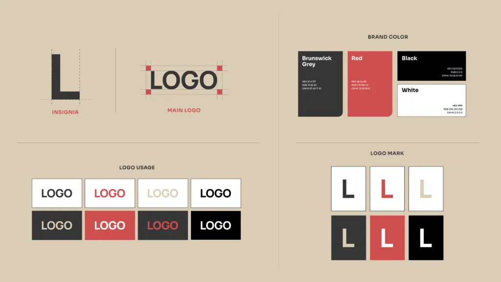
A logo usage guide usually includes rules that clearly define the following:
- Logo variations
- Spacing
- Size
- Color palette
- Background rules
- Other do’s and don’ts for a logo
Why Small Businesses Skip This, and Why It’s Risky
“We’re only three people, why do we need this?”
Valid question. Small businesses usually operate in smaller teams, but this does not mean they can’t make mistakes when using the logo. Different logo color combinations, variations, fonts, and even small, altered details can create inconsistencies. Every inconsistency chips away at customer trust and brand recognition.
The lack of knowledge among first-time founders and entrepreneurs on why logo usage guidelines are important is worth highlighting. You are a small business. Don’t you have long-term growth plans? Do you not want customers to recognize you? For the sole purpose of maintaining consistency, you cannot skip logo usage guides.
It’s risky not having a logo guideline, especially if you are a growing business. It signals to investors and partners that you’re a serious business. It shows that you care how your logo is used. So why skip it when it can cost you funding and customer recall?
What to Include in Your Logo Usage Guidelines
Your logo usage guidelines are documentation that standardizes how your logo is used everywhere. It includes the following:
Logo Description
How do you and your staff describe your brand? A short statement describing your logo and the philosophy behind it ensures everyone on the team has the same idea of what the logo represents. You need to make it clear how the logo fits into your broader brand identity. It also shapes how customers begin to perceive your brand.
Logo Variations
Our experts say there are four logo variations that are a must-have for any business.
Primary Logo: Your main logo.
Secondary Logo: A more compact version of the main logo.
Wordmark: A text-only version of the logo (brand name).
Brandmark: A standalone mark that represents the brand.
Logo Sizes
You need to define sizing parameters of the logo to make sure it looks clear at all sizes. Include minimum dimensions that ensure your logo stays legible on screen and in print. Based on daily use cases, set your logo size preferences. This way, your staff will not get confused about what size to use for the logo. See our logo size guide for maximum impact.
Logo File Formats
Define the logo file formats beforehand. Your designers will give you all file formats for your logo to use across print and digital formats.
SVG: Ideal for scalability.
PNG: Used for transparent backgrounds.
EPD/PDF: For printing and signage design.
Spacing
Decide how much space to keep around the logo. This is one of the most important rules to include in your logo usage guide. The space around the logo should be enough for it to be visible and not blend into the clutter. Too much whitespace will make your logo look insignificant. Too little whitespace will make your logo less visible.
This rule makes the visual impact more powerful and makes your logo free from any visibility obstruction. Your logo needs to have the main character energy, and whitespace gives your logo exactly that area to shine.
Color Palette
Commonly, there are four different color formats you can use:
- Pantone
- CMYK
- HEX
- RGB
Defining the color values in each format ensures the colors of your logo remain consistent on digital platforms and print materials. A defined color palette should include:
- A light color to use as the background.
- A darker color for text.
- A neutral shade for all combinations.
- An attractive color that makes the logo stand out.
Typography
Your logo guide should make clear which logo fonts support your brand identity. Your typography rules should outline:
- A primary brand font.
- A font for headings, body, and captions.
- Styling rules (shading, outlines, italics, or effects).
- How the logotype appears in the primary logo.
Placement and Use
Your logo is used almost everywhere to represent your brand. Define where it goes in a document, in an email, or in a presentation. These scenarios are just a few examples of how the logo is used. The rules that define your logo’s placement make it prominent without overshadowing the rest of the content.
Do’s and Don’ts
Create a bulleted list of do’s and don’ts for logo usage. This will practically show your team the right ways to use the logo. It shows how you can put your logo into practice and what you shouldn’t do to make customers and other people question your credibility.
For instance, what happens if the Nike swoosh logo is used upside down on a product? What happens after that? Even though it would be an original product, it’s not consistent with the rest, and that’s exactly what you don’t want to happen with your logo.
External Use
Your logo usage is not just limited to you. Your partners, journalists, and other people could use it, too. You need to have instructions ready on how people who are not a part of your team or staff can use your logo.
Can You Create Logo Usage Guidelines Yourself?
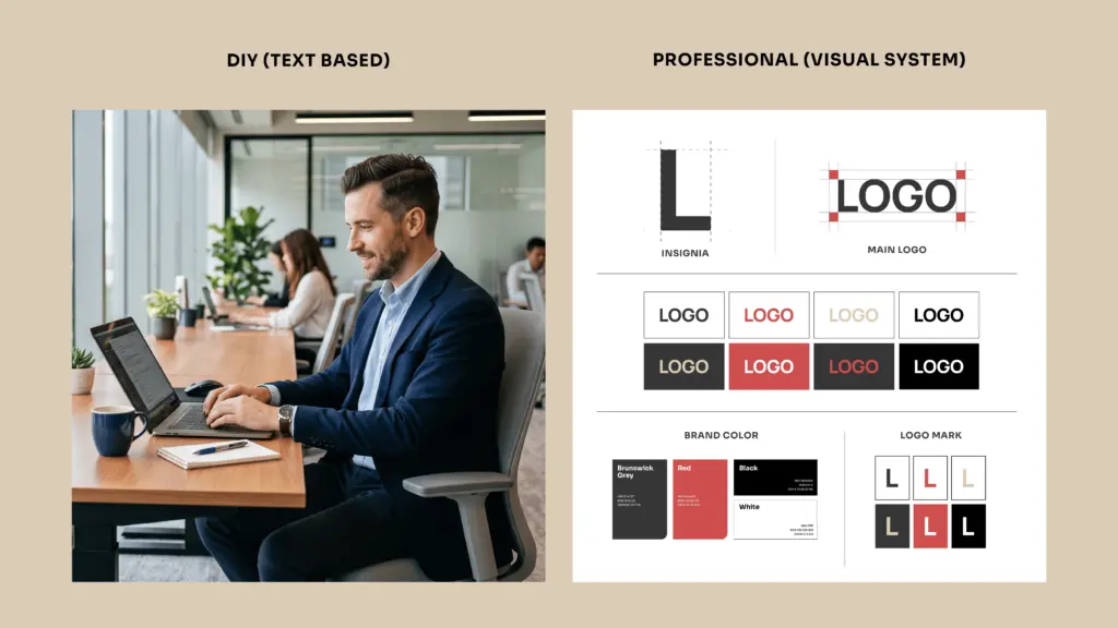
If you want an honest answer from a logo design company, we’d say yes. You can create a logo usage guide yourself, but only if it’s text-based. You can define the do’s and don’ts in words, mention the color codes, and list down the exact rules for spacing. It’s not a bad start for a small business, but that’s it.
For non-designers or your staff to understand what you mean by logo usage, practical examples, logo files, sizes, color codes, spacing rules, and do’s and don’ts need to be shown, instead of being listed.
If you’re complaining about a staff member just stretching the logo and butchering its pixels, it may be wise to get a professional logo guideline designed.
How Much Do Logo Usage Guidelines Cost for a Small Business?
Logo guidelines are rarely sold entirely on their own. They’re usually a part of a brand identity package that can cost anywhere between $1,000 and $5,000+.
For a small business, a standard document for logo usage guidelines costs between $200 and $1,000, designed by a freelancer or a small design agency. Overall, the cost heavily relies on who you hire and the depth of the usage you want to cover.
DIY vs. Professional Guidelines: What’s the Real Risk?
Now, you may be wondering: if I can DIY a logo usage guide, then why do I invest a few hundred dollars in it? Let’s break it down for you.
Professional Logo Usage Guidelines DIY Logo Usage Guidelines

What Good Logo Usage Guideline Examples Look Like
The best businesses define logo guidelines and cover every possible way the logo can be used. Here are some of the best logo usage guidelines examples for you to get inspired:
Spotify: The Spotify logo has its own usage guidelines defined by the team. It covers how developers can use it, what to do and not to do with the logo, the approved color variations, and more.
KFC: The KFC logo has its primary logo and the wordmark defined for usage. Their photography remains restricted, too.
TikTok: The logo usage guidelines for TikTok define how eCommerce sellers can use the logo for the TikTok Shop and the videos shared on the platform.
BMW: It’s one of the most unique logo guidelines we’ve seen so far. The rules emphasize strict spacing, prohibited color changes, and designated usage frameworks for partners, dealers, and clubs.
How Logo Design Valley Builds Logo Usage Guidelines for Small Businesses
When you’re building a brand, you need the assets you need to manage it. Your logo usage guidelines are part of it. Logo Design Valley gives small businesses the opportunity to build a brand without the agency price tag. Our Standard Package for branding is a chance you can’t miss. It includes everything you need to build a brand from scratch. No additional costs.
Build Your Logo Guidelines Without Starting From Scratch
Your team may be small, but your logo represents you in many places. To make sure your team’s using your logo the right way, get a logo usage guideline to maintain consistency.
Author Bio

 verified expert
Duaa writes blogs about marketing, branding, web design, and logo design. She enjoys turning ideas into simple, engaging content that helps businesses build stronger brands and connect with their audience in a more meaningful way.
Still choosing the right logo design company?
Get a quick, expert review. No pitch, just clarity on what fits your stage, budget, and growth.