Small business owners are always looking for fresh, practical ideas to bring to their brand. If you’re launching your business soon or have an idea in mind, you’ll want a few logo ideas. In that case, your first instinct should be to search for logo design trends in 2026.
After working on different brands this year, we’ve created a list of logo design trends that brands preferred or were inspired by. But one thing is clear: Brands now understand the need to invest in a logo design company. They know that without professional help, they cannot get logos that feel personal, human, and tactile.
Here are the top 21 logo design trends that have impressed the small business community in 2026.
What Makes a Good Logo?
If your answer is “trendy”, you’re wrong. A good logo design is simple and timeless. Nothing too fancy, nothing too cluttered, and definitely not trendy. Now you may ask, what qualities make a good logo? Well, the list should come from experts.
Simplicity
Good logos are always simple. If you survey your favorite brands, you’ll notice the simplicity immediately. The Nike swoosh logo. The Adidas logo. The Apple logo. The KFC logo. All simple. A clean, uncluttered design improves brand recognition and recall.
Memorability
What’s the point of a logo if it doesn’t make your brand instantly memorable? The design needs to be unique enough to stick in people’s minds. Attention spans have reduced massively. If your logo fails to become memorable within seconds, you lose potential clients.
Timelessness
You do not get a logo design for a few months and then switch it to something else. Your logo is your most important long-term business asset, so it needs to be timeless. It needs to work for where you are today and where you see yourself in the near future. Your logo needs to look fresh and modern even decades later.
Versatility
Your logo will represent your business everywhere. It’s there on every customer touchpoint. It exists on every marketing material. A good logo can adapt to all these places. It stays legible without pixelating. It’s still readable at different logo sizes. A logo without versatility is a damaged brand asset.
Relevance
A logo only works when it’s relevant to the business, its industry, and its audience. In order for the design to reach the intended audience, it needs to be relevant. They need to feel the emotional connection and the relatability.
A Good Logo Should Last. Yours Should Too.
A logo should be simple, memorable, timeless, versatile, and relevant. We design logos for your business around these qualities, so you don’t spend on redesigns every few years. Get your logo for $129.
Start DesigningWhy Do Logo Design Trends Matter in 2026
The latest logo design trends are an interesting shift away from generic logo solutions. Trends are not rules. They are tools you can combine with strong logo design to create something that cuts through the digital noise and stands out.
Instant Digital Recognition: Your business is on someone’s feed, where they see a hundred small businesses in just one scroll. For a logo to register at first glance, it needs to attract. And what better way to attract customers than trying something trendy?
Battling AI logos: We’re currently living in the AI world. Every output feels the same, whether it’s a tagline or an AI logo design. These trends give brands an approach AI logo generators likely won’t understand.
Distinct Brand Personality: Trends can give your brand a unique personality. A bubbly typeface could make your brand look playful. A solid sans-serif could give your brand a sophisticated look. Following the rules will make a good logo, but adding a touch of trends can level it up.
Do not completely disregard what’s trending. Instead, use it to make your logo more impactful and your business unique.
21 Best Logo Design Trends in 2026
We’ve shortlisted 21 popular logo design trends in 2026.
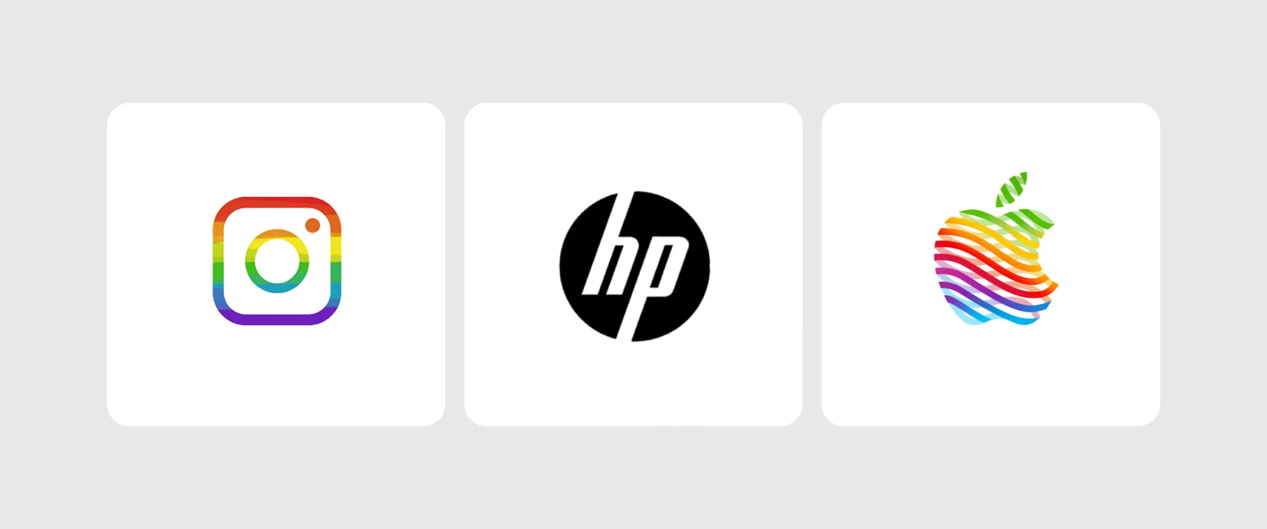
1. Adaptive Logo Systems
Static logos are a thing of the past. Brands now want complete logo systems. Logos need different versions to work across platforms. Big company logos, famous restaurant logos, and other popular brand logos have already adopted this trend, and honestly, it’s useful. With so many changes happening in the digital world, a single, static logo is less likely to adapt.
Why It’s Trending: The trend adds versatility. A logo design idea has to work across social media profiles, websites, apps, favicons, packaging, and many other places. Logo variations make scaling easy.
Watch Out For: Don’t create too many logo versions, or the brand may start to feel inconsistent.
Best-Fit Industries: All industries.

Small Business Tip: You don’t need a complicated business identity system. A primary logo, a brand mark, and an icon version may be enough.
2. High-Contrasting Color Palettes
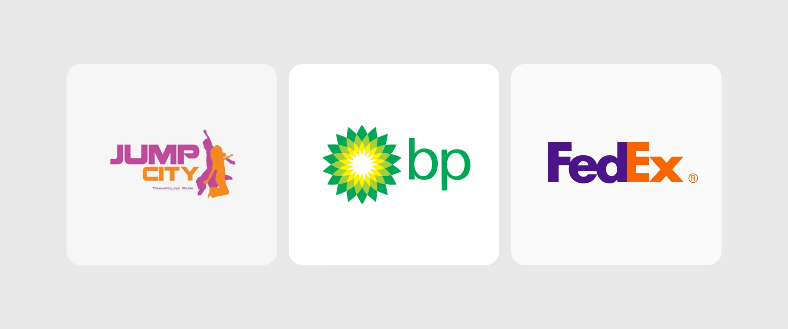
You’d be surprised to know that this trend actually works. You don’t just throw in random colors; you choose high-contrast logo color combinations strategically. Strong color blocking diverts attention toward what matters in the logo.
Why It’s Trending: Bright, clashing colors make the logo pop with energy and personality.
Watch Out For: Too many colors can make a logo feel chaotic.
Best-Fit Industries: Children’s brands, food and beverage businesses, and other consumer brands.
Small Business Tip: Pick one dominant color, a contrasting color, and a neutral color.
3. Slant Break
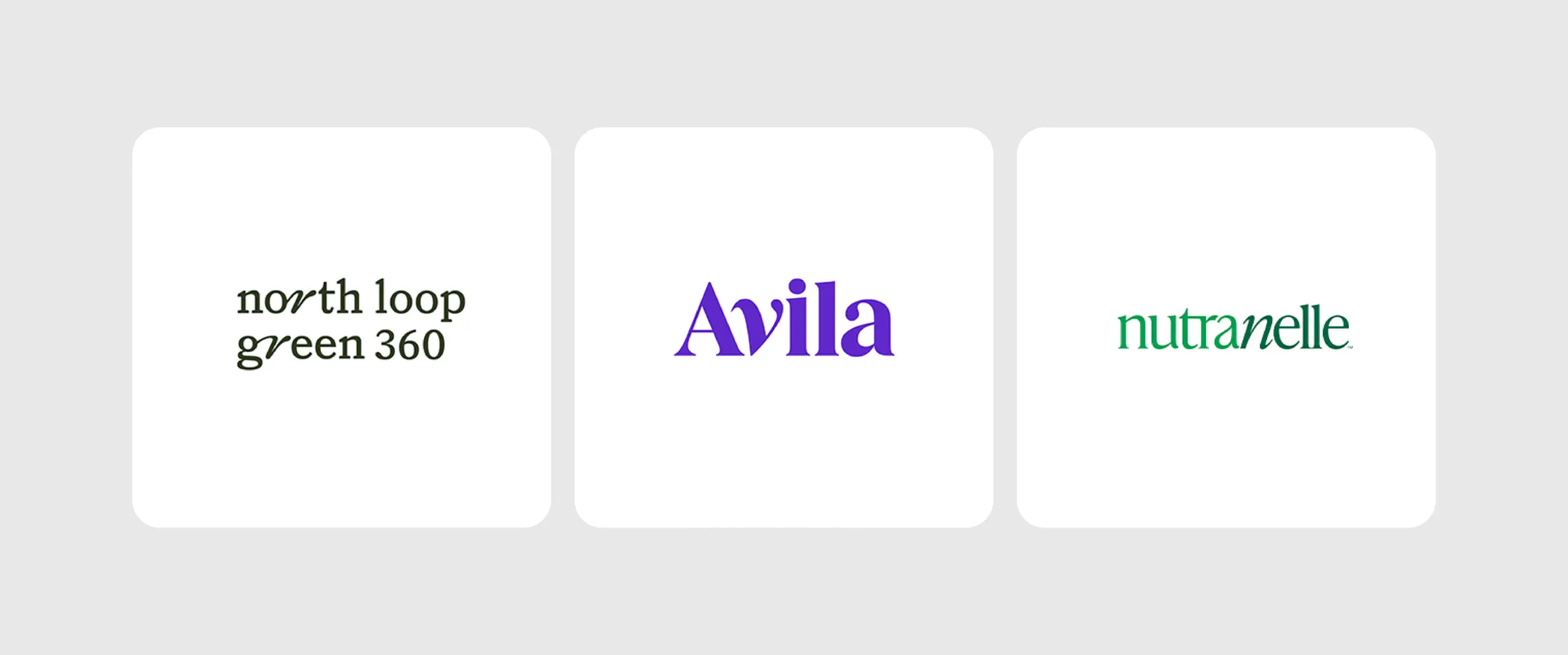
The “slant break” trend is an emerging typography trend. It’s the intentional insertion of an italicized letter in an otherwise perfect wordmark logo. It’s like a speed bump, but for the eyes.
Why It’s Trending: It creates enough tension for the viewer to pause and take a closer look.
Watch Out For: Too many cuts or aggressive angles can make the logo feel harder to read and visually messy.
Best-Fit Industries: Tech, sports, gaming, fitness, automotive, or any brand that represents motion.
Small Business Tip: Use a single, strategic slant break to give your logo more character. It can be enough to make it familiar.
4. Maximalism
Minimalist logo design ideas have ruled long enough. Now, when brands want to add character to their logos, they opt for maximalism. Some logos use stunning, vibrant, detailed imagery to stand out. Others opt for bubbly, bold logo fonts to exude minimalism through typography.
Why It’s Trending: A maximalist logo is the complete opposite of a minimalist logo design. It has more colors, more details, and decorative elements.
Watch Out For: More isn’t always better. Some logos can end up looking cluttered and messy.
Best-Fit Industries: Fashion, beauty, food and beverage, retail.
Small Business Tip: Give your maximalist logo a strong structure. Instead of adding more of everything, build around the elements that matter the most.
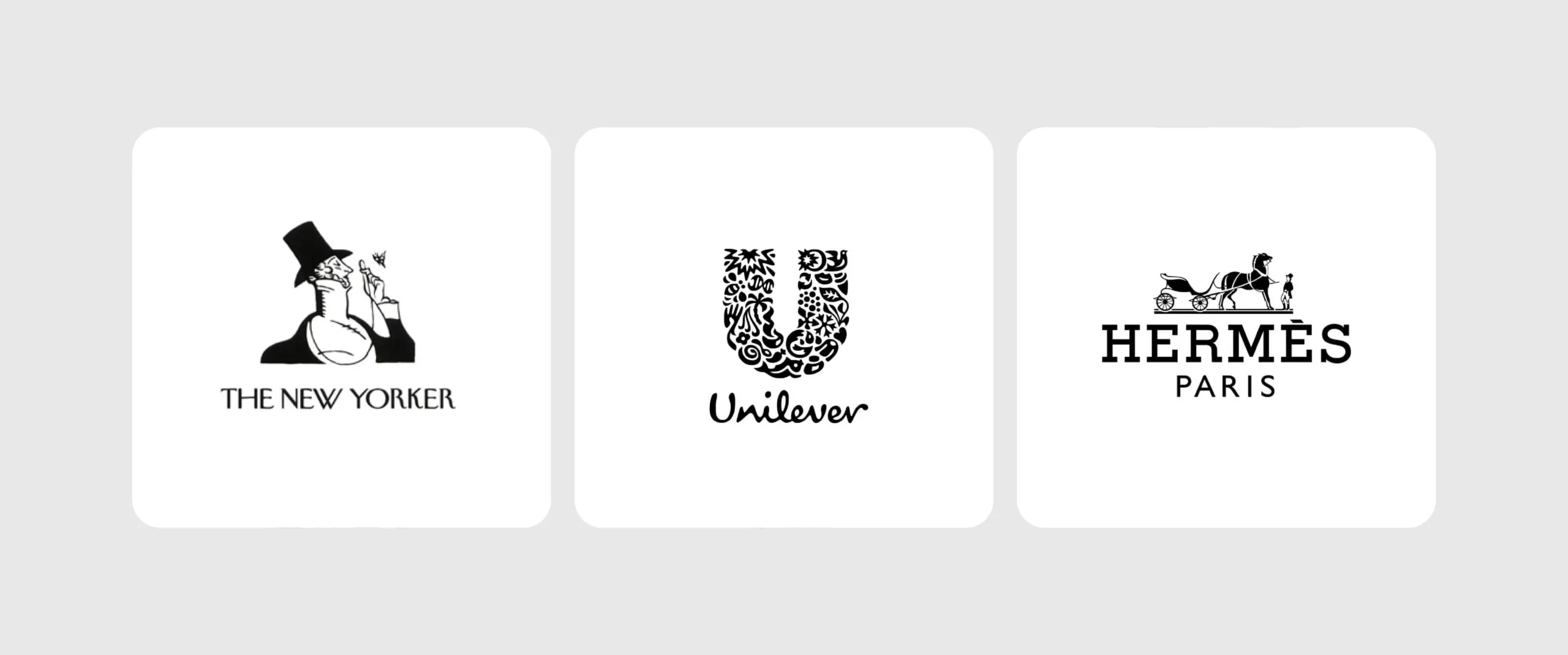
5. Minimalism With a Hook
When we say the “wow factor” works, trust us. In the past few years, we’ve seen minimalism as one of the most prominent trends in branding. But this year, brands are redefining minimalist logos with an unexpected twist. The trend keeps the logo clean overall, but uses an unusual letterform, clever shape, or a hidden element. It’s very similar to a negative space logo but with more character.
Why It’s Trending: Brands can never move away from minimalism. This trend allows brands to adopt minimalism without blending into a sea of similar logos. The unexpected detail makes the logo memorable.
Watch Out For: One of the biggest logo design mistakes brands make is turning the twist into a distraction instead of enhancing the concept. If the twist is too subtle, people may miss it. If it’s too obvious, it loses its simplicity.
Best-Fit Industries: SaaS and tech, professional services, fintech, wellness, law.
Small Business Tip: Start with the simplest version of your idea, then look for an element you can make unexpected. One clever detail makes your logo stand out.
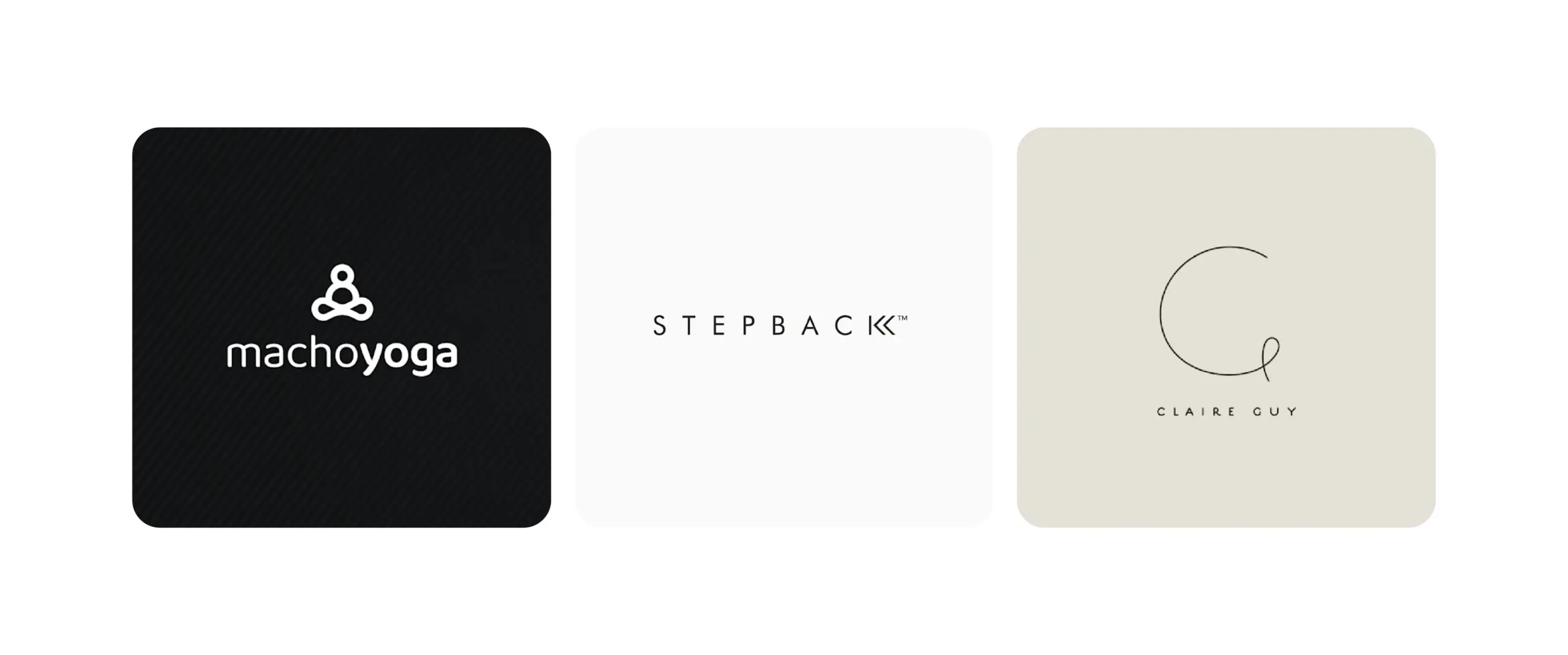
6. Slip Knots
One of the letters loops, twists, or ties itself in a knot. The letter then becomes the logo symbol that captures the brand’s quirkiness. All it takes is a knot to make your business memorable. The best part? The knotted letter can become your brand’s signature icon.
Why It’s Trending: The knotted or looped letter creates a sense of movement, connection, and continuity.
Watch Out For: Overlapping lines can get confusing, especially when the logo is scaled down.
Best-Fit Industries: Automotive, fitness, sports, gaming, jewelry.
Small Business Tip: Use the knot to communicate something meaningful about your business, like continuity, connection, or collaboration.
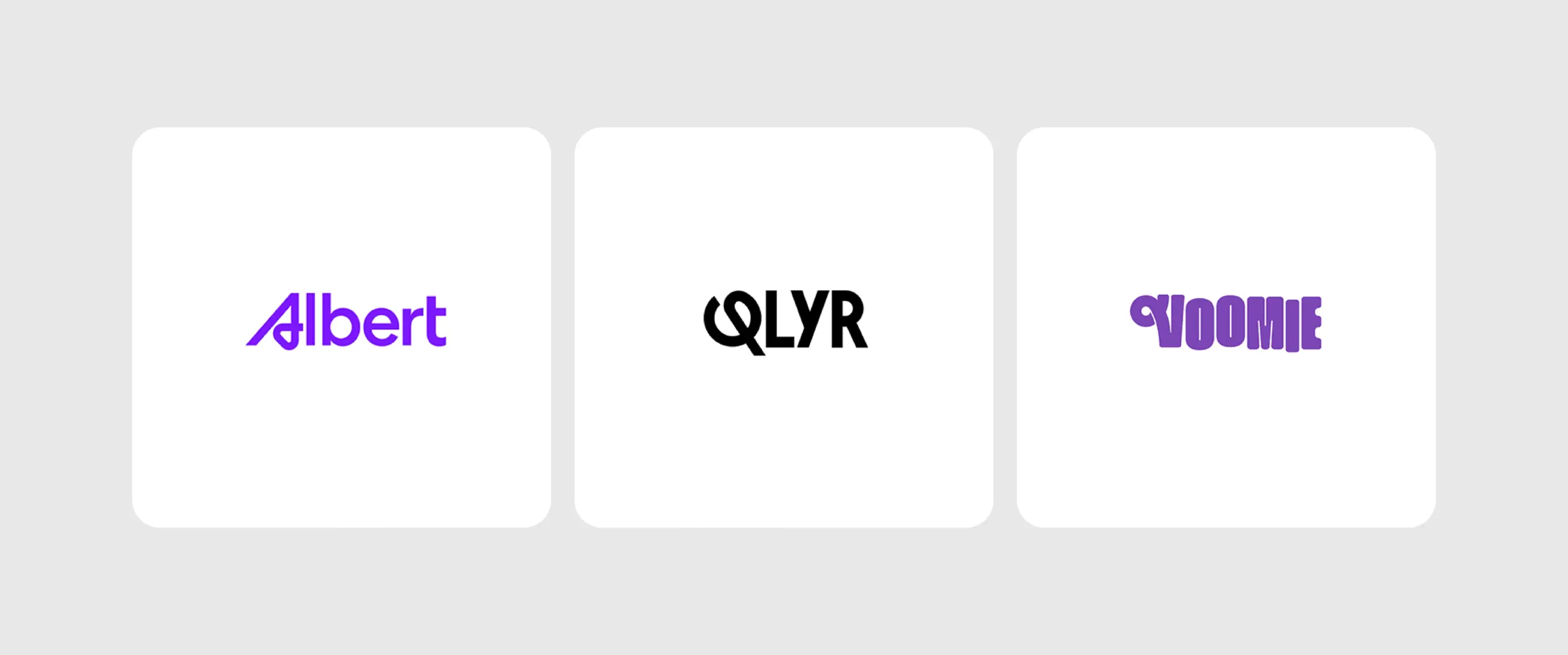
7. Faders
The faders effect uses geometric shapes and controlled color fades to create depth within a logo. It often works with a circle logo or triangle logo, using carefully balanced gradients that transition without muddying the colors. The result is a dimensional look that adds visual depth while keeping the logo clean and lightweight.
Why It’s Trending: The trend adds depth and movement to geometric logos through controlled color transitions. It gives logos a more digital feel.
Watch Out For: Poorly balanced gradients can make colors bleed into each other, losing the logo’s purpose.
Best-Fit Industries: Tech and SaaS, fintech, gaming.
Small Business Tip: Use the fade to enhance a strong logo concept. A simple shape with a purposeful color transition is better than a gradient-heavy logo.
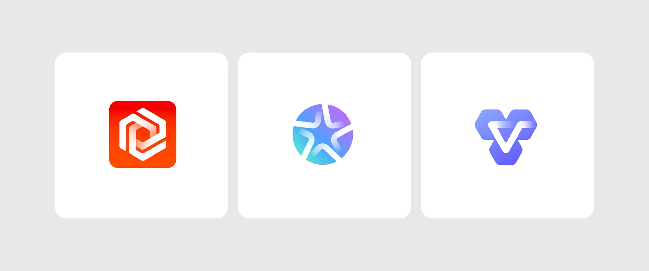
8. Smooth Atmospheric
This popular logo design trend uses soft gradients, fluid transitions, and subtle color blending to create a calm, polished visual feel. This style relies on earthy elements, layered tones, and gentle movement to give the mark depth without feeling heavy or complex.
Why It’s Trending: It gives the logo a clean look. The visuals are on a softer end, making the brand feel modern and approachable.
Watch Out For: Do not blend the colors too much. This way, the logo could feel washed out or generic.
Best-Fit Industries: Wellness, beauty and skincare, healthcare, lifestyle.
Small Business Tip: Do not overuse color combinations. Choose two or three colors that work together to create a restrained, earthy feel.
9. Y2K
Y2K has been a popular trend this year not just in logo design but overall. It brings back the bold, playful visual language of the late 1990s and early 2000s. Recently, Spotify’s new logo took on the trend for its anniversary, too. The nostalgic, energetic feel gives brands a youthful, expressive, and attention-grabbing brand identity.
Why It’s Trending: Y2K aesthetics evoke the feelings of nostalgia, giving logos a playful yet culturally relevant feel.
Watch Out For: Too many retro elements can make the logo look gimmicky.
Best-Fit Industries: Fashion, beauty, music, entertainment, streetwear.
Small Business Tip: Don’t completely replicate the Y2K energy. Try modern fonts combined with nostalgic color combinations and playful graphic details. You do not have to sacrifice the brand’s aesthetic quality.

10. Chunky Typefaces
Another popular typography logo trend this year is chunky typefaces. Almost every children’s brand we’ve worked with in the past few months has asked if it’ll work for their logo.
The trend uses oversized, chunky letterforms to put the business front and center of the logo. The bold shapes immediately make space for the playful, confident, and contemporary brand personality. The typeface choice elevates a simple wordmark logo in an instant.
Why It’s Trending: Brands stand out immediately with the chunky letterforms and bold colors, especially in crowded digital spaces.
Watch Out For: Extremely heavy or tightly packed letters can hurt readability at small sizes.
Best-Fit Industries: Fashion, fitness, restuarant, children’s brands.
Small Business Tip: Let the typeface do the heavy lifting. Do not try to turn it into a combination logo by adding unnecessary graphics.
11. Morphing
Logo marks now shift shape or composition across contexts while keeping the core identity recognizable. The trend highlights how motion is part of branding in 2026. Logos aren’t just adapted with morphing techniques; they’re built to be dynamic from the start.
Why It’s Trending: Morphed logos can move, change, and adapt across digital platforms.
Watch Out For: Overusing the morphing technique can make a brand hard to recognize. The transformation shouldn’t look like it combines five other brands.
Best-Fit Industries: Technology, SaaS, media, gaming, education.
Small Business Tip: Start with one strong logo. Identify the logo shapes or elements that have the potential to be morphed without losing the original brand identity.
12. Linework
You’ve probably seen this trend everywhere this year. Businesses really like it. Clean, continuous, carefully arranged lines give any business a sophisticated look. The logo symbols, shapes, and letterforms are instantly recognizable. Your logo could be a delicate, elegant wordmark combined with a bold, geometric shape to create a combination logo. It’s totally up to you how you want the lines to work.
Why It’s Trending: Linework gives brands plenty of room for creativity. Its simplicity is a different approach from most logos today.
Watch Out For: Fine lines can disappear when the logo is scaled down or printed at smaller sizes. Keep the line weight consistent and do not forget to test the logo.
Best-Fit Industries: Restaurants, fashion, real estate, architecture.
Small Business Tip: The lines are not just decoration. They need to communicate something about your business. This way, the simplicity has meaning.
13. Breezy
The trend favors “fluid minimalism”. Light, flowing shapes, soft curves, open spacing, and airy compositions create a relaxed and effortless feel in a logo. The logo type avoids rigid geometry, giving a logo a sense of movement, freshness, and approachability.
Why It’s Trending: It doesn’t make a brand feel overly polished and corporate. Instead, it gives any brand a softer, more natural visual identity.
Watch Out For: Too much breeziness can make a logo lose its purpose, feel generic, and lack authority. It needs enough structure and contrast to remain readable.
Best-Fit Industries: Travel, hospitality, wellness, fashion.
Small Business Tip: Use generous spacing, fluid shapes, and a restrained color palette to create an airy feel. The logo needs to stay recognizable without disappearing into the breeziness or simplicity.
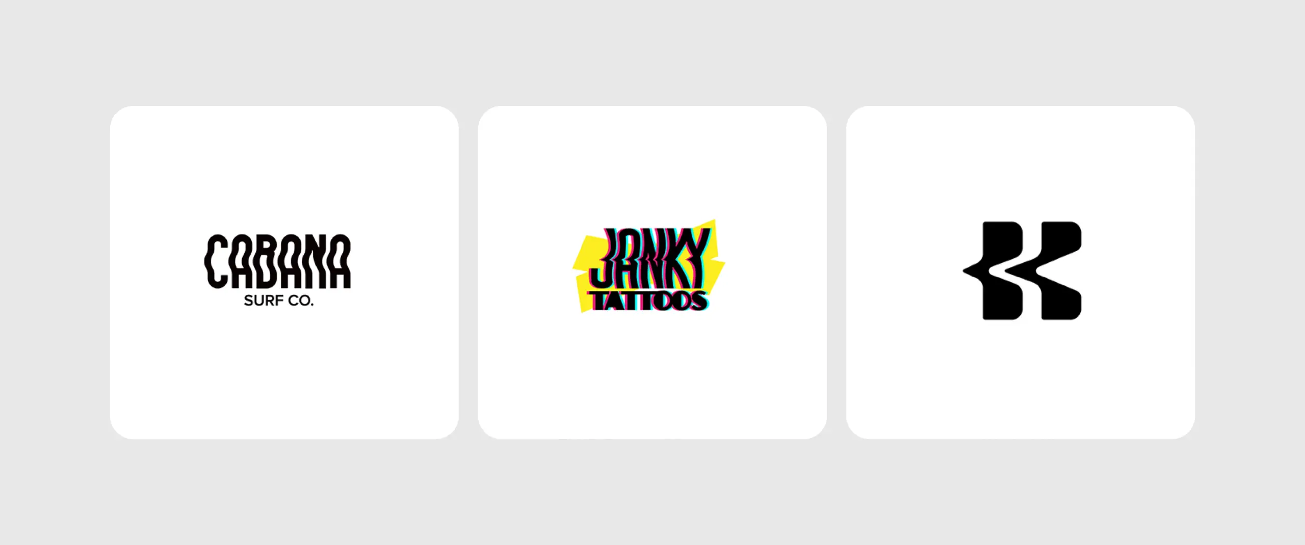
14. Microdetails
Microdetails in a logo are tiny, intentional elements. It could be fine lines, subtle cuts, miniature symbols, hidden shapes, or intricate patterns. These details add depth and character, drawing people in for a closer look.
Why It’s Trending: Small details can intrigue the audience without creating an overall complex composition.
Watch Out For: A microdetail that looks good at full size will likely disappear when the logo is scaled down. Do not rely too much on tiny elements for recognition.
Best-Fit Industries: Luxury, fashion, beauty, architecture, premium lifestyle brands.
Small Business Tip: Treat microdetails as an extra layer, not your entire brand identity. Create a strong, recognizable logo first, then add subtle microdetails.
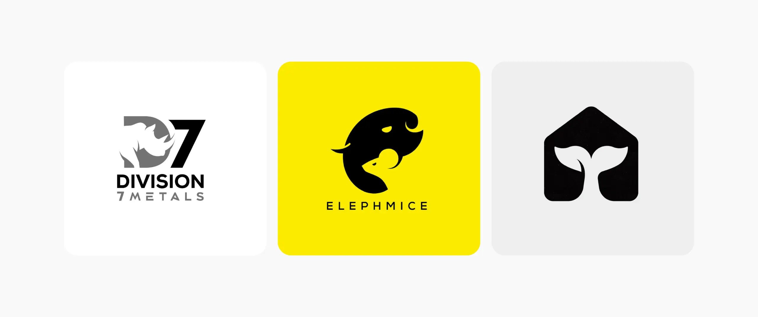
15. Warm Organic
This trend has been absolutely popular in wellness brands we’ve worked with this year. The natural shapes, earthy colors, soft curves, and imperfect details create a welcoming, human feel. The trend draws inspiration from nature and handmade forms, making brands feel approachable, authentic, and grounded.
Why It’s Trending: Warmer, more human visuals and earthy, muted color palettes are growing in popularity because they make businesses feel more approachable and personal. Organic forms and pastel, muted colors are a vibe brands want this year.
Watch Out For: Since it’s a very popular trend, most brands are opting for it. Too many earthy colors or natural elements will make your logo look predictable. Avoid relying on clichés like leaves, plants, trees, or pots.
Best-Fit Industries: Wellness, skincare, food and beverage, hospitality, sustainable products.
Small Business Tip: Focus on how you want customers to feel when they see your logo or interact with your business. A warm color palette, softer shapes, and one differentiating organic detail can be enough to achieve the look.
 16. Stamp and Seal
 16. Stamp and Seal
Stamp and seal logos are elevated emblem logos. They use traditional badges, seals, and official marks to create authenticity and heritage. One of the most popular applications of these is school and university logos, or a coffee shop logo. Circular layouts, bold lettering, borders, and emblem-style details give it a crafted, established feel.
Why It’s Trending: Heritage-inspired visuals are back with an elevated look. They feel more established and trustworthy. Stamp-style logos add personality to packaging, merchandise, signage, and social content. The Starbucks logo is a staple example.
Watch Out For: Too many decorative details can make a stamp logo feel crowded.
Best-Fit Industries: Coffee, breweries, hospitality, handmade products.
Small Business Tip: Use the stamp structure to communicate something specific about your business. It could be where you come from, what you make, or what you stand for. A meaningful emblem will have more impact than a decorative vintage logo.
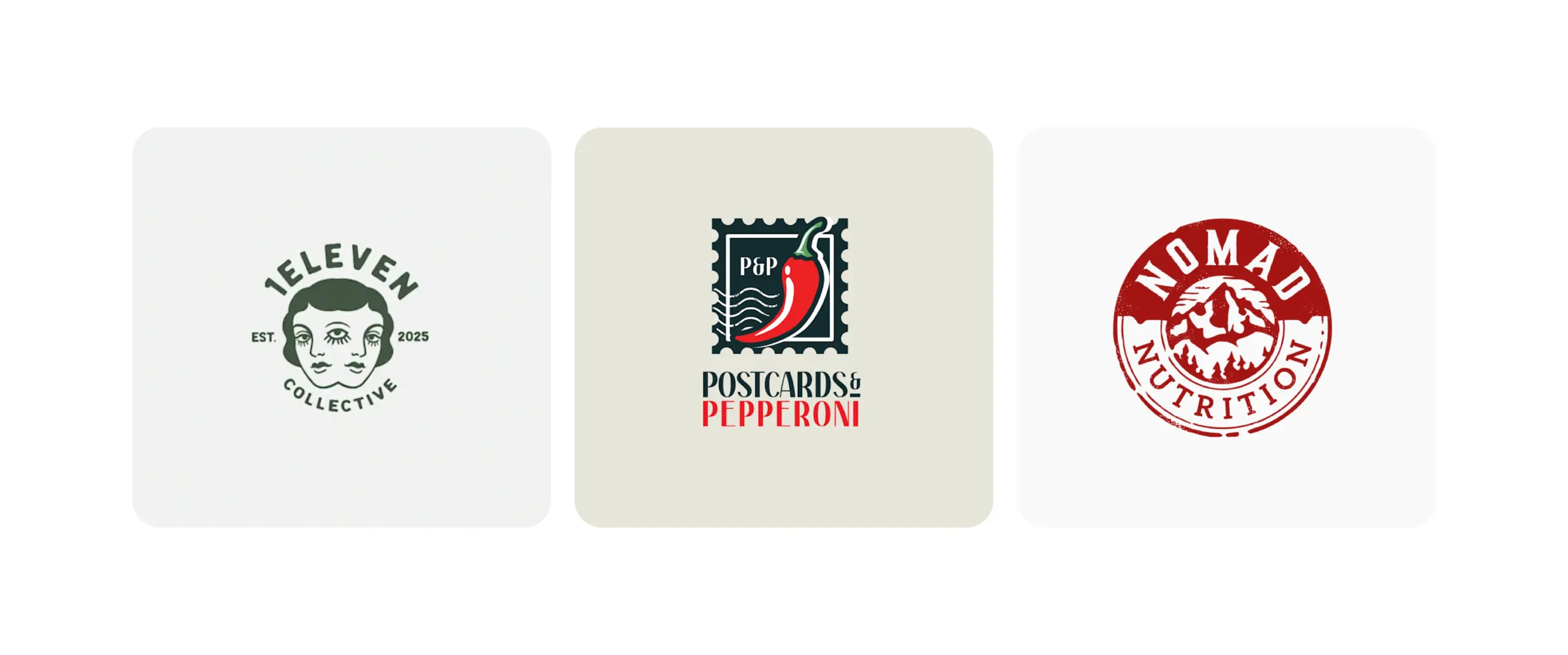
17. Little Blips (Mascots)
We love this one! Little blips are small, expressive mascot-style logos that give any brand a playful personality. These characters could be faces, quirky poses, or distinctive expressions, making a brand feel fun, approachable, and memorable. The character could stand in a mascot logo or wave at you from the corner of the website. Simply, it’s a mascot with intriguing energy.
Why It’s Trending: It adds personality and character to any brand. Small mascot characters work well across social media and digital content. You could take logo design inspiration from Duolingo. It’s the perfect example.
Watch Out For: Your mascot needs to work at smaller sizes. Too many details can be hard to manage. Make sure you and your team follow logo usage guidelines.
Best-Fit Industries: Children’s brands, language apps, food and beverage, entertainment, sports.
Small Business Tip: Give your mascot one memorable trait. Do not try to give it every expression possible. A shape, accessory, or pose could work, too. The goal is to make the logo simple and expressive.
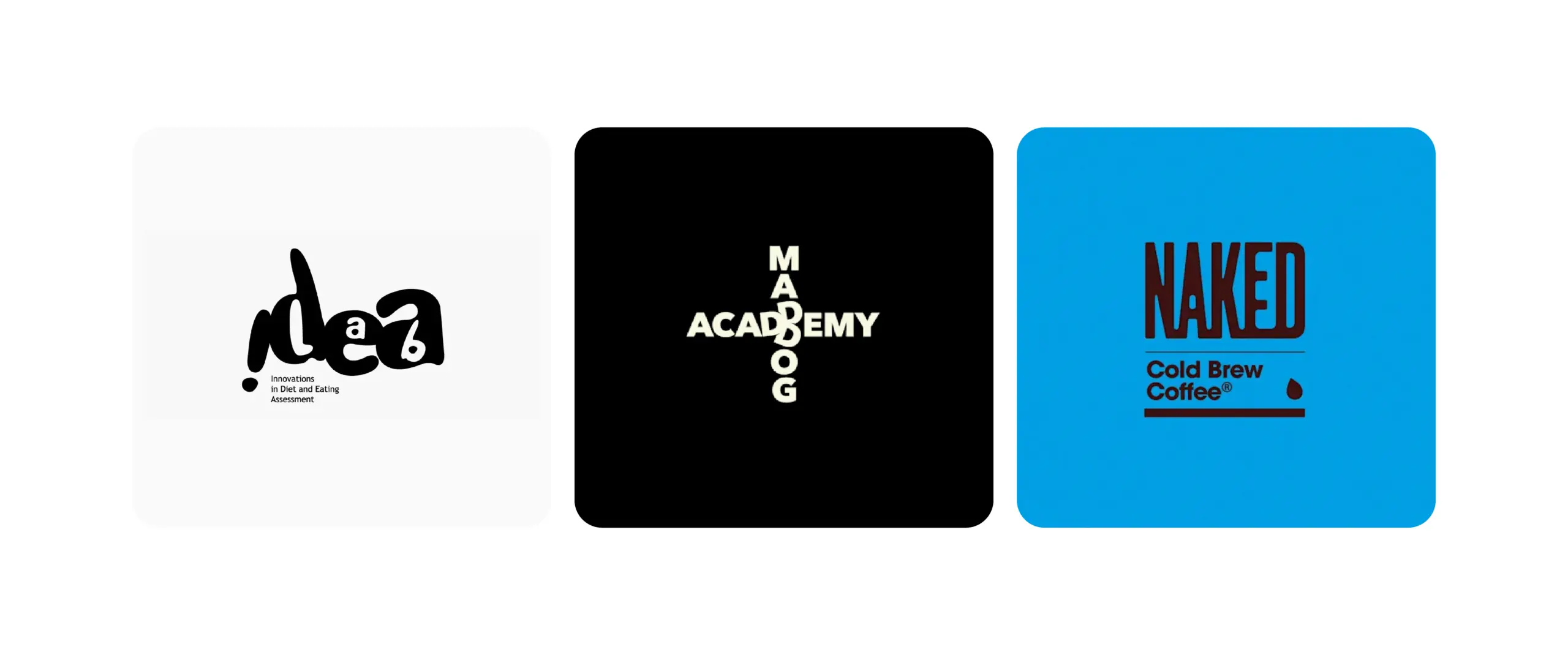
18. Pixel Sharp
Pixel sharp logos are built on strict 8-to-16 pixel grids inspired by 1990s and early-2000s digital screens. These logos are an ode to retro video games and are popular for gaming logos this year. The trend feels modern and digital.
Why It’s Trending: The style is trending because it gives logos a more refined, tech-forward feel. Pixel-sharp logos give brands a strong visual presence.
Watch Out For: Overly sharp angles and tiny details can make a logo feel harsh or difficult to read.
Best-Fit Industries: Tech, gaming, cybersecurity, automotive, sports.
Small Business Tip: Focus on clean geometry and a strong silhouette. You don’t need a lot of pixelation or details to make a logo feel different.
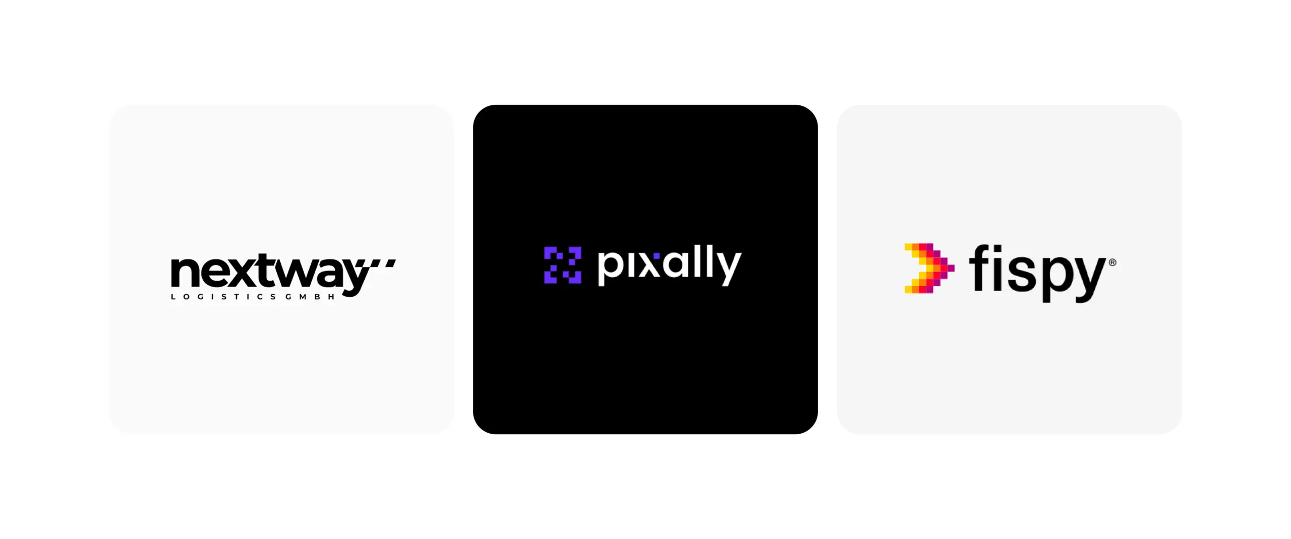
19. Storybook Gothic or Whimsy
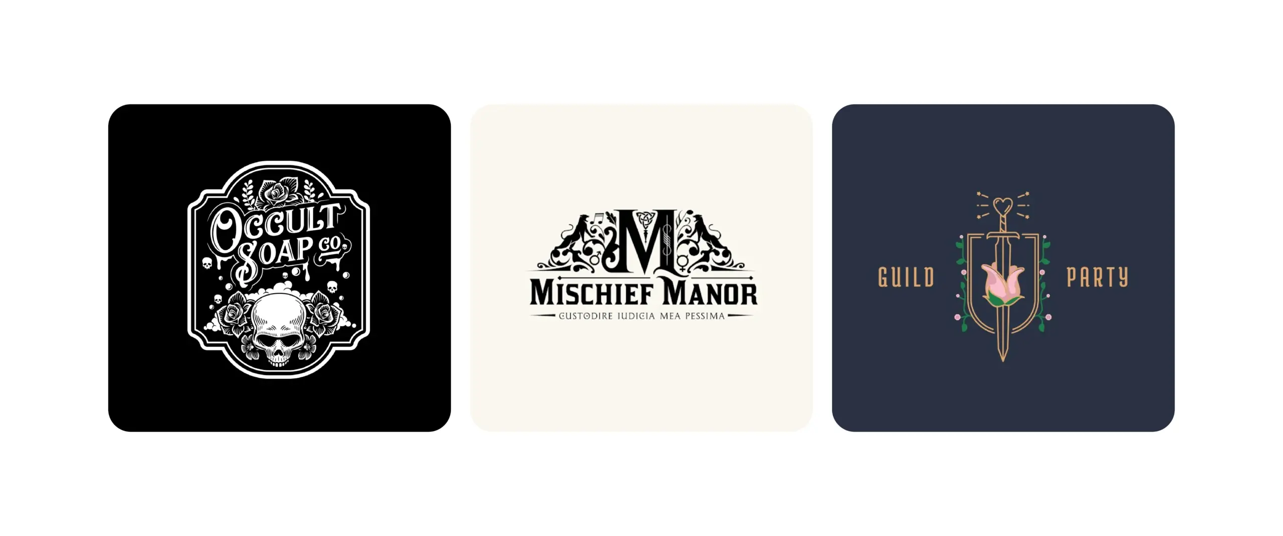
Who doesn’t love dark, dramatic details and the charm of old storybooks? This is exactly why this logo design trend got so popular this year. Think ornate lettering, mysterious symbols, vintage illustrations, and a slightly whimsical edge that makes a brand feel like it belongs in a fantasy world.
Why It’s Trending: Whimsy has been the highlight of 2026. Brands are embracing visual identities that have more personality and visual storytelling. This trend blends mystery, nostalgia, and magic, making a logo stand out in an instant.
Watch Out For: Just design with the logo size in mind. Too many ornate details can make a logo difficult to read at smaller sizes. It needs to work for packaging, websites, and social profiles.
Best-Fit Industries: Publishing, fashion, beauty, jewelry.
Small Business Tip: Your logo doesn’t have to tell your entire brand story. Pick one memorable gothic or whimsical detail, use vintage fonts, or a symbol that adds mystery. Let the logo create the mood.
20. 3D Effects
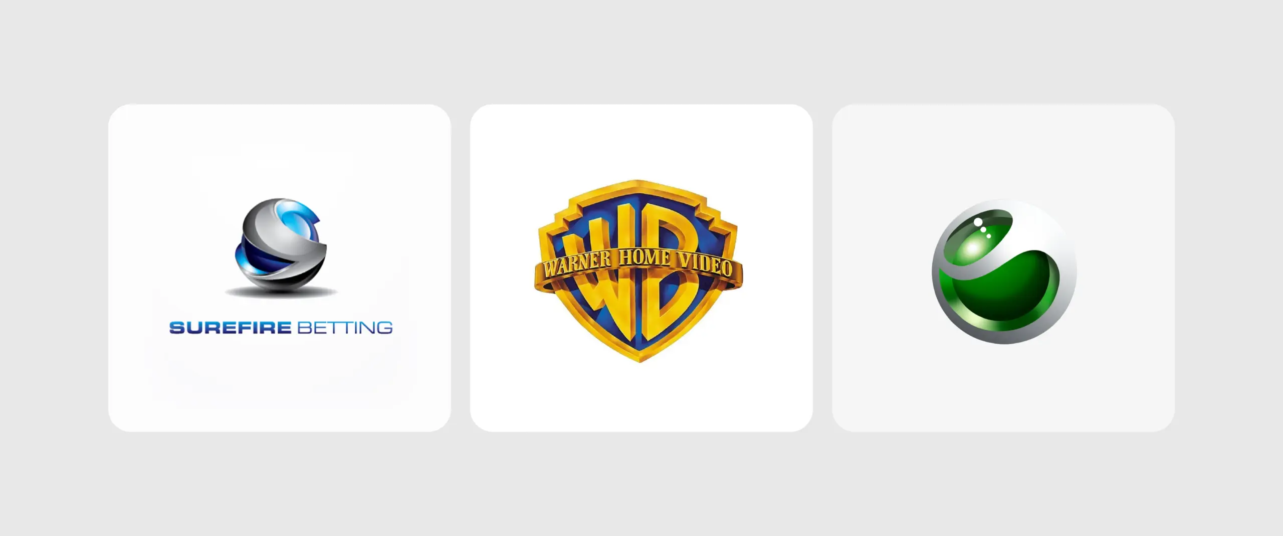
3D logo effects use depth, dimension, shadows, highlights, and perspective to make a logo feel more dynamic. Instead of looking like a completely flat logo design, the effects elevate a simple mark into something bold and visually engaging.
Why It’s Trending: 3D styling can make a logo instantly stand out on websites, app logos, social media profiles, and videos. They work well for screen-based experiences.
Watch Out For: Heavy effects could make a logo look dated or hurt its readability at smaller sizes. Make sure the core design still works without shadows, lighting, or 3D effects.
Best-Fit Industries: Gaming, tech, sports, automotive, media.
Small Business Tip: Build a strong flat logo first, then add dimension where it helps. Use 3D effects where you want to create an impact. This gives your logo the versatility it needs.
21. Logos in Motion/Animated Logos
Animated logos bring a static brand mark to life through movement, transitions, or simple visual effects. A logo might reveal itself, shift between shapes, rotate, bounce, or respond to interaction, giving the brand a strong, dynamic presence.
Why It’s Trending: Brands now have more opportunities to use motion across websites, social media, videos, apps, and digital ads. Animated logo designs get the attention they deserve while expressing brand personality.
Watch Out For: Keep the timing of the logo movement in mind. It can make or break your entire brand perception.
Best-Fit Industries: Tech, entertainment, gaming, sports, apps, ecommerce.
Small Business Tip: Start with a simple animation that works with your existing logo. A quick reveal, shape transformation, or subtle movement can add a lot of impact as your brand is displayed across digital channels.
Trendy vs. Timelessness: Which Works for Small Businesses in 2026?
Trends come and go. In 2026, brands should aim for timelessness in modern logo design. It should reflect who you are today and adapt to the identity you’ll have in the future. Always choose trends that reflect your business, audience, and work well for your industry.

Trendy Logos
- Follow current design styles
- Often use popular colors, effects, or typography
- Can make a brand feel current
- May need updating as trends change
- Great for brands that want a fresh, expressive look
- Risk feeling dated when the trend fades

Timeless Logos
- Stay relevant for years
- Rely on strong shapes, type, and concepts
- Build consistent brand recognition
- Adapt easily as the business grows
- Great for brands focused on long-term recognition
- Less likely to feel tied to a specific era
How Does AI Impact Logo Design Trends in 2026?
The impact of AI on 2026 logo design trends is rapid concept generation. Designers now use hybrid workflows, using AI to generate dozens of layouts, color mockups, and variations in minutes.
Honestly, why are we still debating “AI-generated logos vs. custom-made logos”? The answer is pretty clear. AI logo makers may get advanced, but their outcomes are predictable.
AI logo tools can’t match a designer’s thought process. They can’t identify cultural relevance and shifts. They cannot tell the brand story effectively. This is exactly why big brands still hire designers rather than AI logo tools.
AI is a tool that speeds up the logo design process. It’s good, and it’s cheap, but is it entirely reliable? No, it isn’t.
How Can Professional Logo Design Services Help You Dominate Trends?
Most business owners don’t know how to design a company logo. When they’re DIYing it, they opt for trends. And yes, trends can help you get attention, but in the long run, following them is a bad idea. Your logo might end up looking dated once the trend dies down.
In order to get it right, you need to invest in professional logo design services. Professional help can make businesses achieve the right balance between logo design trends and timelessness. 2026 hasn’t ended yet. We never know what trends we might see in the last few months.
Logo Design Valley is a reliable Dallas logo design company. We design for small businesses with big visions. Your business might have one product or service right now, but it will grow over time. That’s the mindset we design with. We design for your growth of tomorrow.
Your Business Needs More Than a Trendy Logo
Following a trend isn’t bad. It just doesn’t benefit your branding in the long run. We combine trends and good logo qualities to create something that works for you even years after.
Author Bio

 verified expert
Duaa writes blogs about marketing, branding, web design, and logo design. She enjoys turning ideas into simple, engaging content that helps businesses build stronger brands and connect with their audience in a more meaningful way.
Still choosing the right logo design company?
Get a quick, expert review. No pitch, just clarity on what fits your stage, budget, and growth.